Posts: 261
Threads: 9
Joined: Dec 2021
Reputation:
43
Last finished piece looks great!
You have been given some great pointers already on the latest piece so won’t beat a dead horse, but something that hasn’t been mentioned is the hands in respect to the weapons. Now I don’t know what Those knife hilts look like but they would have to be pretty skinny to get the hands to wrap around so much. My paint over shows my assumption on their shape and how I would tweak the right hand fingers and left hand thumb. Keep up the great work

Posts: 307
Threads: 3
Joined: Sep 2019
Reputation:
23
Hi CG - The final image of the tiger woman looks great.
Love your concept on this new character. You're getting a lot of good advice on it.
Looking forward to seeing it come to life
Posts: 1,065
Threads: 4
Joined: Jan 2016
Reputation:
43
Dominicque: Thank you kindly! Fixed the issue regarding the foot, hopefully it works better now!
JosephCow: Thanks! Great point about the depth of the image, I felt the perspective was a bit much on the reference photo but it seems I went too far the other way when I drew it. Your drawing is excellent! Very much appreciate it you taking the time to do that, made a huge difference when I implemented it, it's much improved. With that said I'll try to slow things down in the future!
darktiste: Thank you, hopefully the image works better now!
CBinnsIllustration: Thanks for that, I updated the hands/knife a bit so hopefully it works better now.
Jephyr: Thank you! Always appreciate your support :)
............
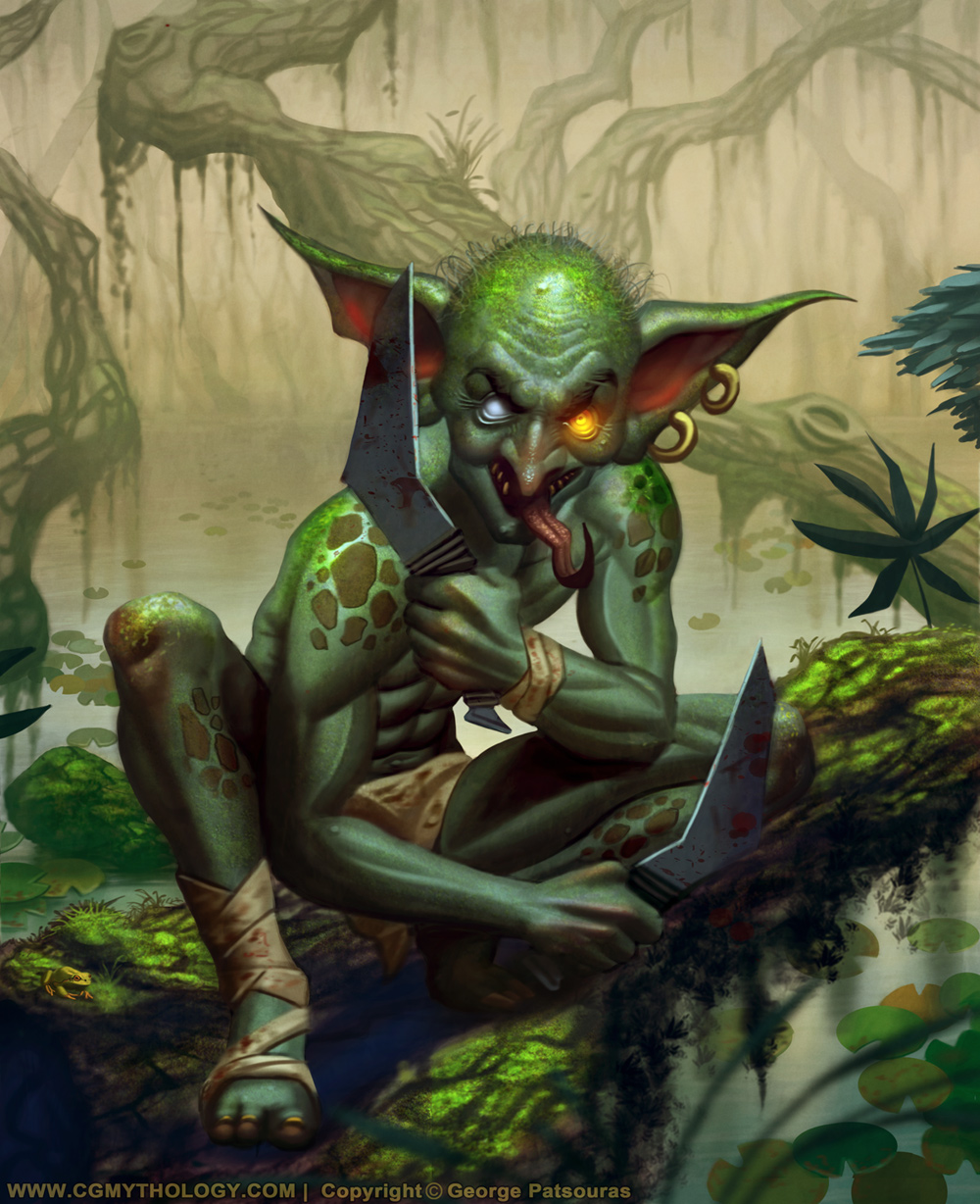
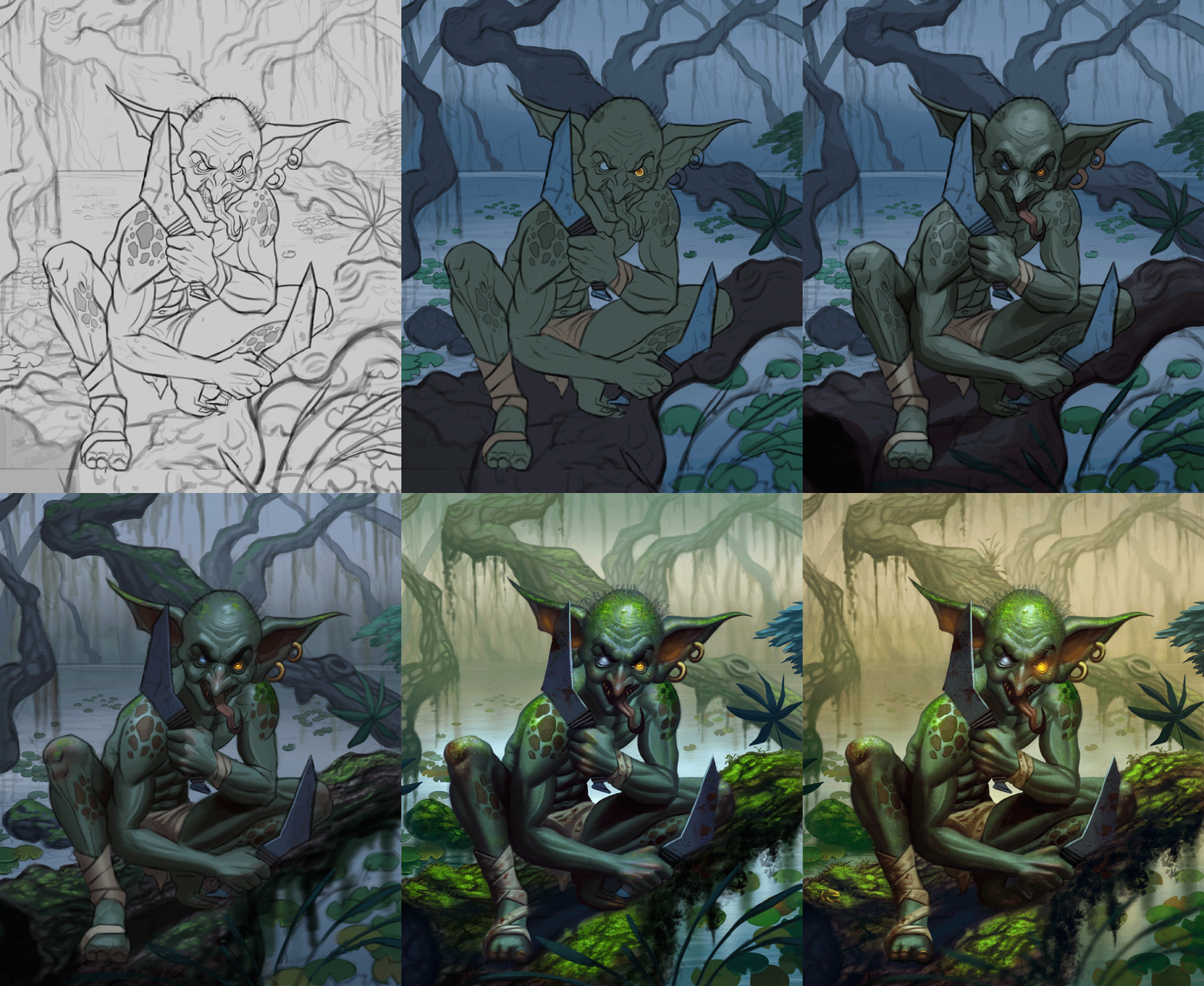
I updated the sketch based on the feedback I received and painted the image in. The environment took a bit longer than anticipated but overall I'm satisfied with how it turned out. As always there's still time to improve it if necessary, so if something looks off please let me know! Below is the final image followed by the steps for those interested.
Posts: 3,336
Threads: 37
Joined: Aug 2013
Reputation:
234
Damn i wish you gone bit alittle more toward that balance between the blue and green it had a more sinister vibe(just my personal taste)
For the dagger i think i would have taken an other route this seem unlikely to have metal laying around but who know the world isn't just a jungle i guess... some nicely craved bone weapon might have been a bit more suited for a savage like him.(Sometime i think to much but hey what would be an illustration without a bit of world building i am right?)
You gone banana with the detail even adding a little frog
Posts: 1,065
Threads: 4
Joined: Jan 2016
Reputation:
43
darktiste: I agree, I also have a bad habit of switching to warmer tones as I progress on an image. I'll try to stick closer to my initial vision in the future. I feel the weapons work well enough, glad you dig the detail work as well!
...................
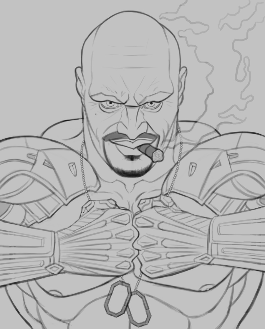
I started work on a new illustrating, a fan art featuring 'Jax' from the 'Mortal Kombat' series. Trying to create an iconic look with this one. Below is the drawing, any input before I begin to paint it in would be highly appreciated!
Posts: 76
Threads: 1
Joined: Feb 2020
Reputation:
4
nice work ont he goblin.
for the colors one thing i would do differently is add some complimentary colors to the green to balance out the green like desaturated yellow and orange
example like this from james gurney
![[Image: maxresdefault.jpg]](https://i.ytimg.com/vi/6A1hbvWB2wk/maxresdefault.jpg)
example of jesper esjing work
id also be careful with workiing with too saturated colors. youd be surprised how vivid you can make your piece with just desaturated colors and only have the saturated colors show in parts hitting the sunlight or some strong lightsource to bring more attention to that part.
im not expert on lighting myself but also adding some hard lights would probably be beneficial to your piece in terms of adding realism. in fact i think im going to study lighting on m y next pieces myself.
![[Image: jesper-ejsing-art-id-161563-moog-war-mar...1480102208]](https://cdna.artstation.com/p/assets/images/images/004/077/140/large/jesper-ejsing-art-id-161563-moog-war-marchal-final.jpg?1480102208)
Posts: 307
Threads: 3
Joined: Sep 2019
Reputation:
23
Hiya,
Your Goblin looks great—the pose is dynamic and I love his crazed expression. You did an excellent job with textures and those knives are crazy cool.
I like the way you pushed that back foot into the shadows and think you could have done a little more of that with his loin cloth — but that's a small nit.
Looking forward to seeing your progress with your fan piece
Posts: 1,065
Threads: 4
Joined: Jan 2016
Reputation:
43
handsomekorean: Thanks! Excellent points regarding the colors and lighting as well, thanks for posting those examples!
Jephyr: Thank you! Had a blast with the Goblin especially his pose and expression so I'm glad you dig it!
................
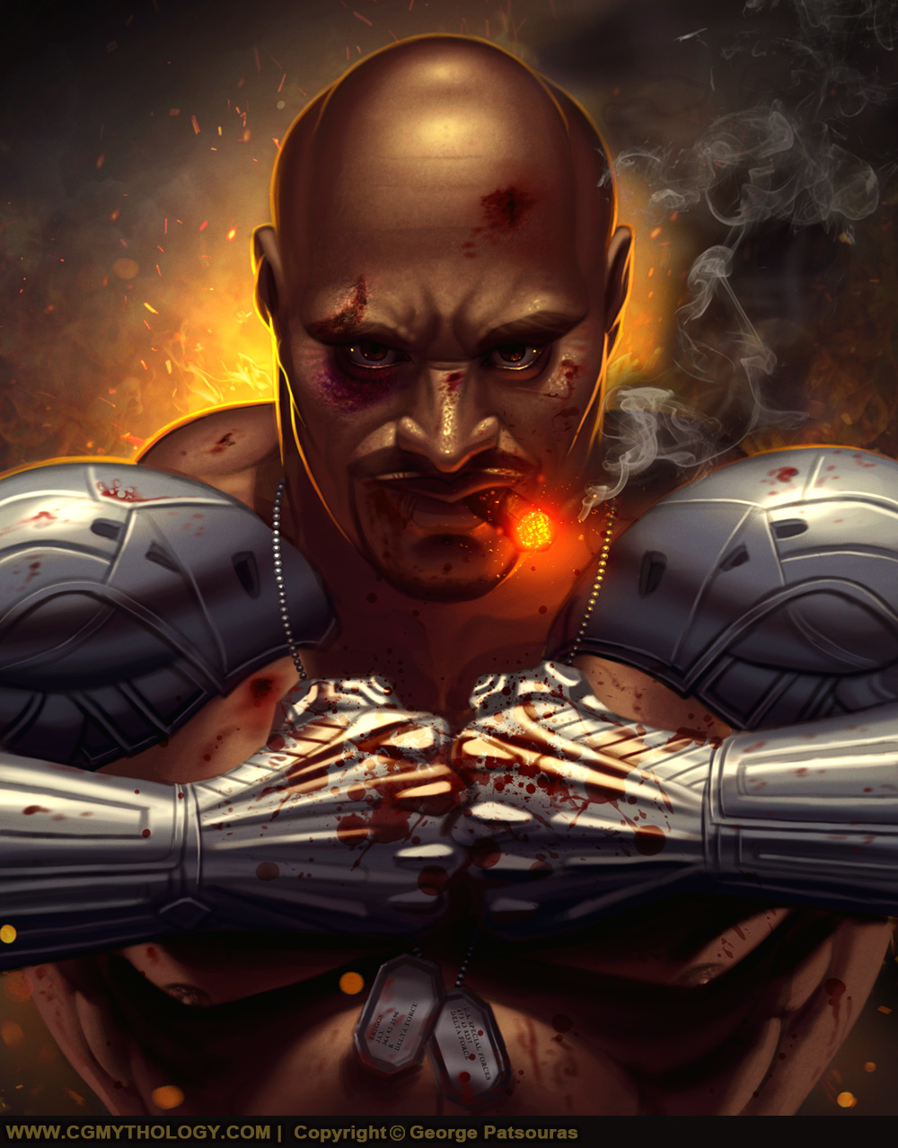
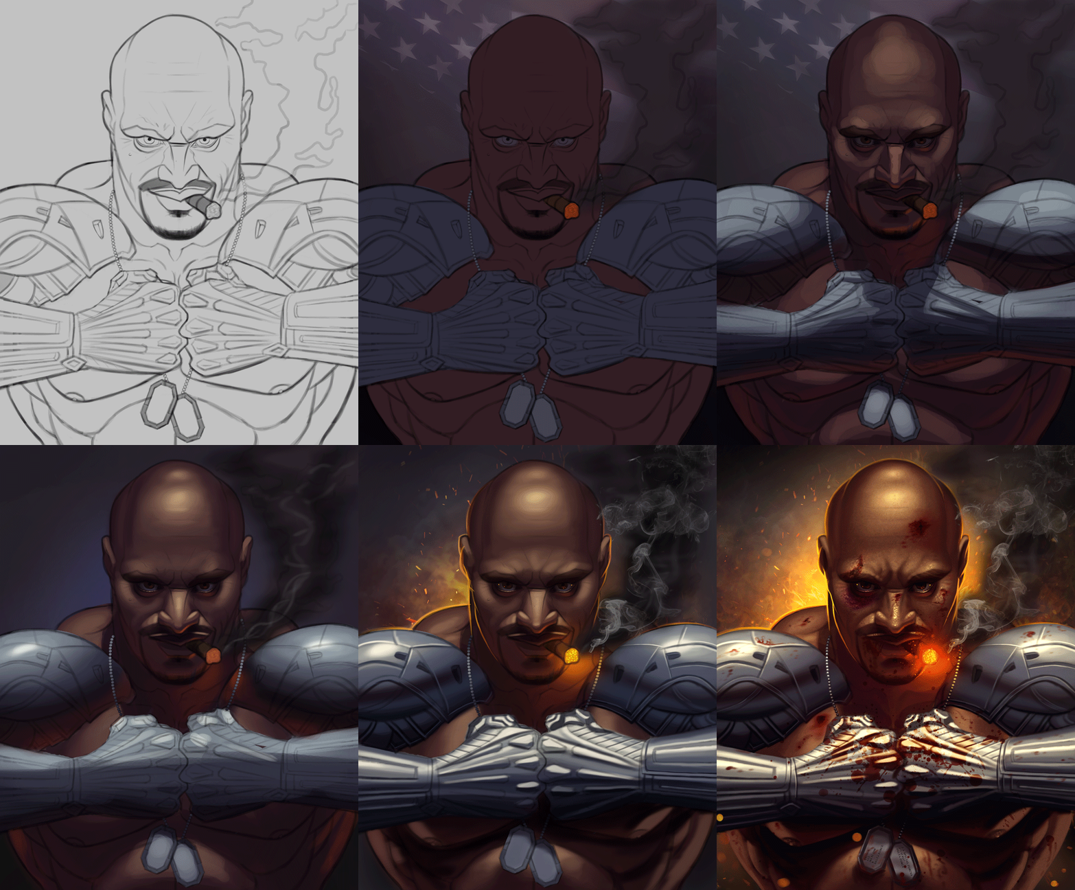
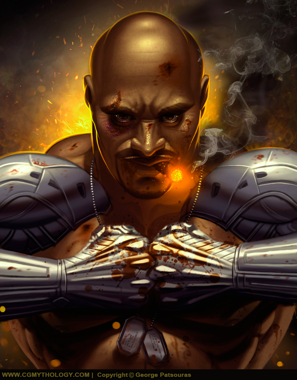
I finished painting the 'Jax' Mortal Kombat fanart piece. Below is the final image followed by the steps for those interested. Any final input is welcome, so if something feels off please let me know!


Posts: 3,336
Threads: 37
Joined: Aug 2013
Reputation:
234
For the oversize version it a bit to unfinish but for the smaller version it work.By that i mean that the detail kinda look unfinish at a larger scale.As if it a flatter than it should and it make look like thing are just decal on a surface.You also painted like the blood would be reflecting the same way as the metal which is kinda weird but blood as high shine .Of course blood reflectivity Depend if it dry blood or fresh from the wound.
Posts: 307
Threads: 3
Joined: Sep 2019
Reputation:
23
Hi CG,
That Jax image RAWKS!!! LOVE his expression, armor and textures. That smoke is AWESOME!! As always your lighting and effects (sparks etc) are superb!
I'm might be a little late with these suggestions but here goes anyway:
His thumbs seem a little double jointed and the lighting on his chest seems a little too strong.
I did a quick paint-over to try and show you what I mean.

Still with those small nits aside — you just keep getting better and better.
Congrats and KEEP 'EM COMING!!
Posts: 300
Threads: 1
Joined: Aug 2020
Reputation:
14
Man, this last one kicks ass. Really nicely conveyed emotion! Keep it up!
Posts: 36
Threads: 1
Joined: Jun 2022
Reputation:
3
Striking and like One_two has said very nicely conveyed emotion in it. Definitely feels fearsome and strong, he's not someone I'd like to mess with haha.
As for a critique - Be careful about the width of each shoulder. Look at the diagram here: https://scontent-ham3-1.xx.fbcdn.net/v/t...e=62D36E22 (sorry for the super long link lol) and you'll see that the deltoid muscle originates from about 1/3 in on the clavicles, and in your illustration it looks as if it actually originates from about 2/3 in.
Nice work nonetheless, keep it up! :D
Posts: 1,065
Threads: 4
Joined: Jan 2016
Reputation:
43
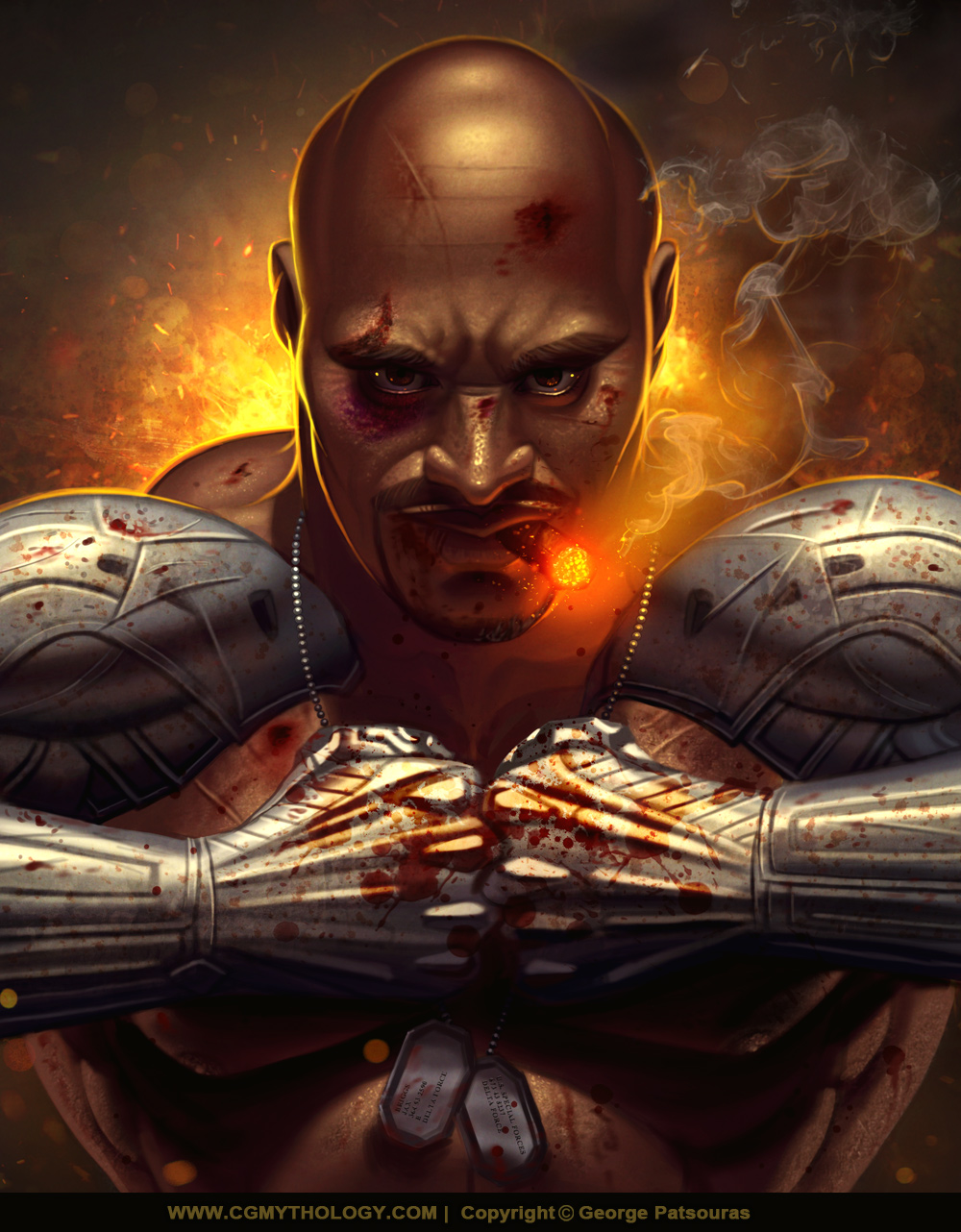
darktiste: Great point, made some changes to the image and added much more detail work, hopefully it works better now!
Jephyr: Thank you! Great points you made and I appreciate the time you took to do the paintover, extremely helpful! I made the changes based on your input, hope it's more to your liking now!
one_two: Thanks, much appreciated as always!
ItsAllHam: Glad to hear it! :D I think the pose contributes to that look, hopefully it's not looking too off but I made a mental note of your input for future works!
................
Some really great feedback I received from everyone, thank you! I was able to improve the image and did some further detail work so it all comes together much better now if I might say. Below is the final and I'm calling it finished for now as I'm itching to paint something new!

Posts: 261
Threads: 9
Joined: Dec 2021
Reputation:
43
Nice work on the last piece there are a lot of things about I like a lot like the background effects, the details around his eyes, the cigar of course, and his expression. However the one thing i cant stop thinking is he is about to start playing the most epic game of Thumb War with himself... If it were me I would have obscured all but a small amount ( maybe a small nub) of the thumbs. If we believe he is making a tight fist those thumbs would be wrapped around those fingers on the backside and leaving maybe a small amount of the first knuckle. But just my takeaway, keep up the great work!
Posts: 307
Threads: 3
Joined: Sep 2019
Reputation:
23
(06-21-2022, 01:03 AM)cgmythology Wrote: Jephyr: Thank you! Great points you made and I appreciate the time you took to do the paintover, extremely helpful! I made the changes based on your input, hope it's more to your liking now!
................
Some really great feedback I received from everyone, thank you! I was able to improve the image and did some further detail work so it all comes together much better now if I might say. Below is the final and I'm calling it finished for now as I'm itching to paint something new!
Hi,
Glad if anything I added was helpful. Like they say, 'Too many cooks can spoil the broth,' so the key is ALWAYS that YOU are satisfied!
I do love the changes you made though — especially to the smoke. Excellent!
And I get wanting to move on to the next project. After putting in a LOT of work — sometimes it's just time to caller 'er dun and move on to the next one.
![[Image: tongue.png]](https://crimsondaggers.com/forum/images/icons/tongue.png)
I'll be waiting to see what you come up with next!
Posts: 76
Threads: 1
Joined: Feb 2020
Reputation:
4
you nailed the expression on the face. good job.
Posts: 39
Threads: 2
Joined: Mar 2019
Reputation:
0
A pleasure to see your work progress over the pages. Page one wasn't bad at all but love how it just improves page after page. Some really inspiring stuff here.. I hope to see more x
Posts: 1,065
Threads: 4
Joined: Jan 2016
Reputation:
43
CBinnsIllustration: Thanks, and great point about the thumbs as well. Now I can't unsee that  Jephyr
: Thank you, glad you enjoy the update!
handsomekorean: Thank you, glad to hear it!
miimogenation: Thank you kindly, great to hear I'm improving!!
................
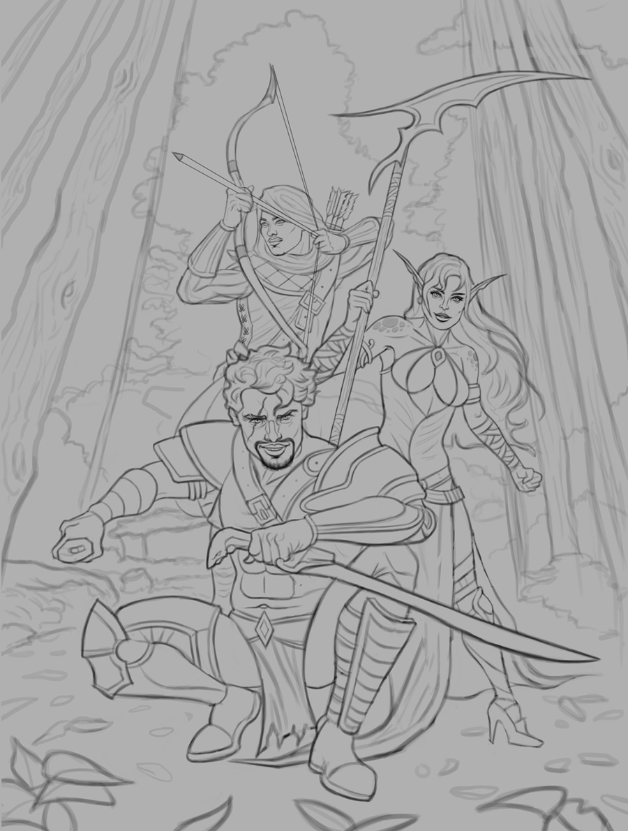
And it's time for a new illustration! This is a group of fantasy warriors, was going for a fairly iconic feel with this one. I had a reference for the general poses as well, while inventing my own character designs since the models were nude for the most part. Spent a lot of time bringing the sketch to life and I'm fairly satisfied with it. I attached it below, any input before I begin the painting process would be greatly appreciated!

Posts: 261
Threads: 9
Joined: Dec 2021
Reputation:
43
My first thoughts are with the archer. I really wanna see that right arm stretched out and more aggressive. Right now he has a very Cupid pose… unless that’s what you were goin for. Other than that looks great, looking forward to your progress on this one.
Posts: 307
Threads: 3
Joined: Sep 2019
Reputation:
23
Hi
I'm diggin' your trio sketch.
Even though they look capable of giving somebody a VERY bad day — they still look like a friendly lot (the kind you'd want on your side!).
You asked for ideas BEFORE you got to painting so if'n I'm not too late.
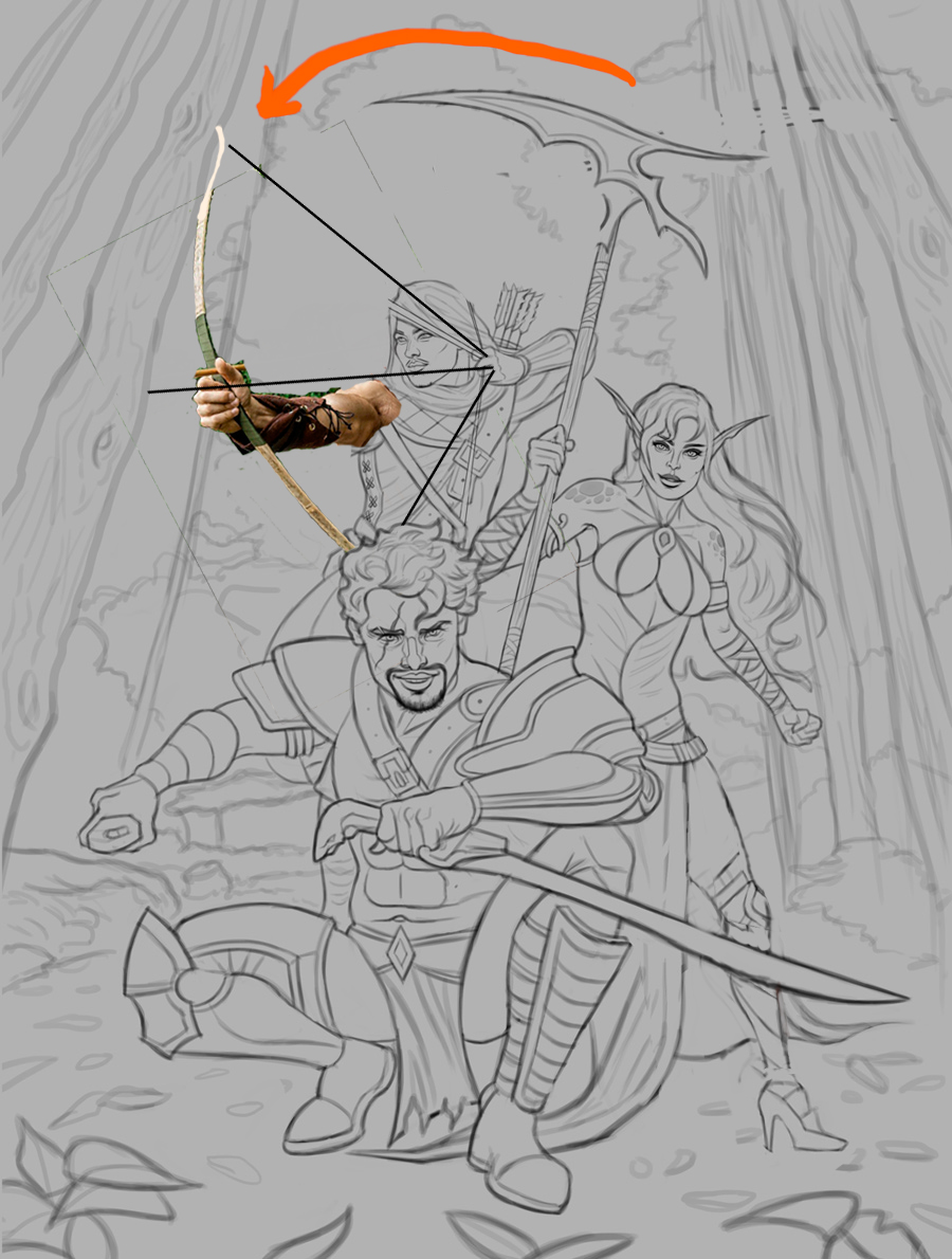
The girl's leg is a bit short and her foot a tad small. In my SLOPPY paint-over (sorry bout that) I extended her leg out a bit into more of a hero pose giving her a little more room for a more proportionate leg.
Did I mention my paint-over was done quickly (and without a ref)!!!!! ![[Image: wink.png]](https://crimsondaggers.com/forum/images/icons/wink.png)
I agree with CB's observation — and since I didn't have much time I added a photo smash over your sketch. I do that sometimes to get a feel for what I want and then hand paint it afterwards OF COURSE!
I turned her weapon into the picture to draw a viewer's eye inward instead of off the page.
The copyright remains with the original owners of all refz in the comp and paint-over. Thanks people!


Hope the ideas help — but I know you'll kill it either way!!
Looking FWD to seeing what you do with this one
|


![[Image: maxresdefault.jpg]](https://i.ytimg.com/vi/6A1hbvWB2wk/maxresdefault.jpg)
![[Image: jesper-ejsing-art-id-161563-moog-war-mar...1480102208]](https://cdna.artstation.com/p/assets/images/images/004/077/140/large/jesper-ejsing-art-id-161563-moog-war-marchal-final.jpg?1480102208)
