+- Crimson Daggers — Art forum (//crimsondaggers.com/forum)
+-- Forum: STUDY GROUP (//crimsondaggers.com/forum/forum-5.html)
+--- Forum: COMMUNITY CHALLENGES (//crimsondaggers.com/forum/forum-46.html)
+--- Thread: Bloodsport 2 Revived: Swamp Elder (/thread-4723.html)
Pages:
1
2
Bloodsport 2 Revived: Swamp Elder - Lyraina - 02-03-2014
Hey guys!
Jaik and I decided to resurrect the old Bloodsport challenges for fun & practice (and a little bit of nostalgia) - once a month, running for two weeks each. We would be happy to see some of you join the fun! We are going to post a new thread in the community challenge sub-forum for every topic, so everybody who wants to participate can post there and exchange feedback. There will be no judging in the end, and no enforcement of deadlines etc - it's all about the process and practice.
This month:
Bloodsport 2: Swamp Elder
Created by: Dave Rapoza
Requirements:
- Clearly realized character AND environment
- Character MUST be in the environment
- Studies pertaining to finished illustration MUST be shown with the piece
- Studies must be relevant to the character design and environment used in the illustration.
Character is a 'swamp elder'- which you are free to interpret any way you like.
Deadline: Monday, February 17th 2014
RE: Bloodsport 2 Revived: Swamp Elder - Jaik - 02-03-2014
Got started on this today. Trying out different approaches to thumbnailing and process. So this time I started with a word ideation (the small ass text at the top I am not sure you can read) then thumbnailed some ideas, then moved straight in to placing them into an environment and did a value pass just to separate some stuff.
I think next time I would do just plane flat grey shapes to separate them then run a lighting pass on that. But for the top one especially (I want it to look like it is just about to be dawn and being lit by a torch) lighting was incredibly important.
RE: Bloodsport 2 Revived: Swamp Elder - Lyraina - 02-04-2014
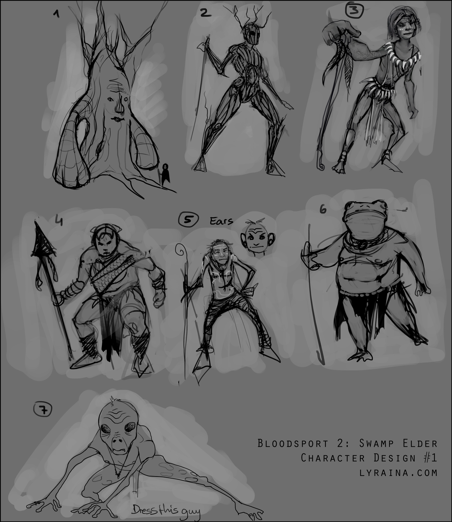
Jaik: Lots of cool stuff and diverse ideas in there. The giant creature lit from below is really cool and could make for a great mood painting. Although it doesn't show off the design very good, unless you stay pretty close to something everybody knows (turtle/toad etc). Value thumb 2 and 3 run the risk of turning into a cliché, especially those birds on branches. If you go into that direction make sure you add something unique as well (face of the bird guy looks interesting so far). That is a problem I am running into as well, because my brain is plastered with tree-people we all have seen far too often by now. Depicting an aged(!) Naga like creature would be pretty cool too, if pulled off successfully! (I say that because I already realized I have sincerely neglected painting aged bodies so far.) Anyway, I like that idea of yours where you combine turtle(?) silhouette with tree elements. Since this topic is very broad and you also explored many possible directions, I would suggest you do some more of those rough concepts before settling on one concept. And if you settle, explore 5 or 10 variations of that design before going on.
Here is what I have got so far. Brainstorming and developing a few ideas... not too happy yet.
SWAMP
dark green, brown, grey
wetlands, ponds, (dead trees), grass/reeds, cypress knees, mist
"bruchwald"
more or less forested
moods: drepssing, morbid, dark vs. dreamlike, misty-green
ELDER
grandfather-like, tells stories to the children
war-chief like, hard person
fragile, strong, tiny/slim, massive ... body language?
religious leader?
SWAMP ELDER
probably some kind of authority, wise
leader or elder of a human tribe living in the swamp
humanoid species, adapted to living in the swamp (frog like/greenish/wet skin)
tree like species, incorporating all 'swamp' things in his design (from moss to hanging stuff), gnarly
combination of all above - humanoid with bark skin etc
what culture does this creature/person belong to? how do they live? what does it mean to be an elder? what's their job and how does it show?
inspired by swamp animals?
to do:
environment -- decide on mood
elder - decide on direction
animals or plants to give life to surroundings
think of the culture they belong to
composition of final image -- maybe some interesting perspective? light situation (campfire)?
what does the elder do? tell stories? give advice? show something interesting to tell a story with visuals.
avoid:
treebeard
WoW druid treeform
gollum
RE: Bloodsport 2 Revived: Swamp Elder - crackedskull - 02-04-2014
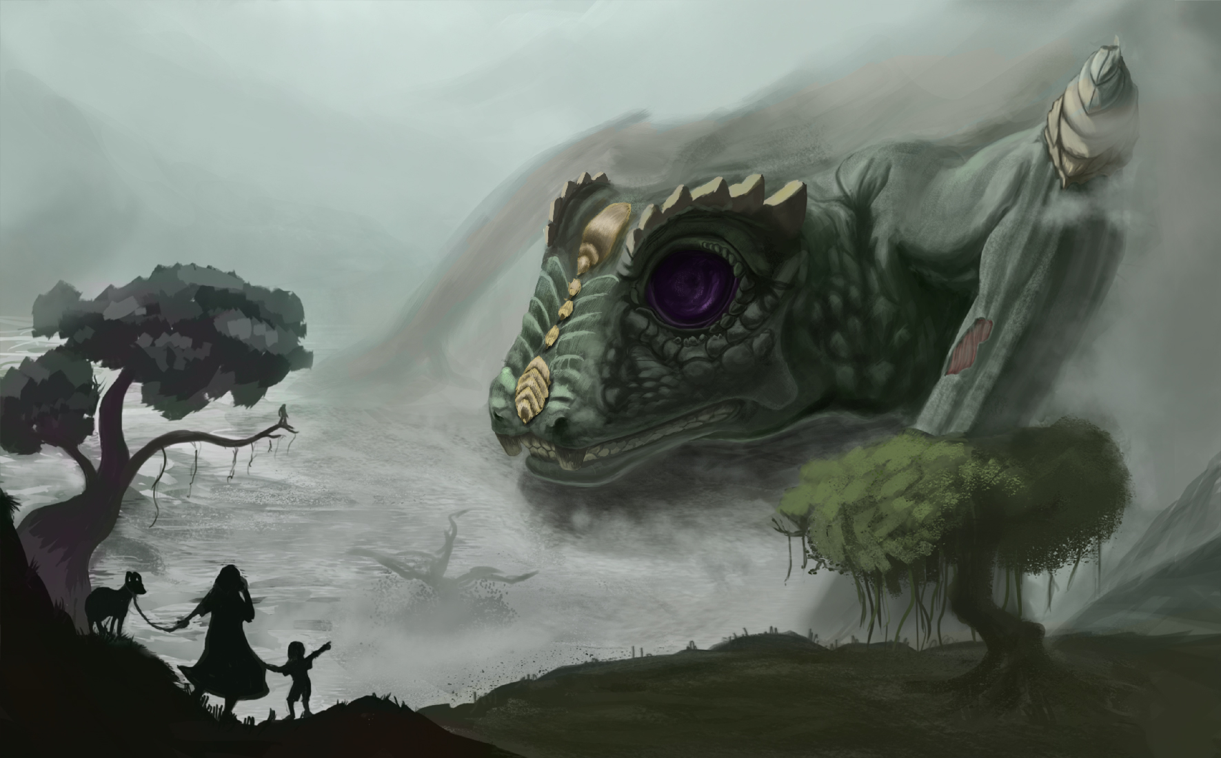
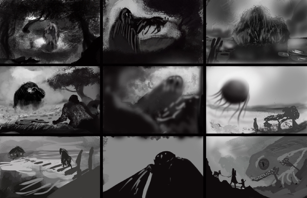
Did some thumbnails, think im going with the last one.
RE: Bloodsport 2 Revived: Swamp Elder - Jaik - 02-04-2014
Cracked:
Last one is definitely the strongest. I like the idea of the family in the foreground. Theres just not much swamp in there for it to be a swamp elder. If you add in a bunch of overlapping trees and vines and foliage and give it a more dense feeling like the first one it will convey the idea a lot better.
---
Todays stuff. Narrowing down the direction I want to go in.
RE: Bloodsport 2 Revived: Swamp Elder - Bjulvar - 02-05-2014
Hey you guys! Really awesome that you're bringing Bloodsports back to us, super-appreciated!
Great start Jaik, those dynamic initial sketches have some good potential and I can totally see them work with the larger composition at the top. It's a very mysterious scene that would benefit with some magical light sources and all that!
Considering your latest head-explorations I'd suggest playing with the design even more, while you're changing the silhouette the design is still the same in a sense.
I think it would be cool and consistent to carry over the trees from the head to the shell, so that it's not just on the top. But that's just an opinion!
Going to be great seeing it further down the line :D
Great way to brainstorm Lyraina ( I keep saying Lyriana in my head :()
I will definitely think about the purpose of the elder too now. So thanks!
I really like number 6, the frog dude. There's a lot of potential to play around with his proportions and silhouette. I guess the challenge is making him stand out, claiming the design as your own, since by now we're all used to seeing anthropomorphic creatures. Maybe you can combine it with the second design and get some kind of hybrid?
Anyway I can totally see him as an Elder!
Looking forward to the compositions :D
Nice comps Cracked, I agree with Jaik about the last one looking interesting! Looks like he's supposed to be huuge right now which is really cool. But there could be some more balance to the compositions. Feels like everything is pulled down to the bottom left corner.
The fifth one looks like it could be straight from a documentary with all that blur. Really stands out!
Rock it dude!
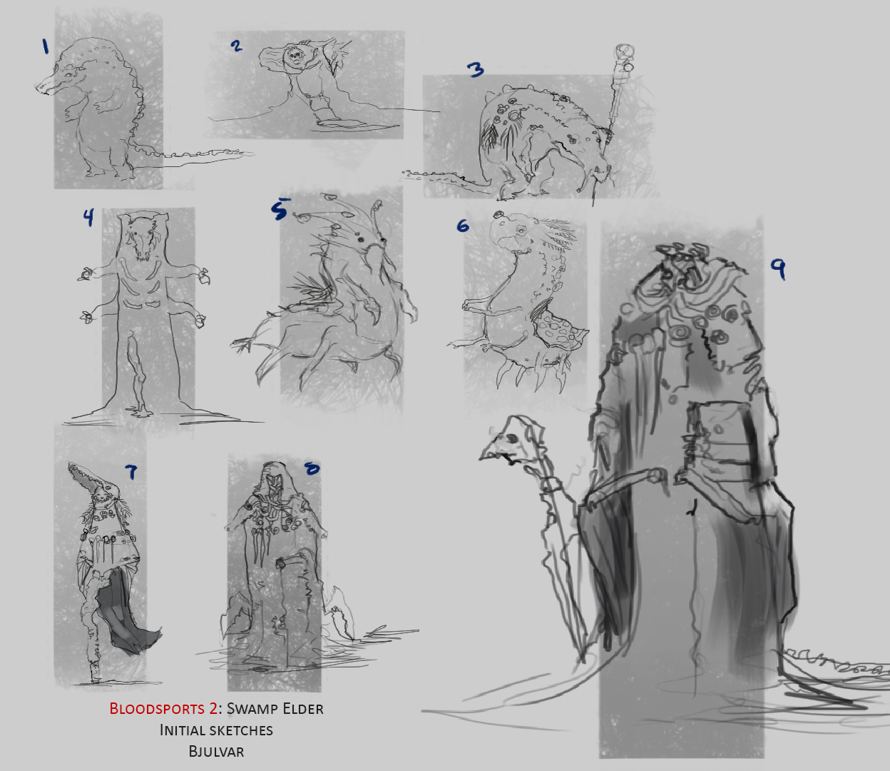
Here's my little initial sketches, at first I didn't want to make him as humanoid as the later sketches show. More along the lines of a deity or spirit, but the goal is to have him as a personification of the swamp that he lives in. We'll see!
RE: Bloodsport 2 Revived: Swamp Elder - Kaffer - 02-05-2014
Hey guys!
First of all, thx Lyrania & Jaik for bringing Bloodsports back! I'm looking forward to this, thee kind of activities were part of why I joined CD the first place!
Lyrania: I think the frog-guy is the most promising as well!
Crack: I am also with the others here, your last comp. sketch is the best, I'd probably try to emphasize him being an elder more - even though its in an early stage obviously
Bjulvar: No. 5 seems the most interesting to me, I could easily imagine him in a swampy environment all dressed up :)
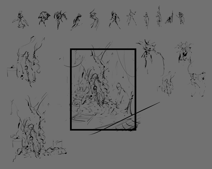
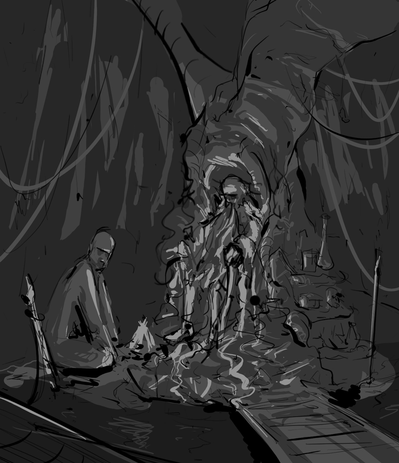
OK so I started with some doodles and pretty suddenly came to an idea I like. I started adding some values, I'll see tomorrow how I like it with a fresh eye. (Maybe do more sketches? It's easy to get carried away in this early stage)
Anyhow, next (or after further sketching) will be putting a moodboard together. Luckily I have one kinda lingering 'cause I made a swamp-themed stuff recently which came out crap, so I guess this is where it pays off :)
RE: Bloodsport 2 Revived: Swamp Elder - Lyraina - 02-05-2014
crackedskull: Mostly agree with what was already said - cool idea with the foreground, but try to push the 'elder' aspect as well as the swamp.
Jaik: I like the turtle theme! The willows are cool too, but try not only to think how it looks, but also how it works and how/why it developed the way it did. Root and bark legs are a nice idea, although the hind leg looks a bit nonfunctional so far. Does it have to mimic the turtle's foot? the shell already is a strong design hint, so you could saflely go more abstract and make it more root like or even something completely different. You could even add some foliage to those leg-trees. Just ideas, no real critique :P I'm looking forward to how you are going to implement the willows - growing on the shell, or coming out of it etc... with that design you have lots of cool possibilities to explore and build your own little ecosystem. Just always try to think how it is going to work (at least roughly) because I think this will make for a more believable design and help coming up with cool stff. What doesn't read well to me so far is that stuff hanging down besides the head - some kind of roots of another plant? Turtle ear-hair? Or hanging lichens? Looks a bit draped so far.
Bjulvar: Feel free to call me just Lyra, which is my original nickname anyway, but you're not the only one misreading that name. I just hope nobody is ever going to google Lyriana when looking for me...
You have some really cool design ideas, 5 and 6 have nice silhouettes! Although 6 looks a bit unbalanced with those little legs. The more humanoid designs are nice as well, I like the asymmetry of 7. Just try to not turn it into a shaman instead of 'elder'.
Kaffer: Nice dynamic sketches... I like the campfire approach which is something I was considering as well, although I feel like children would fit well into that composition as well. Would change the story behind the image, but also kind of emphasize the old age of the elder. Just an idea :)
---
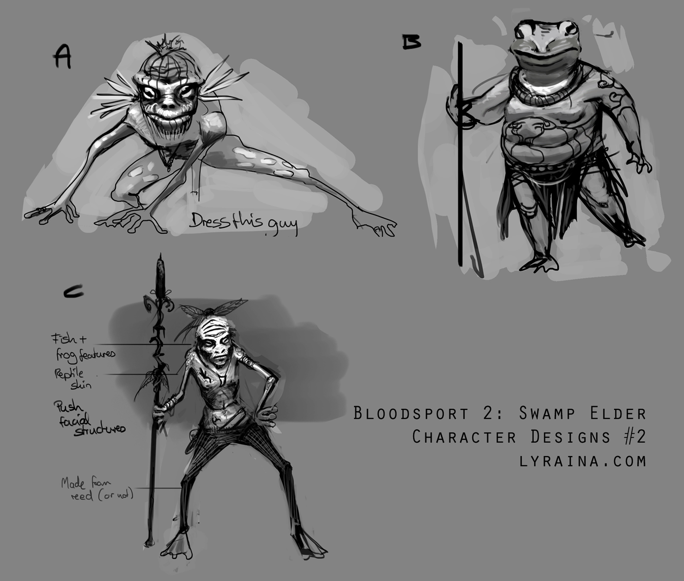
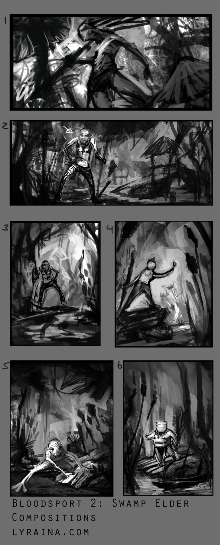
I fleshed out the designs I liked best so far, dropped anything wood related completely..don't think I like the fat frog guy, he just feels so generic. Like... a fat frog, in human form. I might do a hybrid of some froggy-thin-not-entirely-human character though. And then make it more interesting with...stuff. Also started on compositions. I never now how to decide how to continue D: Some are clearly weaker than the rest, but others just have pros and cons....
RE: Bloodsport 2 Revived: Swamp Elder - crackedskull - 02-05-2014
Thanks for the advice fellas :)
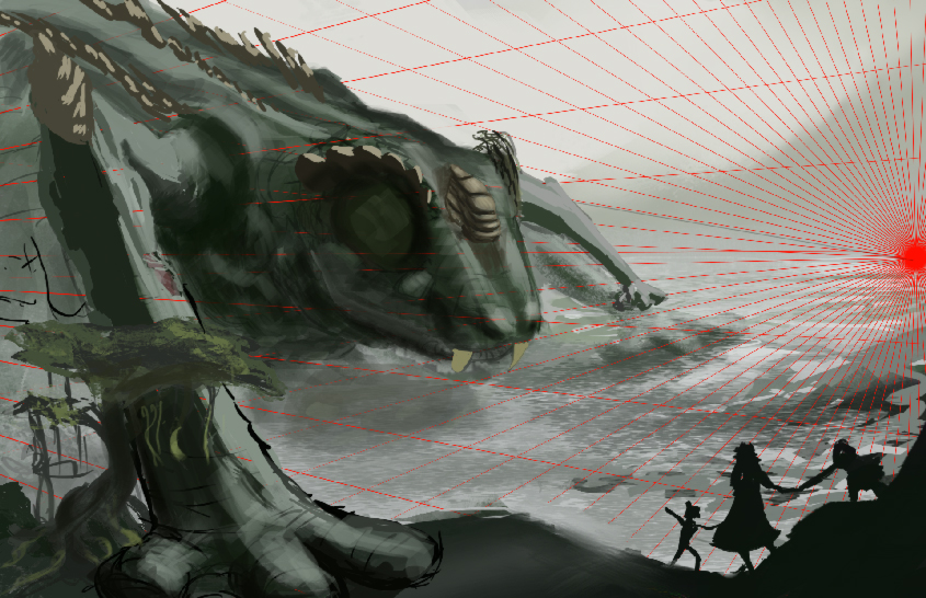
Worked on the thumbnail, I think Ive got it nailed down now, from now on I'll get to rendering and adding minor details here and there.
RE: Bloodsport 2 Revived: Swamp Elder - Jaik - 02-05-2014
Finished the character sheet, those suggestions you gave me, Lyraina, were really handy. So applied a bunch of them. Also brought in more tree sort of designs to the elder as per Bjulvar's suggestion.
Started doing some final thumbs and prepared a bit of a moodboard, but its only got a few pics of trees so I will include that later. I won't circle the ones I like in the thumbs (if you can even make sense of them) so that you can tell me the ones you like best.
Lyraina: : I really like the composition of the first one. Really dynamic pose but I like the frog guy best still. I think you could push the elder a bit more (wrinkles are great for adding personality too) but yeah he doesn't necessarily still have to be fat, could put his head on the body of one of the thin ones like you were saying. Just make sure to emphasize the age. I have the same problem as you of not quite yet knowing whether I want to go for a portrait or landscape orientation on my painting.
Kaffer: I like the idea of bring in a subservient character to the illustration that is roughly the same size as the elder, sort of like a caretaker. As opposed to making them huge which is the approach me and cracked went with, but it is kind of hard to read any of the design of the actual elder itself, but I am sure that will be resolved with time.
Bjulvar: Looking real cool man. 5 and 6 have a real nice Mike Corriero feel to them (I was flicking through Planet to Planet today coincidentally) so look up some of his stuff if you are going to go in that direction. Personally, 8 is my fave. I think you could do some really cool stuff with the design in the upper half of the body (looks like noise at the moment to me, but it probably means something to you) I like 5 adn 6 but I think you will have a hard time making them look elder-ish.
Cracked: You really really need some repeating shapes between the character in the foreground and the elder itself, even if it is just the same tree again and again, because at the moment I am not sure of how big, or how far this hand is coming forward, or the other going back. You also the tree is kind of confusing, since it is behind the base of his foot but infront of the top. The odds of something that big being able to position his arm like that is pretty remote. But I really like the design, I think it has enough of a mix of lizard and alligator to not look like you have directly copied either and just pasted one part from the other on top. So kudo's on that front since it is something I really struggle with (my turtle looks like a turtle with a tree pasted on top >.> ).
RE: Bloodsport 2 Revived: Swamp Elder - Lyraina - 02-06-2014
Jaik: Maybe repeat those mushrooms somehere in the design so it is not focused on just one area? Apart from that, while I love mushrooms, they kind of destroy the sense of scale... Yeah there is a human standing beside the head, but when I look at the image those mushrooms are a lot more prominent, and to me they don't look like human-sized mushrooms but regular... which kind of shrinks the whole elder. I like 3 and 5 for their balanced scale, 5 a bit more because the tilt enhances the scale of the elder. 7 is too centered for my liking, kind of boring. If I had to choose I'd go for 5, as this allows you to show off the elder as well as its environment, and allows to really show the scale with a bit of atmosphere etc. Looking forward to which one you'll choose :)
I didn't get much done today, so here is just a quick update on the design, still not happy. The outer gills will probably have to go. Maybe I will rework him again tomorrow or give the fat one another try...
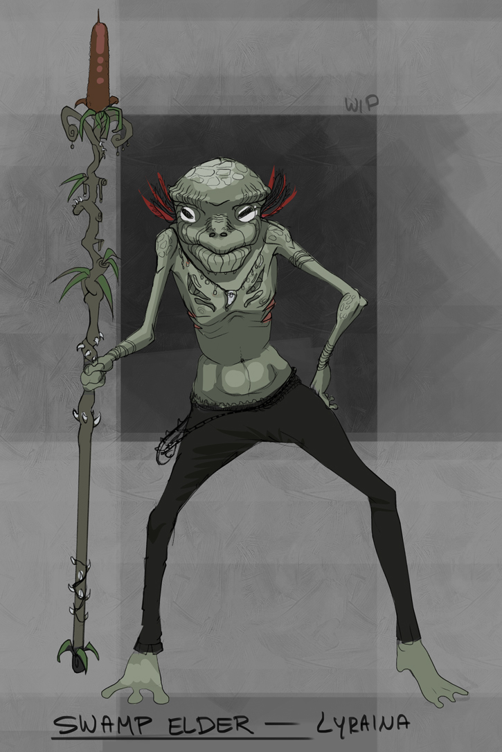
RE: Bloodsport 2 Revived: Swamp Elder - crackedskull - 02-06-2014
Thanks for the critique Jaik, I put in some trees and tried to indicate scale better. The thing is, there arent any massive recurring things in swamps that can measure up to that behemoth :)
Made quite a bit of progress, currently started working on the MOST IMPORTANT PART. Made some alterations to the head because the perspective was off, gotta keep in mind that I have to achieve a good look and do it in correct perspective.
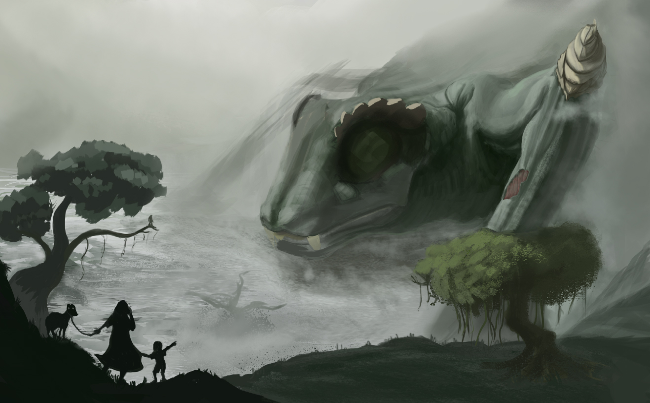
Edit: progress shot.
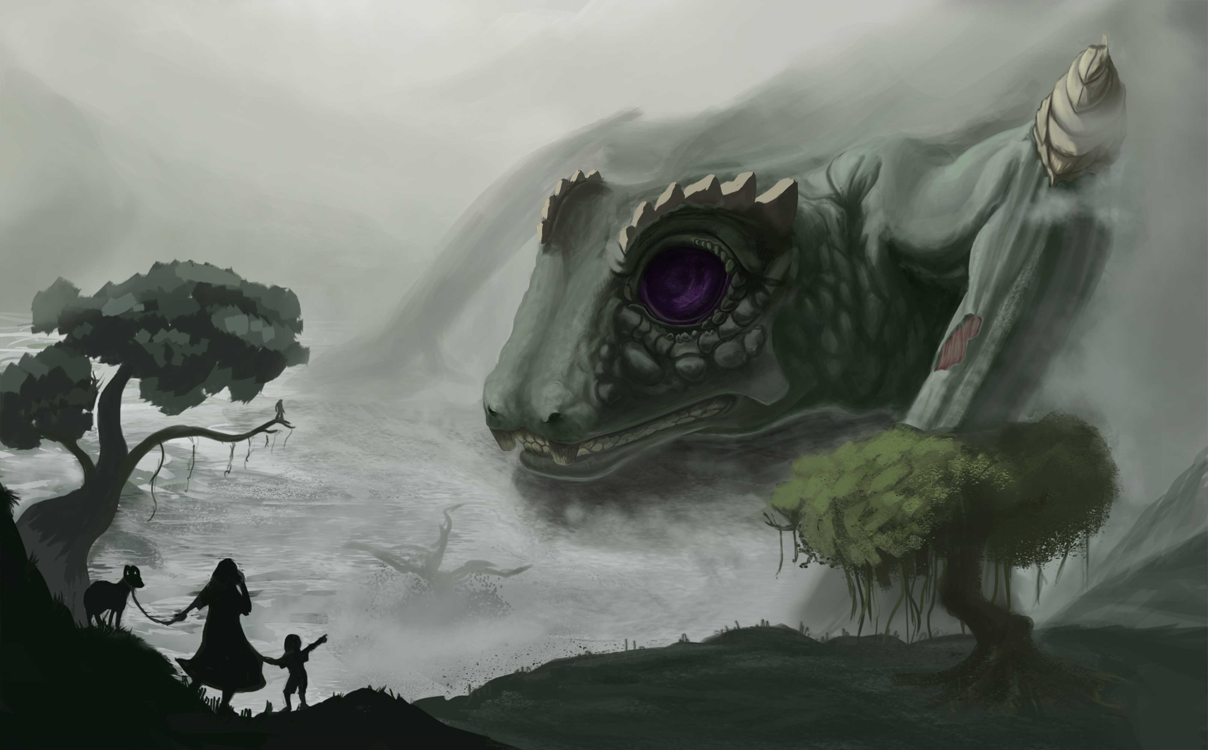
RE: Bloodsport 2 Revived: Swamp Elder - meat - 02-06-2014
Man look at all these great thumbs and WIP paintings already! And all that brain stormings! Makes me want to hike up my skirt and run away, lol! Always a late starter here, and quite frankly I'm afraid I'm incapable of doing a decent, full digital painting, background and all, for this kind of events. But still gotta start somehow, somewhere. Anyway, I'm still finalizing ideas right now, just posting this first reaction sketch to the title "Swamp Elder" for laughs. It's a very stereotyped, and probably racist character of a fat, sagging, retired Viet-Vet, dozing off in warm Louisiana sun after a meal of crawfish. 'cos Louisiana = swamp in my mind.
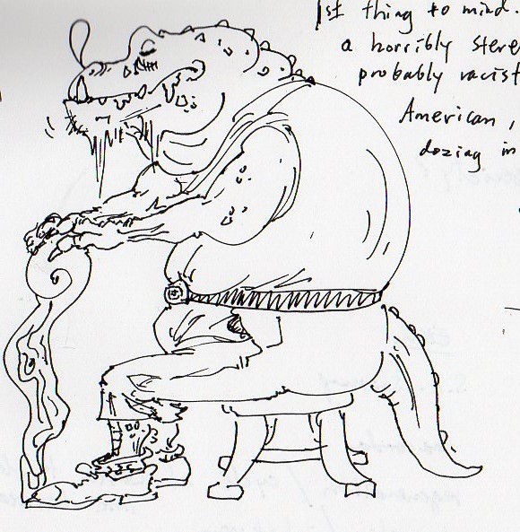
RE: Bloodsport 2 Revived: Swamp Elder - Jaik - 02-07-2014
Lyraina: The colours are looking cool, though these are more muted than the last one I saw :S . They are sort of going for that side scroller style. I think you could afford to exaggerate the warm light/cool shadows though (some anime screencaps are fantastic for this, because they push it so far). I hear ya on the perspective struggle. I struggled a lot with mine too.
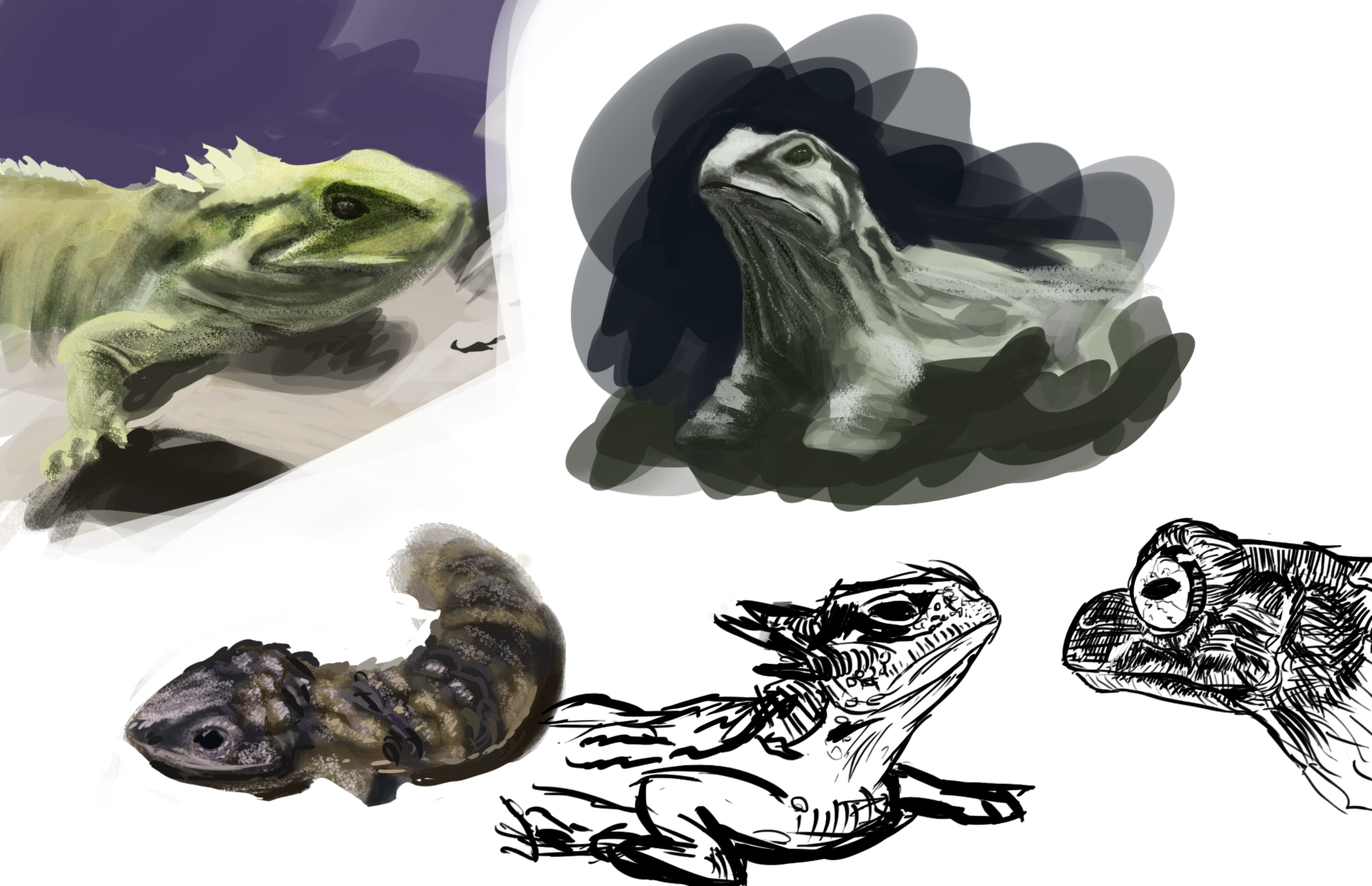
Cracked: Completely hear ya on the 'not a lot of repeatable things for scale in a swamp' struggling with that myself. I would play with overlap of the planes in the foreground a little more (have the mid plane overlap the silhouette of the boy a little since it will help with depth. But its looking good. I like that purple in the eyes. Don't forget to do your studies though, and post em up!
Meat: The first one is always a cliche lol, everyone does it. But good that you are giving it a shot. Never run away from a challenge. Run at it head on. Bloodsports #1 was a massive failure for me but theres nothing else to do but to bend over and take it. Not sure if thats a good way to put it for motivation to stick it out.. but you win some you loose some.
---
Didn't get anything done yesterday as I was working all day then had life drawing. Struggled to get the perspective of the head right today (3p perspective, then the head at a different angle with its one perspective.. so confusing @.@ ). Did some studies. Didn't get a hell of a lot done. Included a mood board for the illustration too, so that you can see the kind of feel I am going to aim for.
RE: Bloodsport 2 Revived: Swamp Elder - Lyraina - 02-08-2014
crackedskull: Woah! Thad eye looks cool.
meat: No running away! :P Don't worry about doing a full painting if you don't feel like it or don't have the time, just do what you'd like to - that sketch is golden :D
Jaik: Dunno what you see, as you're living in the future :P In that final comp A the elder somehow looks smaller than it did before, not exactly sure why that is - probably because the values don't tell much about distance between the figure and the turtle now. It feels a bit strange that the figure seems to ignore the elder - whatever he's doing with that tree, it makes me feel like he really should turn around instead and either interact with the elder in some way, or run away :P
You have some lovely pieces in the mood board, especially the morning mist (4th) is beautiful.
I have been refining the environment a little bit, struggling with the values now and details. Also some minor character updates, not sure about that cloak, mostly an attempt to separate the head from the body...
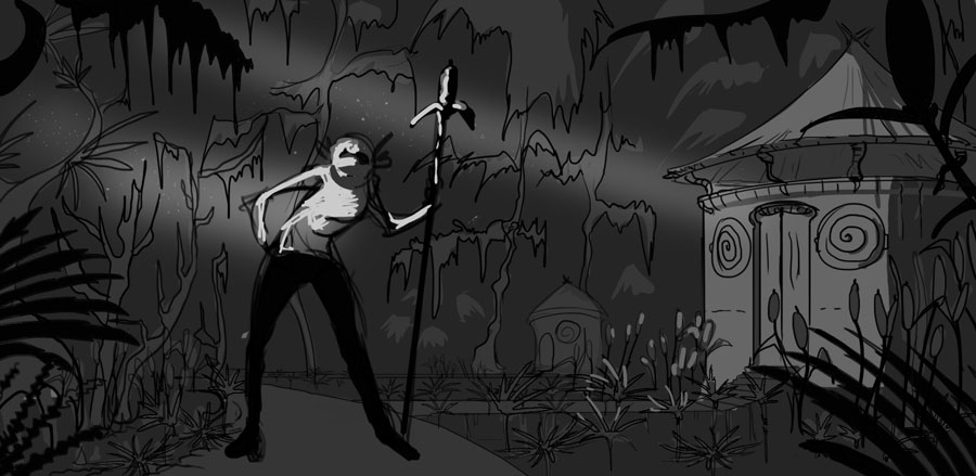
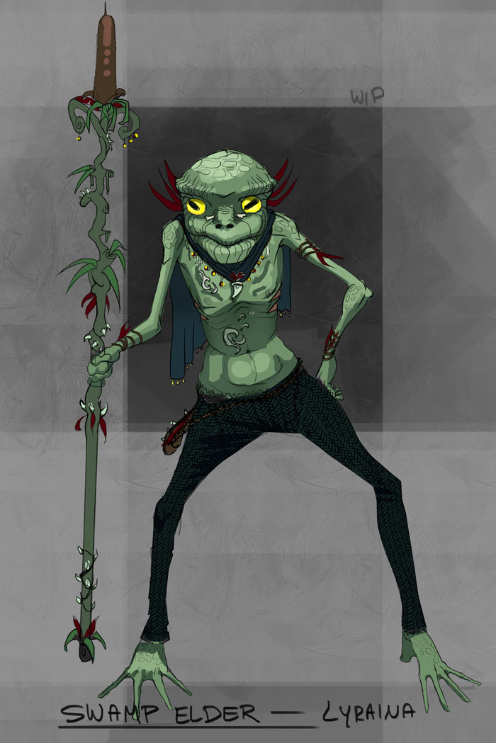
RE: Bloodsport 2 Revived: Swamp Elder - Nous - 02-08-2014
I decided to try a few thumbs. My ideation for swamp elder is abysmal, ancient alien, Cthulhu mythos etc. Essentially it just about includes a character and environment.
Dirty quick sketches followed by mood setting thumbs, no less dirty or quick.
Thanks for lookin'.
RE: Bloodsport 2 Revived: Swamp Elder - meat - 02-10-2014
I really wanted to do Anaconda, but I can't picture it as well as I can the heron or egret. Also need to get environment down instead of keep fancying up the bg stories:
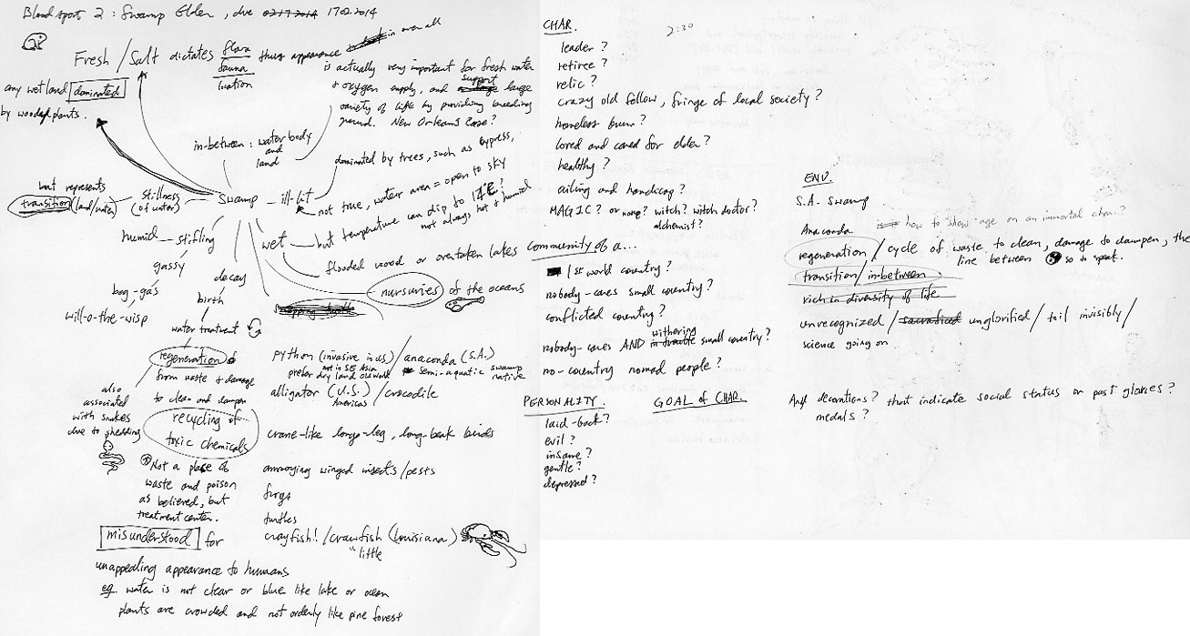
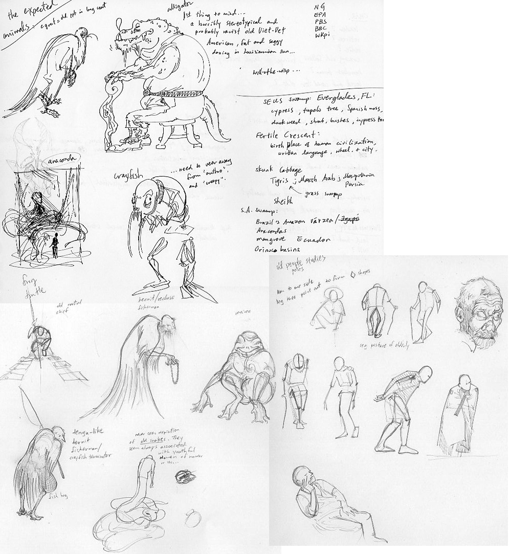
RE: Bloodsport 2 Revived: Swamp Elder - eru - 02-10-2014
(02-05-2014, 08:30 AM)crackedskull Wrote: Thanks for the advice fellas :)
Worked on the thumbnail, I think Ive got it nailed down now, from now on I'll get to rendering and adding minor details here and there.
Hey dude this one seems to tell a story and it has interesting composition and scaling. I think this one is great to push forward too
RE: Bloodsport 2 Revived: Swamp Elder - Jaik - 02-10-2014
Meat: damnnn dude, thats some serious ideation going on there! Killing it, now just for the tedious bit of actually getting whats in your head onto the computer xP
Nous: Nice job, you seem to really work well using value/shapes instead of line.. unlike me.. who sucks at it >.> I like the second value thumb best, not sure entirely why, but it's just enjoyable to look at.
---
Today for me was just laying in base colours and I started going through and doing the torch light as well. The values are far from accurate, since as I go over an area I darken it. This is going to take a while x_x zzzzz
RE: Bloodsport 2 Revived: Swamp Elder - crackedskull - 02-11-2014
Lots of good progress going on here, keep it up people.
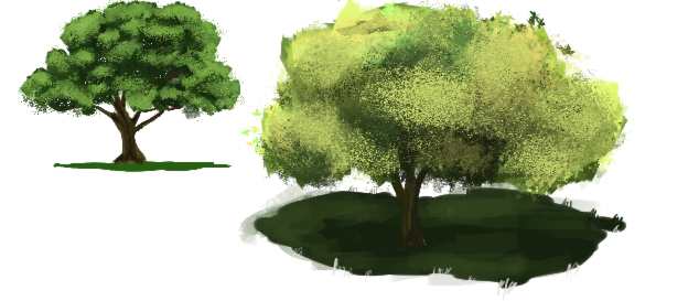
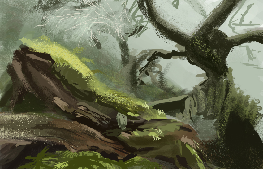
So did some studies and worked on the piece.
Running into design problems on the face, but I can imagine a decent portrayal, now I just got to translate that to the artwork. Also introduced some colors(on a seperate color layer, probably going to change this).
