
+- Crimson Daggers — Art forum (//crimsondaggers.com/forum)
+-- Forum: PERSONAL ARTWORK (//crimsondaggers.com/forum/forum-9.html)
+--- Forum: SKETCHBOOKS (//crimsondaggers.com/forum/forum-10.html)
+--- Thread: Lychee's sketchbook (/thread-4257.html)
Pages:
1
2
RE: Lychee's sketchbook - Lychee - 01-27-2014
Study part two.. It's still taking me too long. Painstakingly painting all the details. There must be a faster/looser/quicker/more intuitive way to do this!
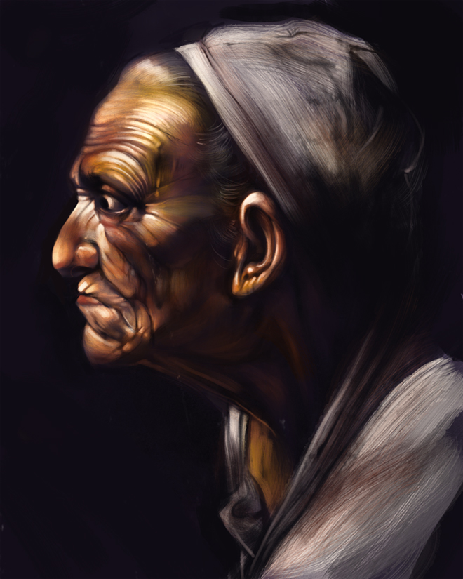
I'm probably going to do the entire painting.. at least I hope (it's a large painting.)
RE: Lychee's sketchbook - Lychee - 01-27-2014
Watching the Impressionists!
http://www.youtube.com/watch?v=odq1HOSnQ9Q
Awesome mini-series. Will buy it.
RE: Lychee's sketchbook - Lychee - 01-28-2014
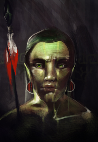
Quick sketch... no ref..
It's a forest elf.. or something.
I don't know why it's this awful
RE: Lychee's sketchbook - Lychee - 01-29-2014
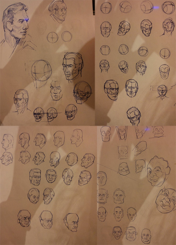
Head & Hands! Read a bit and copied some of the examples (first 27 pages)
RE: Lychee's sketchbook - Lychee - 02-09-2014
Did some cool stuff at school!
Had to think of and pitch a game concept in 3 days.
Here's my concept art:
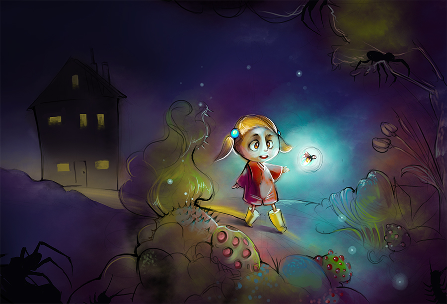
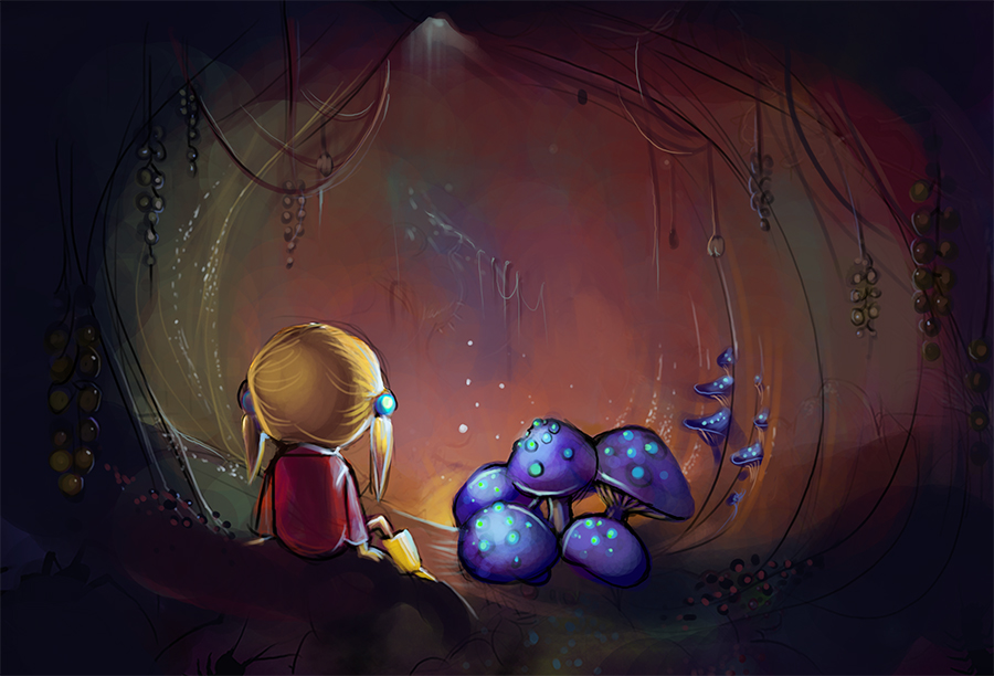
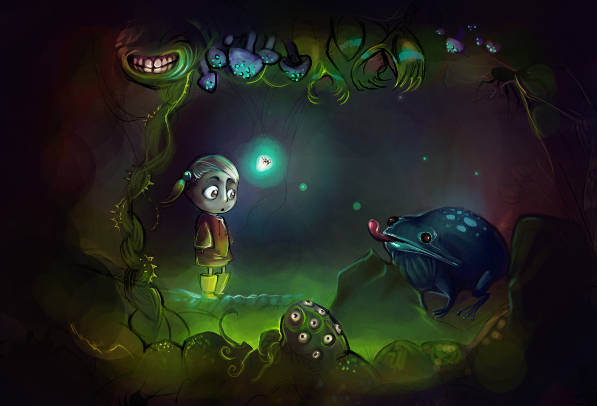
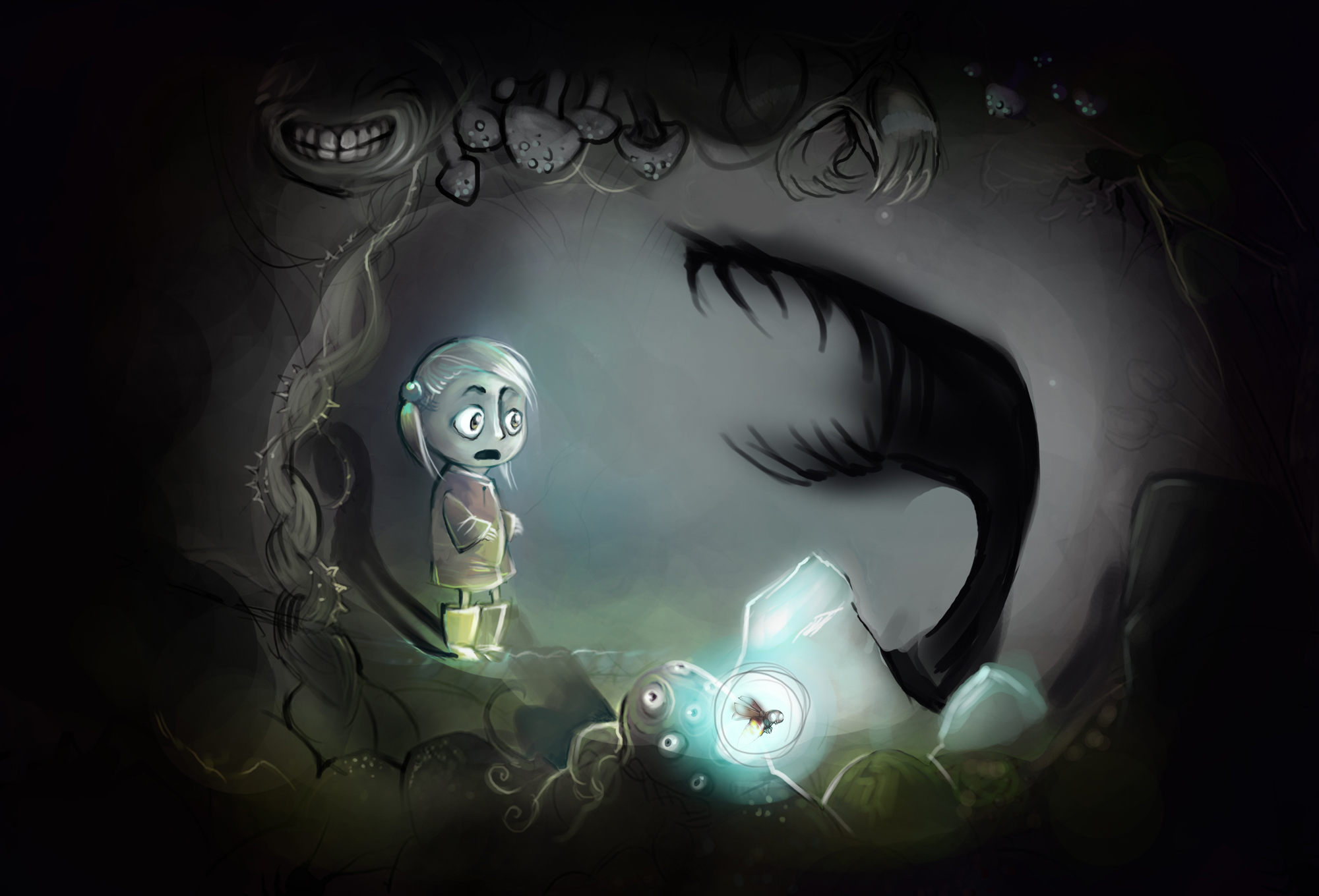
And animation (first part of the walking girl was animated by my teammate! Logo's done by my teammate too)
https://vimeo.com/86157870
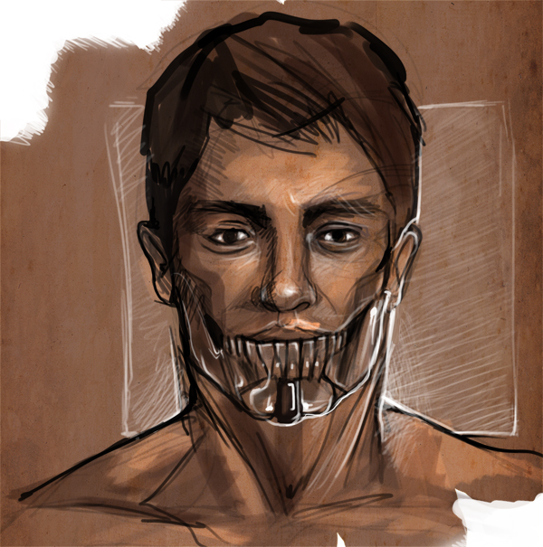
Some sketch of a guy with an iron jaw. Used ref for the head.
RE: Lychee's sketchbook - Wils - 02-09-2014
Hey, great sketchbook, you have a lot of cool stuff going on here. I like the emphasis you are putting on portraiture. For your portraits, a lot of them are looking a bit muddy to me, some shadows going too dark when maybe they shouldn't. Skin is a tricky thing, you have to take into account sub surface scattering of the light which will make some of those shadows look more radiant (contradicting, i know). Anyway, i found this online which kind of shows what i mean:
![[Image: SSSBreakdown.jpg]](http://udn.epicgames.com/Three/rsrc/Three/ScreenSpaceSubsurfaceScattering/SSSBreakdown.jpg)
Some of your portraits look like the first image from the left, a bit opaque and darker, the third image shows the added effect of sub surface scattering, see how shadows are brighter?
My opinion anyway, hope it's helpful. Grewat work, keep those portraits coming.
RE: Lychee's sketchbook - Lychee - 02-21-2014
Thanks! I agree that my portraits look a bit muddy. I'll try to pay more attention to the shading. Also, my edges probably suck too ;P
The problem I get when using less shading is that the face looks flat :| don't know why.
Need to do more studies.
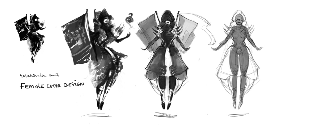
For now, here's some character designs
Thumbnails
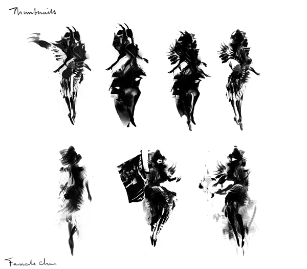
Some further sketching
Random character thing I did for school. Wanted to do something military. ish. with future stuff, I decided later.
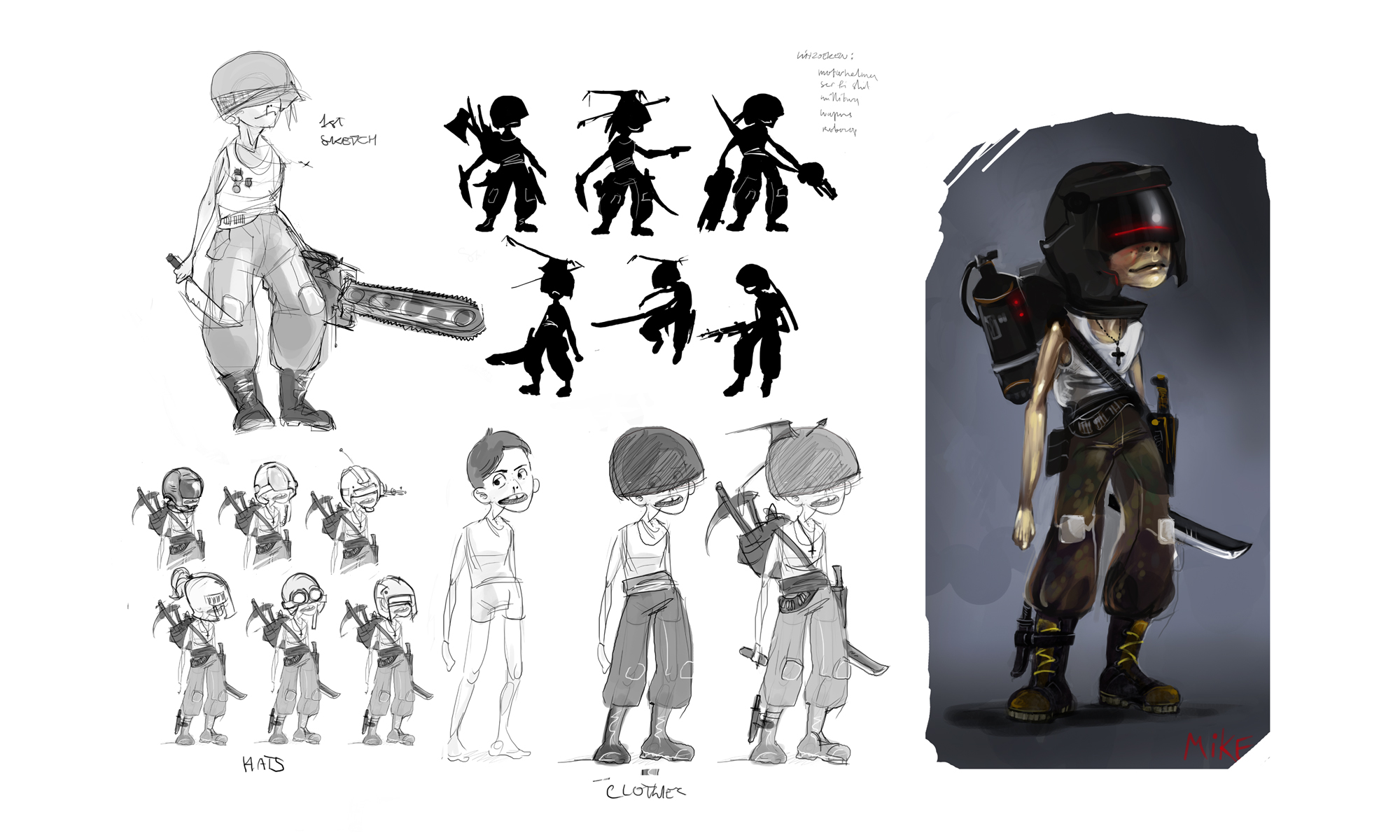
It's kinda meh. (but whyyyy?)
Now the cool stuff! I like the first two of these.
School Assignment- create a character using at least FIVE of these terms:
Flappycheeks | It's Denver | Dragondildo | Strong jawline | cigarette | meaty leaves | Alien-antennae-ball | Rocketarms | Medusahair | Fish | Two attached heads | lamp-tail | Horn-ear | Dress | Robolegs | Hip-arms
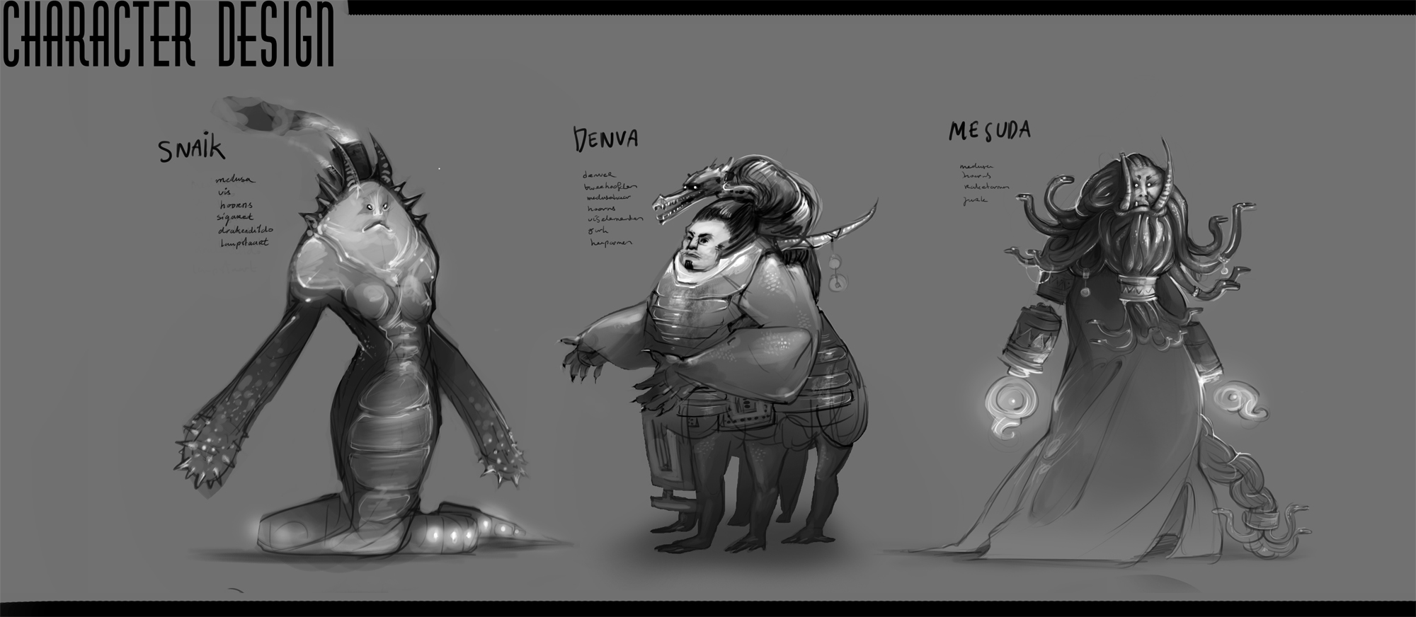
And the extra challenge: Create one containing all design elements.
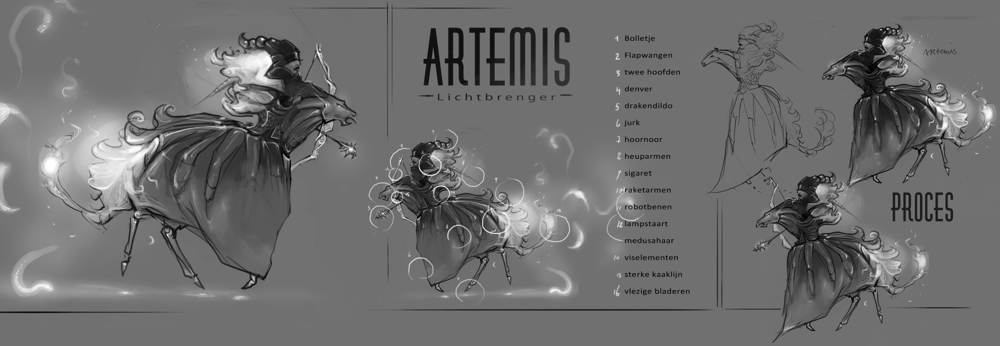
EDIT: Something was bugging me about artemis all the time and I found out. Her torso+head and everything were way too large compared to the horseish body. (compare to progress pics). Fixed it. Way better now.
Super fun assignment! Sometimes very difficult but a great practice.
------
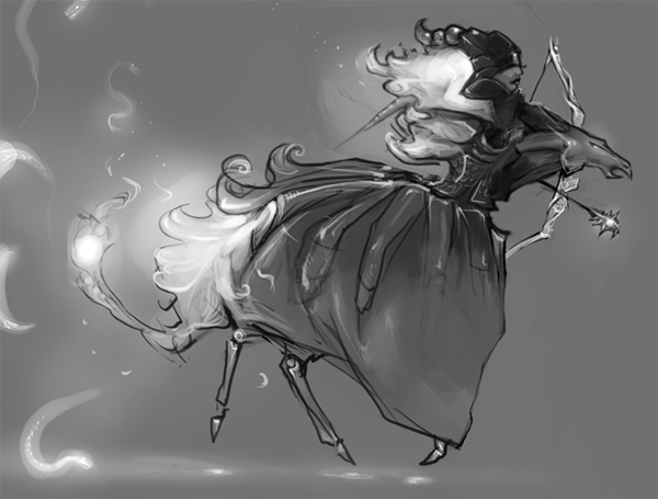
EDIT: I discovered if you look it long enough, the horse head starts looking like a mega-dick. So I tried altering it to look less like a dick.
I think it looks more like a dick now :-(
RE: Lychee's sketchbook - Lychee - 02-27-2014
Did two spitpaints, a sandworm aka. earthpenis, and 'lava pit'.
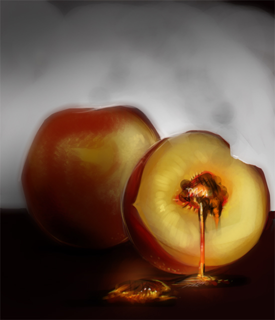
I like the lava pit even though it's not sharp enough somehow.. my edges are weird and it's a bit muddy.
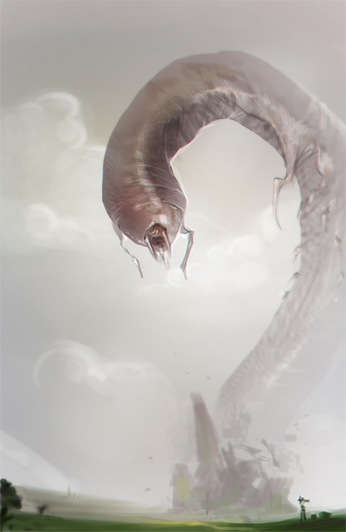
I don't know about the worm, it's almost the way I want, but still very far away :P And I'm still too insecure about whatever the hell I'm trying to do when painting.
Also-shit colours.
Also have to paint something for a gallery themed 'Femininity'. So I made this abstract shit that supposed to be symbolic. I don't know. What do you think? It's a WIP

I got way too much to do so I made a list.
Finish feminine-painting
Finish character design
Finish 3d character design
Mudbox tutorials
More spitpaints
Prop sketches
Material studies
Portrait studies/Master studies
Trying photobashing/texture techniques
Finish another chapter of Head and Hands
Read another chapter of Colour and Light
Create (Sci-fi) story based illustration series for portfolio.
Damn. How will I ever do all of this.
RE: Lychee's sketchbook - nothereanymore345 - 02-27-2014
That WIP is looks quite interesting, I'm liking the transition in colour that spreads across the composition. Also, I think that worm-like creature in the second one looks grand.
RE: Lychee's sketchbook - Lychee - 04-14-2014
Finally posting something again! I've been busy :P
I worked on my character design a bit... did some lineart, now colouring and rendering...
Not very good at colors though :|
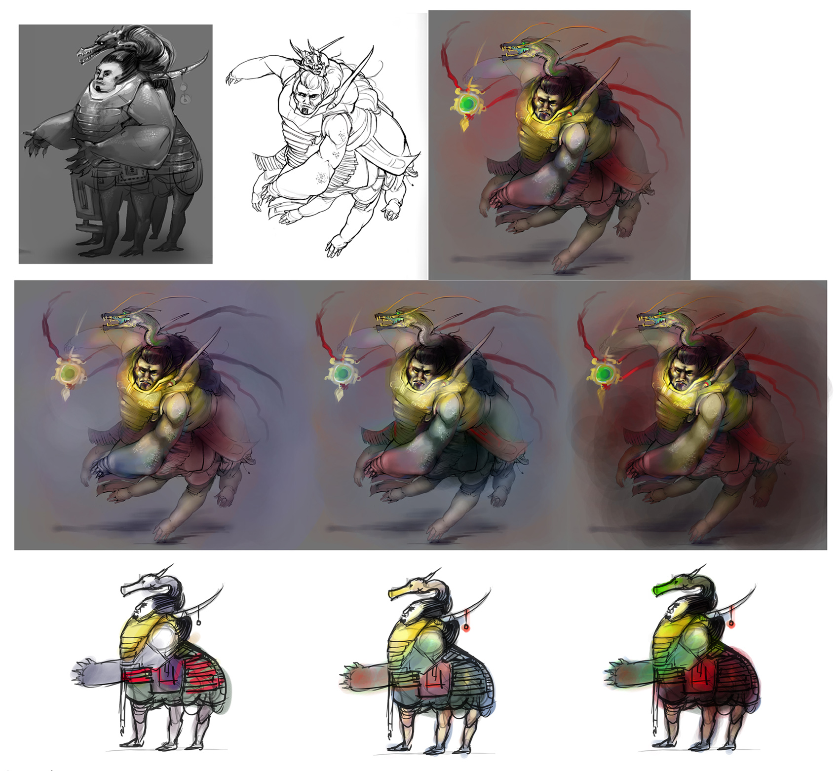
I randomly painted the top one.. middle row I created colour scemes for.
Not sure what I'm doing.
Help? :P