+- Crimson Daggers — Art forum (//crimsondaggers.com/forum)
+-- Forum: PERSONAL ARTWORK (//crimsondaggers.com/forum/forum-9.html)
+--- Forum: SKETCHBOOKS (//crimsondaggers.com/forum/forum-10.html)
+--- Thread: My Digital Sketchbook (/thread-6244.html)
RE: My Digital Sketchbook - AngeliquevdMee - 05-01-2015
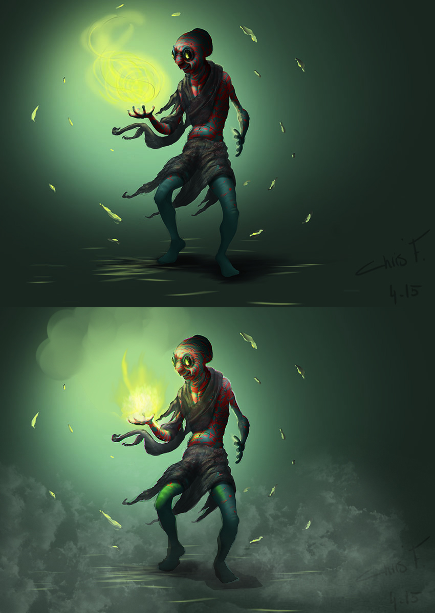
Did a paintover for ya, hope it helps. I can explain really quick what i did but its not a biggie. On your version you have drawn a crazy big lightsource, the yellowand it only consists of.... yellow... hahaha. A lightsource is really desaturated so goes from almost pure white to whatever color you pick - in this case yellow - I added that in... then i noticed you only painted a reflection of the fire/magic in the glasses-which doesn't really make sense, cause the character should be lit since it's really bright ( look at campfire images ) so all the areas that are in the line of the light should be lit. Since its mostly rounded forms the light is almost smudging away, you can do that with mixer brush or eraser. If you want to make the character pop out more i suggest you add some kind of ambient perspective. in this case there was not much to go from so I just added some mist with cloud brush - its all rushed but you get the idea. See that the feet immediatly stand out? :) same I did with the face but in reverse, made the character more '' round '' with highlights. Copy this file in photoshop and turn the image to black and white - you will see what i am talking about.
If you are gonna work on this more I suggest you work on the background, add in more colors instead of only green... look at swamp pictures or forests.. theres lots of colors like red, yellow, blue etc. Makes the image even better! I really like the concept you have. I hope this all makes a bit of sense... keep up the good work!

RE: My Digital Sketchbook - chrisfernz - 05-01-2015
Heyyy Angelique, thanks a lot, I liked what you did with my character, glad you like it! :)
For the background, I imagined him being in a forrest, that's why I added the leaves around him, I'm still figuring out how to do things.
Saw your deviantart account nice work you got there, keep it up!! :)
Character Design finished!! :) - chrisfernz - 05-02-2015
So worked a little more on this piece, it's my first original piece that I did from scratch, I really enjoyed it!! :D
If someone's interested would love to see an Advanced over paint on it!
Armor Helmet value study - chrisfernz - 05-12-2015
Took around 3 hour excluding lunch time and brakes
Movie shot - chrisfernz - 05-21-2015
Such an amazing movie, quick study
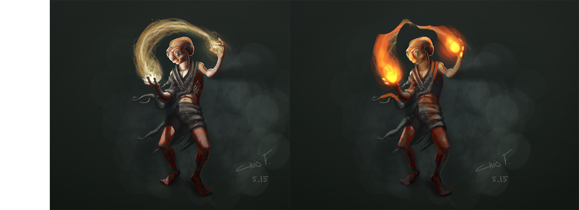
Character Design finished take 2 - chrisfernz - 05-23-2015
Here's reworked of an older work I did, better or worse? I'm not sure anymore
RE: My Digital Sketchbook - Cricketts - 05-24-2015
Great work.
Basketball figure Study - chrisfernz - 05-26-2015
Here's a figure study I thought would be interesting to share with you guys.
RE: My Digital Sketchbook - chrisfernz - 07-19-2015
Study study and more study!! just not posting here anymore for some reason..
RE: My Digital Sketchbook - Blunt Pencil - 07-20-2015
Yo, you got a nice sketchbook going on here. That studies are looking pretty good in general. But I'd like you to see spend more time on the figure studies. Most of them seem rushed to me, or better to say they aren't structured properly. I'm not saying you need to render them to the end, but get the basics down.
Like in the last study pic you posted, the values are not 'clean', they're muddy and messy & exaggerated, you dodged the hands & feet (thumbs up for doing the face tho). What this might result into is you learning the wrong information.
Also another thing to think about is doing more stuff from imagination. Study is how you learn, doing things from imagination will help you understand what are your weaknesses, what do you know & don't know, what you need to focus on etc.
About the character illustration you did, that a nice one. I think you should keep up with stuff like that. I won't crit your painting skills on that one b/c I feel AngeliquevdMee got it covered for now. But think about this- what does the audience see when they see it? What I mean is we see a creature who is doing some sort of magic, which is a cool idea but the audience can't relate to the character. Like think about communicating who is he, what sort of life experience did he have, what sort of culture does he belong to, what is he actually doing....think more about the storytelling aspects. Like for instance, maybe include some ornaments made out of bone, or wood or whatever to show that this chrachter is more 'tribal'. I hope I got the idea across.
Keep up the good work & don't stop posting. :)
Angry MMA fighter - chrisfernz - 07-21-2015
Yo Blunt Pencil, thank you for the great advice and observation to my work, I feel like I'm rushing for some reason, not sure why tho, I should defiantly take my time, I love that ornaments idea you had of my character, so awesome man, thanks again!!
Here's a study I did coz I feel like I need to studystudystudy...!!
RE: My Digital Sketchbook - meat - 09-13-2015
Start putting in shadows on the ground of what you're drawing. Also do what Angelique says and think about some simple background - could even be abstract graphics design things like boxes. Angelique's some high level Dagger!
RE: My Digital Sketchbook - Bookend - 09-13-2015
I know that actor! Wonder from which movie though. He's a fantastic actor.
Anyway, great studies!
 Keep it happening!
RE: My Digital Sketchbook - AngeliquevdMee - 09-13-2015

RE: My Digital Sketchbook - chrisfernz - 10-24-2015
Hey guys, been a while... sorry :S
RE: My Digital Sketchbook - lurch - 10-25-2015
nice update, like that last character a lot - if you're going to develop it further, I think the chest is a little out of proportion. At the moment the chest muscles look about the same size as the abs.
looks good so far tho!
RE: My Digital Sketchbook - chrisfernz - 10-25-2015
Hey Lurch, thanks man I see it now that you've mentioned it :)
RE: My Digital Sketchbook - stonedpanda03 - 10-27-2015
There was a lot going on since i last checked your sketchbook :D Anatomy is getting better, color studies are better and i really like how shading turned out in that last drawing. Great work, mate. :3
Hope to see some more stuff soon.
RE: My Digital Sketchbook - chrisfernz - 10-27-2015
Hey Stoner, thanks a lot for the kind words!! 8) personally I don't feel like my paintings has improved a whole lot but if you see it I admire that, I promise to keep uploading more, cheers buddy!
RE: My Digital Sketchbook - chrisfernz - 11-22-2015
Still WIP but almost done, C&C are always welcome :)