
+- Crimson Daggers — Art forum (//crimsondaggers.com/forum)
+-- Forum: PERSONAL ARTWORK (//crimsondaggers.com/forum/forum-9.html)
+--- Forum: SKETCHBOOKS (//crimsondaggers.com/forum/forum-10.html)
+--- Thread: tchangchang's sketchbook (/thread-9088.html)
Pages:
1
2
RE: tchangchang's sketchbook - darktiste - 01-02-2021
Remember as you progress it not the talent that carry you it the willingness to get up and learn from mistake that will carry you much further than the rest of other artist.Patience is something every artist should cultivate but not only that a passion for observing and absorbing what we see to inject into were work.
RE: tchangchang's sketchbook - cgmythology - 01-03-2021
A very solid start here! You're concentrating on what you should be at this point, anatomy, perspective, values, etc. I would keep working on drawing the figures nude before doing any heavy character designs altogether, as you could do those at a later point when anatomy comes more naturally to you, it should also heavily improve your character designs as a result as well. Keep it up, looking forward to seeing more progress from you!
RE: tchangchang's sketchbook - tchangchang - 01-04-2021
@darktiste I completely agree with you on that :)
@cgmythology thank you very much for the encourgagement! Yes, I'm hoping that following the figure drawing courses on Watts online will give me a better foundation for character design/illustration in the future.
RE: tchangchang's sketchbook - tchangchang - 01-04-2021
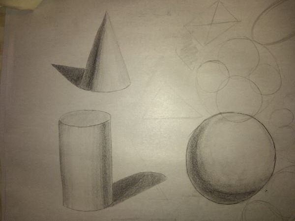
More basic for shading and practice with ovals/lines again following Watt's online:
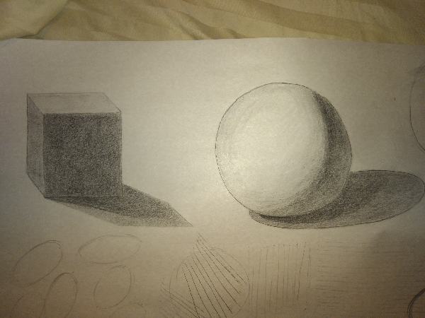
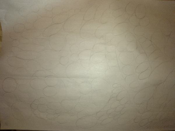
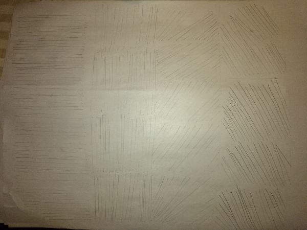
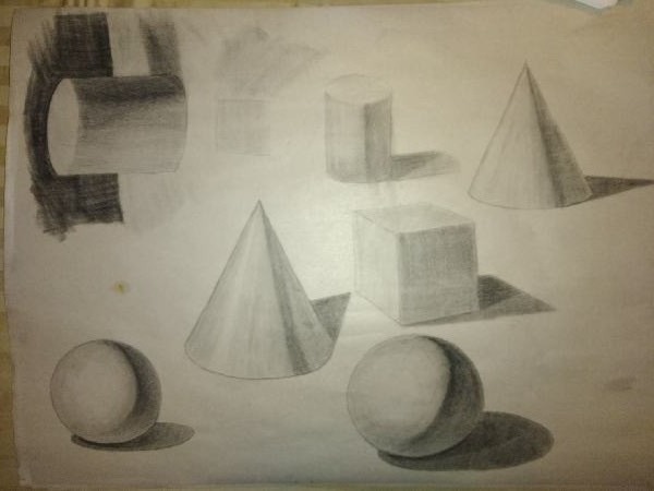
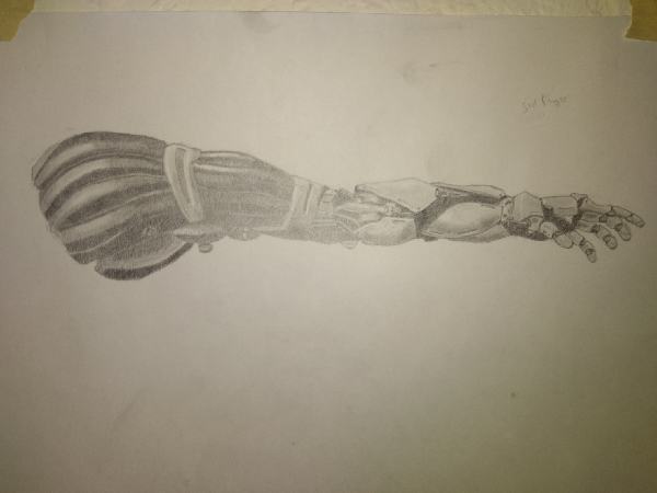
I have an idea for an ilustration that involved a robo-girl (was inspired by Klinck's SB drawings of robo-girls in part) so here is a study for learning design and shading of such:
(this is a COPY, original artwork is by Dries Deryckere at https://www.artstation.com/artwork/DVXx9)
Edit: Oh yeah, happy new year to all!
RE: tchangchang's sketchbook - Artloader - 01-04-2021
Nice going in here tchangchang :).
I like your shading - the core shadows are looking cool :).
Also congrats on taking the plunge with Watts - I've seen a few people on here enrol on their courses and they seem to get a lot out of them.
Keep it going :).
RE: tchangchang's sketchbook - tchangchang - 01-12-2021
Hey artloader, thank you much for the comments! Really appreciate it. Yeah I'm really excited about Watts, he's super inspirational and really knows his stuff. Only things that scares me is when he says it takes 5-10 years to become a good artist even with proper instruction. I guess these things can't be rushed, its a marathon not a sprint.
Still been doing a bunch of basic form studies but they're kind of boring to post. Here's a value study I'm working. If anyone could ge me pointers on where I'm messing up with the values I would be very grateful!
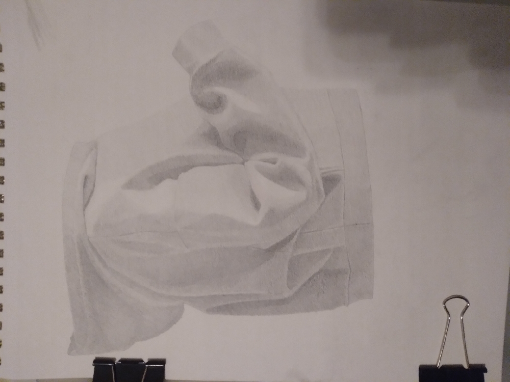
Original reference (from https://www.womenshealthmag.com/uk/gym-wear/g34069169/best-hoodies-women/)
.png)
Edit: this is really bugging me..how do I remove images from a post? The "remove" button does not seem to work. That's why I have 2 copies of the same image uploaded. #firstworldproblems
RE: tchangchang's sketchbook - darktiste - 01-12-2021
A common issue in regard to value is being timid with the darker value.But there also a reason to why you generally have this issue because when you work with a white paper the value around the value you put at the start as alot of white around it which can be a issue because on your picture all the value are already there will you have to fill the value on your drawing.I want to bring something to your attention when ever you see a fold you can pretty much assume your not pushing your value enough.Also think about the place where the cloth touch other part of the cloth itself this tend to create strong dark and also if the limb are near the body you generally get even more dramatic folding due to the fabric being compress specially if the cloth is loose.Your almost there in term of seeing a full range of value after that it will be all about control and subtile shading.
RE: tchangchang's sketchbook - mixedmax - 01-12-2021
(12-20-2020, 11:28 AM)tchangchang Wrote: Hey everyone, I'm returning to art after quite a long downtime. Right now I don't really know where I'm headed with my art but like most of you I'm trying to get better. I've never really posted my work online but I'm setting an ambitious goal for myself to post something at least once a day (mmmmm...ok maybe every other day or so) to avoid getting demotivated and giving up.
Since its been a while since I posted here, just wanted to say hi to everyone also :)
Here are some sketches I did from reference today for a character design concept of a native american warrior girl I plan to work on:
Thanks for looking and cheers until next time!
Hey tchangchang,
really nice progress and I like how you are posting your progress almost daily.
I'd love to see how the native warrior girl turns out :)
Try loosening up the lines a bit, some of the lines on the armor and heads on the lower right look a bit stiff. I'd try loosening up your hand a bit more with the sketching, kind of allowing your movements to free up a little bit and using more light and shadow to define where things like the nose/mouth/eyes and parts of the armor really are. After that, you can still use darker lines to define everything and get more contrast out of it.
Actually, just like you already did really well with the native american kid in the middle of the sketch with the feather headband! :)
Cheers to you and keep it up!
RE: tchangchang's sketchbook - JyonnyNovice - 01-14-2021
great sketchbook! Spent the last 5 minutes trying to write some guidance about values... but it was all coming out not so useful, I think you're on the right track! don't think you're messing up anything. Maybe on the back, in the darks, think about 'massing' that stuff together more, and balancing the image out with some more darker darks on that side. From some painting advice - you don't have to stick to the reality and the reference, goal is to make an appealing image and you can 'be god when you draw' as Christopher Neumann says and change things that don't fit or detract. Use lost edges if the details on the back detract from the focal point (which for me the front of the bent arm). (This advice may not apply to that sweater study! depends on your goals with it... but figured I'd throw it in anyway!)
Subscribing to your sketchbook anyway!
Also sorry idk how to remove images... any images that aren't added to the post get automatically added to the bottom.
RE: tchangchang's sketchbook - Zorrentos - 01-19-2021
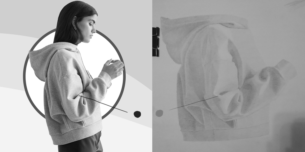
Your reference has a much broader range of values than your drawing. I desaturated your reference and drawing to showcase:
As for the 5-10 years, it's true what he says. There is a saying that it takes 10.000 hours of focused studying to achieve master level in any subject. However, I have also heard that it takes far less time to become "decent". If I understood it right, a person can actually become decent in a subject after as little as 20 hours of focused studying.
It may not be true, but I can really imagine a person becoming an ok draftsman if he were to spend one week being trained by Feng Zhu for example. At least I found the thought encouraging! :)
Keep up the good work!

RE: tchangchang's sketchbook - darktiste - 01-19-2021
Concerning what zorrentos said about improvement it not the hour you put in but merely how much you can stay focus and avoid the same error the next time you pick up a drawing.One as to have the visual capacity and understanding to see mistake before he can see improvement.Without proper understanding your eye might be able to catch up something is wrong but if you leak the understanding you will be doom to commit the same error unless you understand which aspect of the fundamental is at play here.
We can point at some mistake and say this is or that is wrong but if you don't understand why sometime is wrong your stuck in your understanding it might be due to a leak of understand of the theory or it might be due to poor eye sight i mean it could be literally the case.
But sometime the problem of not seeing any progress is doing the same thing over and over and expecting change that simply madness.
To see progress you need to be able to put yourself in a position to fail.I am not talking about trial and error as a method that is madness.I am talking about trying to apply the theory as best you can even if it mean getting harsh critic from your peer.
A method i been using is make it stupid simple.Basicly you set yourself to do something you know your able to do.You don't try to do everything fundamental at once.You pick one fundamental you want to improve and you try to go outside your comfort zone.The idea is not to be overwhelm by to many concept at once.The idea is that overtime you scale up the difficulty trying to avoid repeatinfg the same error and start to mix many fundamental principle at once.To avoid doing the same error over and over again post your work regularly on forum to get feedback.
Avoid at all cost the comfort zone it ok to celebrate the small victory but don't let them stop you.
It not rocket science i think.Now i hope this was helpful and remember to do your best because it only goes as fast as you put in.Just don't think that overworking yourself is gonna do more good than harm.What is important is to listen to your own limit and to be able to allow yourself to recover.It can be mentally taxing so it important that you eat and sleep well if you want to have everything line up toward sucess.