
+- Crimson Daggers — Art forum (//crimsondaggers.com/forum)
+-- Forum: PERSONAL ARTWORK (//crimsondaggers.com/forum/forum-9.html)
+--- Forum: SKETCHBOOKS (//crimsondaggers.com/forum/forum-10.html)
+--- Thread: Gerben's Sketchbook - Sharpening the axe (/thread-9131.html)
Pages:
1
2
RE: Gerben's Sketchbook - Sharpening the axe - gerbenpasjes - 02-10-2021
(02-07-2021, 09:32 PM)Zorrentos Wrote: ZorrentosYour CHOW is looking quite good! As an illustration, it certainly works well! However, I'm a bit curious about some of the functions of the scuba diving suit. Like, what are those "fins" on his legs supposed to do? This is one of those times where I would really like a breakdown with some explanation of the design.
Thanks! I felt super rusty (and still do) but I had a blast and was nice to see the other entries as well! I've got a design sheet for the "fins" but yes I totally should have presented that better. I'll touch it up and post it later.
(02-09-2021, 07:02 AM)Peter Wrote: PeterHey man great work so far :) Really digging that scuba diver painting in particular.
In reagrds to omitting information from studies. As long as you have set your intention for your study and felt like you have achieved that then I guess it doesn't rally matter haha. I've been doing some landscape studies recently and didn't bother with the figures since I was just focusing on studying his colour choices. :)
Thanks Peter! Yeah I guess you're right, but when following Craig Mullin's advice he says "Try to get the main information down as quickly as possible." To which then I feel I can't really omit a foreground character! Oh well.
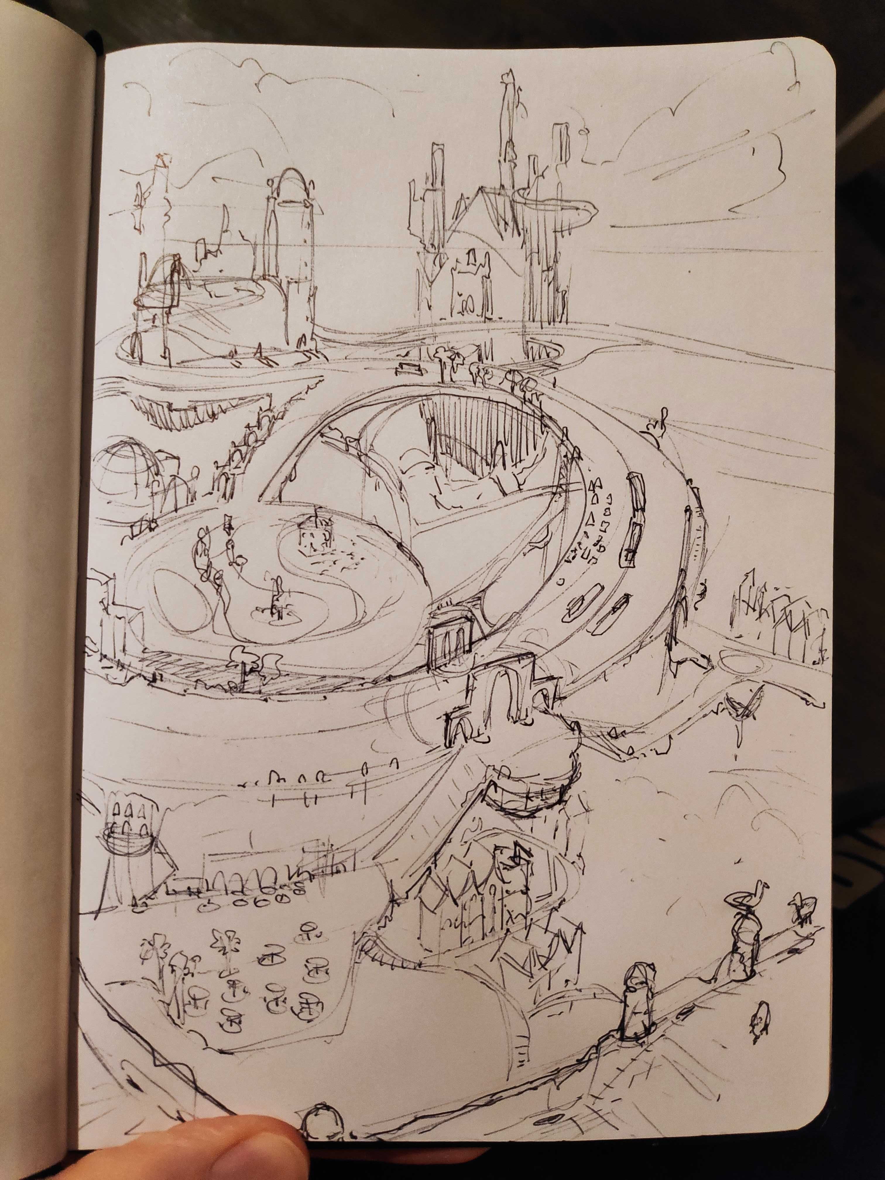
Here's some new work I did in between working on a game. Finally something in my sketchbook again. Been way too busy doing digital and 3D that I really quite neglected it, as well as my gouache set. #2021goals. I want to push this into a full fantasy illustration, something I really don't have in my portfolio.
Very happy with this boy, despite my hesitant start. I felt so overwhelmed trying to capture the detail but somehow I managed, within 30 mins. I was quite warmed up, unlike the 2nd one, so that might help.

Quite happy about the relationships and colors here, though initially I did paint it too cold. It's easy to fix using color balance but somehow I thought using actual paint and palette would make this easier!
RE: Gerben's Sketchbook - Sharpening the axe - gerbenpasjes - 02-12-2021
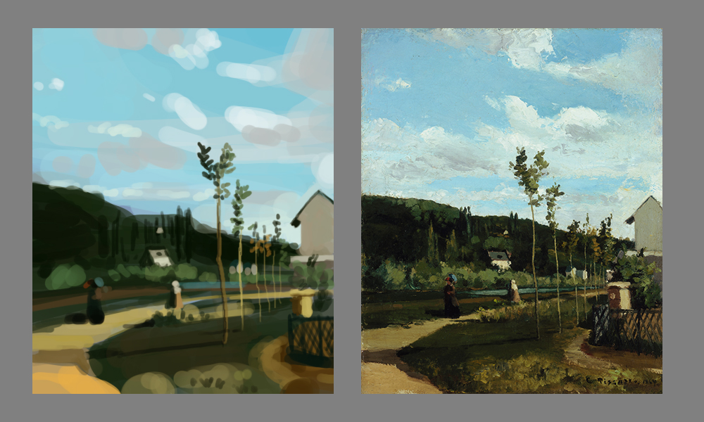
Some new studies, still enjoying the heck out of it. I feel like I'm discovering a new way to paint, which is really exciting.
I am always very technical-heavy with my work, and I also consider my canvas as a 3D space. But recently talking with JosephCow and others, and seeing some of the more "flat" stuff out there I start to realize that the canvas is not 3D, it's flat. Depth is an illusion, which gives me much more freedom to place things where I want them to make an interesting composition, as opposed to placing things where "they should be because that's the 3D space".

John Berkey, what a legend. Looooove his work. Very challenging subject again a very detailed spaceship. In my version not all the shapes read the same way his do but I'm happy with the overal impression I captured of it.

John Harris, also a legend. I don't know what the original of this looks like but in my pic the colors are super intense. Was especially fun to consider the best order to paint this in, which element first and which second. The shadow color's value is super duper bright, would have never considered doing this myself.
RE: Gerben's Sketchbook - Sharpening the axe - wld.89 - 02-16-2021
Man, great amount of studies here ! Also thanks for sharing wisdom from Mullins and Marcus Aurelius ! It really makes sense to me and i'll apply those concepts in my daily routine ! keep up the good work !
RE: Gerben's Sketchbook - Sharpening the axe - gerbenpasjes - 02-16-2021
(02-16-2021, 05:35 AM)wld.89 Wrote: Man, great amount of studies here ! Also thanks for sharing wisdom from Mullins and Marcus Aurelius ! It really makes sense to me and i'll apply those concepts in my daily routine ! keep up the good work !
Thanks! Been working mostly on a game in my evenings and weekend, here's progress on that. Have to learn Unity from scratch but it's fun, messing around with shaders and the like. The backdrop is painted by my friend Leon Tukker.


Also worked a little bit on a fantasy illustration but I can't find the right colors yet. Attempting to do a high key painting as Korwin explains but it's very difficult.

RE: Gerben's Sketchbook - Sharpening the axe - Zorrentos - 02-22-2021
The Unity game is looking incredible! I'm dying to dive deeper into that engine myself!
RE: Gerben's Sketchbook - Sharpening the axe - gerbenpasjes - 03-08-2021
Been a while! Had a busy few weeks at work which made me really not wanna spend time keeping up appearances here haha. Such a lot of active sketchbooks!! Loving it.
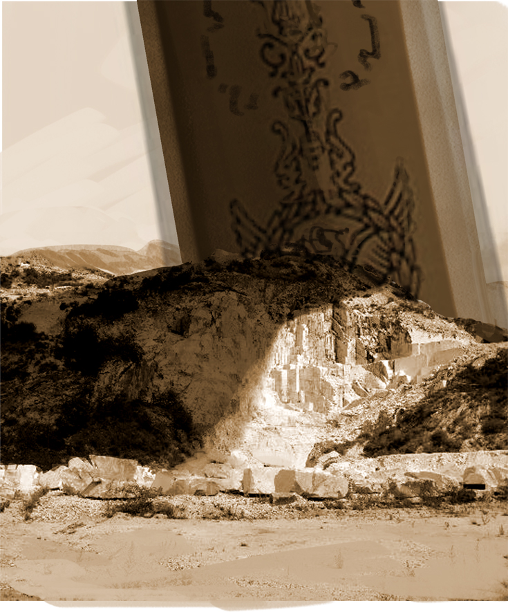
Been making a concept push for one of my personal projects, with a workflow inspired by the early Guild Wars work from Horia Dociu. Lots of photos and black, high contrast stuff. My new motto for the work is "no respect". I try to have as little respect as possible for color, texel density, resolution, perspective, etc. I just want focus on getting the idea out, and trust on my art instincts to keep the picture somewhat readable.





RE: Gerben's Sketchbook - Sharpening the axe - darktiste - 03-08-2021
If you want to work really messy you need to adapt your workflow to be none destructive did you ever heard of such method?
RE: Gerben's Sketchbook - Sharpening the axe - gerbenpasjes - 03-08-2021
(03-08-2021, 08:13 AM)darktiste Wrote: If you want to work really messy you need to adapt your workflow to be none destructive did you ever heard of such method?
Yes I do! Actually most of the time I work non-destructive but I've found it also stifles my creativity a bit. So I'm using an extremely destructive workflow here, merge often to a single layer.
RE: Gerben's Sketchbook - Sharpening the axe - Skeffin - 03-09-2021
nice studies - you have a good sense of keeping your values grouped and keeping the colours quite accurate. When you say you're working on a game are you also doing the coding too?
RE: Gerben's Sketchbook - Sharpening the axe - gerbenpasjes - 03-09-2021
(03-09-2021, 09:29 AM)Skeffin Wrote: nice studies - you have a good sense of keeping your values grouped and keeping the colours quite accurate. When you say you're working on a game are you also doing the coding too?
Hey! No not really, I just barely manage editing the existing code. It's an old gamejam project that I'm trying to get to a demo level quality, so it's mostly me switching the art out!
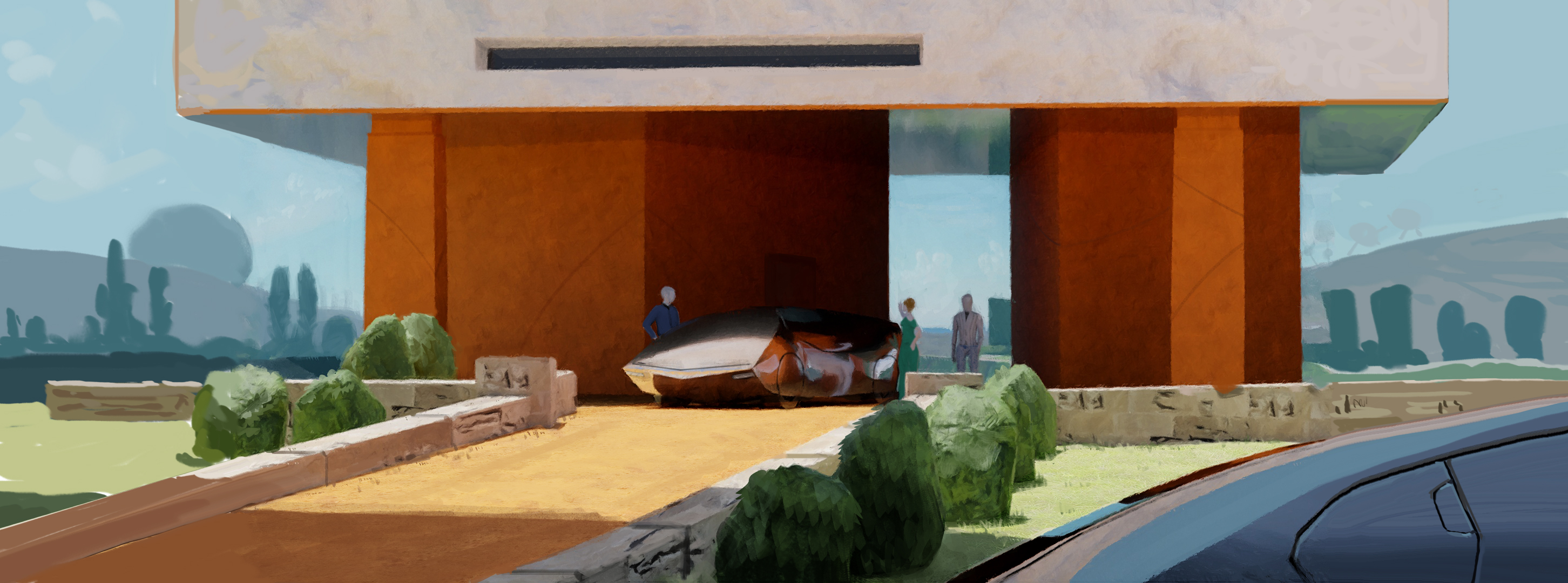
Worked on a little thing as a collab with a 3D artist. Not sure if this ever gets finished so I thought I'd post it here.
RE: Gerben's Sketchbook - Sharpening the axe - gerbenpasjes - 03-12-2021
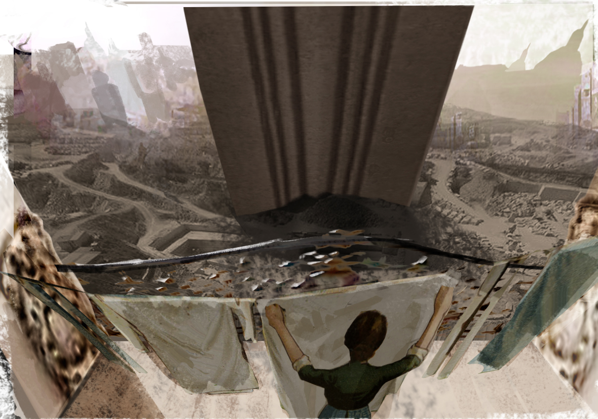
Finished my little VR modeling try-out with some overpainting. I'm attempting to build more authentic scenes (like keyframe artists can do) with real, believable people in them. This one doesn't quite hit the mark yet though. Ah well.
RE: Gerben's Sketchbook - Sharpening the axe - darktiste - 03-12-2021
I don't like how the top section connect with the side of the frame.I don't know if you understand what i mean.It just make the top form lose is dimention.
RE: Gerben's Sketchbook - Sharpening the axe - gerbenpasjes - 03-14-2021
(03-12-2021, 12:03 PM)darktiste Wrote: I don't like how the top section connect with the side of the frame.I don't know if you understand what i mean.It just make the top form lose is dimention.
You are absolutely right! I've updated it quickly, much better now.
Also did my first gouache painting! I think the last time I painted anything traditionally was in elementary school lol.

RE: Gerben's Sketchbook - Sharpening the axe - Zorrentos - 03-14-2021
The image is turning out really good! A little bit more work put into the atmospheric perspective and edges, and it will be all set to go!
I like the gouache sketch. It's a bit basic atm, and a bit hard to read some of the shapes. But I expect that you will make quick gains here as well if you keep up with it! : D
RE: Gerben's Sketchbook - Sharpening the axe - Skeffin - 03-15-2021
Sometimes editing existing code is harder than writing your own from scratch , cos at least then you know where everything is so to speak. I like the gouache painting and the concept above it. The perspective on the gouachr painting seems a bit off though ( I think the top of the brown plant pot shouldn't be more circular than the foreground white plant pot , as the further away things are the more squashed the elliptical gets provided its at the same height )