+- Crimson Daggers — Art forum (//crimsondaggers.com/forum)
+-- Forum: PERSONAL ARTWORK (//crimsondaggers.com/forum/forum-9.html)
+--- Forum: SKETCHBOOKS (//crimsondaggers.com/forum/forum-10.html)
+--- Thread: sketchbook of kniv3s (/thread-9223.html)
Pages:
1
2
RE: sketchbook of kniv - kniv3s - 07-17-2021
(06-20-2021, 10:14 AM)Kassatay Wrote: Great sketchbook you have here. I like the asaro head study. Keep it up. May I suggest adding more edge variation.usually the part in shadow is less in contrast, less defined. You should check Proko"s videos on egg shading.Thank you kindly for advice and I'll make sure to check the vid right away! I'm really sorry for replying so late.
RE: sketchbook of kniv3s - kniv3s - 07-17-2021
(06-20-2021, 04:42 PM)cgmythology Wrote: Excellent work with the planes, those should be really helpful to give your images a more three dimensional and professional look. Keep it up!Thank you very much for encouraging words (& sorry for such late response!!)
RE: sketchbook of kniv3s - kniv3s - 12-10-2021
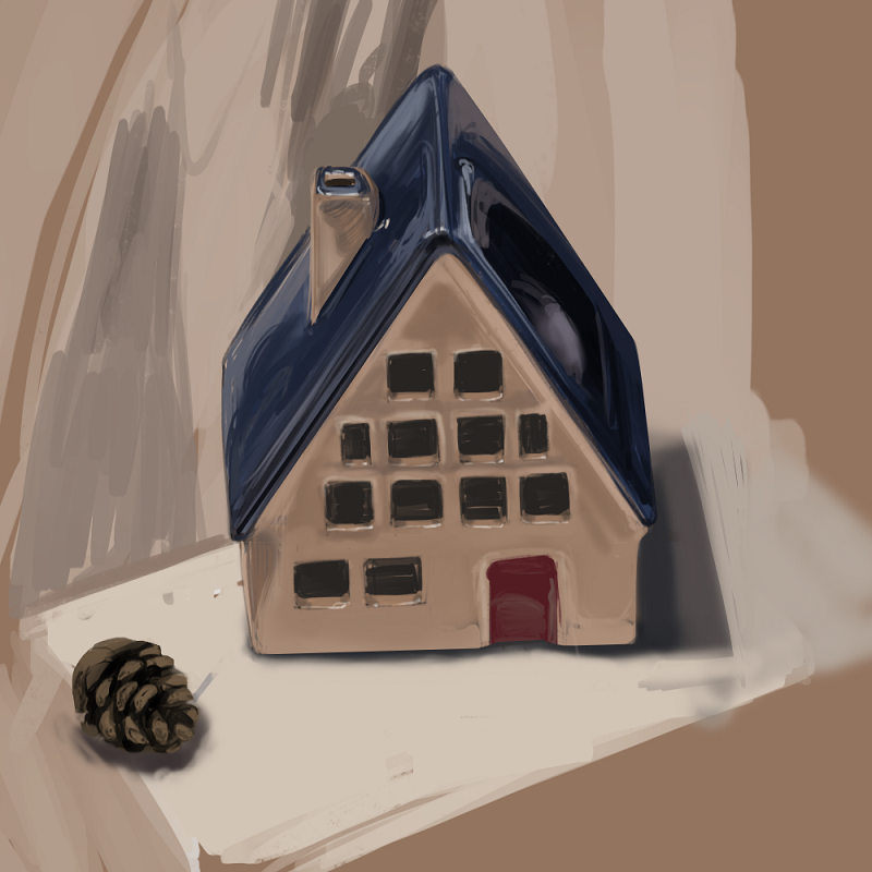
Been dead for a while but I'm here again with
a bit of compositional training
.png)
.png)
an exploration of awesomeness of soft round brush
.png)
another dropped pic
.png)
and two pieces I'm currently trying to get done
.png)
.png)
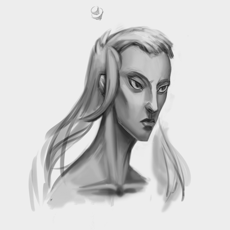
So, this portrait started really horrendous, to fix it and to understand the human face a lil bit better I did 3 separate studies of David's features on paper (eyes, nose, mouth) which helped. Still not satisfied with how it looks but hopefully getting it done.
RE: sketchbook of kniv3s - darktiste - 12-11-2021
I recommend you gift yourself a few drawing course for xmas.I suggest a course on perspective and an other on lightning.You can find a selection of pretty cheap and good tutorial here. If you need any suggestion send me a email if you know how or reply here if it easier for you.
https://foundation-patreon.gumroad.com/?sort=newest
RE: sketchbook of kniv3s - JosephCow - 12-12-2021
I really like your piece with the eyeball dudes in the forest! It's kinda cute, kinda creepy.
The portrait looks like a pretty good attempt to me! The proportions are pretty nice actually, except I would make the mouth a little bigger.
I suggest trying to make the shadow mass darker, and just keeping things massed together in general. Not just for the sake of contrast, but because you won't get the effect of a bright light from such a pale shadow. There's still tons of room to show whatever you want to on the shadow side.
RE: sketchbook of kniv3s - kniv3s - 12-13-2021
(12-12-2021, 04:10 AM)JosephCow Wrote: I really like your piece with the eyeball dudes in the forest! It's kinda cute, kinda creepy.
The portrait looks like a pretty good attempt to me! The proportions are pretty nice actually, except I would make the mouth a little bigger.
I suggest trying to make the shadow mass darker, and just keeping things massed together in general. Not just for the sake of contrast, but because you won't get the effect of a bright light from such a pale shadow. There's still tons of room to show whatever you want to on the shadow side.
Oh wow, thank you so much for painting over my sketch and explaining all this, I can see my mistakes so clearly now! I was told before that it's better to work with larger masses instead of details first but I totally forgot it until now. Tysm for spending your time to answer, it's greatly appreciated
RE: sketchbook of kniv3s - JosephCow - 12-13-2021
Yeah no problem. try simplifying the composition into big masses of light and shadow and just messing around with their value and color. Either with curve adjustment or painting it by hand or whatever. It's fun to do and you can see what it does to the effect of light.
RE: sketchbook of kniv3s - kniv3s - 12-13-2021
quickie

RE: sketchbook of kniv3s - kniv3s - 12-15-2021
(12-11-2021, 02:55 AM)darktiste Wrote: I recommend you gift yourself a few drawing course for xmas.I suggest a course on perspective and an other on lightning.You can find a selection of pretty cheap and good tutorial here. If you need any suggestion send me a email if you know how or reply here if it easier for you.
https://foundation-patreon.gumroad.com/?sort=newest
thanks for heads up!
RE: sketchbook of kniv3s - kniv3s - 12-15-2021
speedy sketch

RE: sketchbook of kniv3s - kniv3s - 03-21-2023
RE: sketchbook of kniv3s - Leo Ki - 03-23-2023
Hello! If you push the shades more in your last piece, you can make it striking dramatic.
RE: sketchbook of kniv3s - darktiste - 03-23-2023
A light from below with a good contrast that would be really cool and add to the scary creepy feeling.Humidity bug are just yuk.One coming out of is mouth or nose would be the cherry on the creepy factor.The problem with the insect shape is that it to rounded which make it bit to friendly but i don't know maybe you want a creepy friendly vibe.