
+- Crimson Daggers — Art forum (//crimsondaggers.com/forum)
+-- Forum: STUDY GROUP (//crimsondaggers.com/forum/forum-5.html)
+--- Forum: MENTORING (//crimsondaggers.com/forum/forum-59.html)
+---- Forum: CLASSES (//crimsondaggers.com/forum/forum-61.html)
+---- Thread: Environment Design Rocks! (/thread-6851.html)
RE: Environment Design Rocks! - Amit Dutta - 01-12-2017
Hey no probs! Using bold sharp edged notan shapes in layers definitely doesn't feel as intuitive as painting at first especially if you are used to just going for it. The benefits of it might be realised down the line when you search for a more efficient workflow moving from comp to colour render, but it is in the end just one technique. Use whatever you feel works best for you!.
One thing I noticed in your notans was it seemed like you used a small brush to paint so a lot of your edges and shapes looked a bit scratchy. Perhaps using a bigger brush with some pressure/speed taper on it could help you get stronger shapes?
RE: Environment Design Rocks! - razvanc-r - 01-13-2017
Yeah... these are the WIPs I'm working on for WK3 - mood. Any comments are very much appreciated
*edit*: oh, hey @Amit, just noticed the comment, yeah, definitely, I'm experimenting quite a lot to find something that feels ok :). In the things here I tried your notan way on the left and the more painterly (still on separate layers tho') on the right. We'll have to see how the color will go :)
RE: Environment Design Rocks! - seki - 01-14-2017
Good work razvanc-r!
I like lower left bus-stop one. It has clear sharp edge.
Thank you for the critique, Amit!
I tried some reputition and adding fog as other ways for showing scale in my third assignment.
( Without black silhouette in foreground like my last assignment )
I also considered direct and ambient lighting but I think... it didn't work well in my following works.
It was hard for me to keep good value when it comes to colorizing grey sclale sketch, so I patinted over in many place using normal mode brush.
Thanks!
RE: Environment Design Rocks! - razvanc-r - 01-16-2017
Hey @seki, nice work on the assignment. I really like the last two, but especially the last one, it has some surreal type of feeling to it. There might be some slight strangeness going on around the bottom right corner, too abrupt transition between value (the blue & the dark tone) and it pushes the eye there because of the contrast. I like the painterly style. For mine, still have to try and color them :D, let's see which one looks better in the end :)
RE: Environment Design Rocks! - Artloader - 01-16-2017
@Razvan, Seki and Mannion: Good to see you guys pushing on! I love the sense of scale you guys are putting into your pieces.
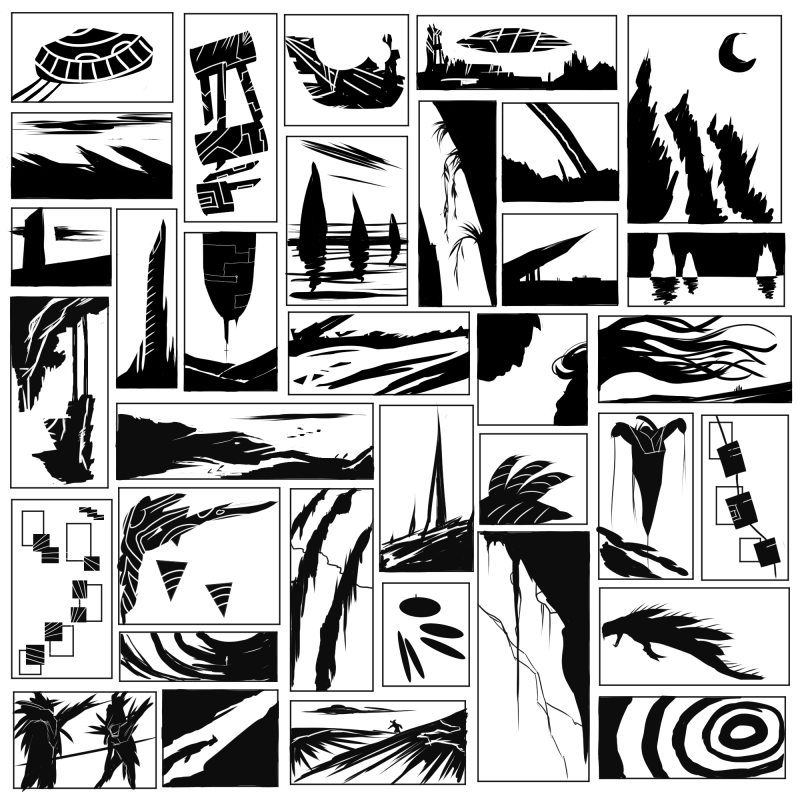
Quote:@Art, welcome on board and great start. I really like the symbolic nature of your notans and how you use rhythm and repetition to create interesting patterns. Great stuff! And yeah our brains our built to interpret patterns so we will always start to see things in things that aren't actually there. :) Don't be scared of this. If you see something emerge, let it happen! I mean eventually you can use these as a way to do thumbnails for representational pieces.
Thanks Amit, OK I stopped being scared of seeing stuff in the shapes with this last lot and just went with it! Doing these notans reminds me of when the Karate Kid had to keep on waxing the cars!
RE: Environment Design Rocks! - seki - 01-16-2017
@razvanc-r
I greatly appriciate your clitique! The bottom right corner definitely had wierd value transition. It was not my focal point but the highest contrast. So I painted over there and defined some other vague points. Thank you and let's enjoy our work!
@Artloader
Good works! I like the three rocks with black background.
The rhythm and perspective are cool.
I'm watching some clitique vids in this workshop and learning a bunch of things from others' assignment. Especially about criating depth, I was confused a little bit because there are many approaches :D
RE: Environment Design Rocks! - seki - 02-15-2017
Finally, I finished my 4th assignment.
I'm sorry for my excessive late.
The most element I struggled with is just composition and I'm feeling a little bit anxiety.
But, I enjoyed it!
Thank you.

RE: Environment Design Rocks! - Amit Dutta - 02-15-2017
Hey Seki, nice one man. Good job on all 4, they all read well, with a decent amount of depth, are clear and have potential. Nice use of repetition for scale/ I particularly like the rock and the mushroom ones. Though I also really like the initial scale of the little thumbnail for the rocks as well, or pushing that even more as if the rocks are really huge looming over a forest valley or something like that. But that's all your personal choice. I think the lighting on that one is the best atm, though given the cue of the sunny bright day, you might want to play with pushing some more direct (dappled?) lighting a bit more in the scenes, they do seem relatively ambient at the moment.
Watch the scale cues on the mushroom one as you take it further, to make sure you get it right.
Carry on!
RE: Environment Design Rocks! - Artloader - 02-15-2017
Wow, nice work Seki! Your perspective looks good and I'm loving the tree silhouettes in the background :).
RE: Environment Design Rocks! - seki - 02-17-2017
Thank you guys!
I'm very encouraged by your comments.
>Amit
It is great idea that rocks are huge as if they loom over a forest. I like it!
I will think about more direct lighting and may add dappled sun light which pass through leaves.
Now I decided to brush up the mushroom one in the rest of the time.
>Artloader
Thanks! When it comes to the tree silhouettes, I thought about a little bit diagonal or perpendicular line.
I think...Former one gives some movements, and latter one looks good when it combined with horizontal line.
RE: Environment Design Rocks! - seki - 02-19-2017
Hi, I improved the last assignment, mushroom one.
I considered direct lighting, correct scale, and leading line.
Though... I feel something wrong. It is too scattered...?
RE: Environment Design Rocks! - Artloader - 02-19-2017
Nice going Seki! I think it's good that you've added some dappled light, although if it was me I'd maybe have a fewer sun beams and save them for areas you want the viewer to focus on? Just my thoughts - they're probably rubbish so ignore me :).
I'm still lagging behind on Assignment 01, here's my first 2 Value Notan Study:
![[Image: arturas-jelesinas-redplanet.png]](http://crimsondaggers.com/forum/attachments/97289/arturas-jelesinas-redplanet.png)
![[Image: NotanStudy2Values1.png]](http://crimsondaggers.com/forum/attachments/97290/NotanStudy2Values1.png)
RE: Environment Design Rocks! - Gnoblin - 03-02-2017
A week ago I started on the wk1 assignment as promised. It was quite hard to get going at first. Notans are very confusing as I can't see anything in them most of the time. I was not sure if I should put mid greys as black or white when was doing notans. I attempted to get the shape of the main object as well but it did not work that well :/ Also I worried that they could bee to similar to each other.
Studies on the other hand were more fun and I enjoyed some of them. However, I can't say I am super proud of my work though. Its a good start at least.
This is one of my first attempts at digital art so it was an 'interesting at times' experience.
Feedback is welcome though.
Gonna try to do 2nd week now but I can't say I am confident that I can come up with an interesting and/or original environment.
PS I know that my perspective is perfect and I definitely focused on it all the time...
PSS I can't seem be able to add an attachment or link the image of my work :/ so I uploaded it to imgur here is a link:
homework wk1
PSS It seems that neither png or jpeg want to upload probably a glitch in firefox :/
![[Image: G9OPX]](https://imgur.com/a/G9OPX)
RE: Environment Design Rocks! - Artloader - 03-03-2017
Hey welcome to the forum dude - if you're having trouble with uploading images, you should check out this thread:
http://crimsondaggers.com/forum/thread-8082.html
Good luck!
RE: Environment Design Rocks! - Amit Dutta - 03-14-2017
Awesome to see you here gnoblin. Did you get that image upload working? If the files are too large you can use tinypng.Com to reduce file size a lot while maintaining quality. I'll pop in some feedback on your work soon.
RE: Environment Design Rocks! - zdele - 03-24-2017
Hey guys, I m new here, dropped by to do some exercises :)
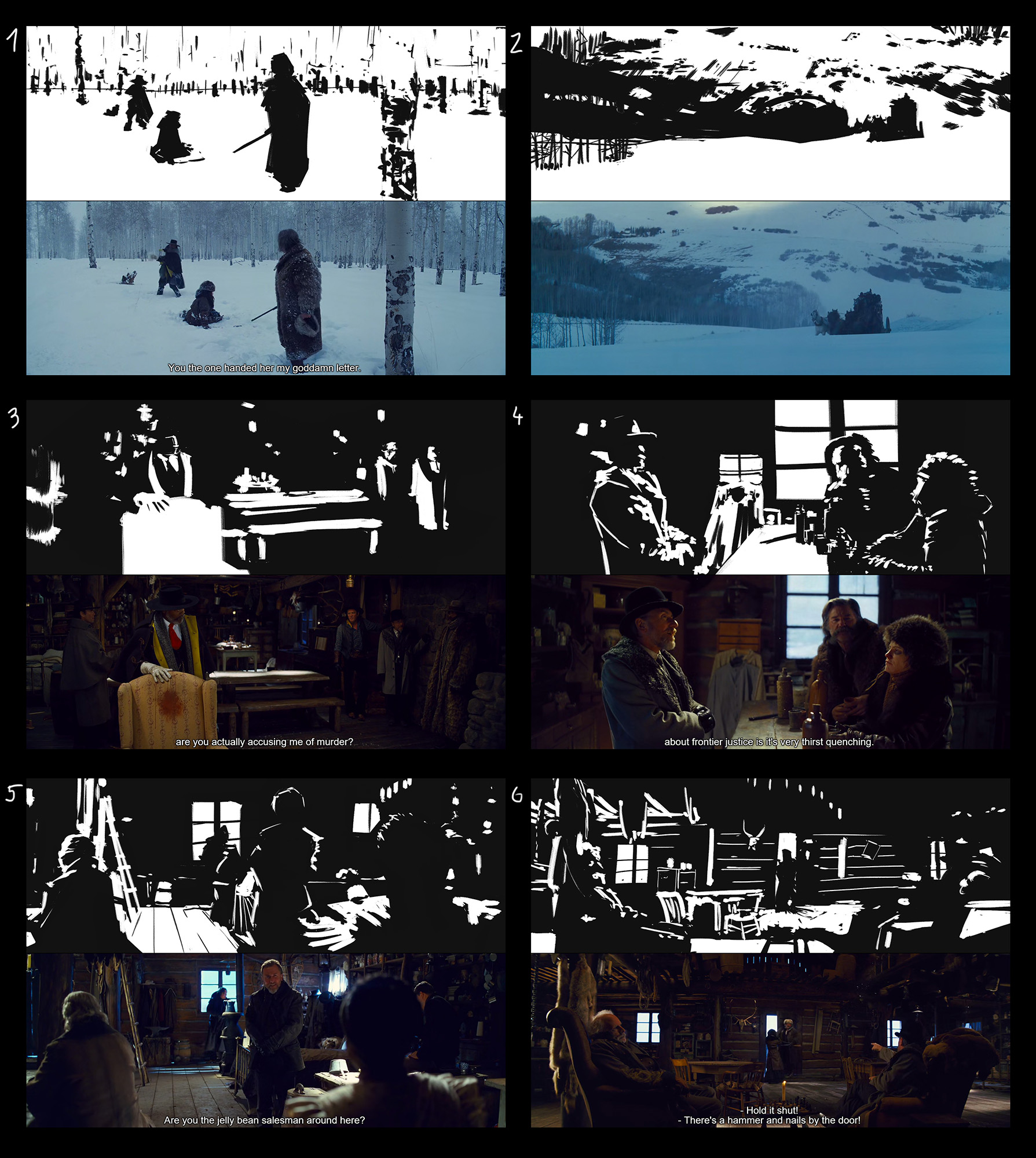
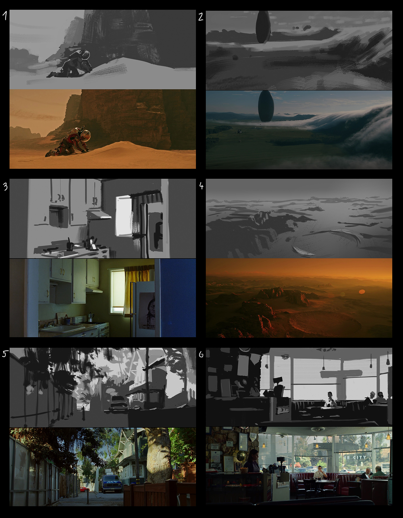
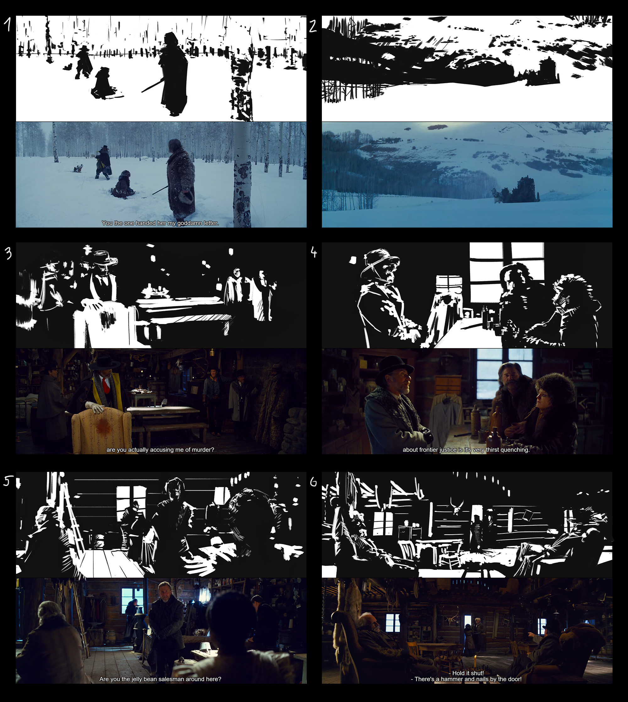
Anyway, my work for week 1, i struggled the most with limited value studies, the initial challenge of choosing values was by far hardest part of them
RE: Environment Design Rocks! - Anvikli - 03-24-2017
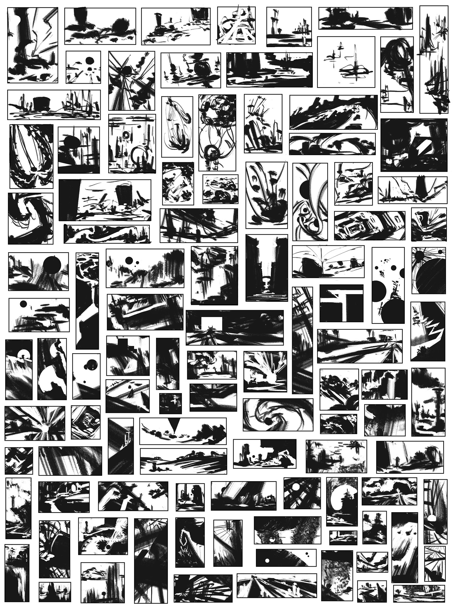
Hi! I'm new here too. These exercises are very useful, I've never done notan studies, only tonal thumbs. I'm learning how to learn :)
It's hard to decide how to draw a contour and don't spoil the reading of the object.
On some thumbs I spent more than 2-3 min because was carried away by drawing details. That is my other problem )
RE: Environment Design Rocks! - Amit Dutta - 03-25-2017
@Artloader. Nice one man....let's see more!
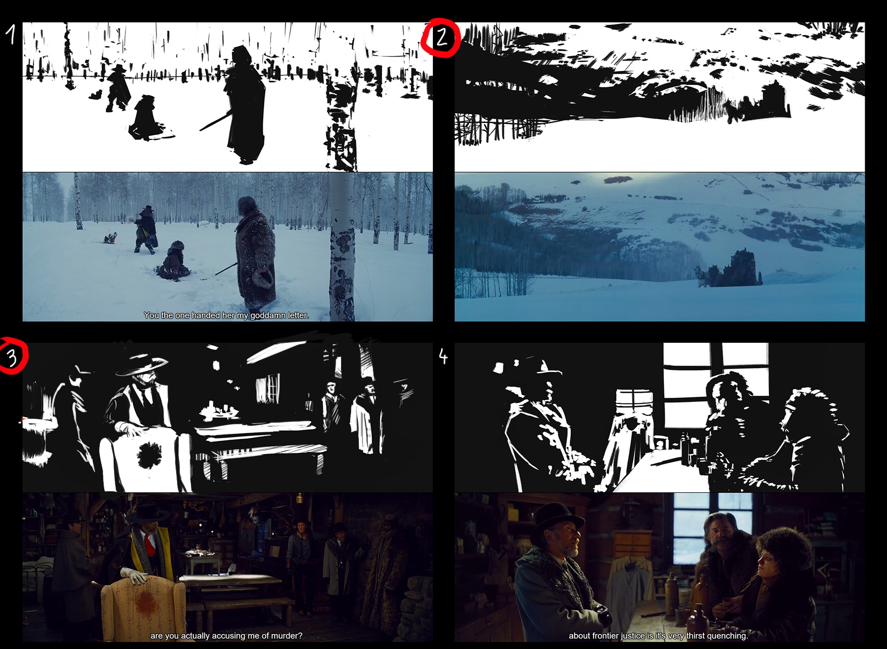
@Zdele. Quick work dude. :) And nice work too. Great stuff, you've done very well capturing the idea of the comps in the first 2. You did pick some really difficult scenes to notan up with the interior Hateful 8 caps since they are so dark.
Because this exercise is about composition, I'd like you to think about replicating that over and above everything else. If a shape is very important to the comp, you can think about using some slight linework to pick it out so it becomes more readable rather than try and do a 1 for 1 value black to white "translation" to notan. This shouldn't become a linework exercise, but used when necessary it can help with legibility. You can also use thinner hatching of sorts to get a little bit more of a sense of midtone if it is in an important part of the comp that requires some contrast (such as around the dog in number 2)
For low contrast or dark shots, I find it very useful to really amplify the lit side of objects and shadow sides of objects regardless of what the actual value I am looking at in the reference. This is basically like chiaroscuro but simplified, amplified and applied locally to every important object. I applied this to the chair and the main characters and you'll see they become more recognizable. Also made it clear the stain in the chair since that's basically the main focal point of the scene.
FACES. Always be more accurate with faces and human shapes and they will immediately become recognisable.
Another tip in scenes with obvious perspective in them, show some elements that suggest that perspective (window/beams) so things don't end up looking like a bunch of floating marks in space and retain a sense of depth to the scene.
I circled the ones I adjusted. I suggest if you like to try the above to apply my suggestions with #5 and #6 again because despite their low contrast they have very strong comps.
Not much else to say on the rest. pretty good value studies , if anything I would suggest a bit more focus on accuracy of shapes, especially in perspective. If there are straight lines, use straight lines, not purely for the sake of perfectionism, but it will lead to a better overall final result and help you train to do this more efficiently when it comes to your own workflow in the future. #6 is my favourite of the bunch. I like the 100 notans, nice variety. Good stuff man.
@Anvikli. Welcome to the EDRocks team and good on you for doing the exercises!! I think you've got the idea of notan simplification down very well in all of your studies. They are all readable and the comps are clear. Well done! I agree with your self assessment that you focused too much on detail with the 100 notans. Many of them are more like linework sketches than notans really. As I mentioned to zdele above, using some "linework" is totally fine to show contour and bring out some contrast or mid tones where needed, but try not to go to far into linedrawing. Really start to think about lit sides vs dark sides of things if you are going for a representational scene, and using finer linework only where necessary, but if going for more abstract, just play with shapes, rhythm, balance etc to get a nice comp out and not focus on linework rendering. Great start!
For your 4 value studies, I have nothing to add, except to say as you do more of these in the future, you can start to add, gradient/soft brush transitions between values and add things like light bounce etc, and then you are pretty much all the way to a workflow to doing full value studies. Just stay as accurate as possible within reason. I'm anal so I like to be as accurate as possible with shapes even if I am focusing on basic value or composition studies. Better to practice doing things well, than doing things sloppy. Dorien Iten's guide on accuracy is a nice one to get on gumroad if you haven't seen it yet :)
In general for anyone reading, Always think of lit vs shadow side in the simplest terms and you'll start to make more recognizable shapes in complex low contrast studies. This kind of thinking will help your overall rendering too for ANY piece as your brain starts to do this kind of analysis and simplification much easier with practice. Oil the Groove!!!
RE: Environment Design Rocks! - zdele - 03-26-2017
Thanks for the critique amit :)
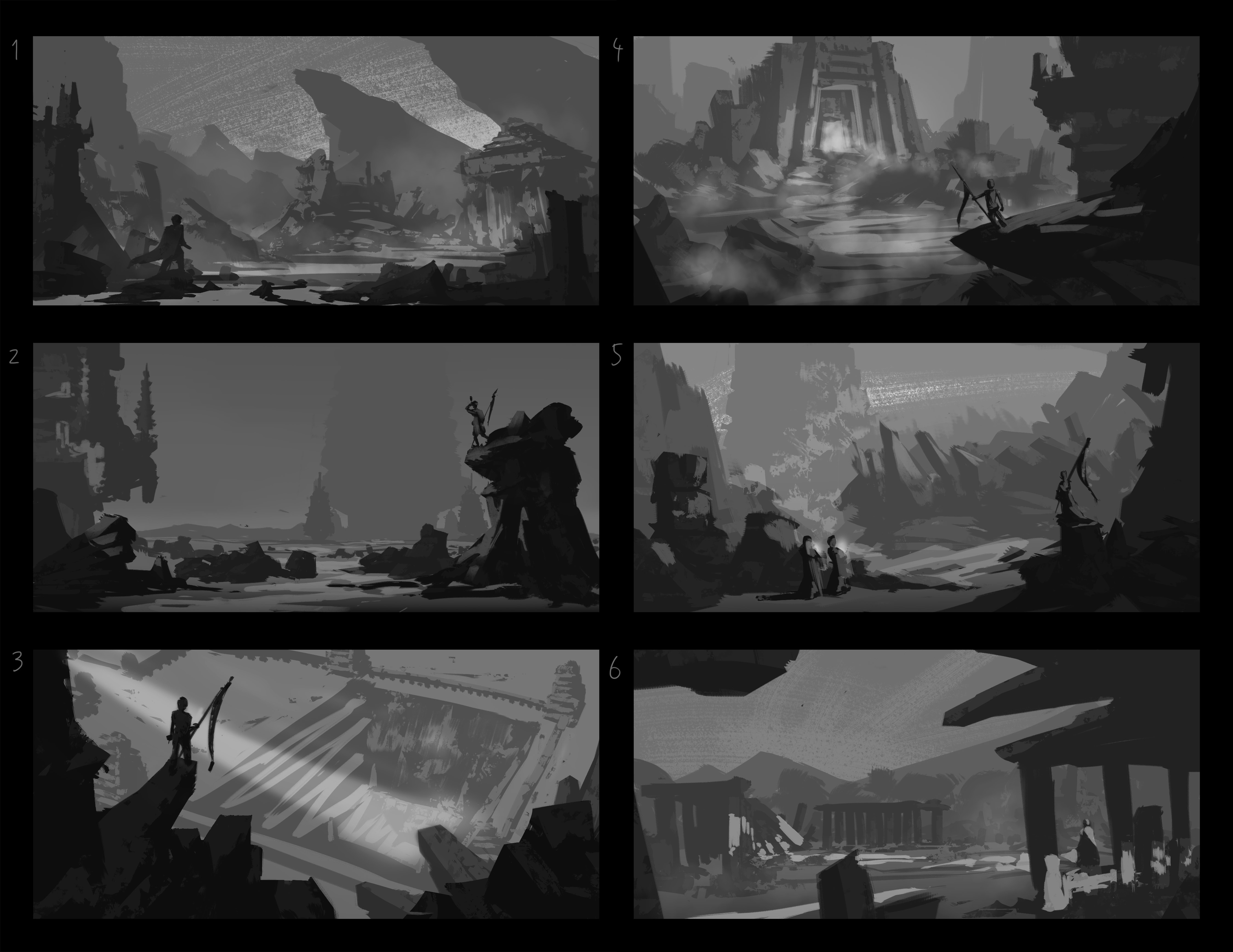
Here is assigment number 2, i usually prefer to use minimal amount of layers, and have more painterly approach, so this was more challenging for me, having everything cleanly separated
RE: Environment Design Rocks! - Amit Dutta - 03-26-2017
Yeah i prefer few layers as well, and working with layers like this can feel a bit clunky at first, but they quickly become an invaluable and much more efficient way of working especially once you get to client work and might need to change anything quickly on request. It sucks balls to repaint over and around things constantly. For value thumbs i rarely go over 5-7 layers. Things can always be flattened once you have landed on a nice comp and make it painterly, but anyway workflow is about personal preference mostly, so always keep experimenting with different methods that you might want to integrate. This is one of my main comfort zone workflows when i do environment client work, but I'll also do line drawings and sketches, especially for character work. It totally depends.
With your comps, nice separation and depth in most, i feel you are lacking in some good focal points in most except for 4 and to a lesser extent, 1. 3 is strong but not sure what's down in that pit as a payoff, so can't really comment. 2 has some cool background and midground stuff going on that i feel would work better given a bit of space without such a large block in the foreground. Perhaps smaller rocks and figures on the ground level would work better and the towers in the back would be a nice focal point. I would suggest you play around with your shape language more. Look at reference to get ideas if you tend a to do the same shapes over and over. Ands always I urge people to try and move away from relying solely on the travelling foreground stick salesman trope. It works, and yes many of my folio pieces have this too, before i learned better. You can do better by just imagining a specific narrative other than dude standing around on his own looking at a view. If there have to be character/s why are they there, who are they, what are they doing that might suggest something else of interest, are there vehicles or animals or even just vegetation instead?
Much better on the redo pieces. Without knowing how quick you worked, I have a feeling you could use some work on understanding how to simplify face shape and structure. Some portrait notan studies are also a great way to understand that haha :)