+- Crimson Daggers — Art forum (//crimsondaggers.com/forum)
+-- Forum: PERSONAL ARTWORK (//crimsondaggers.com/forum/forum-9.html)
+--- Forum: SKETCHBOOKS (//crimsondaggers.com/forum/forum-10.html)
+--- Thread: Sketchnoob (/thread-7068.html)
RE: Leo's sketches - dodeqaa - 03-10-2016
Good work with the consistent posting man!
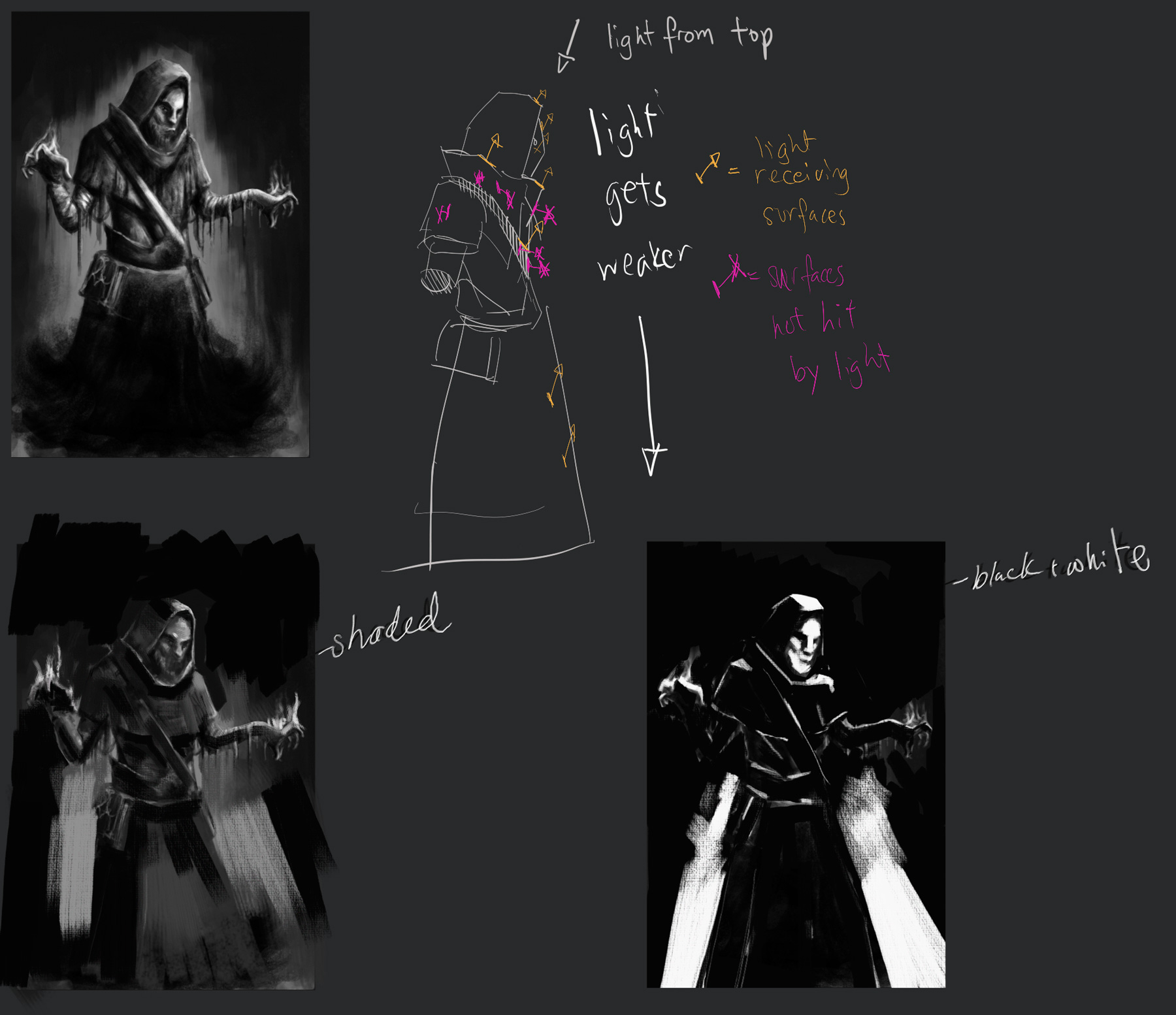
Feels like the light source is coming from quite a few areas right now.
The leather strap of his satchel is receivbing some intense front light,
there is also an ambient light brightening up the front of figure.
The intensities of the lighting is inconsistent, leather strap is light brightly from the front but the clothes dont seem to be as affected.
I did some notes that might be useful to you,

It is important to keep a greater vs lesser light source in most scenes, so that it doesn't end up flattening out the form. The correct drawing/shading of the form is also vital, especially when you are executing it in a painterly fashion, it is very easy to lose the sense of structure in shapes. Volumes must be expressed definitively, with no ambiguity.
Consider the material on your character, leather, clothing and skin all react pretty differently to light. This is show in the way the colours transition across their surfaces, reflective objects have large jumps between darks and lights and matte surfaces transition more gradually.
Also consider, the strength and shape of your light source. a single light bulb in a room vs a panel of flourescent lights will cast light differently.
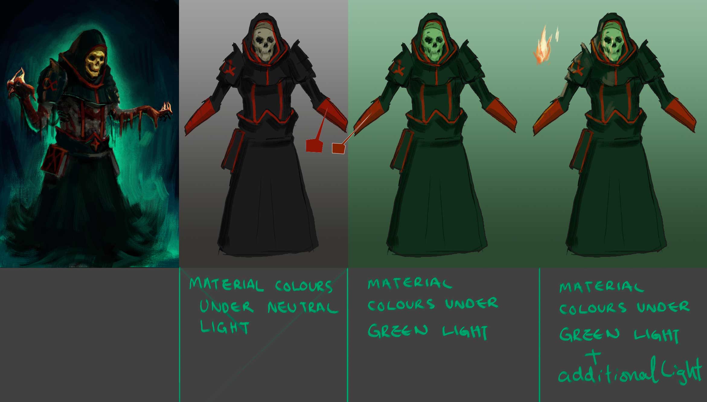
Lastly, when it comes to colours, consider the colour of the object and how it reacts to the colour of the light. A blue tee shirt under a yellow/orange streetlamp ends up looking pretty gray.
Here is a good resource on light and colour http://www.itchy-animation.co.uk/light.htm
Between light, colour and form theres alot to learn, but its alot of fun :D
If theres bits that doesn't make sense to you, please dont hesitate to ask!
Keep truckin' and keep having a ball!
RE: Leo's sketches - Leonard - 03-12-2016
Thanks for the feedback.
Made it darker and changed the color,
don't know which one i will choose tho.
I feel like it is too dark now...
![[Image: Owsn8vl.png]](http://i.imgur.com/Owsn8vl.png)
![[Image: X79zWL5.png]](http://i.imgur.com/X79zWL5.png)
RE: Leo's sketches - Leonard - 03-13-2016
Got some feedback on another artforum :)
Finished it :D
![[Image: y009W3X.png]](http://i.imgur.com/y009W3X.png)
RE: Leo's sketches - dodeqaa - 03-13-2016
Heyo,
Good work finishing the piece!
I agree it can get dark and stuffy in some areas.
Black fabrics are rarely pure black in nature, so you can try using a dark colour and lightening up the cloth folds with the a dark desaturated green of the environment.
I did a paintover and some notes, see how the local colours of the materials shift according to the lighting.

Hope it gives you some useful ideas for your next piece!
Keep up the good work!
RE: Leo's sketches - Leonard - 03-14-2016
your critics are very usefull <3
thanks again, will change that :)
RE: Leo's sketches - Leonard - 03-14-2016
The second page was without reference :)
![[Image: CGh1lUw.png]](http://i.imgur.com/CGh1lUw.png)
![[Image: kvMeQTq.png]](http://i.imgur.com/kvMeQTq.png)
RE: Leo's sketches - Leonard - 03-14-2016
finished it :)
![[Image: XHQ8opr.png]](http://i.imgur.com/XHQ8opr.png)
RE: Leo's sketches - Leonard - 03-14-2016
again second page without reference :)
![[Image: urIQKOX.png]](http://i.imgur.com/urIQKOX.png)
![[Image: DVkrSRG.png]](http://i.imgur.com/DVkrSRG.png)
RE: Leo's sketches - neopatogen - 03-15-2016
Great work with your figure drawing!
RE: Leo's sketches - dodeqaa - 03-15-2016
^agree!
Great action on those figures!
RE: Leo's sketches - Leonard - 03-15-2016
thanks guys :)
RE: Leo's sketches - Leonard - 03-16-2016
anthony jones gumroad practice :)
![[Image: mEkJnjK.png]](http://i.imgur.com/mEkJnjK.png)
RE: Leo's sketches - Leonard - 03-19-2016
Testing mischief :)
![[Image: uLqfuEF.png]](http://i.imgur.com/uLqfuEF.png)
RE: Leo's sketches - Leonard - 03-21-2016
some small B/W compositions for another illustrationchallenge :)
![[Image: 7TVA0YX.png]](http://i.imgur.com/7TVA0YX.png)
RE: Leo's sketches - Leonard - 03-23-2016
more studies and sketches
![[Image: tVRDL0I.png]](http://i.imgur.com/tVRDL0I.png)
![[Image: chT4SlM.png]](http://i.imgur.com/chT4SlM.png)
RE: Leo's sketches - Leonard - 03-27-2016
changed the whole thing again new composition etc.
the challenge is kinda funny there are gonna be random things in the illustration
![[Image: 3psS3Cf.png]](http://i.imgur.com/3psS3Cf.png)
RE: Leo's sketches - Leonard - 03-29-2016
update
![[Image: rptZQY7.png]](http://i.imgur.com/rptZQY7.png)
RE: Leo's sketches - Leonard - 03-29-2016
bringin in color :)
![[Image: qkmrLGP.jpg]](http://i.imgur.com/qkmrLGP.jpg)
RE: Leo's sketches - Leonard - 03-29-2016
mechs :)
![[Image: qHOLKb7.jpg]](http://i.imgur.com/qHOLKb7.jpg)
RE: Leo's sketches - BrushNoir - 03-29-2016
Nice studies you got there. All I can say is watch your values, I think you're going to dark on some of your pieces.