+- Crimson Daggers — Art forum (//crimsondaggers.com/forum)
+-- Forum: PERSONAL ARTWORK (//crimsondaggers.com/forum/forum-9.html)
+--- Forum: SKETCHBOOKS (//crimsondaggers.com/forum/forum-10.html)
+--- Thread: Them sketchies (/thread-7946.html)
RE: Them sketchies - Hozure - 03-11-2017
@Mariyan: Oh no, did I do something wrong? D:
@devares: Hah, noted. ;)
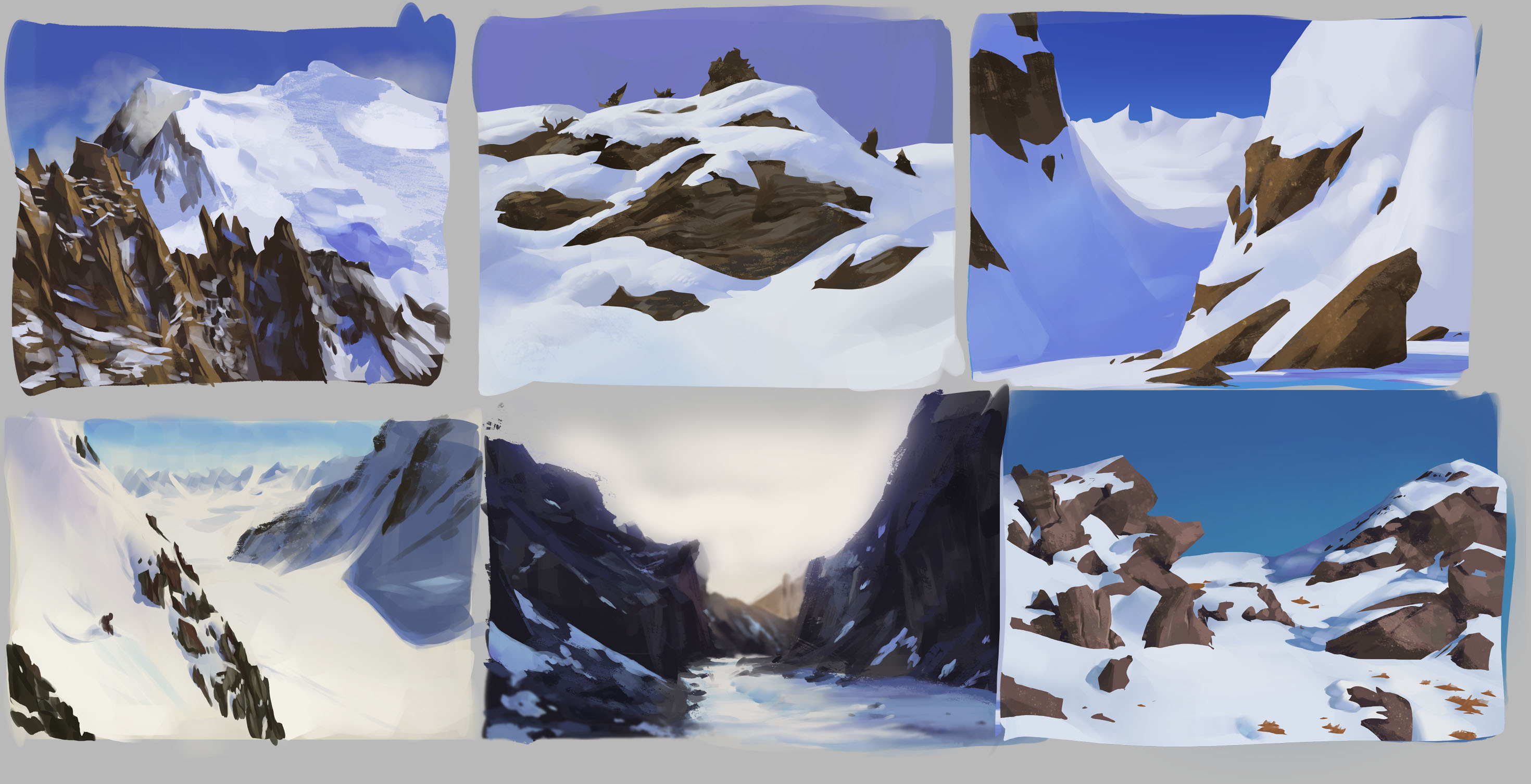
Couple more environments and its onto bodies. Might just really focus into bodies and switch it up with architecture down the road.
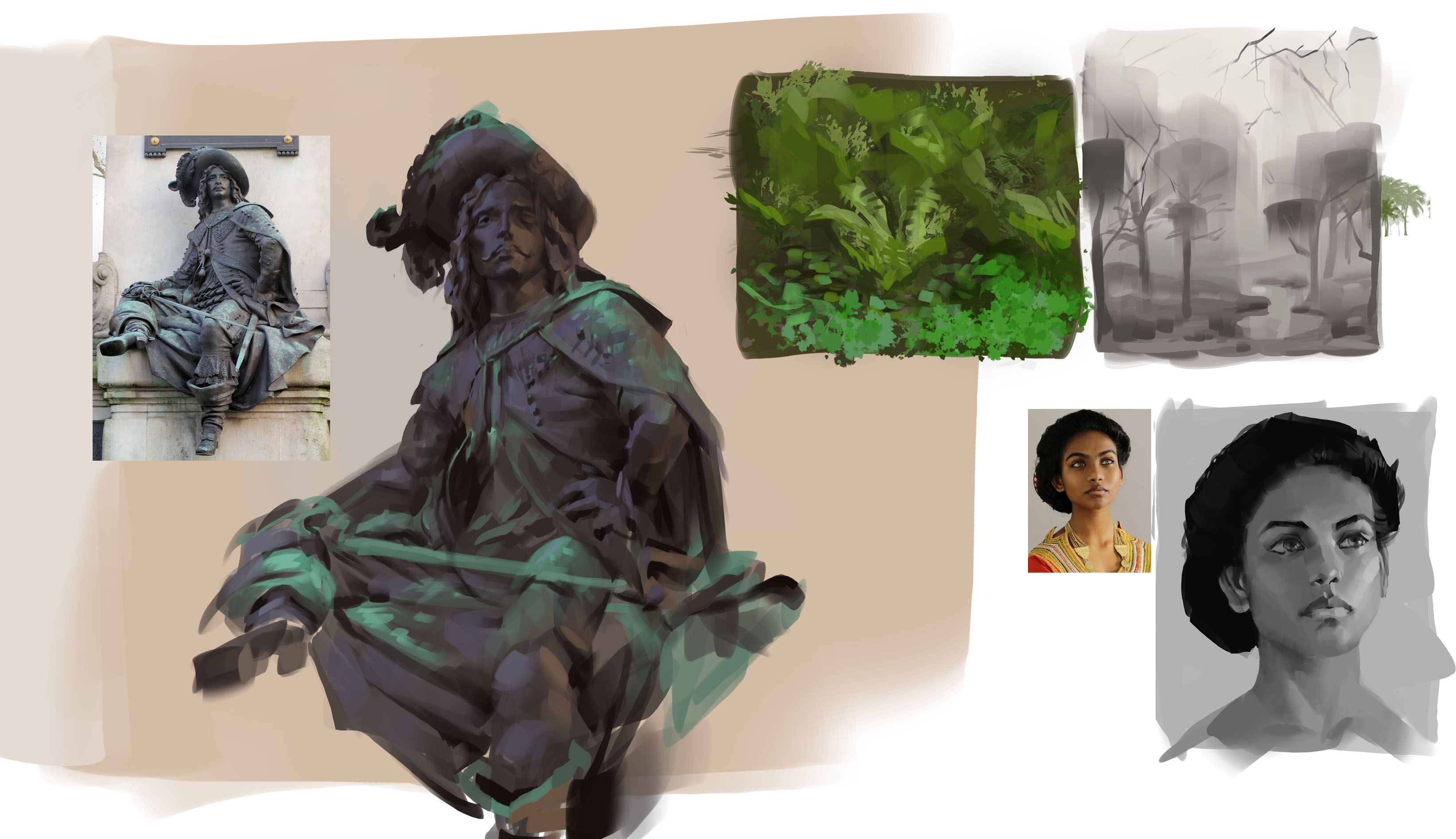
A doodle. Eyes taken from those asian painters.
RE: Them sketchies - tfantoni - 03-12-2017
Whoa dude, you're reeeally good! :O I like pretty much everything you've posted here, hahahaha! Consider putting some values for your comp sketches, I'd love to see moar like these :)
RE: Them sketchies - Hozure - 03-12-2017
@tfantoni: Thankies. :u
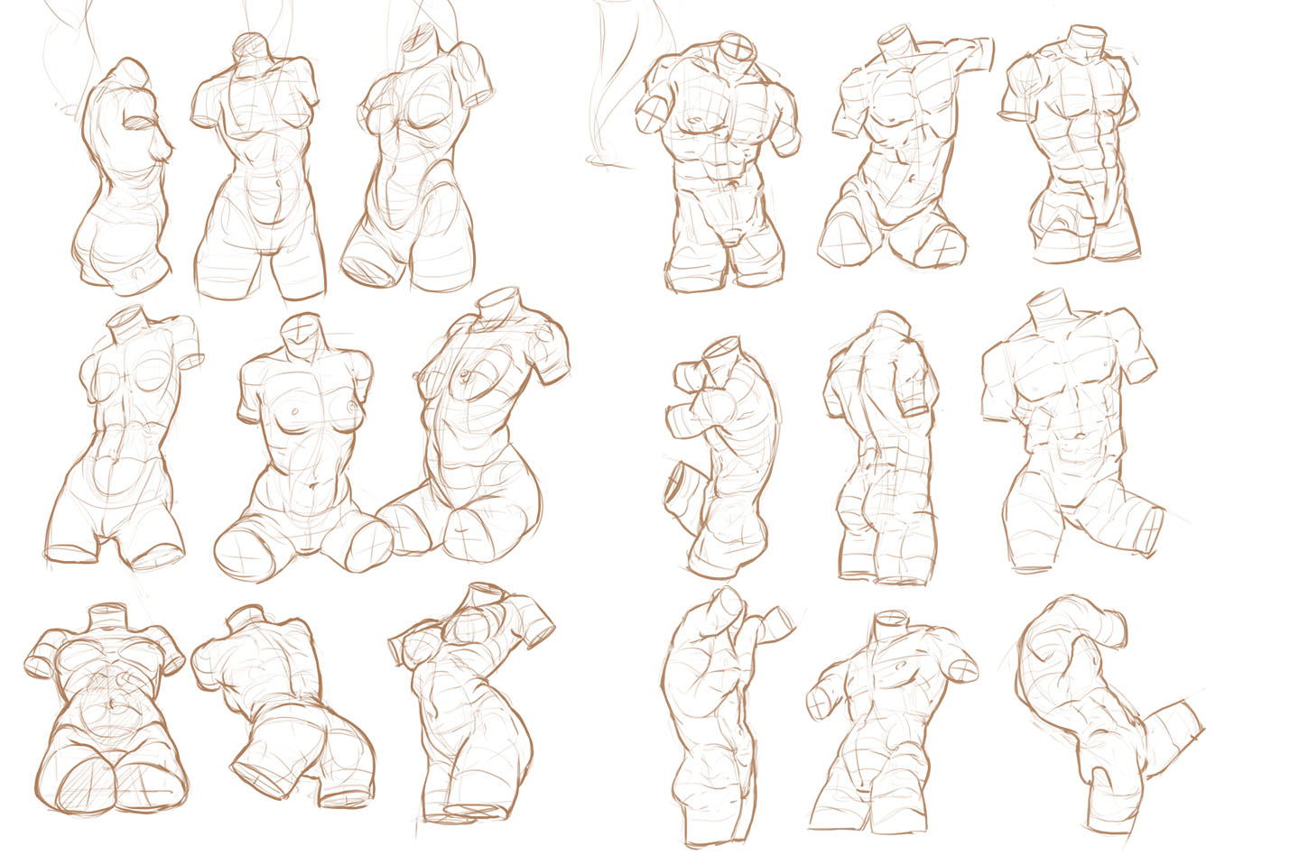
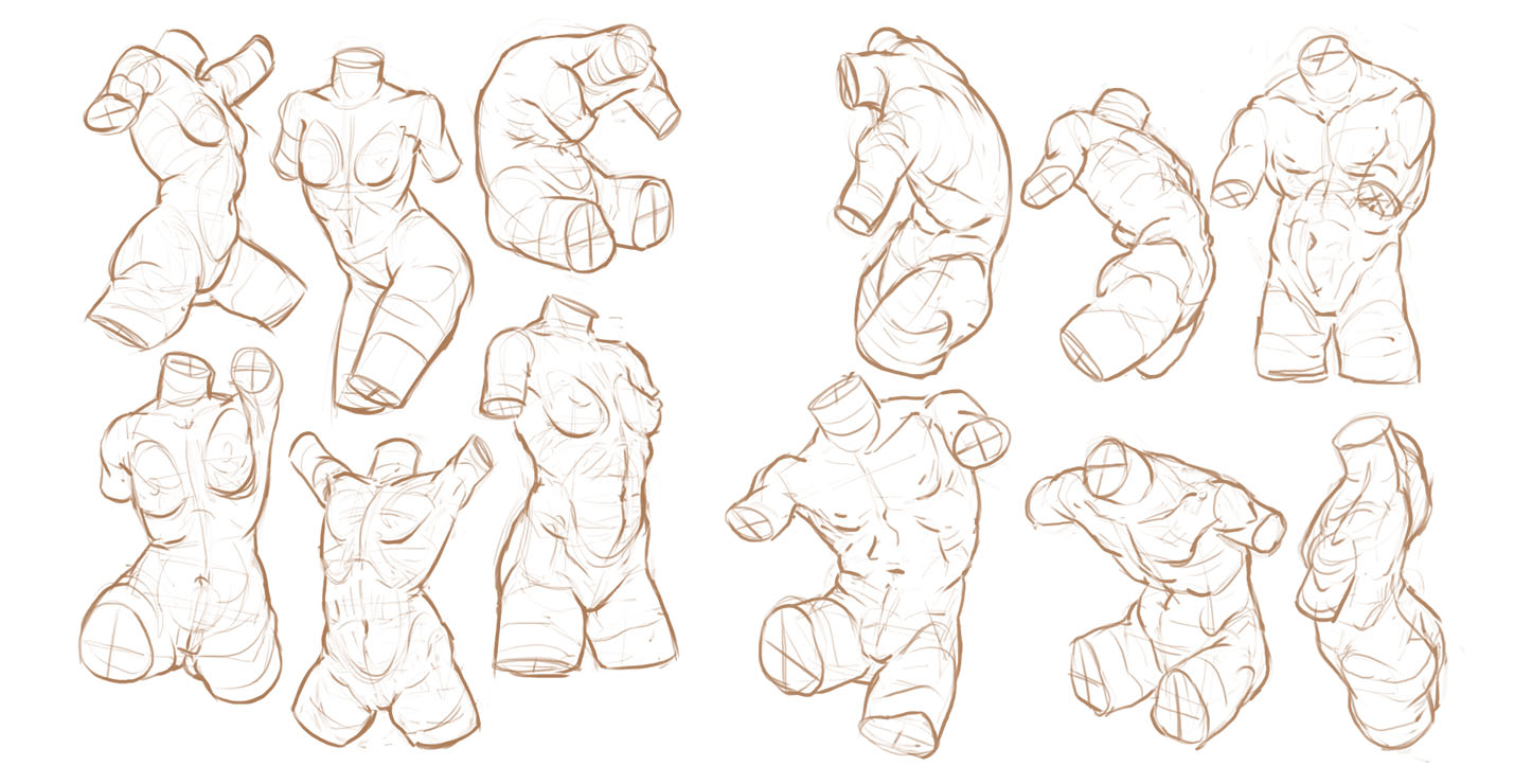
Torso galore. Profile views are incredibly difficult. I still often autopilot and misplace the center line when it's rotated.
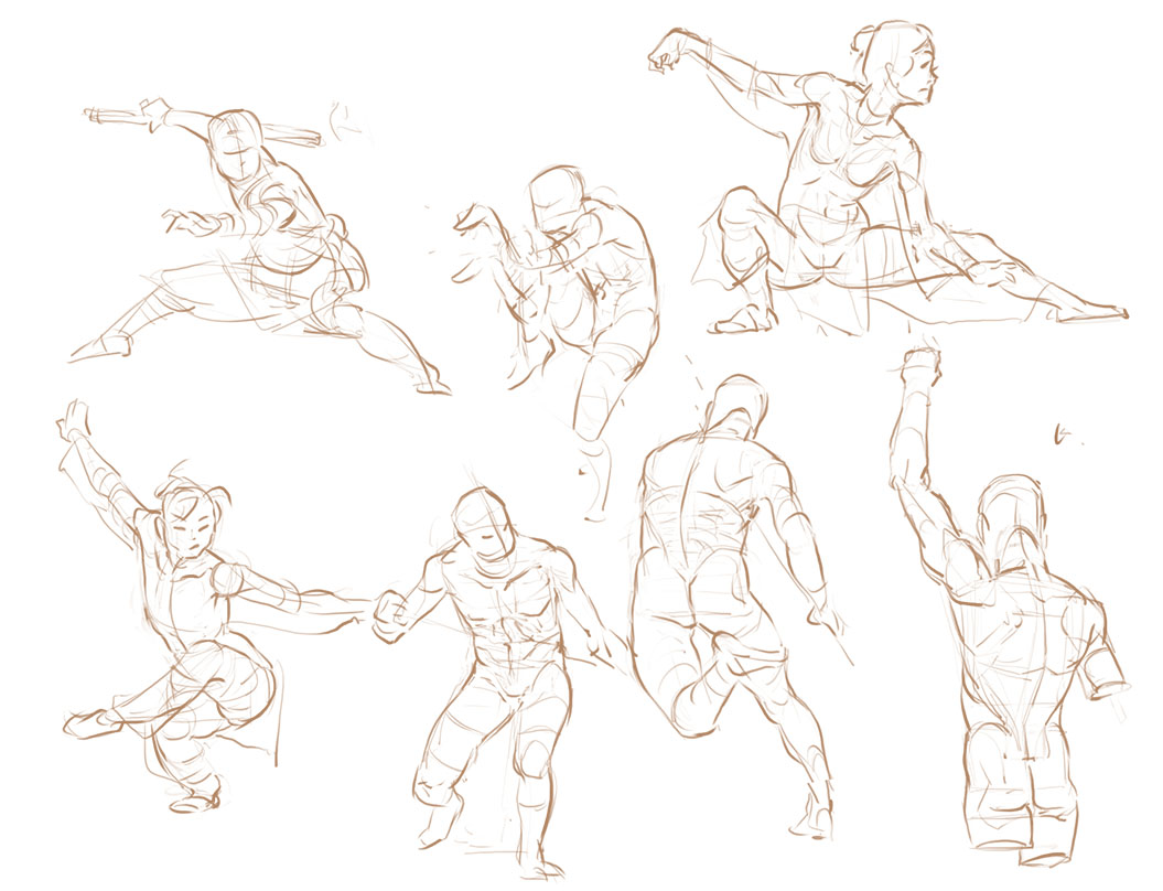
Applying to imagination:
RE: Them sketchies - Fedodika - 03-12-2017
great work on the imagination!
RE: Them sketchies - SerGeorgious - 03-12-2017
Love the stylized painting you do! Your sketchbook is really a lesson on how to study and improve!
Keep working hard c:
RE: Them sketchies - Jonesoda - 03-12-2017
Really great work in here! I haven't been active for awhile, but I've never really seen a style like yours on these forums, it's pretty refreshing.
(Edited: wrote that before crashing last night and realized what I said before wasn't what I meant to say lol, oops)
RE: Them sketchies - Hozure - 03-13-2017
@Fedodika: -thumbs up-
@SerGeorgious: Aye, will do. I personally don't feel that much on the improvement side so I'll have to take others' words for it!
@Jonesoda: You know, until you mentioned it I didn't notice. I always just put more finished/personal stuff on other sites and leave this one for improvement. Guess that can get stale quick. :u
Hair studies. Gotta move away from that generic female bang cut.
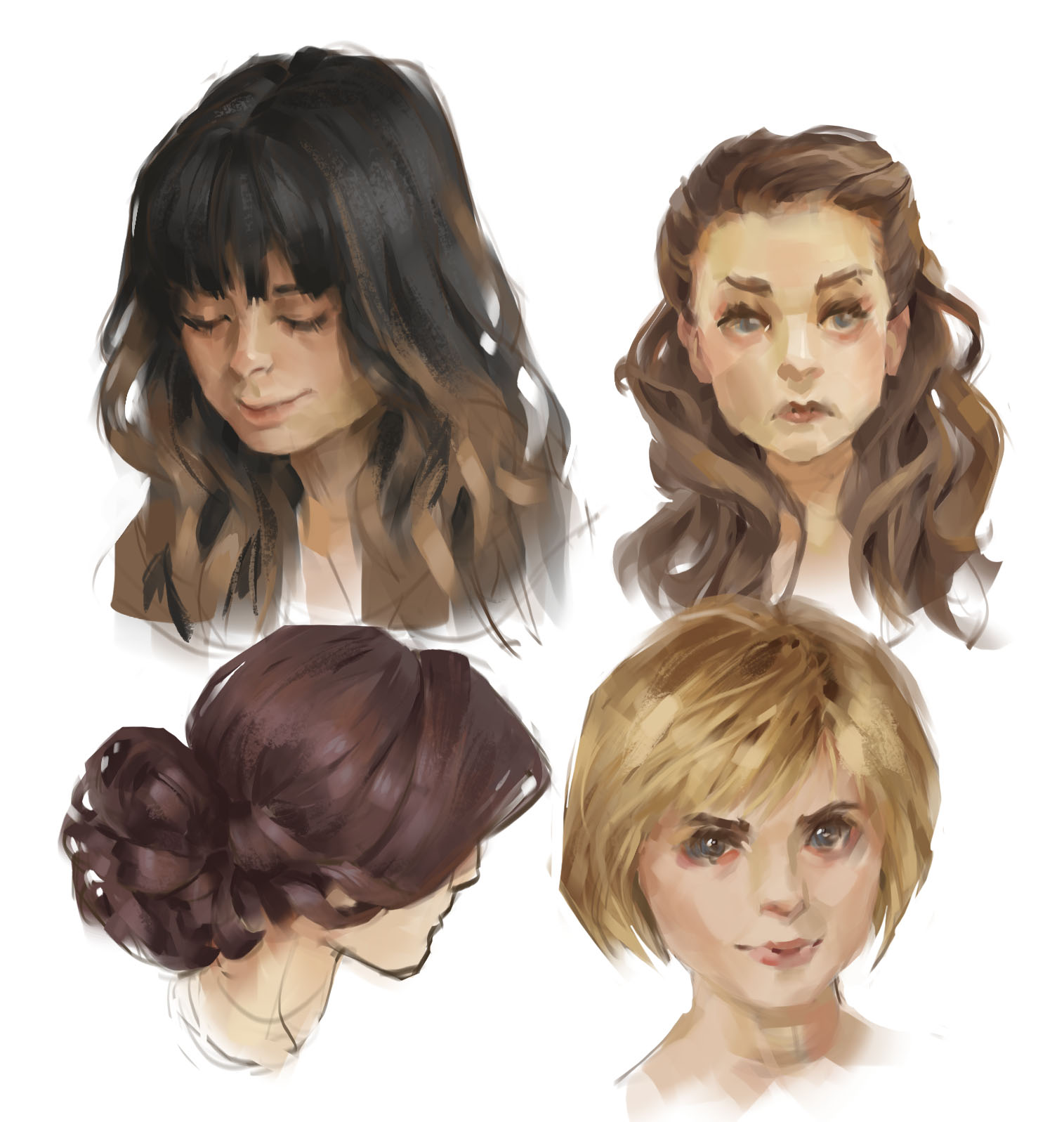
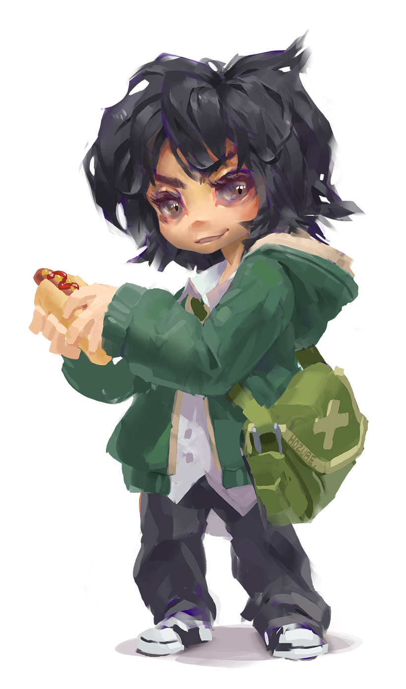
Imagination.
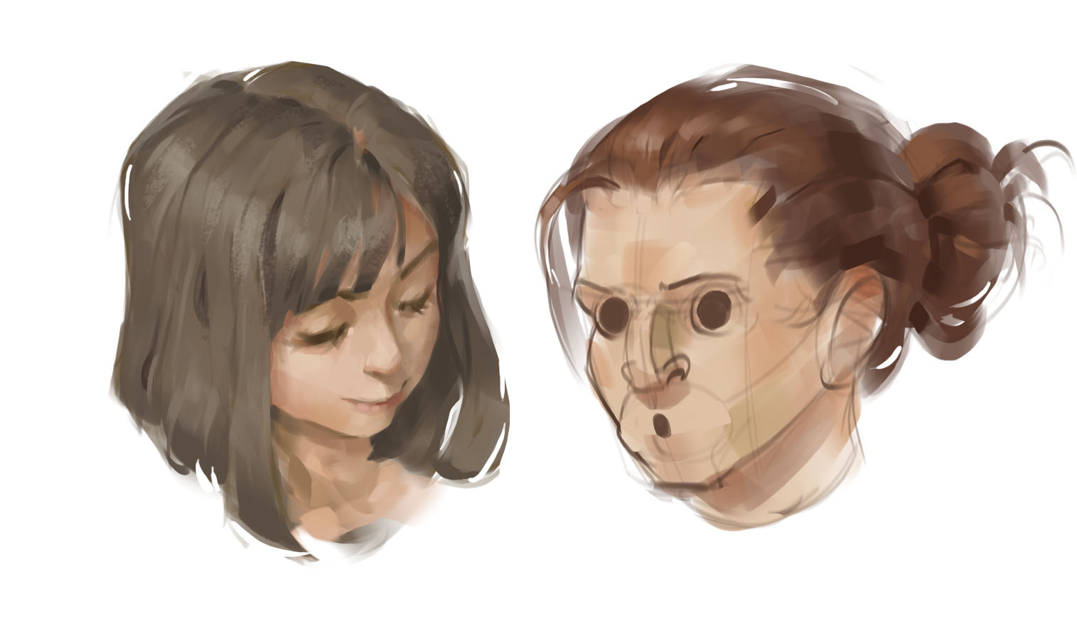
Originally just wanted to paint the hair but got carried away.
RE: Them sketchies - Pinshivic - 03-14-2017
Really liking your stuff, specially your anatomy and construction drawings, keep it up :)
RE: Them sketchies - Hozure - 03-15-2017
@Pinshivic: Will do, thanks!
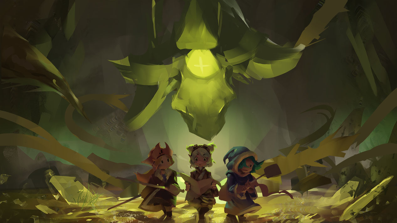
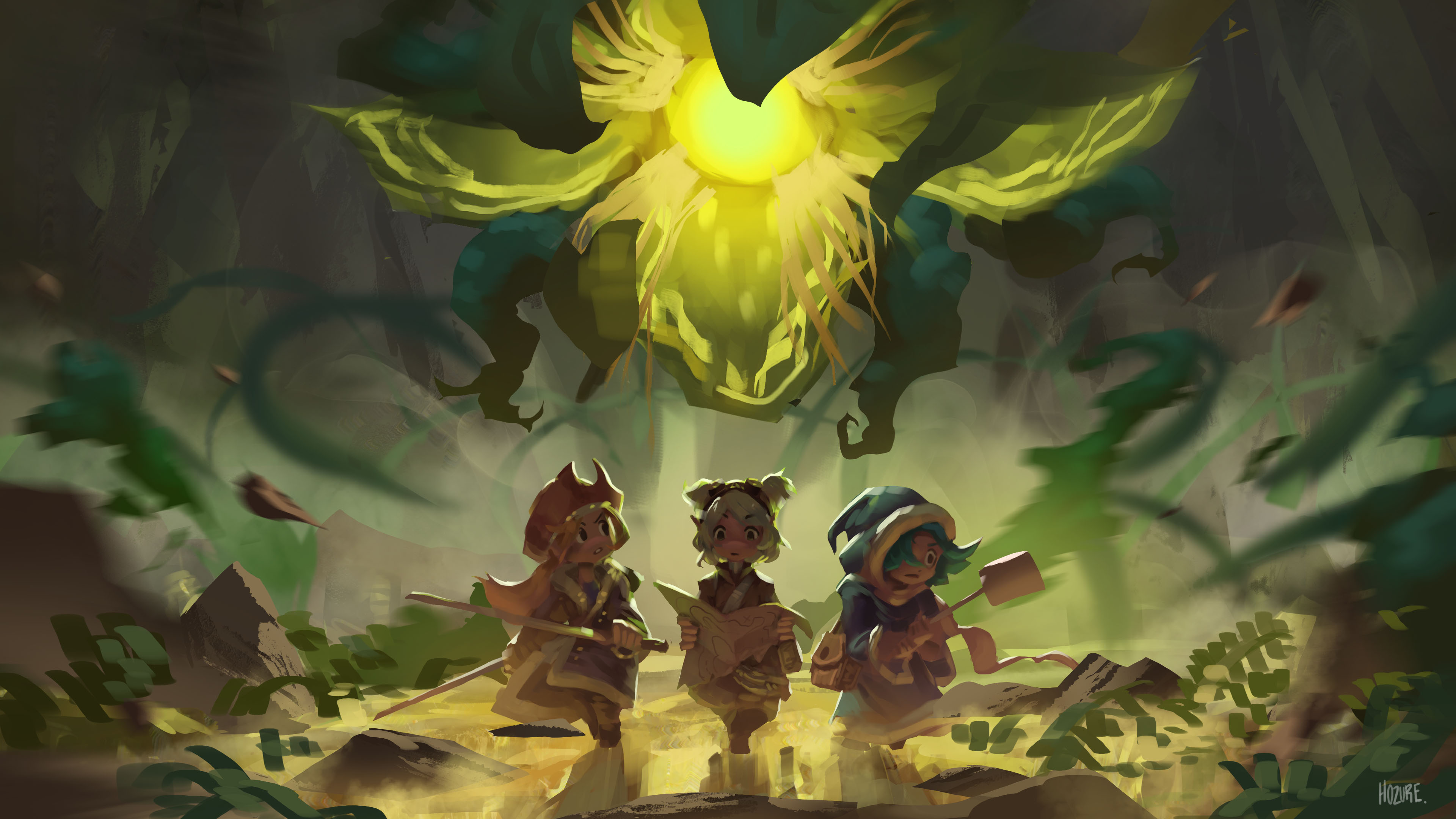
A more symmetrical painting I've been working on. I'm wondering if there's anything I can change to make it more..."more".
RE: Them sketchies - Joe - 03-15-2017
your construction and forms are so solid
 it's really impressive. I was wondering what you were studying before you started the sketchbook here (your figures and heads were damn strong from post#1), I think a notice the Reilly method in a few, but i'm not 100% what that is. I hope you don't mind me asking, mainly just curious what you found the most helpful on your journey so far.
Your design sense is on point too.
do you have a link to your finished stuff that you mentioned?
RE: Them sketchies - Fedodika - 03-16-2017
hmm well the kind of wispy thorny shapes you have going on in the middle of the page don't read from afar, I think it's the value more than the hue, since it is warm on cool. The kind of flower shape above the middle figure, you could probably shave a bit of that off to give some more space between the top of her head, or just move the flower shape up a bit altogether.
I stood back from my desk and I really think the major forms are reading but the smaller things you have going are not evident, they're just not dark enough or light enough. Also refining the ground area would help a lot, maybe some interesting rock or grass patterns
RE: Them sketchies - kvSketch - 03-16-2017
You're work is awesome. Do you have a instagram or anything like that? I feel like your stuff would do very well on there :D. Keep working hard man.
RE: Them sketchies - AlexShi - 03-16-2017
Love your studies! Especially how efficient you are with your brush strokes to define structure. Really great work <3
RE: Them sketchies - Hozure - 03-20-2017
@Joe: Ah...nothing too specific. I try to draw people as often as I can, maybe in imagined perspectives, stylized proportions, etc. Slowly picked up a bunch of different inspirations like Steve Huston and Krenz. Main motivation was to get good at form so I could rely less on photographs. As for the reilly method, it's faked and I don't really understand it. My deviantart has most of em. Same name as this.
@Fedodika: Gotcha. Appreciate it man!
@kvsketch: Thanks. I have a deviantart with the same name.
@AlexShi: Thank you~
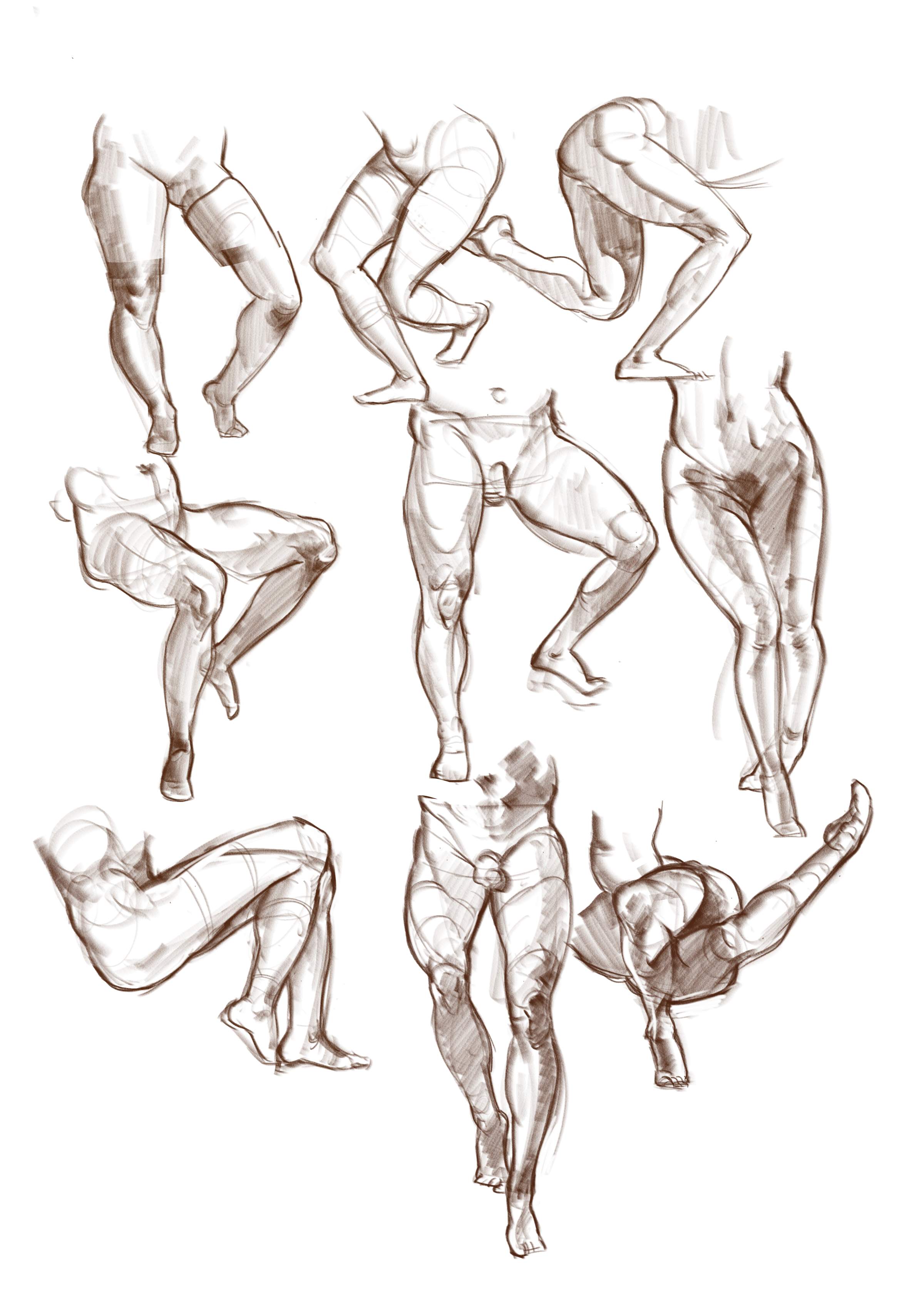
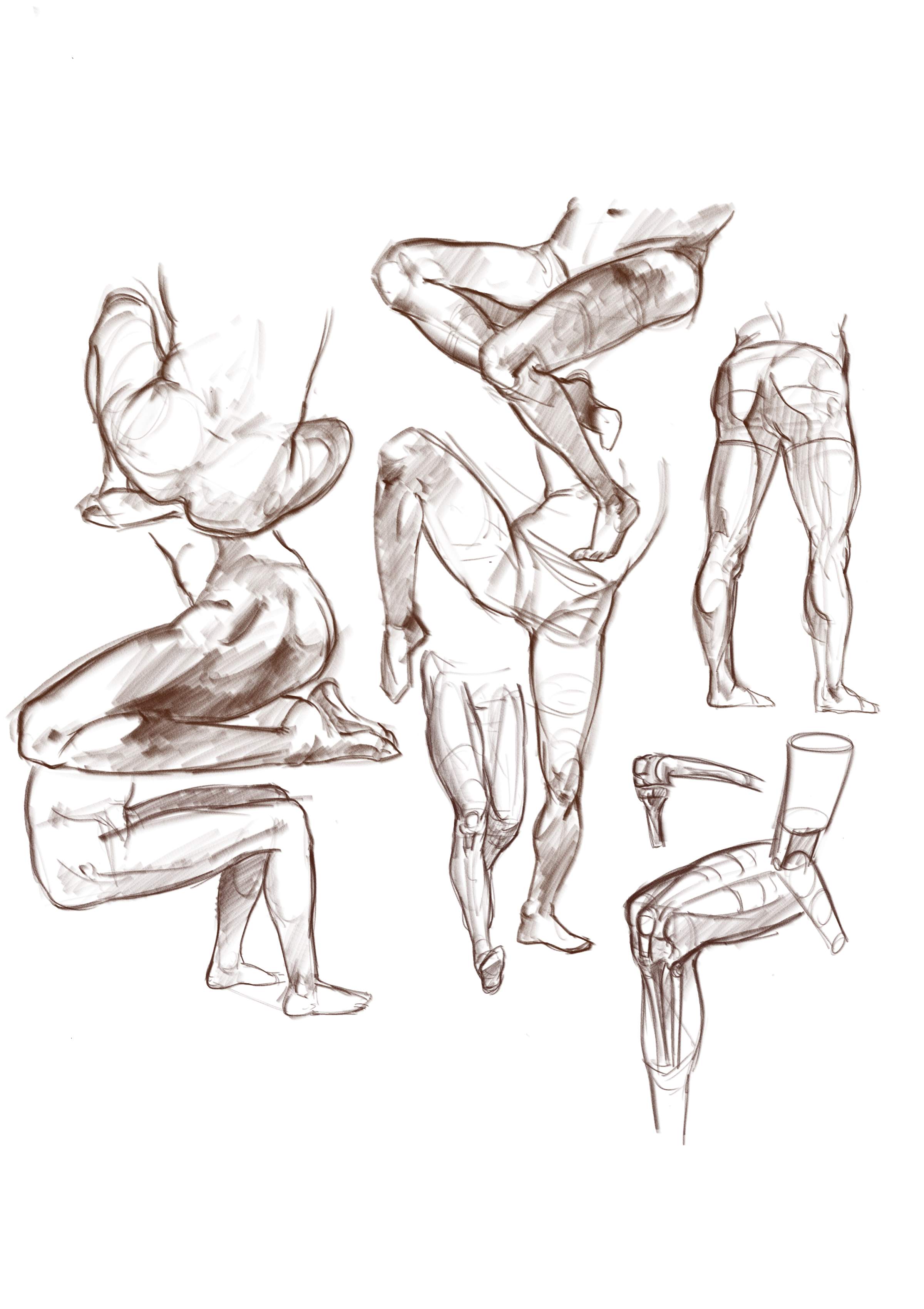
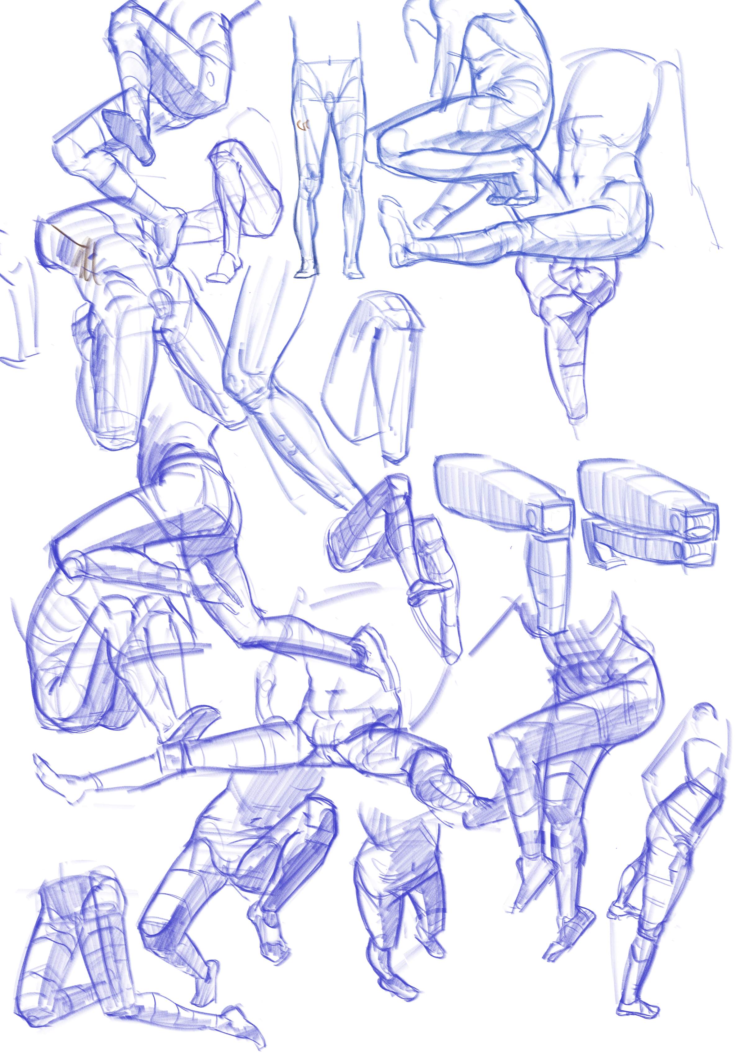
Leg and knee studies. Knees are the most frustrating thing ever so I've been trying to simplify it.
RE: Them sketchies - Hozure - 03-22-2017
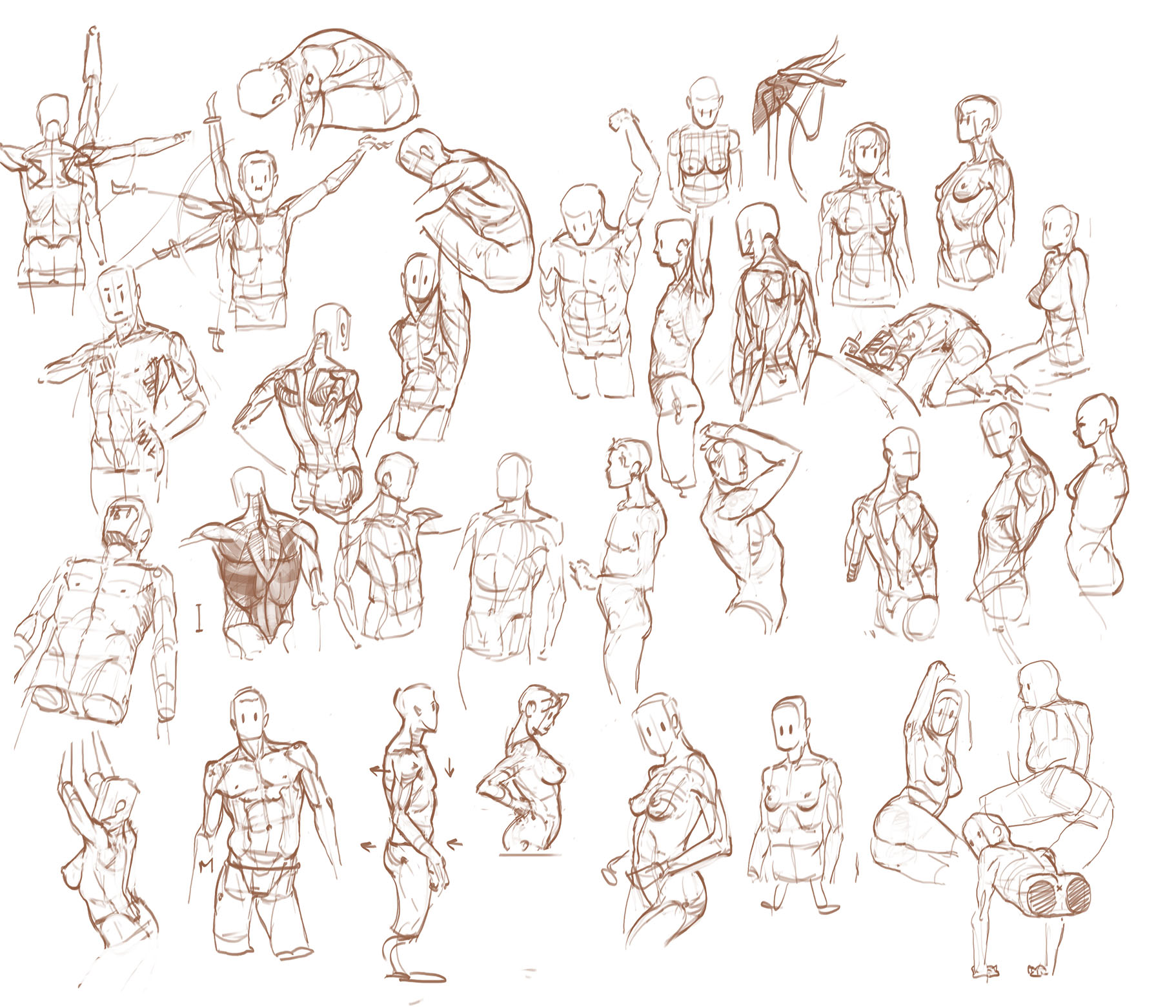
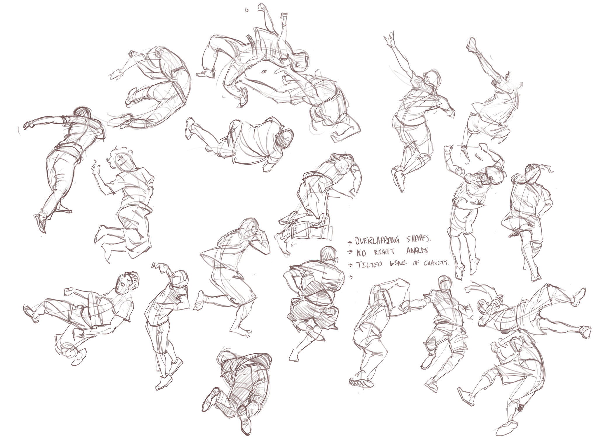
Form game on the torso weak af. Also some dynamic poses from those slow-mo tricking videos because I didn't feel like drawing.
RE: Them sketchies - NoodleInBox - 03-22-2017
You are so good *.* i just love pretty much everything you do so i cant really critique anything right now. Just keep going with what you are doing. The way you paint hair is awesome by the way
RE: Them sketchies - Hozure - 03-27-2017
@Noodle: Will do. Hair's always been a huge challenge, specially when there's lighting involved.
Updates and vent paintings. I'm really used to working on characters as the one focus of a drawing, so I have a hard time planning out the comp of sceneries and deciding where and how much to work on an area. My backgrounds look ass, and rightfully so considering the amount of time I spend on them.
I'm thinking it's partly due to me not being clear enough in the drawing stage which leads to a ton of inconsistencies later (indecisive about where the camera is situated in respect to the scene, often wanting to drag it to the ground more and more as the painting progresses to add more drama and then finding out nothing makes sense).
Anyways, character stuff time.
RE: Them sketchies - Fedodika - 03-28-2017
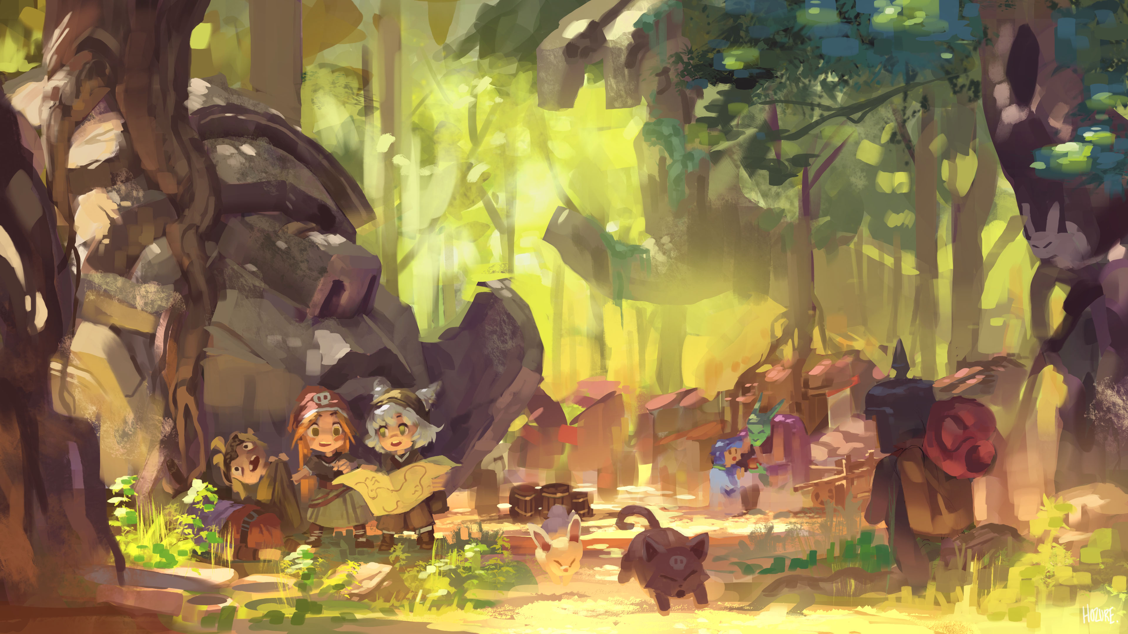
Here I did you a quick write up. I've been studying composition a lot lately, mainly by just writing things on top of paintings I like and seeing what I think works. The image I posted first with the kind of forest town, it's way too busy. The animals are running: story. Someone is buying something: story, the guy coming to town: Story, the girls reading: Story. These can all be a painting on their own.
Now with time, you'll be able to work something like that into a scene, but right now, the way the background is arranged with all these little details, it's just too busy, there is too much happening so it looks cluttered. The elements are too close together and there's basically just two small slivers of space that has no detail.
For the flower piece, the biggest problem is the arrangement of shapes. It's basically just a few squares. The figures are all the same height, the same basic silhouette, and the scene doesn't really make sense. Like, there's this big flower that's above them that is uncomfortably close, and the characters seem lost but at the same time there is this big gust of wind on the ground which makes no sense. The characters seem oblivious to the other elements, like they aren't reacting to the wind or the massive strange flower, both of which could dramatically affect the characters poses and reactions. I know you could say the flower provides light to read the map, but you know, it's just not very interesting at this angle in particular.
Now your colors and character designs are great, as you know and have heard many times, I do think it's good you're trying a bit tougher of a composition with multiple figures. I would highly recommend doing some studies of people you look up to, not painting or drawing their work, but just writing down what is working in the scenes, find the big shapes, make notes etc on top of their work. you'll learn very quick, I promise ;). Also thumbnail moar <3
RE: Them sketchies - Triggerpigking - 03-28-2017
@Fedodika I think the leaves blowing might be due to the force from whatever's behind them, though I agree it's a bit messy.
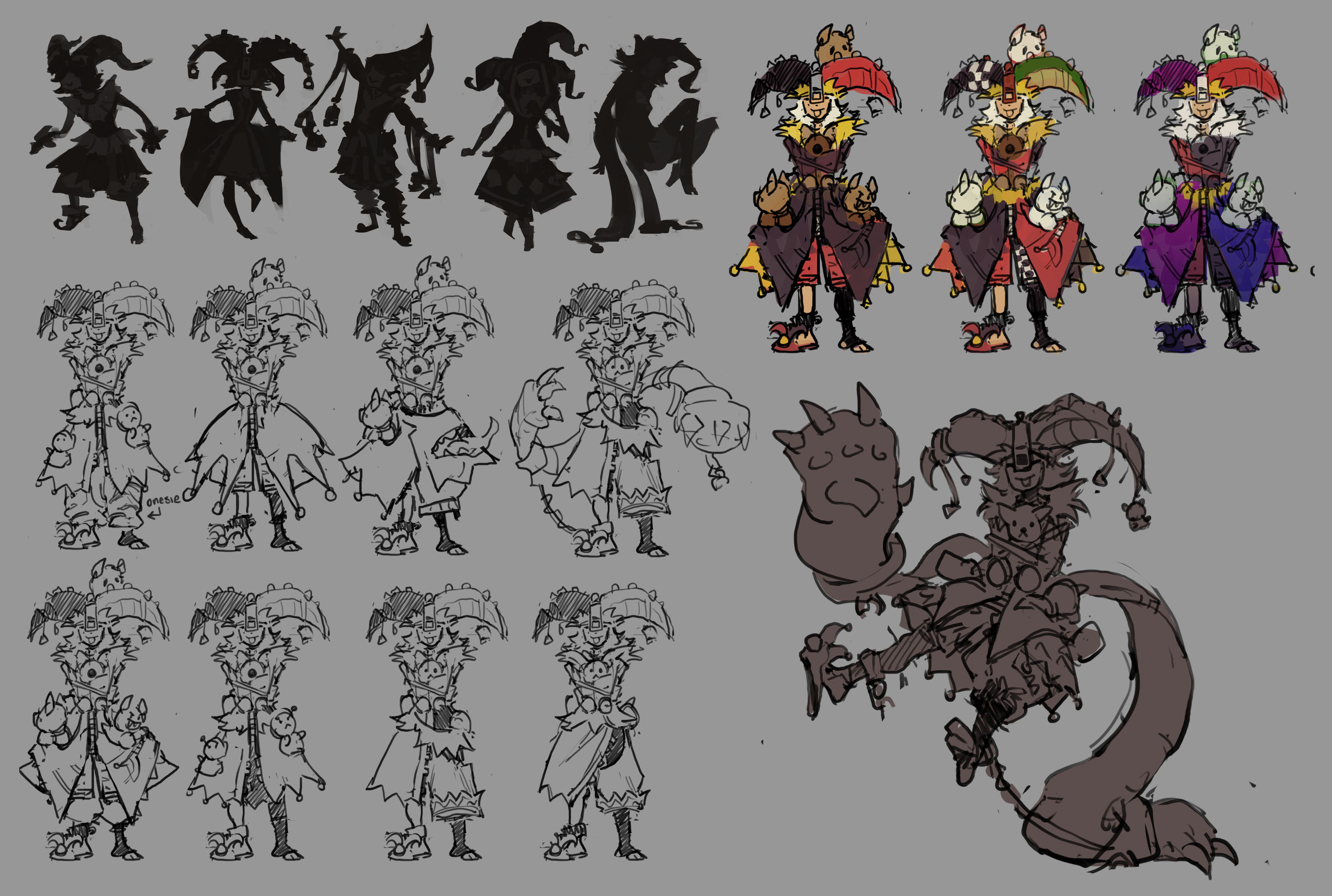
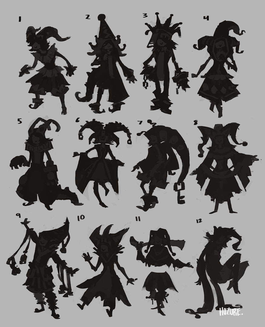
Those Jesters are interesting!, I really like 11, the floating torso is a cool design decision, I also like 2,5 and 6.
About the backgrounds, Krenz did a gumroad vid(he's releasing the second part soon), which might help, he goes very in depth with how to place the figures perfectly in perspective.
Design wise I think it mainly comes down to practice, studying paintings you like and doing more thumbnails.
Thumbnails especially since you said part of your issue is wanting to change stuff midway, experiment a lot more in that phase with compositions and camera angles, should save you a lot of time.
I'm seeing a lot of thumbnail sketches in your SB but not any relating to some of your major pieces like this one.
RE: Them sketchies - Hozure - 03-28-2017
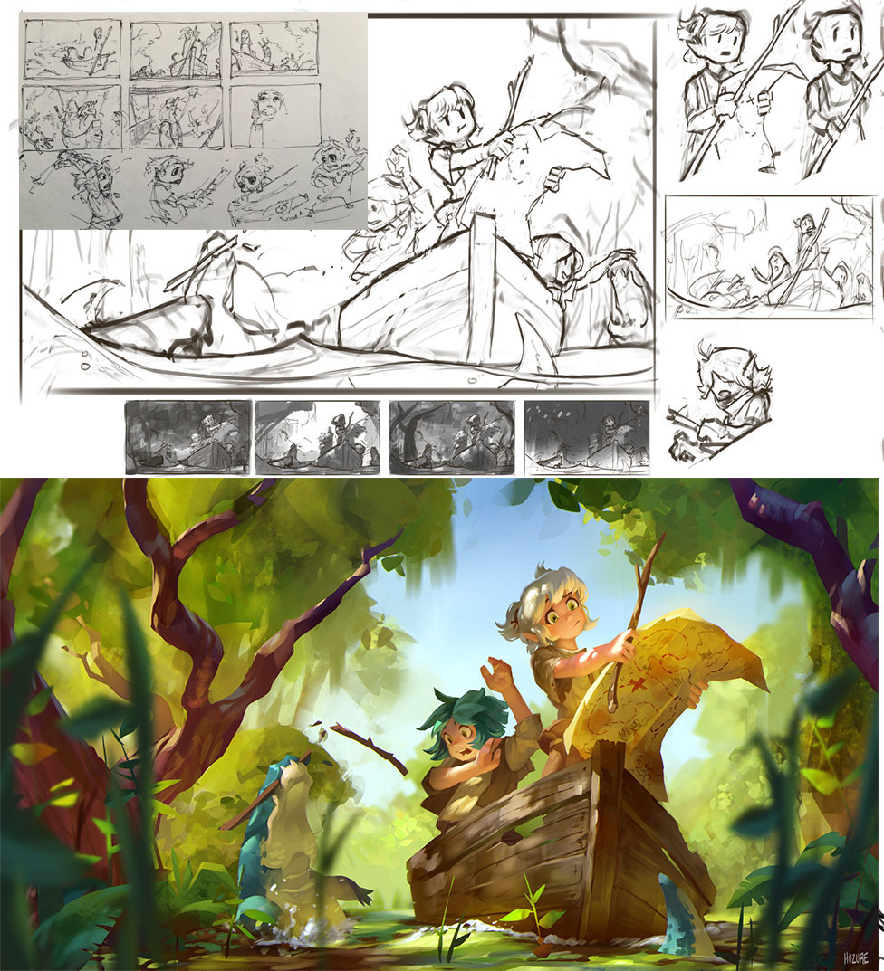
@Fedodika: Thanks man, I really appreciate the effort you put into all this. Little planning, lack of focus, and too many separate things going on at once as you said. Was going for an alternate approach to the swamp one I did below which is a comfort zone composition but obviously I lack the practice to do so, so stuffing in a crap ton of details and elements is my go-to for smothering the nonexistent pre planning. As for looking at other people's work, I'm still super attached to Riot's splash arts, but they all rely on the character(s) being the main focus. Environments alone just don't give me as much interest. Will keep trying to figure it out!
@Trigger: I may invest in Krenz more, absolutely. The thumbnails I've uploaded thus far were under study purposes. For some reason I still feel obligated to upload only studies and personal works are not allowed, especially when I accidentally finish a painting and think "I can't upload this, it's too finished". Probably the dumbest thing ever.
This one was the first out of the three, as well as the only one with even the slightest bit of thumbnailing. God I hate the other two haha.
Update on Lhittle Lhettie with the five thumbnails I liked the most. Hard time figuring out if I wanted the lower half to be symmetrical, as wacky as possible, or whatnot. Symmetrical ended up being more appealing but...who knows. Always open to thoughts~
