+- Crimson Daggers — Art forum (//crimsondaggers.com/forum)
+-- Forum: PERSONAL ARTWORK (//crimsondaggers.com/forum/forum-9.html)
+--- Forum: SKETCHBOOKS (//crimsondaggers.com/forum/forum-10.html)
+--- Thread: Peter's Sketchbook (/thread-8171.html)
RE: Peter's Sketchbook - Peter - 01-30-2024
Happy New Year! (albeit rather delayed), still alive and kicking. Apologies for not posting the last few months, ended up suffering from really bad burn out and depression so I decided to just take a break from art as a whole whilst re-evaluating things, caught up with friends, got into indoor climbing.
Wasn't 100% sure if I still wanted to pursue art career wise but truthfully can't see myself doing anything else so I felt like it was time to get back into things. Set myself a goal this year to be more active online and in the community with posting my work and talking to others, whilst trying to find a better work/life balance. I was also going to just think over the next year if there is anything else apart from art that I'd like to do career wise incase things don't plan out but trying not to rush things.
Anyway enough blabbering, playing catch up here so I'll be posting some older stuff along with new stuff.
Old Work
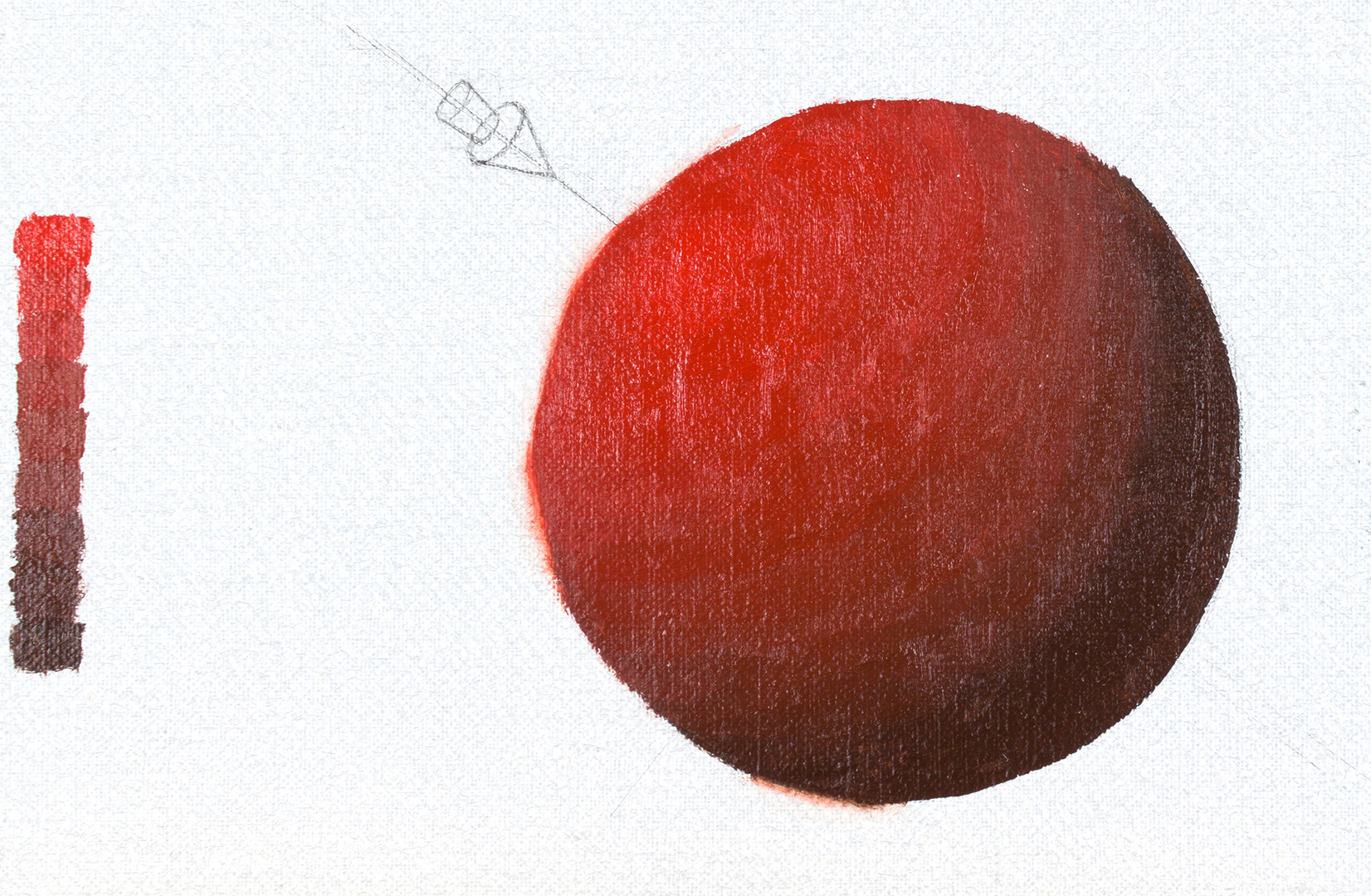
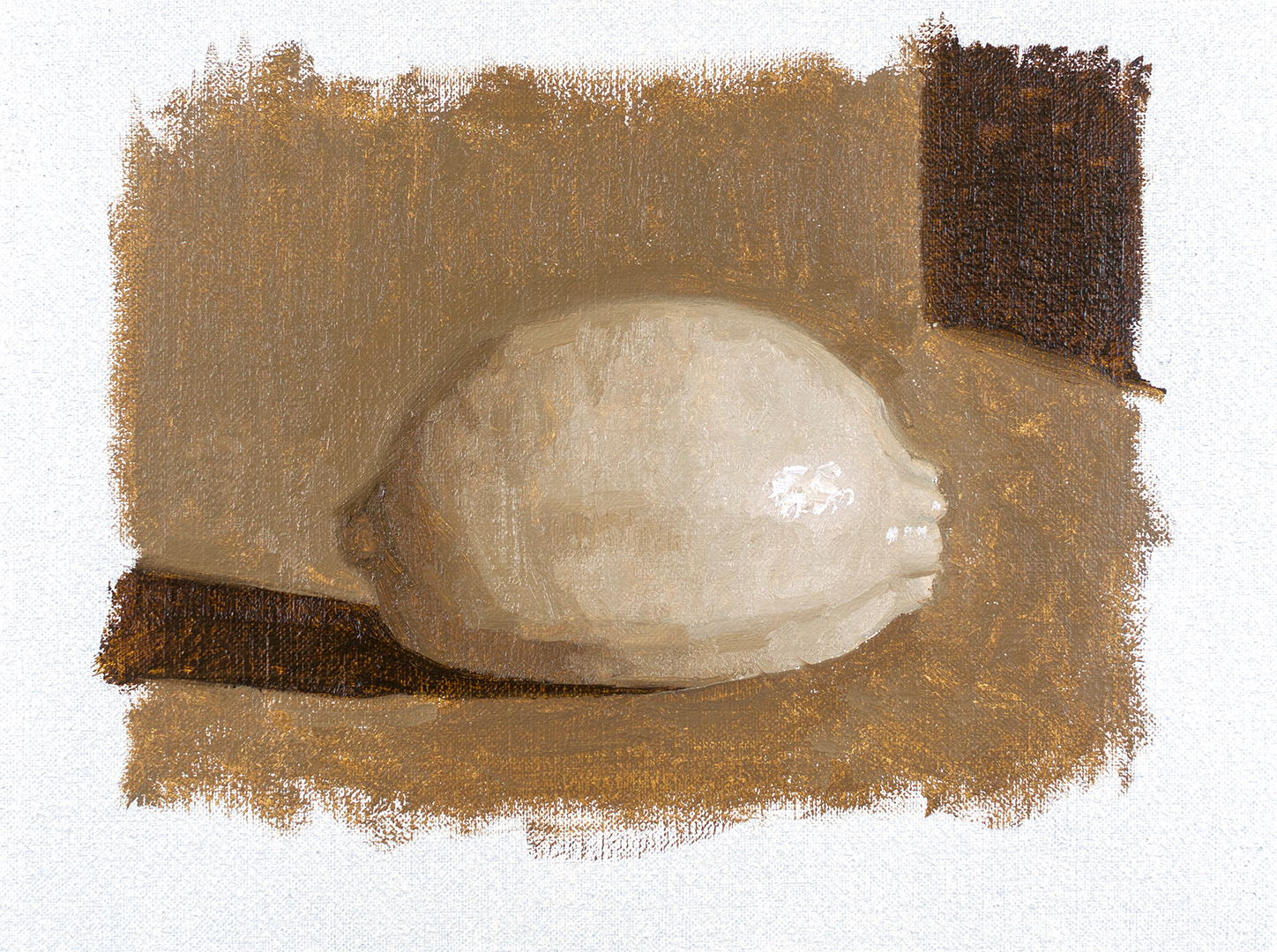
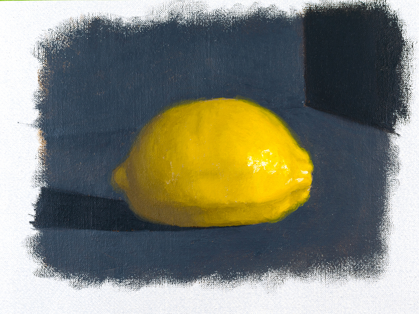
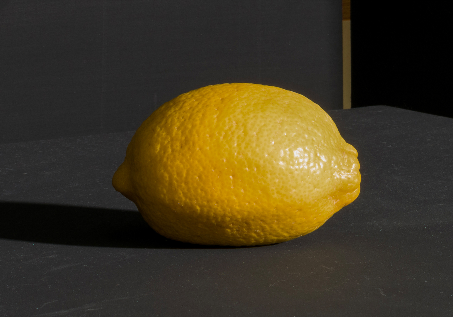
Here are the final painting studies from the GCA orientation class.
Invented Sphere
Lemon Study
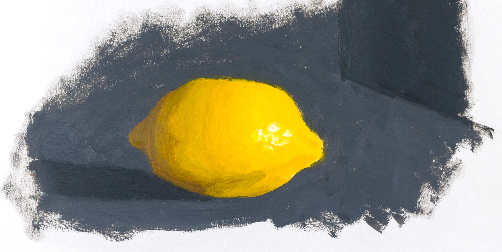
Lemon under painting
Colour
Ref
New Work
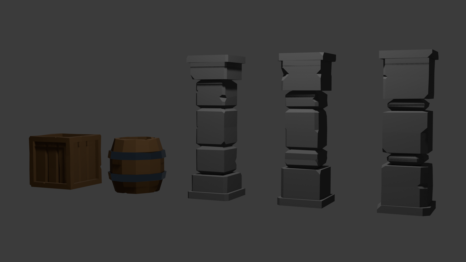
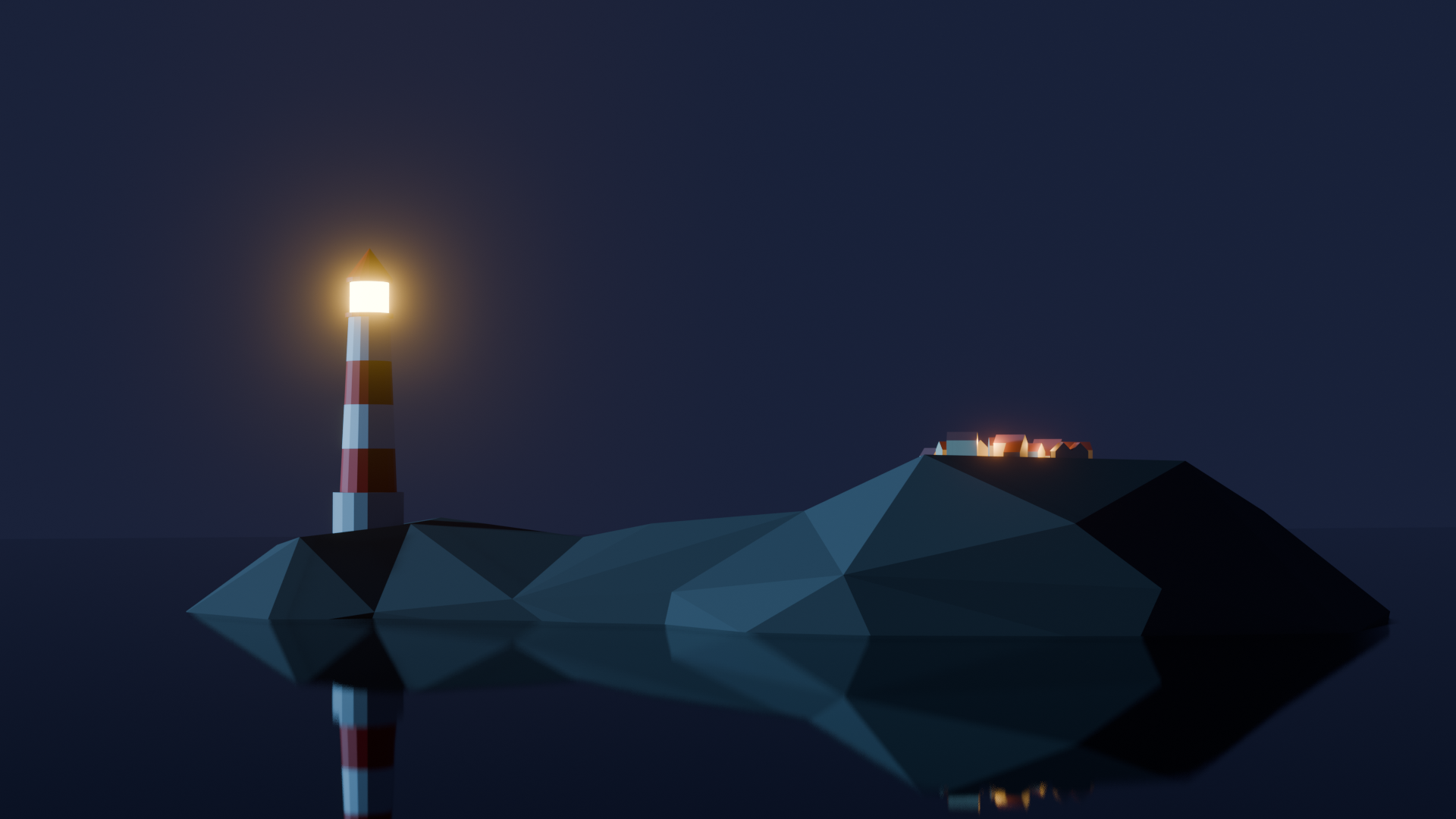
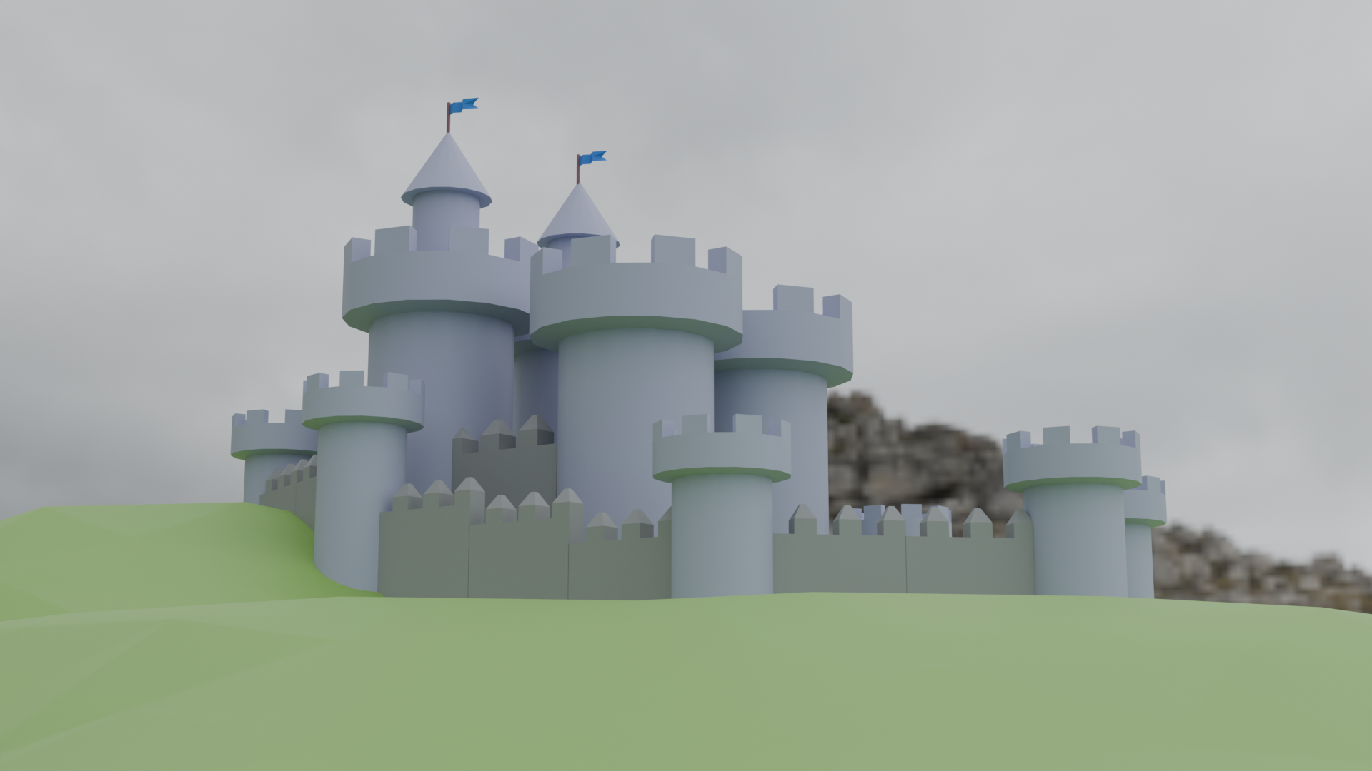
I've been spending some time the last couple of weeks trying to learn blender. Thought it would be good to learn to help me set up scenes for illustrations like interior shots, and outdoor scenes with lots of buildings etc, that way I don't have to mess around with griding these scenes by hand and worry if the perspective is correct.
Bought a couple of classes on Udemy so I've just been working through them.
FAS
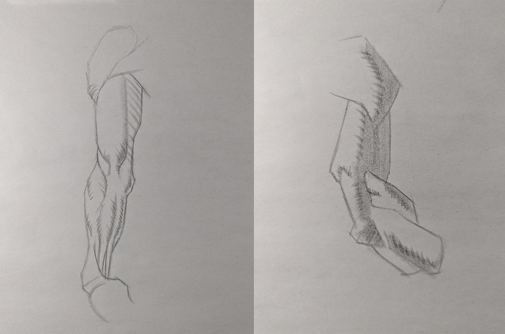
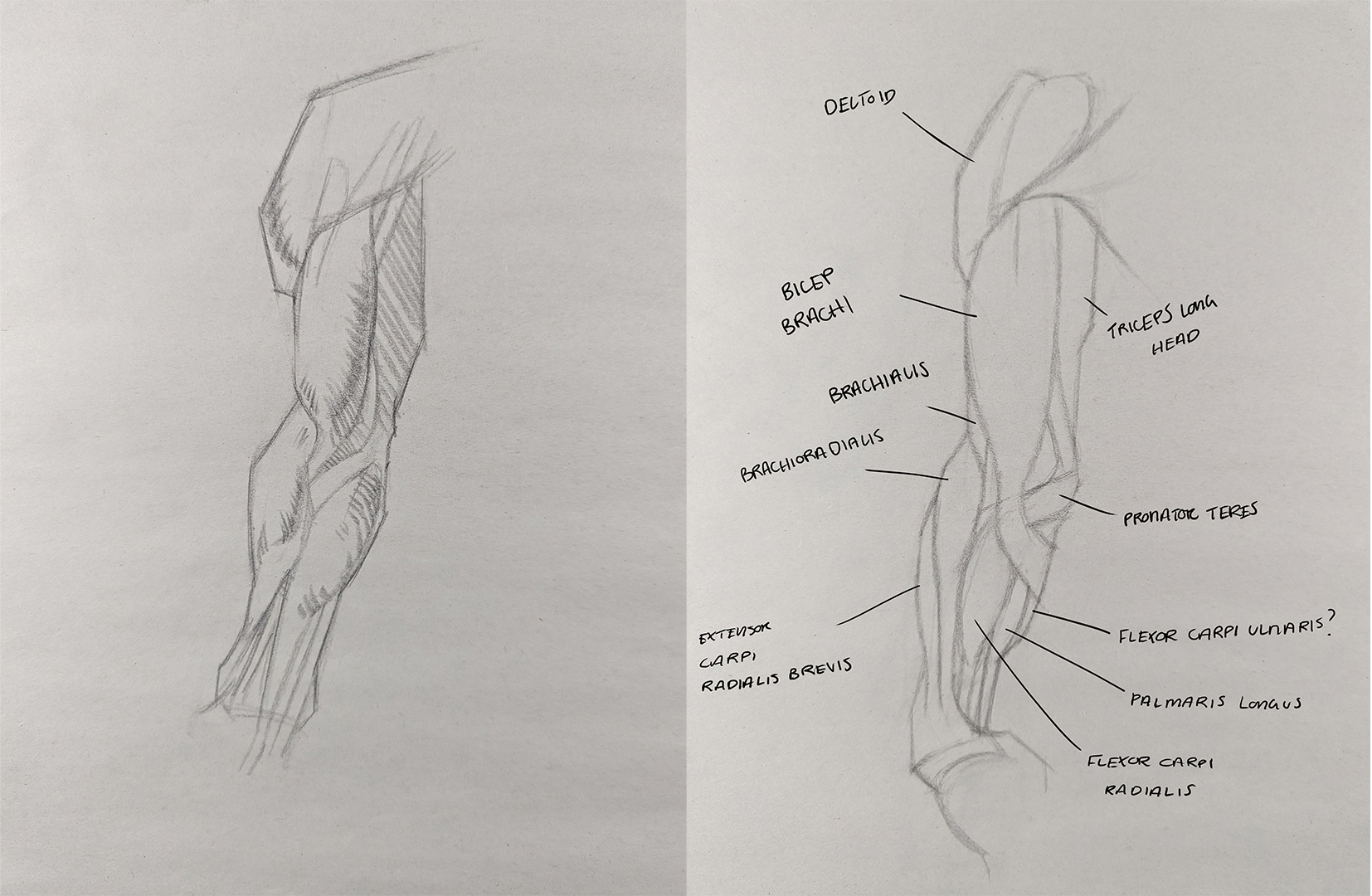
Singed up for another class at foundation art school, this time bridgeman anatomy
RE: Peter's Sketchbook - cgmythology - 01-31-2024
Loving the updates! Great job with the lemon studies, you nailed the lighting and textures there. Nice to see you experimenting with Blender as well, those renders look great! Keep it up!
RE: Peter's Sketchbook - Peter - 02-06-2024
cgmythology - Thanks man! :) Need to attempt making my own objects/scene in blender, so far I've just been following along with the courses I bought and doing the homework, probably cant remember half of the commands haha.
Just a small update. Just getting back into the swing of things, probably wont have the same output as I used to have since I'm still trying to find a nice work/life balance.
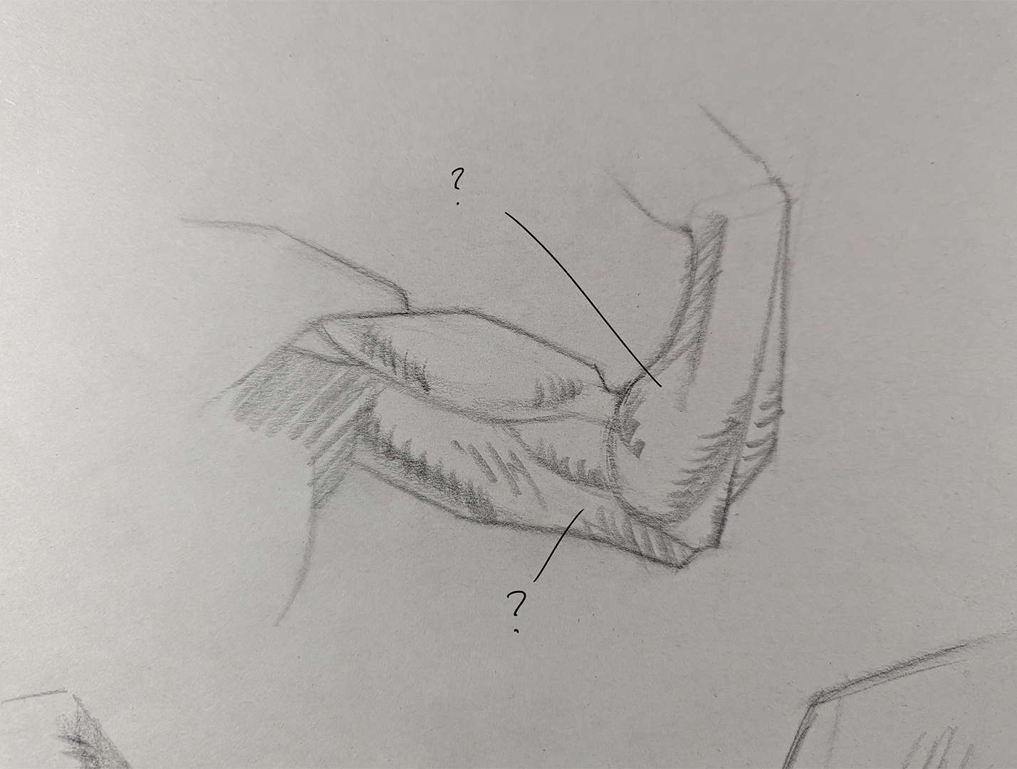
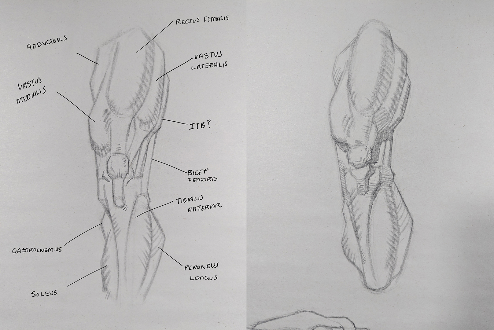
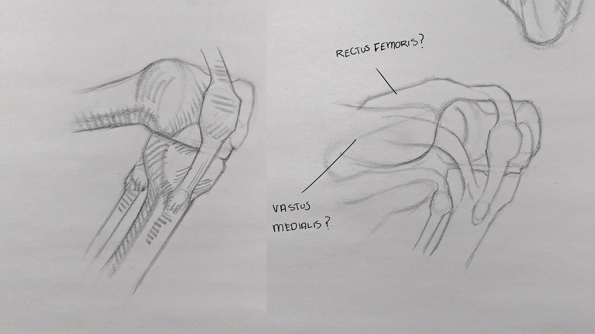
Leg Anatomy
Some Bridgeman leg studies, mainly focused on the knee since I still find it rather confusing.
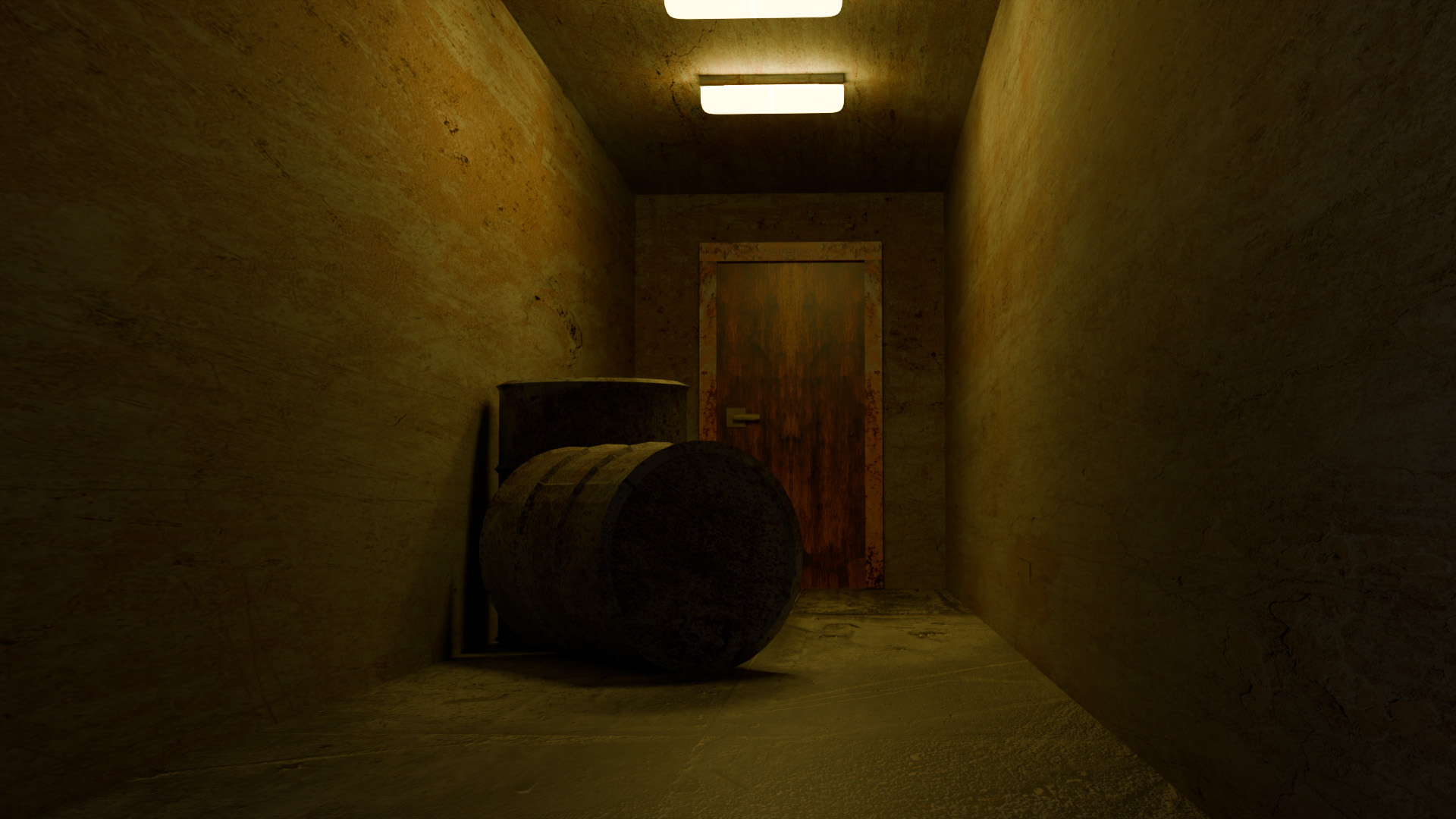
Blender
A spooky interior shot of a corridor as part of the assignments from the udemy course I'm working through. Main focus of this assignment was to address uv mapping of textures for the scene.
A family member has asked me to create a illustration for a book cover her group are putting together so I thought this would be a good opportunity to try and use blender and see what I can do, just need to get back into painting and have some practice since it's been awhile.
RE: Peter's Sketchbook - cgmythology - 02-08-2024
Nice anatomy studies! Loving the latest blender piece, excellent incorporation of lighting with great atmosphere, nicely done!
RE: Peter's Sketchbook - Peter - 08-05-2024
cgmythology - Apologies for the late reply and thanks! It's been a few months since I last used blender so I really need to use it again since I've probably forgotten so much.......
Didn't realise it had been so long since I last updated! No excuse really, just been busy with work/life and trying to fit enough time in to study whilst still having some time relax.
My output the last few months hasn't been as much as I would have liked, like to think I'm being more thoughtful though in my studies/work rather than blindly drawing/painting which I think is the better approach.
Anyway here is some stuff from the last few months.
Book Cover
A family friend asked me to create a book cover for her creative writing group which sounded like fun so I happily obliged.
Rough Comps
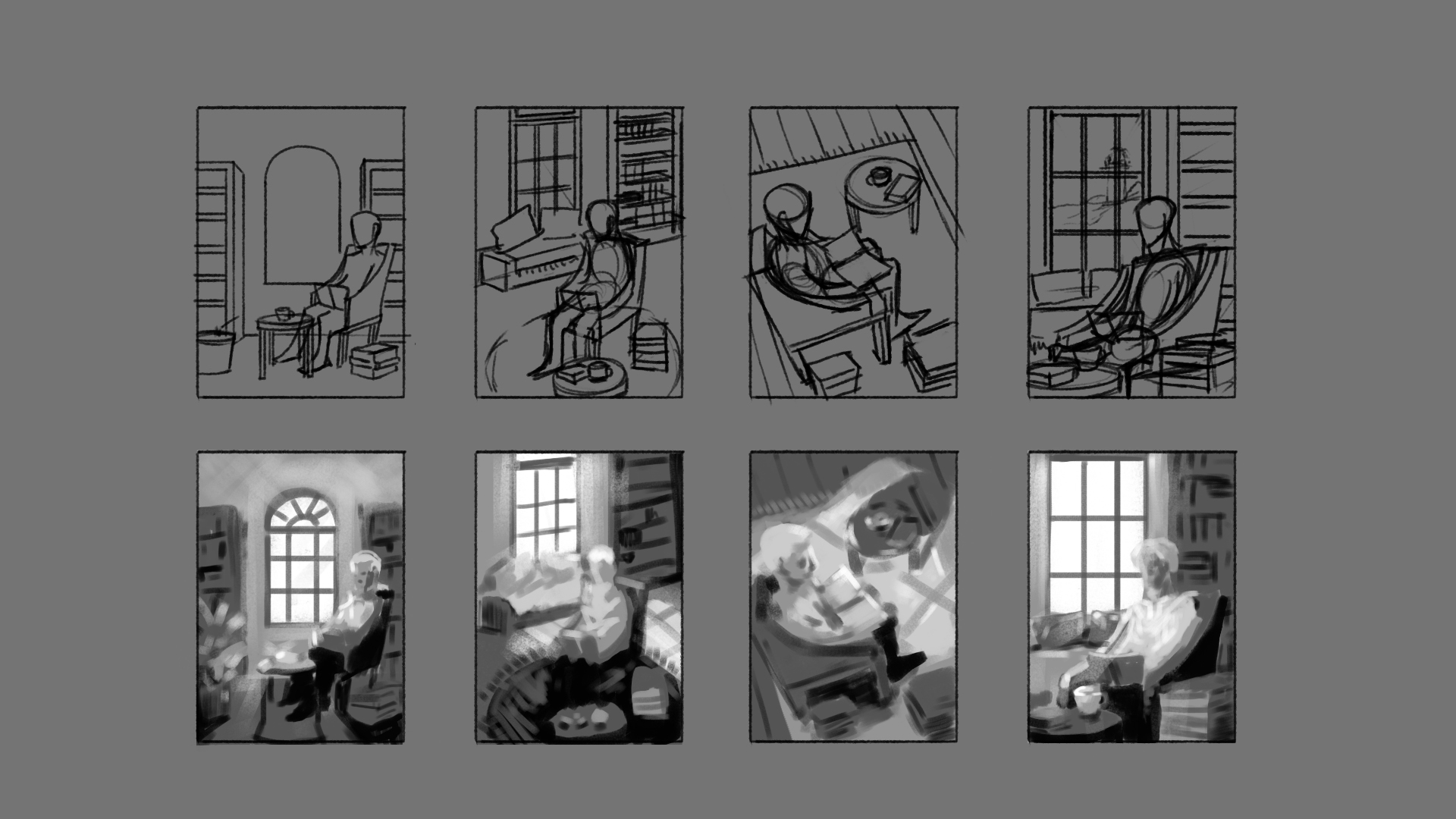
She already had a rough idea of how she wanted the cover to look, which was to have someone sitting in an armchair surrounded by lots of books so I drew up a couple of variations from different angles. In the end she and the group liked the 4th comp.
Colour Comps
Used my recently acquired Blender skills and recreated my rough comp which I used as reference for the finished drawing/lighting and played around with some different colour options. 3 was my strongest which is the one they ended up going with. They also decided that they didn't want someone sitting in the chair.

Revised Comp
Got some feedback after I sent them the colour comps which was to add more books to the scene and a writing pad. I was also able to get the final dimensions to the finished book size hence the slight change in size.

Finished Cover
Decided to paint the cover rather than finish it digitally. Wish I chose to go the digital route in the end as the deadline was moved up significantly, which only gave me 3-4 days to paint it, and since it was during the week I had even less time since I had my day job.

I like some parts of it but really wish I had more time to take it further as I feel it it is still lacking. They where happy with it which is the main thing, have been thinking of working on it some more for my sake and try and take it to a level I am happy with.
Portrait Painting
I've also been working on my rendering skills as it was pointed out as an area to focus on when I had some portfolio reviews last year. Rather than paint the whole thing alla prima like I usually would I decided to take my time and work in layers to really take it to a nice polish. In the end I was quite pleased with this.


Digital Illustration
Recently I've been working on a digital fantasy illustration. I was made aware of swatches academy by a user on another art forum so I decided to give them a go and try something new since it is something I have never done before. Just taking the self study option and following along and have been enjoying it alot.
It's 8 weeks in length and you create a fantasy illustration based on a MTG brief.
Week 1
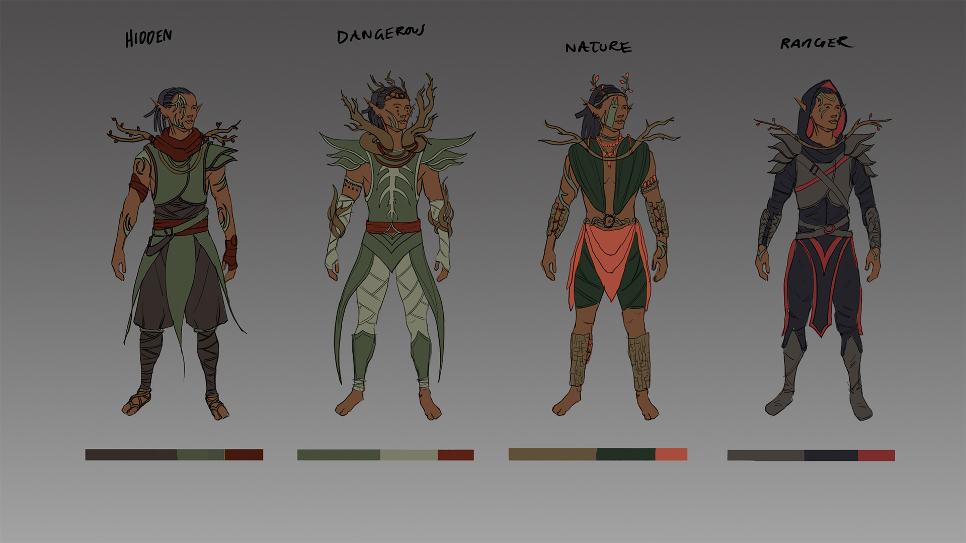
Character Designs based off the brief which was for an elf in a forest setting. Ended up choosing design 1 as I felt it fitted the brief best.
Week 2
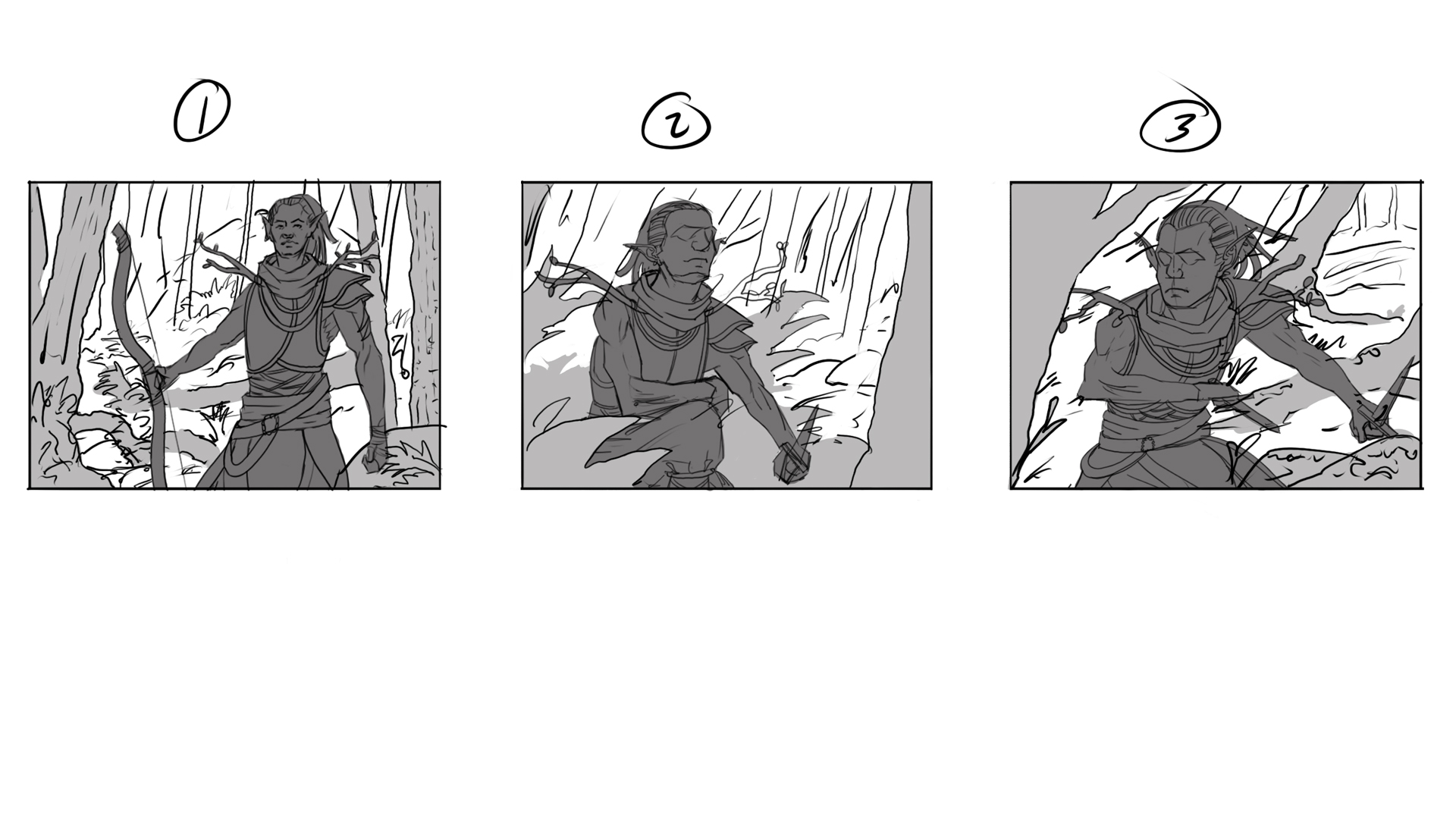
Rough comps. The brief asks for the character to be stalking in a forest setting, either up in the trees, or down on the forest floor. They have to be carrying either a bow or dagger/s and to be depicted from the waist upwards. Decided to go with the 3rd comp as I felt it was the most interesting.

Week 3
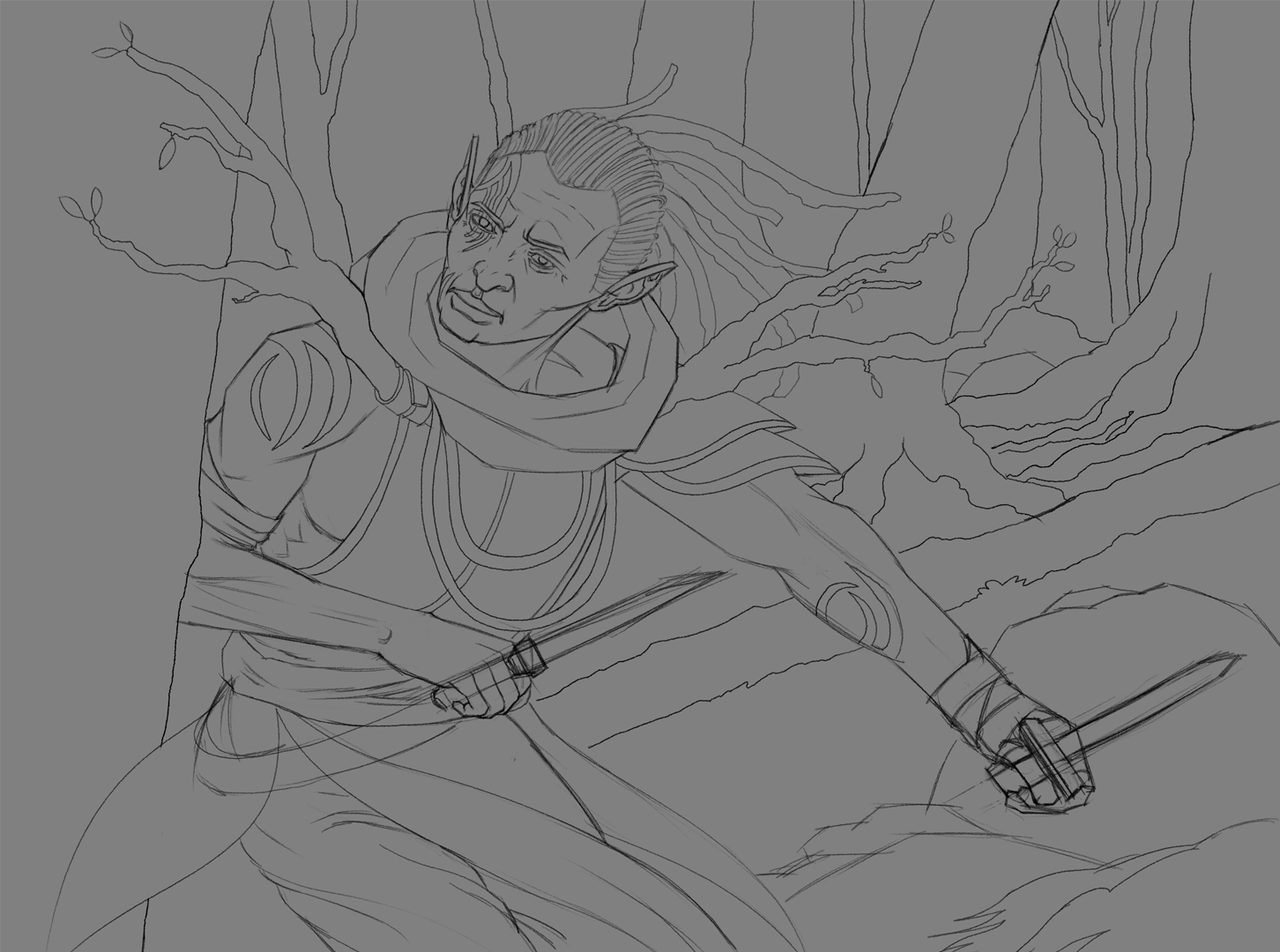
Line drawing. This is where I am currently at. I've shot/gathered some reference and have started the line drawing. Plan is to finish it this week and to do some notan studies, and hopefully I can start painting it next week.
Going Forward
I'd really like to start getting paid illustration jobs and work towards packing up my day job so my plan for the next few months was to redo my portfolio and have a mix of some digital fantasy illustrations, aswell as some traditional illustrations based on short stories. I've been reading some short stories and already started an a rough comp for one which I'll get back to once I finish this digital piece.
As always any feedback is always welcome :)
Hopefully I can find time next week to post an update.
RE: Peter's Sketchbook - ThereIsNoJustice - 08-05-2024
That looks like a good start. I would reconsider a few small things, though.
The overlaps of the tree on the left and the figure and clothing looks a bit strange to me. The thumbnail looked better to me. With the tree on the left and the figure slightly further apart, and with the tree having a branch coming out and that is framing the image a bit better.
The other thing that stood out to me is the angles. The daggers are lining up, and lining up with the path (or fallen tree?) in the background. Again the thumbnail looks better on these angles.
RE: Peter's Sketchbook - Jephyr - 08-08-2024
Heya — The book cover and portrait are looking great!
RE: Peter's Sketchbook - Peter - 12-20-2025
Back again after a long break.
Life got busy, and posting here slipped away from me for a while, but I’ve really missed being part of an arts community, so I’m trying to get back into the swing of things and not be as shut off as I have been.
No huge updates — I’ve just been quietly practicing, making new pieces, and trying to keep improving bit by bit.
Right now I’m working on putting together a new, more fantasy‑focused portfolio, which admittedly is taking alot longer than I had thought as the only chance I get is after work and evenings.
Here are a few things since I last updated, I'll try and keep it brief.
Art Competitons
Pushed myelf to enter more competitions over the last year, mainly to try and get more exposure. Unfortunately it didnt lead to anything but it is what it is.
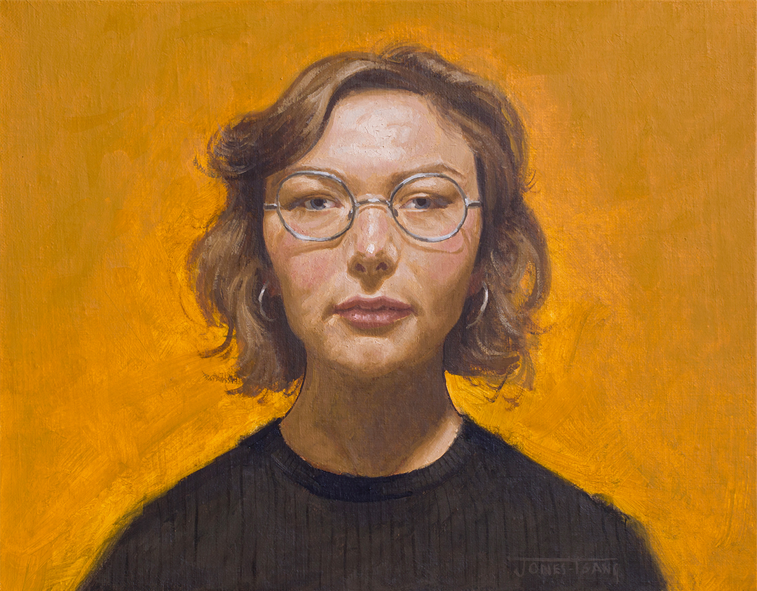
This was for a portrait/figure painting competition.
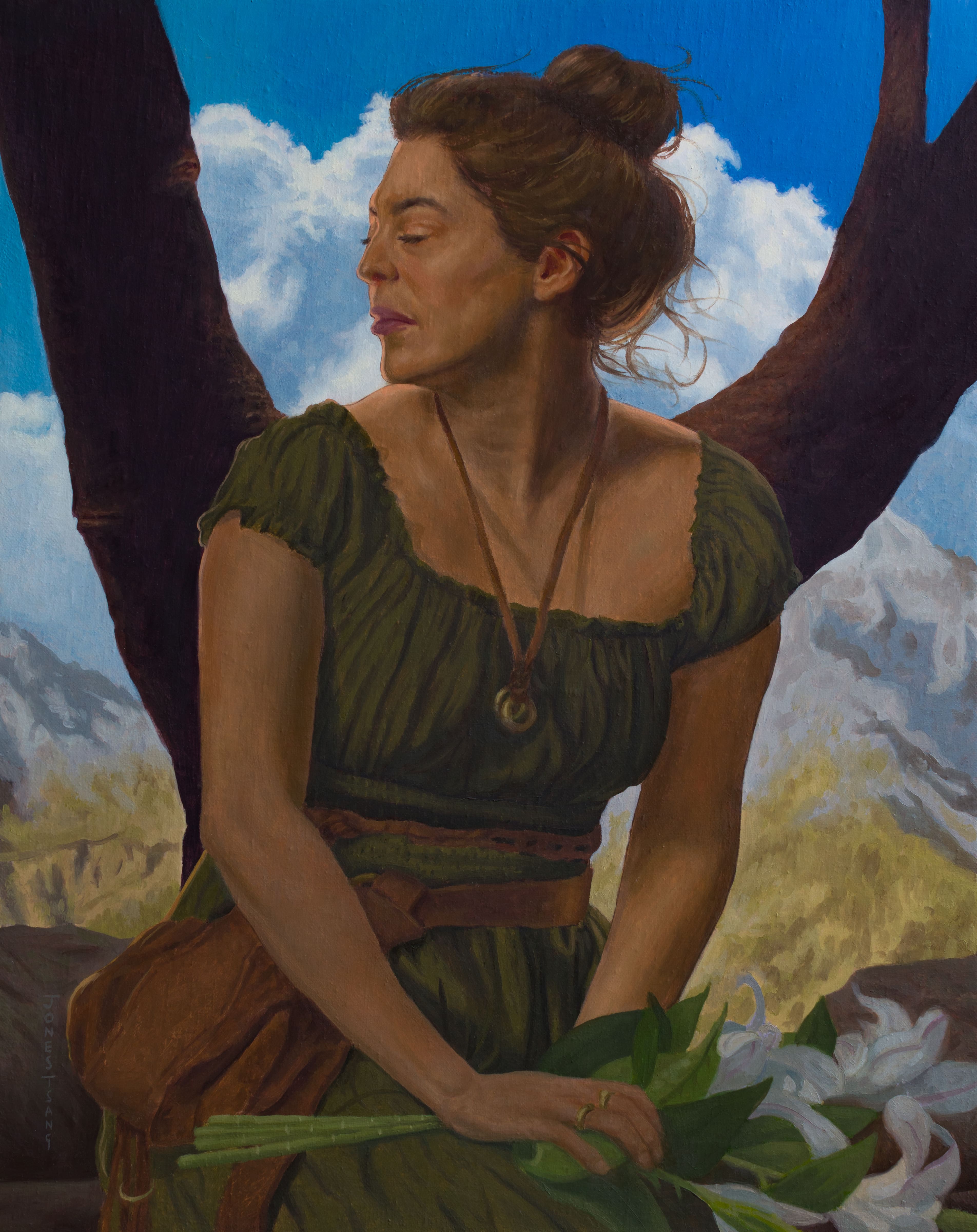
This was just a general art competition which didnt have any set rules in terms of theme etc. I took inspiration from Alphonse Mucha's "Seasons" paintings and reinterpreting it, this one being based on Summer.
Arts Club
I was asked by a local arts club back in the summer to paint a portrait for an exhibition they wanted to put on for members, with the theme being a narrative portrait, i.e. showing the stages of a portrait painting from start to finish.
I wont bore you with each step so I'll just post the final image.
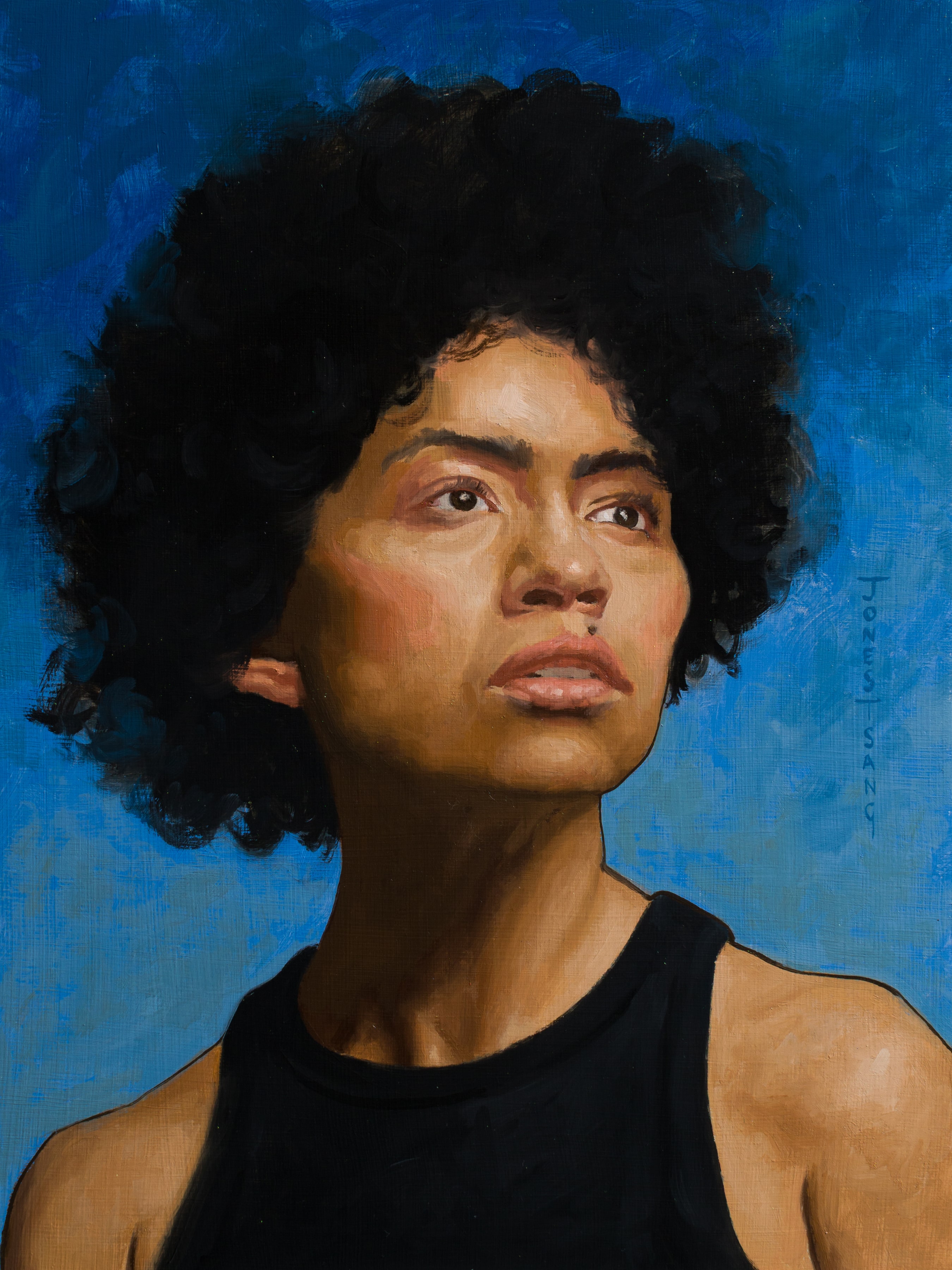
Had a lot of fun doing the work for them, was abit nerve wracking as I had to get up and give a 10 min talk to a room full of people but they all seemed to enjoy it.
Character Design
Bought a few classes from swatches academy as I wanted to work on my digital skills and to get an insight into how people tackle fantasy as it's something I dont have lots of experience with myself.
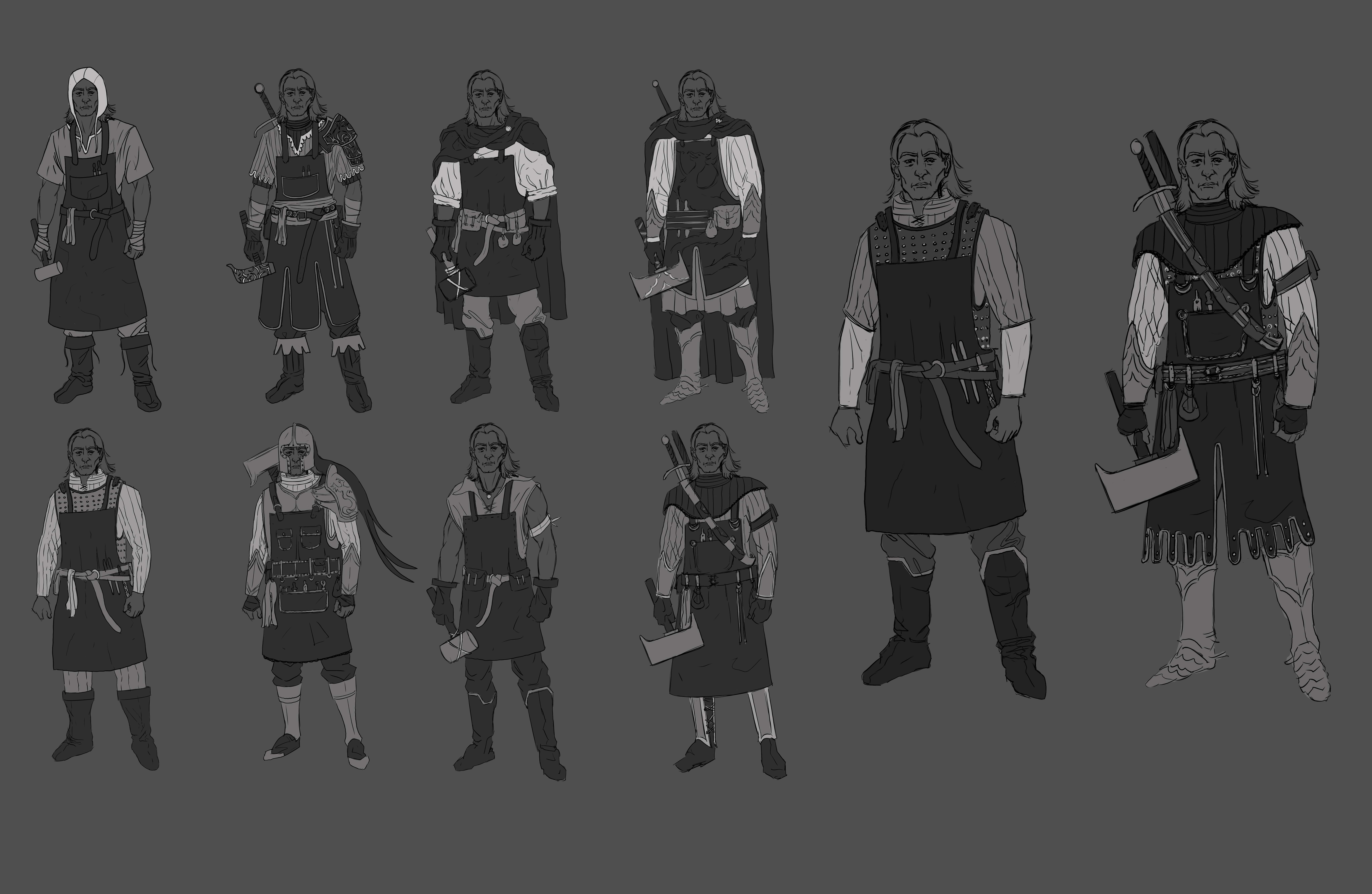
These where my rough designs

Selected my favourite 2 designs from the above, cleaned them up and experimented with colours.
This is where I'm currently at with it. I was working on it during the summer just before the arts club contacted me so I had to put it on the back burner.
Man Horse
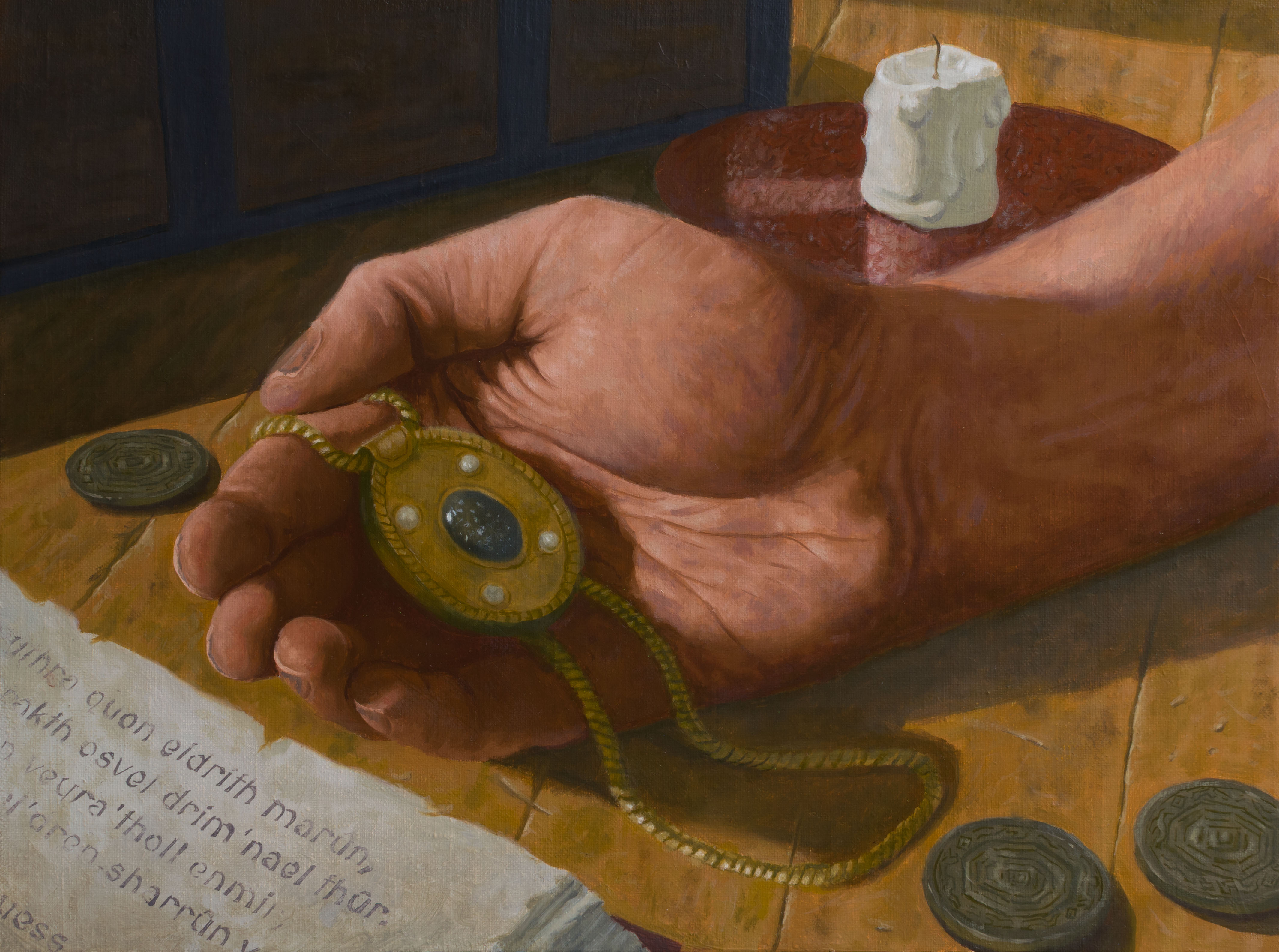
As I mentioned I've been trying to create more fantasy illustrations for a portfolio, I was spending some time reading some fantasy short stories as I thought they could be useful for briefs. This was based on a short story by an Irish author.
.jpg)
The latest peice I've been working on is based on one of the briefs from swatches academy, specifically a mtg inspired brief depicting a corrupted knight midcharge at the viewer, with his left arm being covered in black tendrils inspired by innistrad.
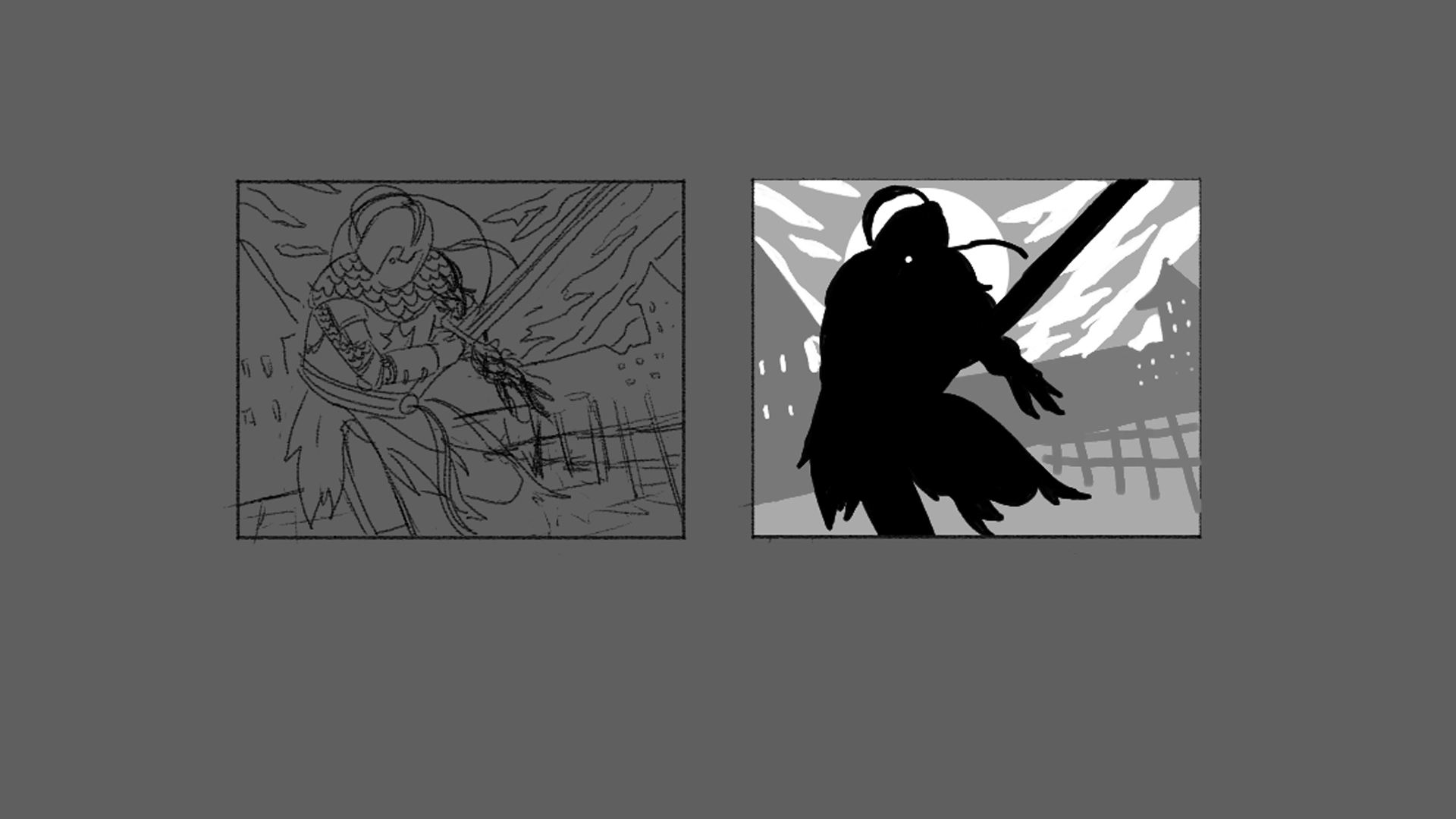
This was my rough comp along with a quick value comp.
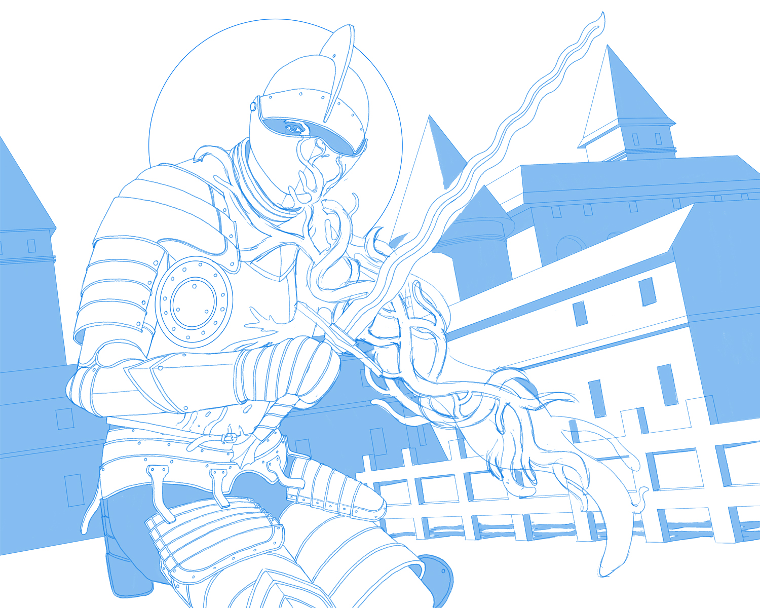
This is where I'm currently at with the drawing. Spent alot longer on reference stage for this one since drawing armour is not my strong suit. Ended up creating a mock up in blender for the background and to help with lighting.
Taking abit of a break from it atm and just planning out the next few illustrations I want to create for a portfolio, all being based on briefs from swatches academy, just torn on whether to try and paint them digitally or stick with oil painting.
RE: Peter's Sketchbook - JosephCow - 12-21-2025
The painting of the hand holding the necklace looks amazing! incredible detail, especially on the words in the book. It's so difficult to actually paint text. And all the cracks and dents on the table have depth to them which must have taken some time.
RE: Peter's Sketchbook - one_two - 12-21-2025
Nice oil paintings, man!
RE: Peter's Sketchbook - Crowbit - 12-23-2025
them traditional paintings are quality!!!!!
RE: Peter's Sketchbook - Jephyr - 01-01-2026
Good schtuff! Love that second portrait and the 'fantasy illustration.'
RE: Peter's Sketchbook - Peter - 01-10-2026
JosephCow - Thanks! :) I don'tt think the cracks and wood rendering took ttoo long in the grand scheme of things actually, I was using the process from Swatches Academy to help me with the wood and found it helped reduce the total time it would have ttaken me otherwise. With the words in the book I actually just arranged it all in photoshop on a text layer (using copilot to help me make up some random looking fantasy text) and warped to get the perspective right, then I just printed it onto a piece of paper, put oil paint on the back and did a transfer to my surface using a pen :)
one_two - Thanks for the kind words :)
Crowbit - Hahaha cheers!
Jephyr - Aww thanks! glad you like them
Ok back with some more work. I've been working through the Materials Rendering Course from Swatches Academy. Actually bought the course ages ago and made a start on itt but other work got in the way and it got put on the back burner. Thought I'd spend a few weeks now working through the entiretty of the course as I will help me finish off the character design that I posted last time.
Week 1 - Stone and Wood
Here's my attempt at creating some stone squares and wooden boards with a breakdown for each stage - and then trying to apply those princples to some simple forms that the course provides the line work for.
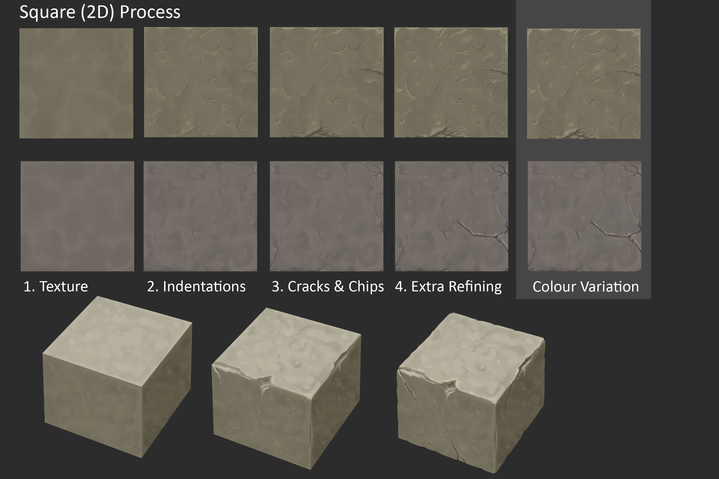
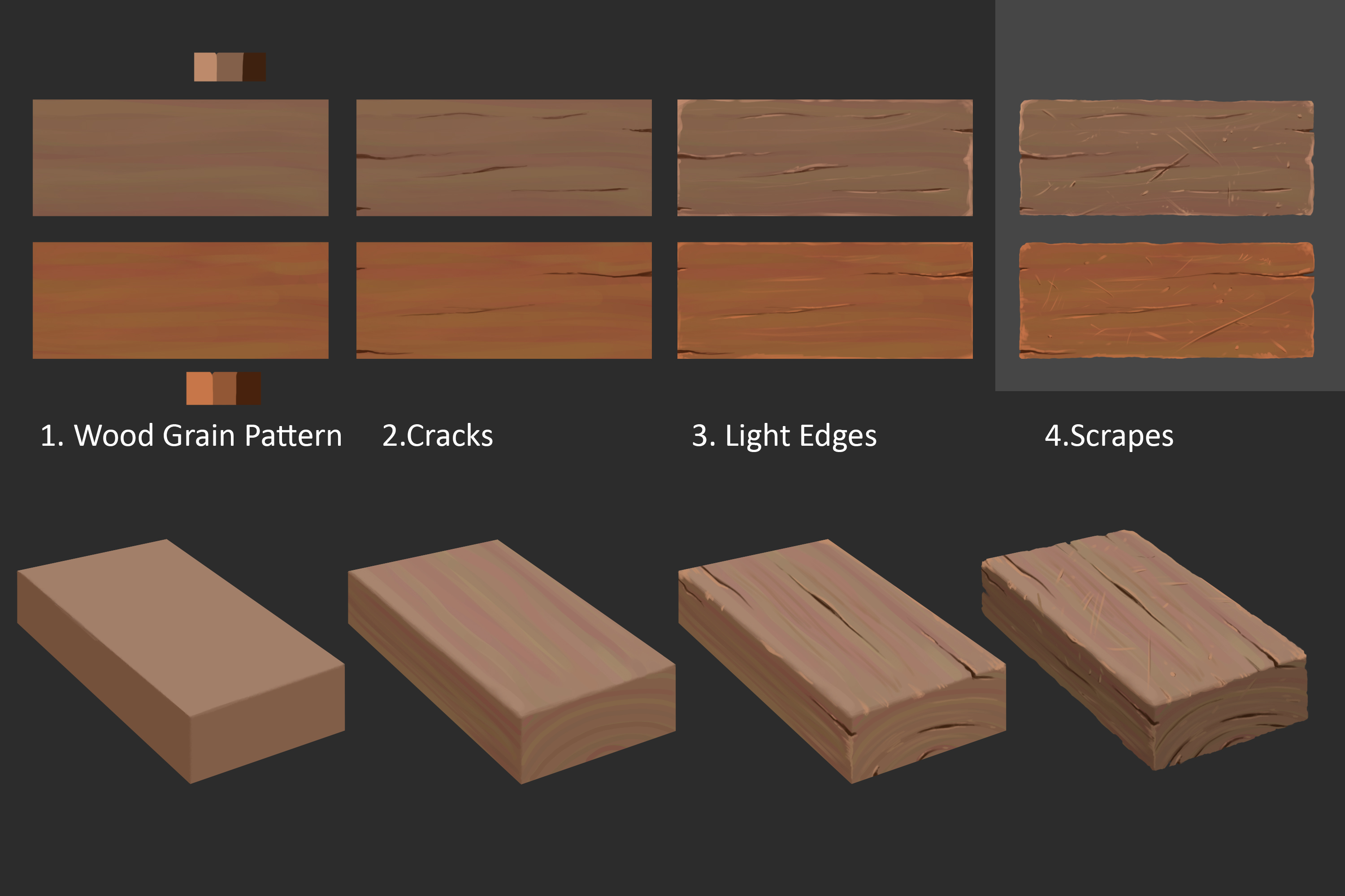
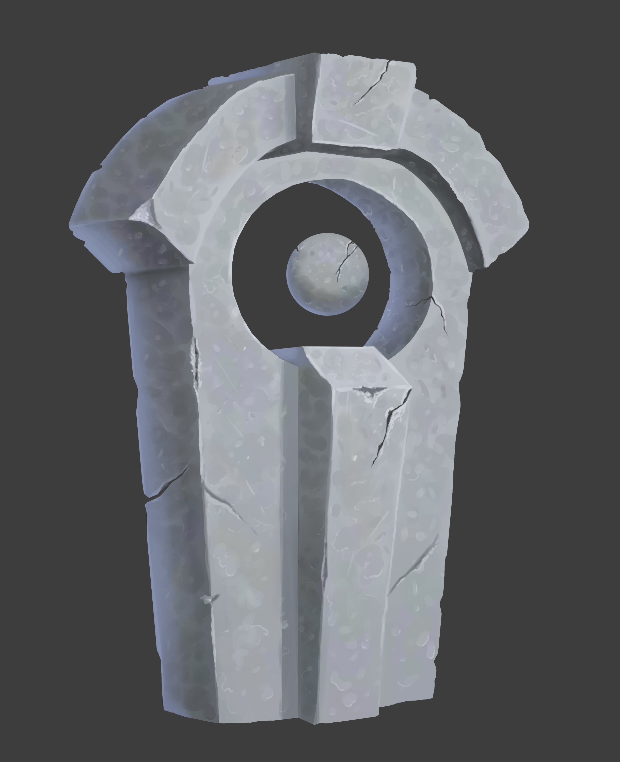
I think it looks ok? for a firstt attempt atleast, my digital skills can use some improving but I'm hoping that since I can paint decently tradtionally that I can pick this up quicker.
As I said my plan was to spend tthe next few weeks working through the whole course and then come back to each lesson seperately, do some more studies, and have another crack at these homeworks before I attemptt the final homework for the course which is to create a prop scene.
RE: Peter's Sketchbook - cgmythology - 01-10-2026
Awesome texturing! I like the subtle color shifts as well, I feel that's something important that many artists can tend to leave out when texturing. Keep it up!
RE: Peter's Sketchbook - JosephCow - 01-10-2026
ahhh using transfer for the text is genius. I was gonna say I was literally zooming in like surely that part is done digitally, but no it's paint. Honestly I probably wouldn't have thought to do that
The rock and stone textures look really nice. I've definitely seen those swatches assignments before and i kinda want to try them.
I feel like the stone sculpture has some super hard edges here and there that seem inconsistent with it being old and weathered, but I think they are both getting there!
RE: Peter's Sketchbook - Peter - 01-18-2026
cgmythology - Thanks! I feel like one of the good things about this course is helping me get a bettter understand of photoshop, I know the main functions but little tricks like enabling color dynamics (which Is what I did here for the colour shifts) is something I probably wouldnt have known about hahaha.
JosephCow - Hahahahaha I was surprised myself by how well it turned out truth be told, I thought it might work out ok but I'd have to go and clean it up afterwards but nope! :) I definitely work better with a set structure/process which I find this course does really well, would have liked for a paint over video of past students attempts/the instructors attempt at the homework but sadly there isnt one with the course. Yh I definitely agree about the hard edges, kinda felt like these took alott longer than they should have but I'm guessing it's becuase I dont have much practice with digital painting.
Definitely want to do some more studies and then attempt all these assignments again once I've worked through them once already to help cement the ideas.
Not a whole lot this week as my time has been rather divided. I've started on the week 2 assignment which is painted woodand leather but I wasn't able to finish it this week so the plan is to tick it off this week.
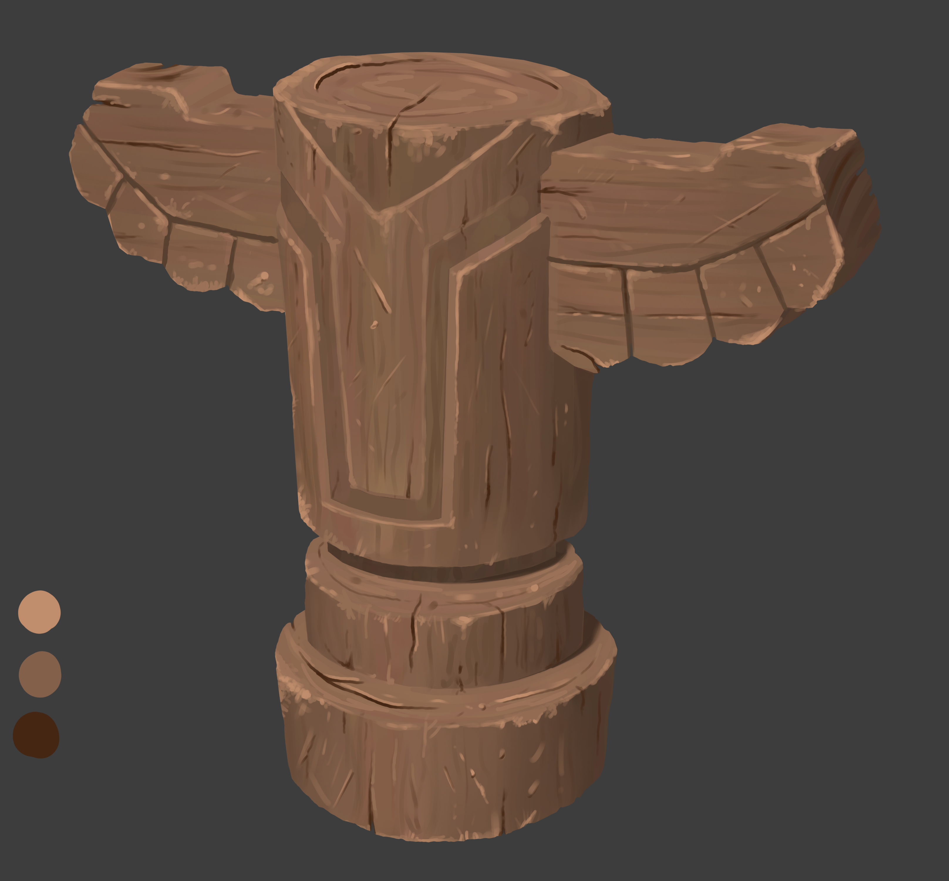
Painted Wood

Here is the first part of the homework which was to complete an observation study and then apply that knowledge to a differentt form to help it sink in. Mainly used the brushes provided to create the wood chips etc but I noticed in one of the slides in the notes that the instructor's observation study was completed using only a round hard brush rather than the texture brushes, so I tried the same for the 2nd cylinder - if that makes sense?
Sketchbook
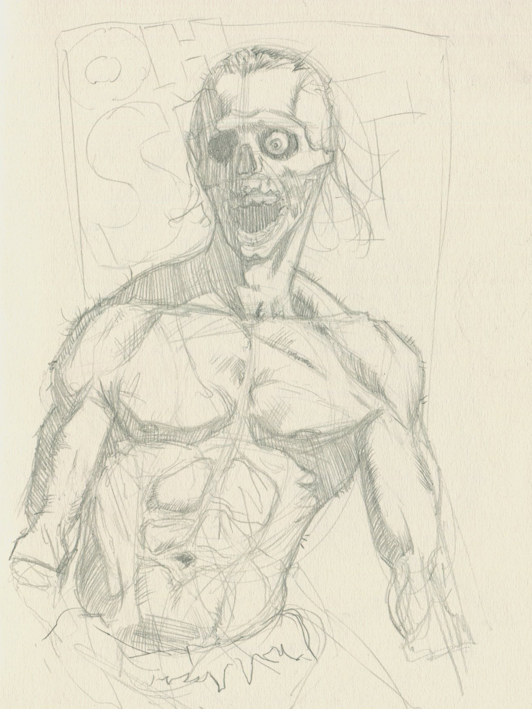
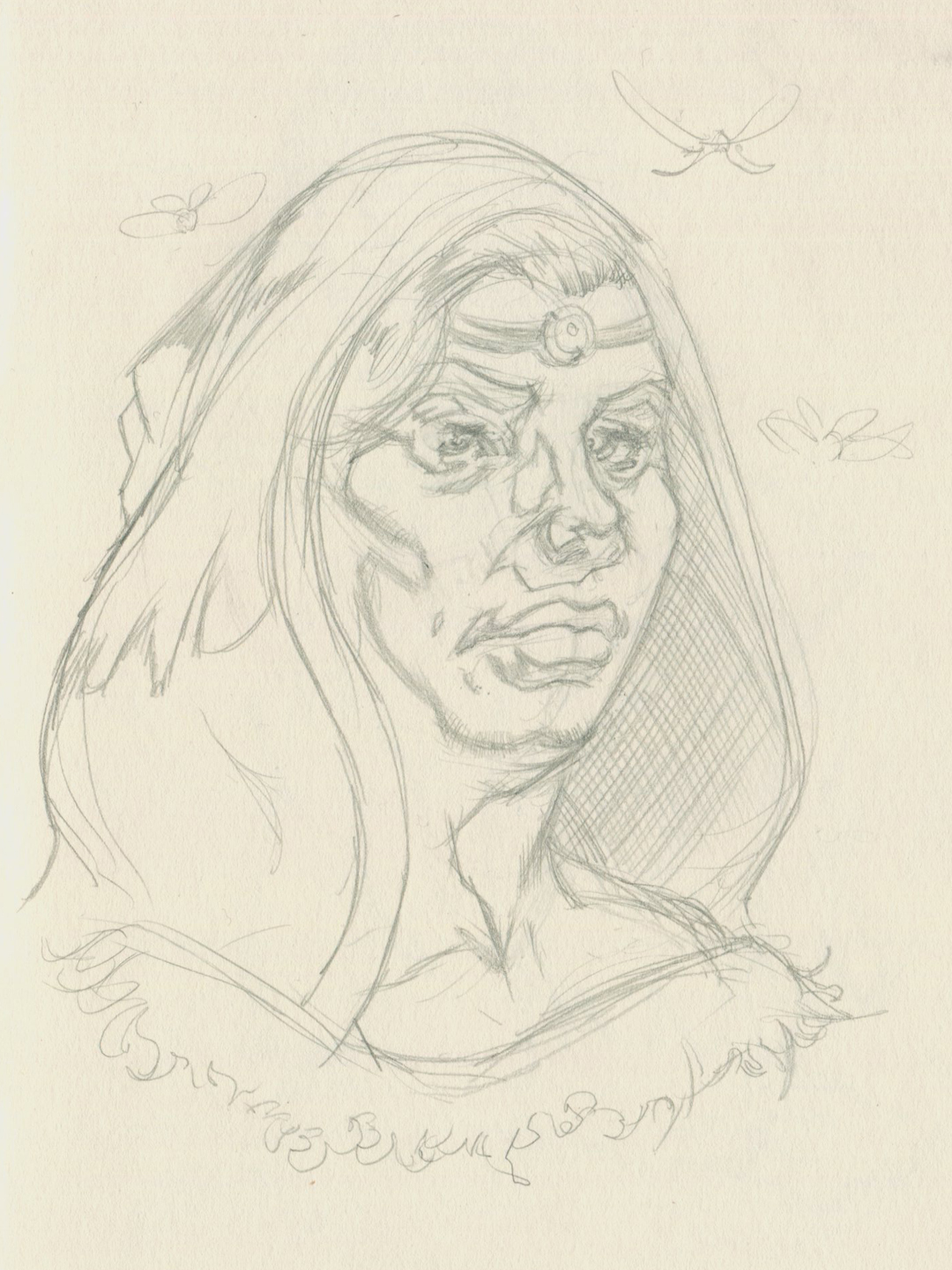
I always forget to share my sktehcbooks so decided to change that and include some random imaginary sketches from a few months back :)
