+- Crimson Daggers — Art forum (//crimsondaggers.com/forum)
+-- Forum: PERSONAL ARTWORK (//crimsondaggers.com/forum/forum-9.html)
+--- Forum: SKETCHBOOKS (//crimsondaggers.com/forum/forum-10.html)
+--- Thread: Nika's Sketchbook (/thread-2764.html)
RE: Nika's Sketchbook - donm - 01-21-2014
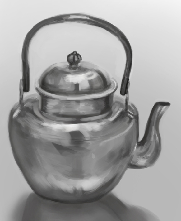
I'm really enjoying the freshness of mark making you have here as well as the subject matter. Maybe focus a bit more on the drawing underneath to give it more dimension. Try flipping the painting back and forth too to see those drawing mistakes. Keep it up!
RE: Nika's Sketchbook - Nika - 01-22-2014
Thx and Welcome to CD Donm! yea, I can see what you mean. Sometimes I sketch like that, but for these I kinda rushed through because of the new painting style, I just like doing it alot.
Thanks for stopping by and I hope to hear about you soon!
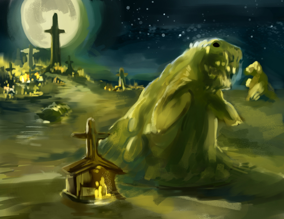
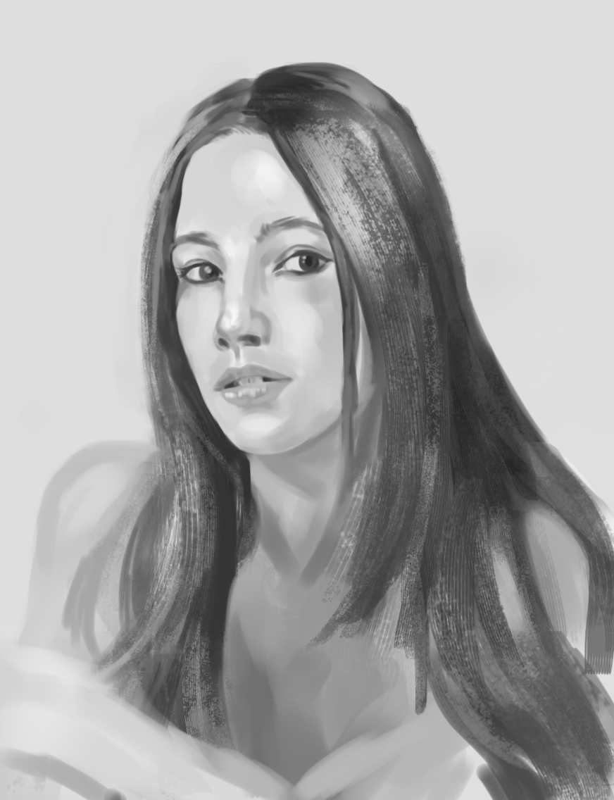
Daily Spitpainting from facebook, theme: Rising from the grave, was done under 30 min
RE: Nika's Sketchbook - Nika - 01-24-2014
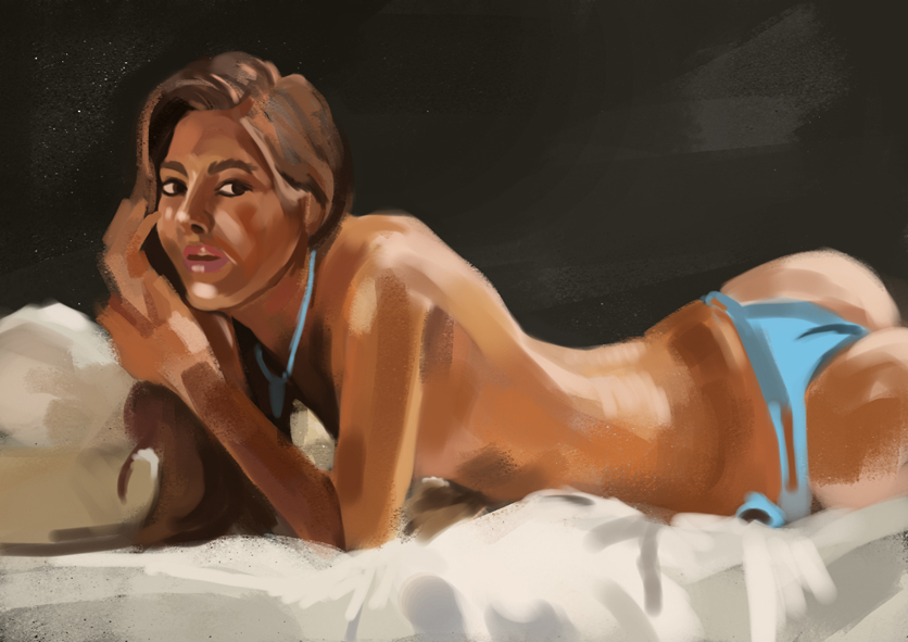
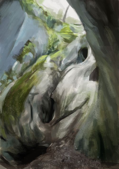
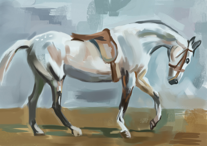
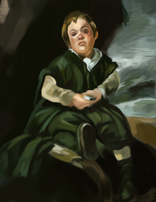
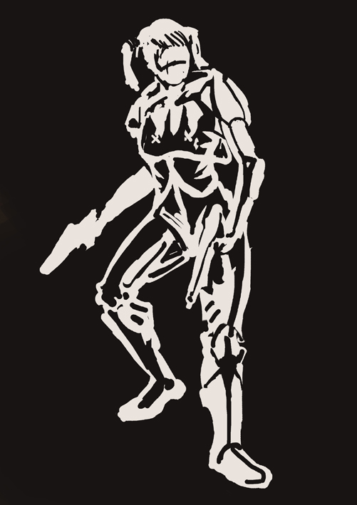
Random stuffs
RE: Nika's Sketchbook - Nika - 01-25-2014
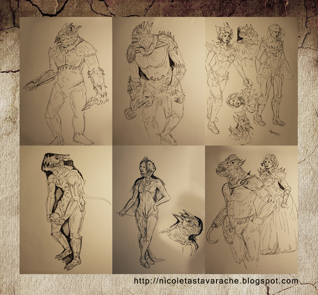
Some sketches from imagination
RE: Nika's Sketchbook - Nika - 01-26-2014
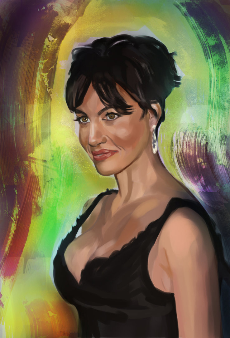
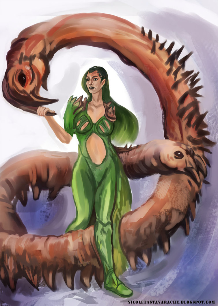
A color study and second piece is from imagination, no ref!
RE: Nika's Sketchbook - Jaik - 01-26-2014
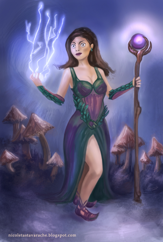
Lots of cool stuff in here. I like the triatric (spelling? Pfft. What ever, I didn't go to art school! Who need that stuff) colour scheme, but at the moment the three colours, red green and blue are all similar levels of saturation. I would porbably tone down the reds and the blues if you want to the character to be the focus. It will make it feel a bit more comfortable to look at.
Keep up the good work though, lots of cool things here :D
RE: Nika's Sketchbook - Nika - 01-27-2014
Jaik, thanks for checking out my work! I appreciate it. I have horrific color issues, I'm trying to correct this though. arggh I need to work harder. I will practice, practice, practice.
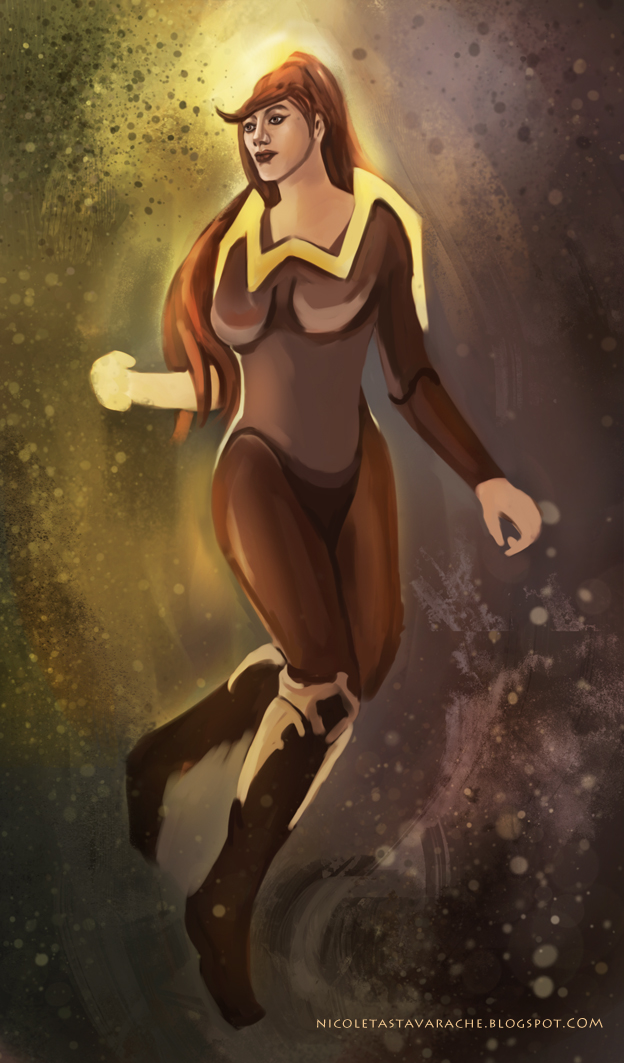
Here's a doodle, no ref.
RE: Nika's Sketchbook - Lyraina - 01-29-2014
Cool color study up there! Just be aware that if you use strong and saturated colors around the face, it can make the skin color look desaturated in comparison.
I like the doodle of your last post - but either I am misunderstanding what's going on with the light at her head, or she lacks a piece of forehead. Always think about where your light source is, maybe make a arrow or two on your canvas to remember where your light comes from.
I've made a little overpaint to show what I mean about the head - if you want to turn the head up or away more, maybe drawing the skull underneath first could help. And as I was in photoshop anyway I simplified the shadows a bit to show what I mean by using a defined ligth source to describe form... sorry for molesting your painting *runs away*
RE: Nika's Sketchbook - Archreux - 01-29-2014
Hey, really nice sketchbook ya got here, there's been a really great amount of improvement since page one. If you keep this up in another 5 pages you'll be twice as good as you are now, haha.
I'm really liking where your stuff is going, especially the brushwork. Continue studying faces, and getting some good gestures in here. There's just a few issues with the facial proportions and stiffness of the poses. Keep going strong! :]
RE: Nika's Sketchbook - Nika - 02-01-2014
@ Lyraina Thank you for advice - you're right, my figures color are a lot dodge. I should pay more attention at the light source...Thank you again for your helpful comment!
@ Archilux, Thanks, you're flattering me. You're right, stiffness of the poses bother me 2, I hope soon I will fix that issue!
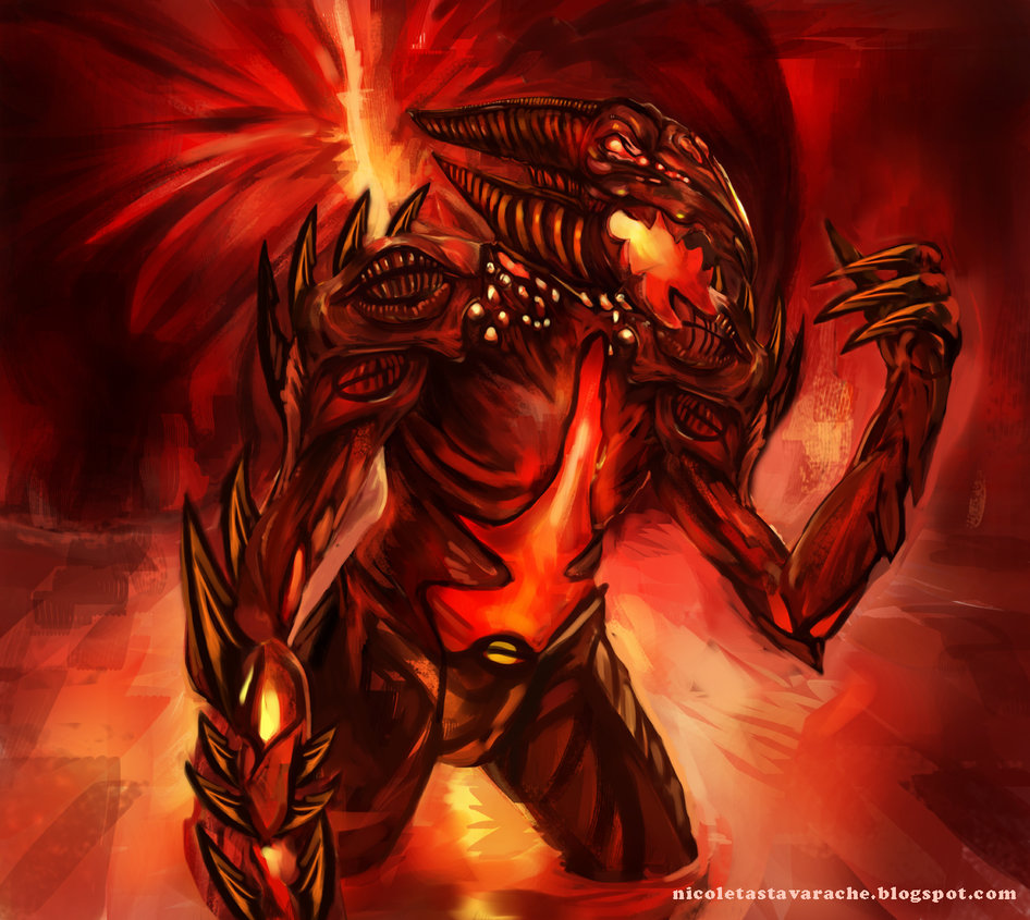
I've tried something creepy so here it is, I hope everyone enjoys it!
RE: Nika's Sketchbook - Lyraina - 02-03-2014
Wow, that's intense! :D Really cool design, love all the fire. If you want the character to really stand out, I'd suggest toning down the contrast and saturation of the background a bit, especially the light at his back, as this competes with the fire-y parts on the figure a bit. Still, very cool (or hot)!
RE: Nika's Sketchbook - Nika - 02-05-2014
Lyraina, Thank you very much! I have a feeling, my design it's still weak especially for theme like horror and sf. I need to improve in these domains.
RE: Nika's Sketchbook - Jaik - 02-09-2014
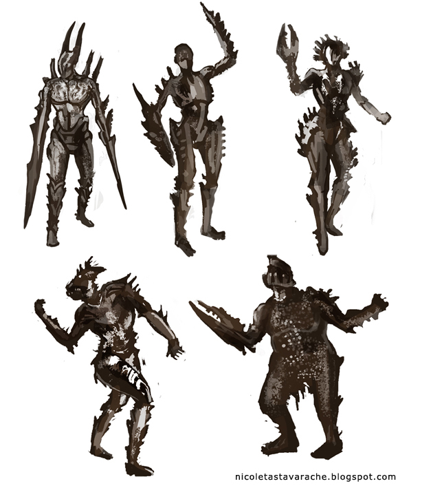
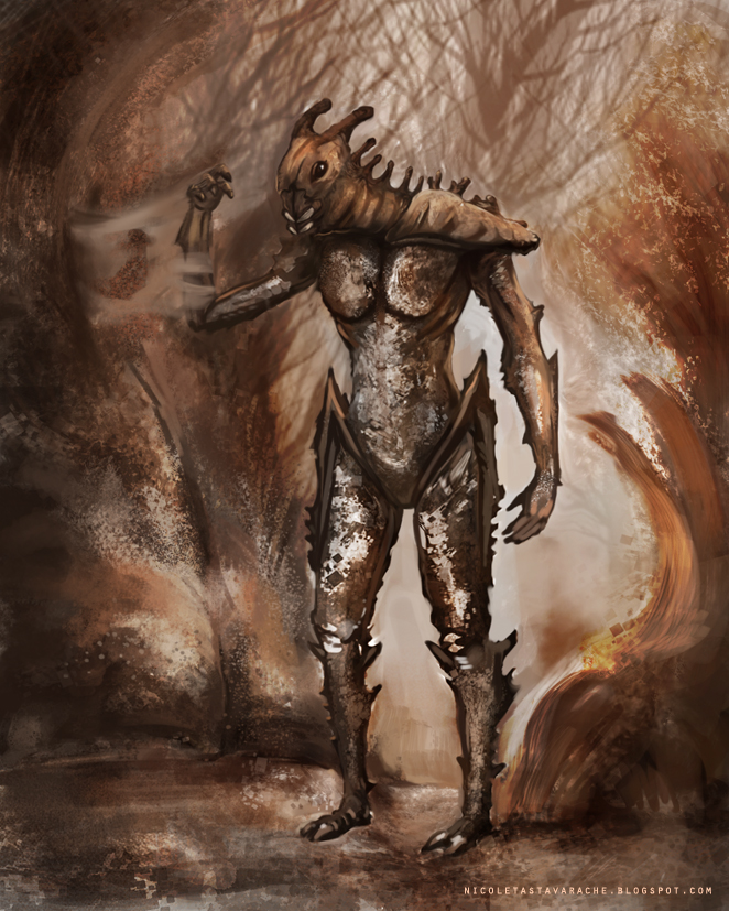
Nice updates. For the bug guy, try alternating the colours in the background to not be the same as the character,. This will make him stand out some more.
I really like the middle sketch in the last post. you should bring it into photoshop and colour it and take it further. See how it turns out :)
RE: Nika's Sketchbook - Nika - 02-11-2014
Thank you very much for stopping by Jaik! I will try to paint that one and thx for advice.
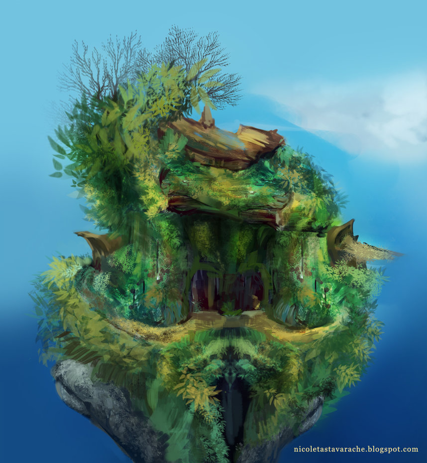
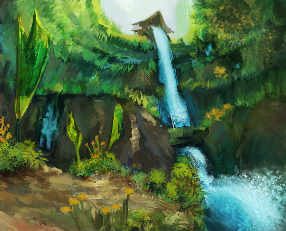
Just messing around with brushes. I wish I had more to show, but I've been busy doing another things these days.
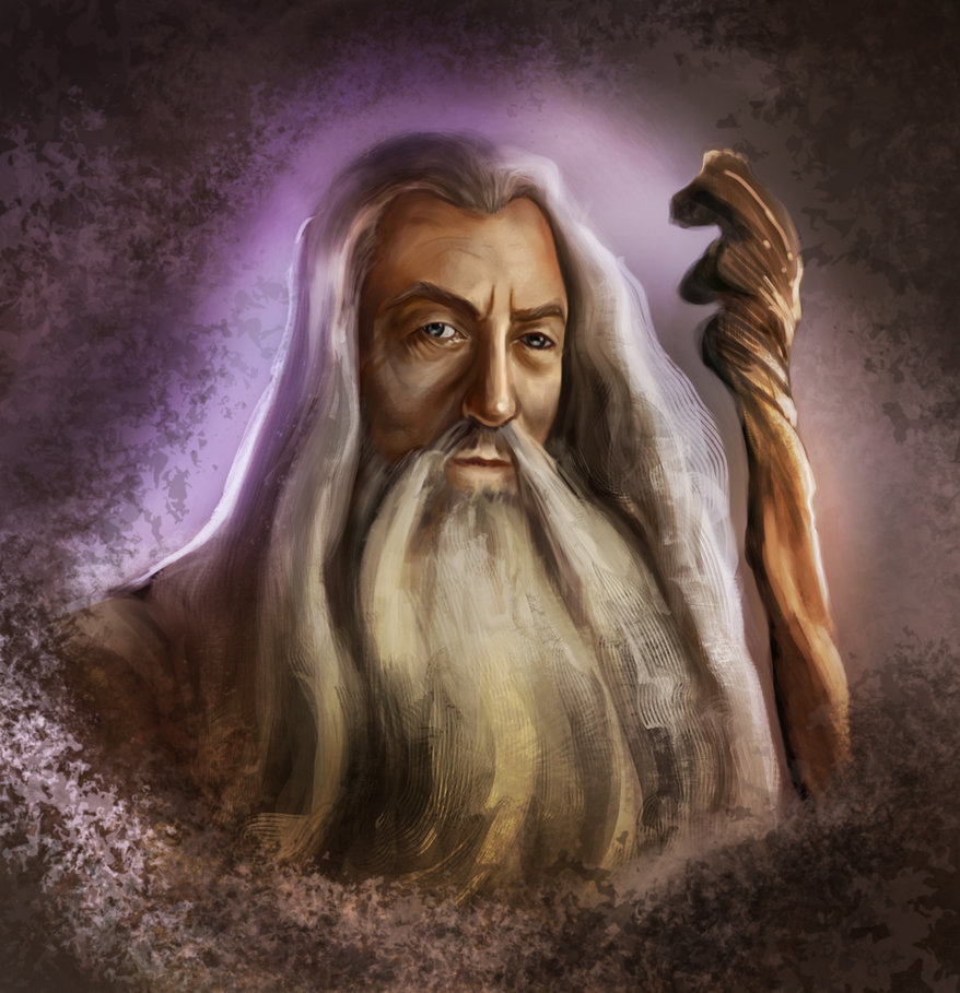
Gandalf's eyes are just another failure! Next time I will try my best.
RE: Nika's Sketchbook - Nika - 02-13-2014
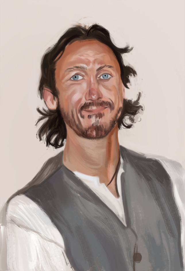
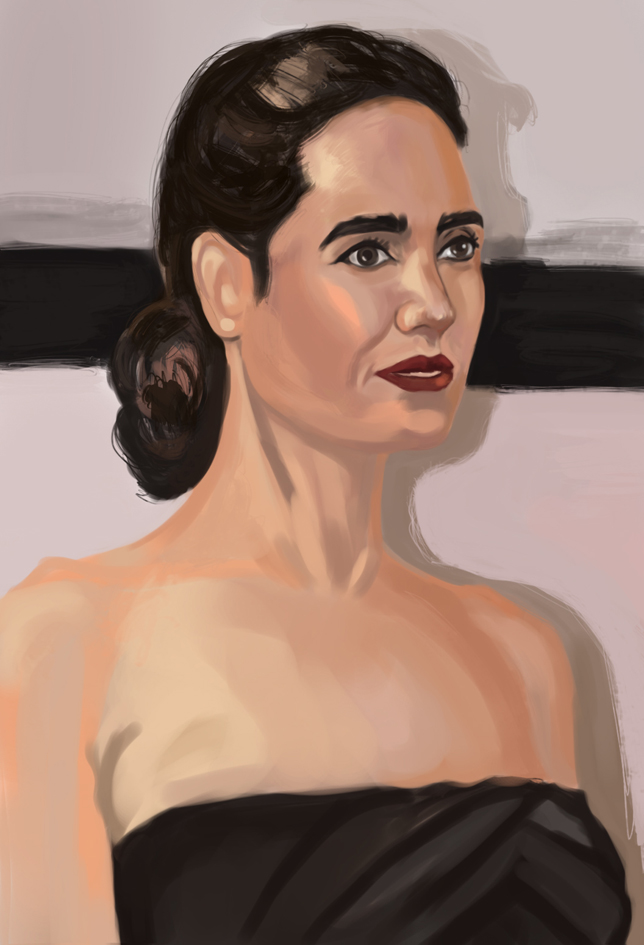
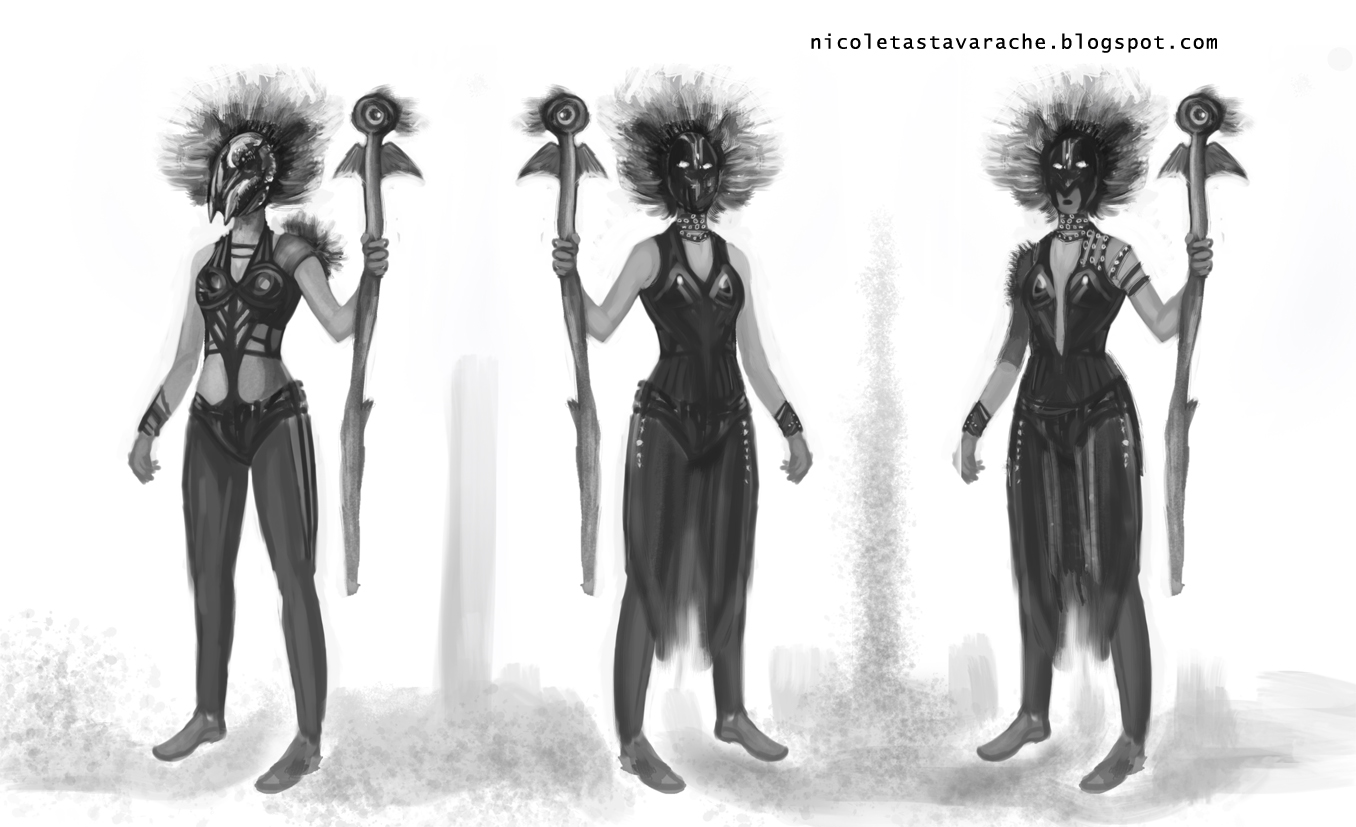
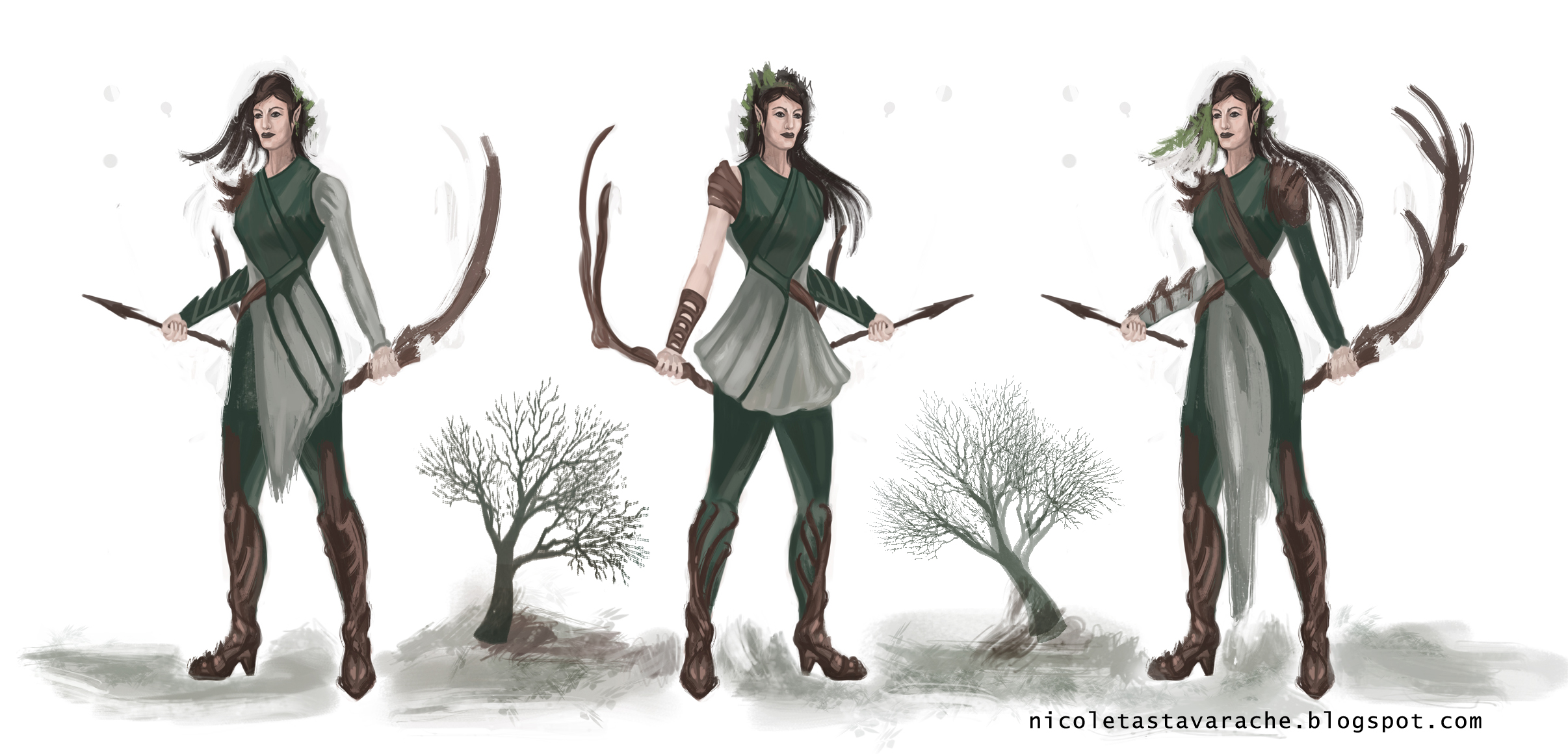
Some studies and concept art work
RE: Nika's Sketchbook - Rognoll - 02-13-2014
Hi, Nika! Nice use of colors! Your pallets are delicious! I wish I could be as bold as you with my colors!
RE: Nika's Sketchbook - Nika - 02-16-2014
Thanks a lot, Rognoll! I practice anatomy and color every day. You're super awesome!, saw your last work and Wow.
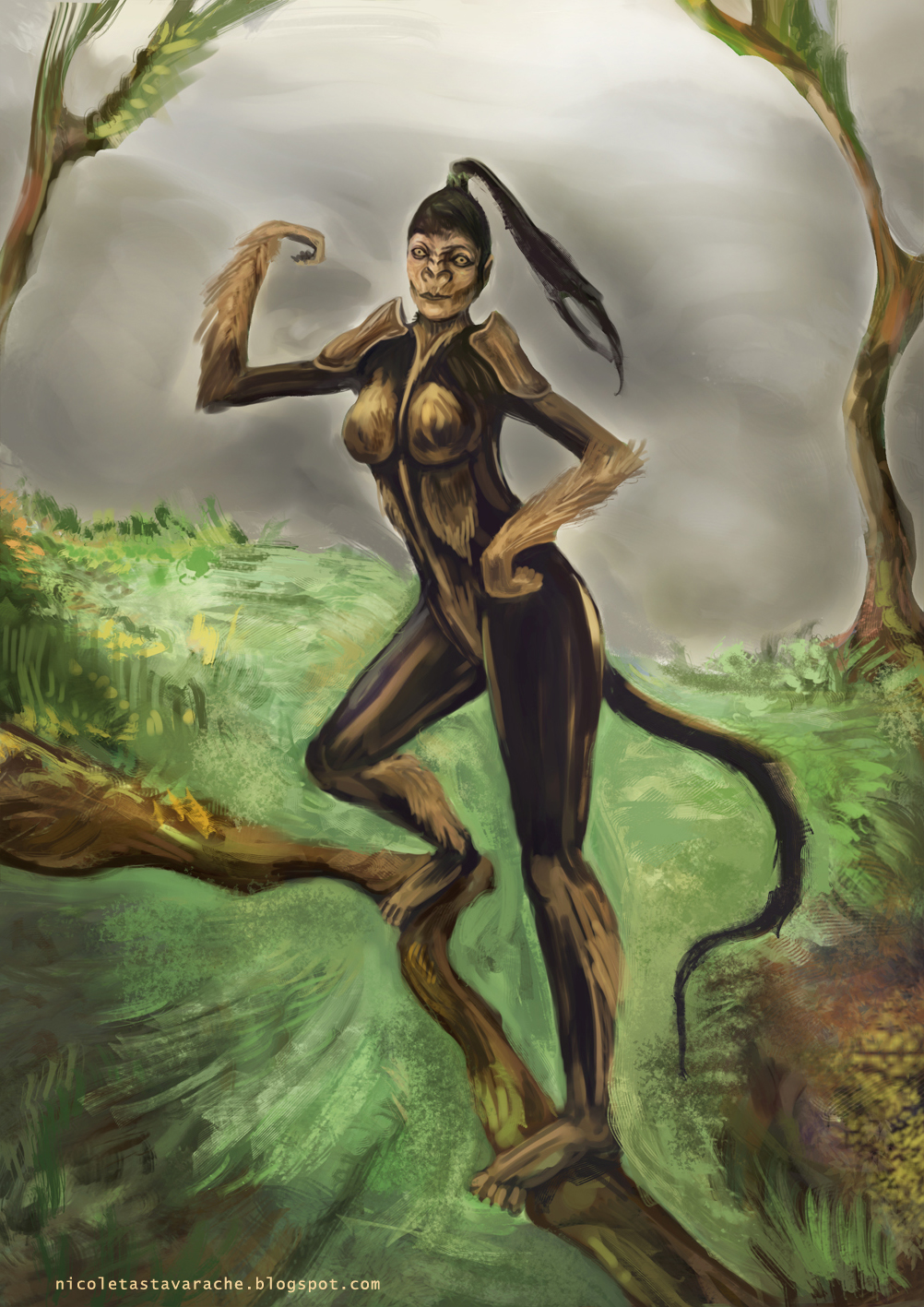
Concept art: Monkey girl, I hope she shows sex appeal :D
RE: Nika's Sketchbook - Jaik - 02-16-2014
Nice job, your progress is coming along nicely :) Not actually knowing your layer structures, it may be beneficial to keep the character (and branch) on one layer above the background so that you can paint the background without having to go around the branch. But thats just a technical suggestion. Keep up the good work :)
RE: Nika's Sketchbook - Lyraina - 02-17-2014
When painting eyes (or struggling doing so), try to think of the eyes not as "eyes" as we know them, but as the spheres covered with skin which they are. In Gandalf's case, they are a bit too pointy, especially the right eye. It also affects the way you shade them (like a sphere).
Love your brush work <3
RE: Nika's Sketchbook - Nika - 02-19-2014
Jaik and Lyraina, Thanks you for your helpful comments!
It's really difficult to work an extended amount of time. There are so many problems to solve at the beginning of a painting ( design, anatomy, composition, dynamics, color, etc.) and Photoshop has a multitude of options for rendering. I'm motivated to practice and get better.
First piece is a cartoony mage and second a creature sketch
