+- Crimson Daggers — Art forum (//crimsondaggers.com/forum)
+-- Forum: PERSONAL ARTWORK (//crimsondaggers.com/forum/forum-9.html)
+--- Forum: SKETCHBOOKS (//crimsondaggers.com/forum/forum-10.html)
+--- Thread: Zorrentos Sketchbook (/thread-7893.html)
RE: Zorrentos Sketchbook - xelfereht - 10-31-2020
Hey man,
Just wanted make some suggestions which you're free to disregard should they not vibe with you.
these are some things I've found helpful.
start from lifestyle, the lifestyle you imagine you would like to have, this is kinda more important than dream job even.
as much as you enjoy art, you want to probably get to a place where it fits into a happy lifestyle so, and it may be harder than it sounds, start from here.
next instead of dream job, what do you want to make. what will you be most happy doing in art, in terms of subject matter, rendering style, usage (book cover, card art gamer concept and so on)
what will you care about getting better at, because this is your best bet to excel and to be happy learning.
I'm saying this because it's still a very big thing for people to chase where they imagine the job are and what the viable types of work are. It's like when you see people that love illustration become graphic designers because seemed like a more realistic career path.
any path is viable and you will do the best job following what you love with the least compromise.
people often don't notice how much the compromise is the killer of passion
you may hit a point of dissatisfaction without realizing its because you're doing the job next to the job you wanted to do.
you gotta make money along the way, but having a strong idea of where the direction is leading you will help you make the choices of what jobs to prioritize as stepping stones to your bigger goals.
If you love working on mobile games, ok, but if it's not your real goal, please give it some consideration.
I'm saying this stuff without knowing much about where your passion is at,
but you got some good skills but I cannot see where youre aiming
and I dont mean aiming at the next job, far beyond that.
most goals will fall short in reality, so you best aim high as you can.
every decision in life is a sacrifice, so make the study and images you create, focused with multiple goals,
each portfolio piece can have job getting intentions, marketing and self promotion, immediate sales, multiple study goals within it.
art is a fantastic career but please dont compromise too much or it may become just another unsatisfying job.
theres so much advice that guides people to fighting over low to mid tear work
and everyone can do what they want, I'm no one special.
but I am happy with where I'm at,
I only worked to get better and never got an art job I applied for, I just kept raising my skill and every year the work has been more frequent and higher paid and during a pandemic, I am busier than ever.
I hope this doesnt come off as a boast or anything, I'm just starting to feel the relief that my career choices panned out as i anticipated based on the advice i accumulated in the beginning years, and I want to share those thoughts in case they are helpful to you or anyone here.
I know how hard and shitty a time and a struggle this all is,
but you can fkn do it, and do it bigger than you imagine. and without school!
(reasonably priced online learning is fine)
anyway, power to you
if youre having a hard time working out your direction, welcome to have a chat
again im nobody, ive just been thinking about this shit for the last 7 years
RE: Zorrentos Sketchbook - Zorrentos - 10-31-2020
@xelfereht.
Thank you for visiting my sketchbook and sharing your input and knowledge! It's always much appreciated. I read through your post fully, and decided to take my time and write out a proper answer.
My goal at the moment is to get a job within the game industry, not just because I like games, but also because it seems like a solid, futureproof careerpath from what I can tell.
I have already completed three years of schooling and work within this industry (That is why you see a gap in this sketchbook from 2017-2019/2020. I was busy going to school at that time). I have already been employed at one point at a studio that made mobile games where I had numerous different roles such as 2D artist, 3D artist, VFX artist, Animator and more ... The reason why I am making my own game mockup right now is to simply build upon that knowledge and expand it as much as possible.
I realize that my sketchbook at the moment is rather diffuse and "all over the place", but there is a reason to the madness so to say. First of:
I couldnt focus on any specific area for a long time, because I had to quickly learn new software for the job I had at the time. Thats why there are so much half-finished stuff here. Now that im at home all day just working and studying, im hoping to finish for a whole bunch of this stuff and post it to my portfolio.
Second: Im positive that the game project im making will come together nicely in the end. And as I finish various aspects of it (the concept art, the logo, the 3D models etc)I will be able to post it on my various social media sites. This may take some time to finish, but it will be a ongoing process that will hopefully teach me a lot as well.
As for the lifestyle ... What im really seeking is just stability. I want a nice job at a good company where I can grow and improve. Hopefully with a decent salary as well. The freelance lifestyle is fine, but I think my future lays in a good company.
Here are some warm up sketches from this morning. Its from CubeBrush art camp Term 2. I was only planning on watching a bit, but it was so interesting that I watched the whole thing haha:

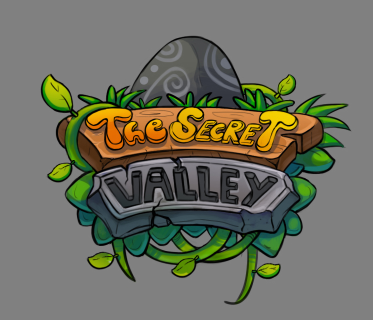
And updated logo design:

Now im gonna go back to work! Cya all soon!
RE: Zorrentos Sketchbook - darktiste - 11-01-2020
I recommend getting this course (Video Game Design: Create A Competitive Design Portfolio) it should give you a really good idea on how to create a solid game portfolio it might not be exactly for the branch of game you want but it really can be in my mind adapted to any video game career for more info look at
https://www.udemy.com/course/video-game-design-portfolio/
the table of content is there.You can apparently even rerfund it if it 30 day after your purchase if it as nothing to offer you.
It talk about useful concept that are still as applicable to any career in the game industry even if at time it seem it about level design and game design and not necessarly the artistic side with a little extra time it shouldn't be that hard to adapt to your need.
What i personally like is the questionnaire section they have where you have to lay down your intention and interest by answering solid question that should inform you about your future direction.
RE: Zorrentos Sketchbook - xelfereht - 11-04-2020
I don't have personal experience working in the games industry,
my impression from listening to people talk on their experience in it, hasn't been that of stability.
It is also the very type of job that just let you go
by all means, aim for the games industry but don't sell yourself and consider what really grants you future proofness
often in games, particularly when your'e roped into being a jack of all trades.
you may come out with little significant work to show when the studio drops you for whatever reasons.
you may develop skills but you might get pulled away from the areas you're interested in and have a hard time finding the time to build those skills
you mention this happening to you already
I feel like, the artists I see with true stability in their futures, are the ones that have a body of work recognizable as theirs. the ones that get sought after because they are the best as doing their signature style of work.
when these guys get hired to work on games, they can appeal for a good contract price or salary because they are in possession of skills that are less replaceable.
getting to that skill level when you have as real future proofness as you can, takes directed effort and time.
I just question a little bit if your plan adds up or you may be selling yourself short for some reason, maybe it's what you feel is achievable and safe.
stability, decent salary, good company are still vague as far as an answer to lifestyle.
For me, I considered that I want to be able to work from home, so if i have kids i can spend time with them, i could have the ability to travel any time if I'm working remotely. I want to be independent enough that my personal work can sustain me without needing a company.
with this goals in mind I get clues to the direction to develop my skills.
anyway, I wasnt going to reply or say more but I think youd be doing yourself a disservice buy not aiming a bit higher and considering what really grants stability for artists.
but welcome to disregard what I'm saying too.
these are just my personal thoughts on the matter
I dont know you, and if your'e feeling happy and on track to your dreams then great

ps: cheers for the comment in my sketchbook, absolutely no reason you wouldn't get a daily deviation some day
All the best
RE: Zorrentos Sketchbook - Zorrentos - 11-09-2020
@xelfereht
Thanks for your input. I really appreciate that you take the time to share your thoughts like this.
Yes, the game industry can be very much unstable, and companies often mistreat you or dump you, but you can also be lucky and end up at a company where you are celebrated and allowed to stay for a long time to make a good living, as well as grow and evolve as an artist. I'm really hoping I will find such a studio one day. I wish I could say that I live for art, and that money/making a living is not important, but at the end of the day, we need to aim towards an actual career if we want to survive.
As for aiming a bit higher, I can totally see what you mean, but IMO, by working towards this goal, I am also improving in my overall craftsmanship and skill level, so I am essentially hitting two birds with one stone. Being able to be "THE" artist that gets hired for his or her skill is a very nice thought ... But we have to actually get there as well! And I don't see myself getting there without the right connections and opportunities... The thought that I would be suddenly discovered on the internet seems quite far fetched in today's social media climate.
Here are some more recent stuff: Some studies


Some sketches:


And finally, an updated logo. I showed it to a friend in the industry, and he suggested I replace the text with an actual font rather than a hand-drawn... What do you guys think?

RE: Zorrentos Sketchbook - JyonnyNovice - 11-09-2020
You've been busy :D great to go back over all the fundamentals, I bet you're getting a lot of benefit from it all!
I never looked too closely at mobile game logos, but from memory they do seem to be really 'clean' looking, kind of slick and precise (but maybe that comes from downscaling to a small size?). So yea, I can see where your friend is coming from maybe. Could try using illustrator to recreate what you've already done, but starting from a font so you can get that clean look. I like your one too, but the two T's, two E's in the first line and the two L's in the second line don't have that pixel perfect matching you get from a font, which may be noticeable to someone who's used to seeing perfectly matching letters and might dissuade them from clicking it.
Another little thing could be the light and shadow shapes on the leaves and vines, some of them could benefit from more purposeful shape. Like instead of little stripes of light and shadow, something more interesting could be constructed (I know they're minor elements, and I skimp on those things all the time but it could all help). Could also try just running a posterization filter on it which would create some interesting shadow shapes you might not think of on your own.
Great stuff tho! I know it's a struggle for you right now, but you have this great treasure of a lot of free time to study and fill in gaps ^_^
RE: Zorrentos Sketchbook - Zorrentos - 11-10-2020
Hey Jon! Thanks for dropping by!
Yeah, my friend has a LOT of experience in the mobile games industry, so I'm just gonna trust his judgment and get back to improving the logo. Thank you for your input as well! I'm gonna consider it all!
It's always good to go back to the basics and fill up knowledge gaps and solidify other knowledge more. I'm going through CubeBrush Art school at the moment (Not in order, I take the classes as I need them while producing my personal work), and it's amazing how much info I missed back in the days when I was heavy into studying. Hopefully, it will pay off in terms of better and better work. It's certainly a faster process this time around.
I appreciate the free time as well. I just gotta make sure to make the most of every free moment I have! :)
Here some stuff from today. Studying material and it turned into something else. More soon!

RE: Zorrentos Sketchbook - Zorrentos - 11-12-2020
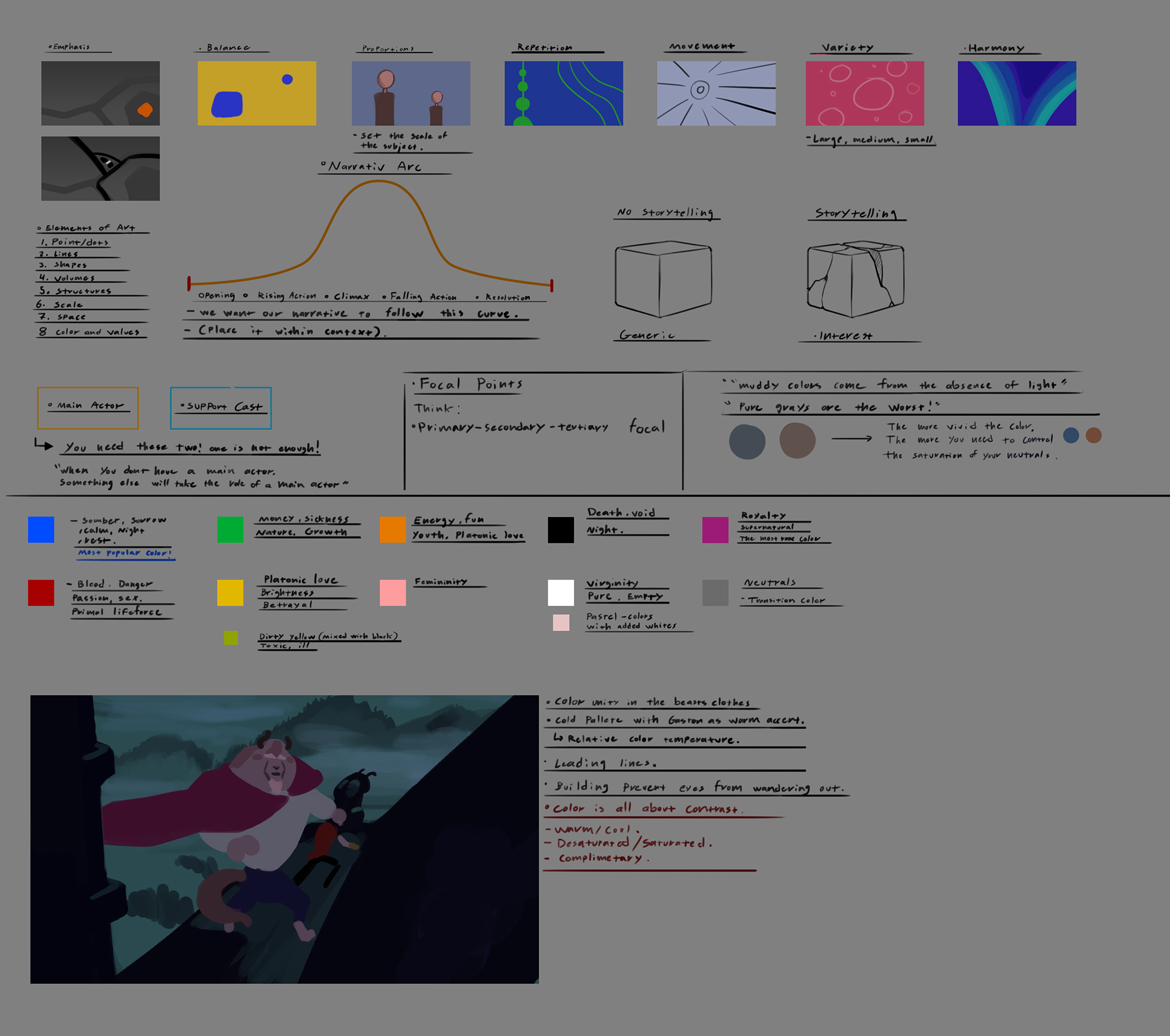
Busy day today. Had a work interview and also finished a long video on CubeBrush Art school. Learnt a ton of stuff about how the torso works and took A LOT of notes:

Another update on The Secret Valley is coming quite soon!

RE: Zorrentos Sketchbook - Artloader - 11-23-2020
Hey man - some great studying going on in here - it's interesting you going back over stuff that you've been through before - as you say I think us artists often find that when we go round again - we learn something new that we never picked up on before and it just pushes us up a level.
Also I wanted to wish you good luck with the job interview - kudos to you as you have already been making a living from art - long may it continue for you!
By the way that material study - is the central sphere supposed to be of a chrome material? If so I think maybe the shapes reflected off the surface should have sharper edges? I only mention it because I didn't realise that the red circle on the side of it was supposed to be the reflection of the sphere next to it? Anyway feel free to ignore if this isn't useful.
Keep it going man!
RE: Zorrentos Sketchbook - Skeffin - 12-01-2020
You have some great landscape studies - love the colour of the field in the one with the mountains.
Not sure if you're taking critique on your sketchbook pieces but I can offer some?
RE: Zorrentos Sketchbook - Zorrentos - 12-03-2020
@ Artloader:
Thanks a lot, buddy! It's a good idea to go back to the basics sometimes when you got the free time. You tend to fill up a lot of knowledge gaps once you go back and study again with all the new knowledge that you've gained. >
As for the material study, that one really sucks! I need to go back and do some proper ones. I just wanted to study the roughness/glossiness of some different materials after watching some videos on the subject. :)
@Skeffin:
Thank you so much! And please post the critique and anything you think I could improve on! I'm always striving to improve my craft/art
Hey guys! I've been away for a while. I've done some interviews and art tests for companies, and I just got another one, so it will be a while until I'm able to post here regularly again. In due time, I may be able to show (edited) versions of some of these tests that are not using other company's assets or IPs. Some of these tests are quite long (one week or longer) so they take up a lot of time and effort. It's great that things are moving forward tho, and I'm really happy for the opportunities I get!
Here is a new version of the logo as well as some Photoshop/Illustrator studies. I spent some time last week deep-diving into illustrator to get more comfortable with it. Fun software!


See ya in one week or more once I'm finished with the test! Wish me luck!
RE: Zorrentos Sketchbook - wld.89 - 12-04-2020
Hey dude, What's up ? nice improvment in your sketchbook ! I hope you don't mind if i made a paintover on your daily sketch practice 1 ! I think there are some things wuite important concerning light, especially some rules to follow if you want your volume to really feel solid !
1 you really need to separate your light and shadows ! Your lightest value in your shadow should always be darker than your darkest value in your light ! it's easy to loose focus of that especially when you're zoomin in and add a bit of dark or light here and there but you really need to keep that separation strong ! we should be able to know what is light, what is shadow, what is reflected light, etc!
2 if you have several light source, you need to create a hierarchy for them, one strong light, one dim light, and maybe some ambient light ! if your lights compete with each other you'll loose this sense of form you're trying to achieve !
I hope it's helping ! cheers

RE: Zorrentos Sketchbook - Skeffin - 12-04-2020
My critique was going to be about your greyscale painting of the girl with the starry night sky behind her. It seems like there could be a lot more variation in your edges, as it currently looks like they are all soft edges with little variation. Also her nose looks a bit too long, especially considering that the viewer is looking up at her.
The painting of the bloke is a lot better and has a far more edge variation, not sure if the painting of the women is an older piece?. I would also suggest making sure your brush strokes follow the forms of the face(the part that jumps out to me is the left side of his face with the shadow under his cheekbone), but that can be more subjective. It also looks like the values can be pushed slightly more for a better read, but you've done a good job at showing the form of his face
RE: Zorrentos Sketchbook - chubby_cat - 12-04-2020
Good luck!!!!!! Wishing you all the best!! :)
RE: Zorrentos Sketchbook - Zorrentos - 12-10-2020
@wld.89:
Thank you so much for the overpaint! I will make sure to apply that critique to my upcoming work! Really appreciate you taking the time! :)
@ Skeffin:
Thank you for the critique and the kind words! I will make sure to take them all to heart. The girl is based on a sketch that was a bit older. Maybe I shouldn't have used it ... but well, it just goes to show I need to push myself and get better!
@ chubby_cat
Thank you so much for the well wishes! :)
Hey guys! It was a though, fun test! I enjoyed making it, but since I was not using my own assets with it, and it was a company IP, I can't show it.
Here's a little other thing from some time ago tho. I painted it in Photoshop and animated it in After Effects.

You can see the looping animation on my Artstation:
https://www.artstation.com/artwork/R3N9vv
More very soon! Gonna work really hard this Christmas and really try to push myself to get better!
RE: Zorrentos Sketchbook - Zorrentos - 12-15-2020
The studies and work continue whitout rest.
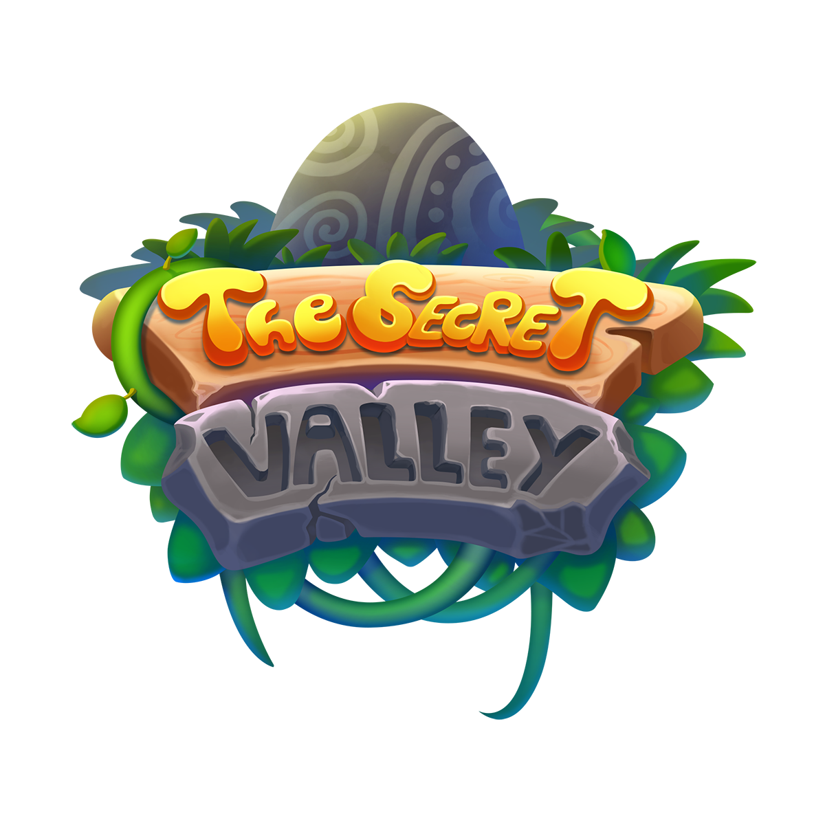
Here is the finished (for now) logo for my personal project:

Check out the animated version at:
https://www.artstation.com/artwork/XnazKa
Be right back!

RE: Zorrentos Sketchbook - Artloader - 12-16-2020
Cool logo Zorrentos! The animation looks great too - how did you do that?
RE: Zorrentos Sketchbook - Zorrentos - 12-19-2020
@Artloader: Thank you so much! I animated the logo in Adobe After Effects. Will definitely dig deeper into this software for future projects.
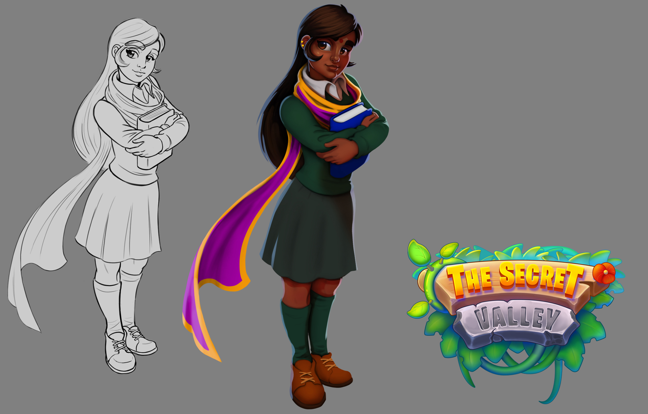
Im working on rendered versions of my Secret Valley character designs. Im trying to emulate the style seen in Playrix games such as homescapes and similar. Please share any critique you may have! :)


RE: Zorrentos Sketchbook - darktiste - 12-19-2020
Looking good i think you should consider an other color choose than gray for the background.I think a nice green would probably be your best choose or a blue with a gradient effect radiating from your character toward the outside.Are you applying to any of those two studio?If not maybe you should reconsider studying the studio style more carefully.
RE: Zorrentos Sketchbook - tchangchang - 12-21-2020
I really like the last 2 character designs from secret valley, they look polished but still have a nice stylized appeal to them. If its ok for me to make a small, nitpicky crit: on the male character the the moustace is not very visible on the rendering so he looks a bit younger than the lineart (idk if this was an intentional redesign); the girl's render seems to have her chin protruding a bit more than the lineart (due to the way the highlight goes around the chin) and this makes her seem a bit less feminine to me compared to the lineart. These are just small details however, the overall impression is still very nice. Hope this helps :)