
+- Crimson Daggers — Art forum (//crimsondaggers.com/forum)
+-- Forum: PERSONAL ARTWORK (//crimsondaggers.com/forum/forum-9.html)
+--- Forum: SKETCHBOOKS (//crimsondaggers.com/forum/forum-10.html)
+--- Thread: Sketchbook: Version 1.5 (/thread-9422.html)
RE: Sketchbook: Version 1.5 - darktiste - 04-14-2024
Are you sure it an official take on spider men the eye shape i can't find any spider men which that double triangle pointing up exept one design that as that sharp trinagle shape most of them have a triangle that kind swoop. The one with the sharpest Triangular eye would be the 2012 version you can probably look that one up but it doesn't have the web pattern so for this reason he disqualified in my opinion.
But i suspect if it your son demand he must be about what 10 to 20 years old which mean i suspect he not reading the classic spider men so he probably is more familiar with the 2010 ish spider men it probably the spider men with the black suit which would mean it the 2011 version but with a alternative eye then is should be on that design the closest to this 2011 design is the 2000 but this one as the rounded triangle will your as a more vertical triangle so none seem to respect the ''official design'' so i am really wondering who that master is and if they took any liberty on the design because it make the job of identifying who it could be very hard...
So in conclusion it look like a mixture of design.
So the only question i have that might help narrow it down is the reference in black in white or color and if it in color?
Can you provide the color reference i might be able to help.
RE: Sketchbook: Version 1.5 - RottenPocket - 04-14-2024
Paolo Pantanela. :)
https://pantstudio.com/wp-content/uploads/sketchbook_v01_page59_spiderman_500.jpg
RE: Sketchbook: Version 1.5 - Damien Levs - 04-14-2024
darktiste - my son is 5 :D
RottenPocket - Thanks so much! Another artist to follow!
RE: Sketchbook: Version 1.5 - Damien Levs - 04-17-2024
...
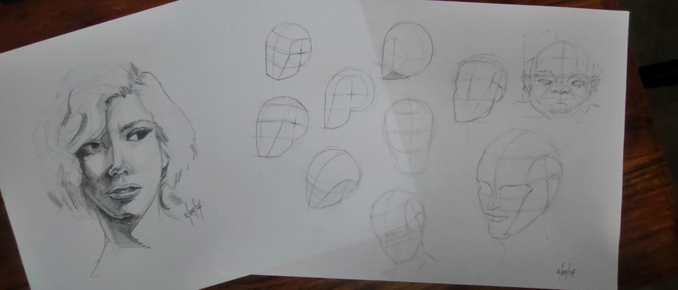
RE: Sketchbook: Version 1.5 - Damien Levs - 04-19-2024
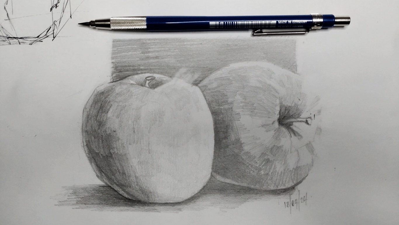

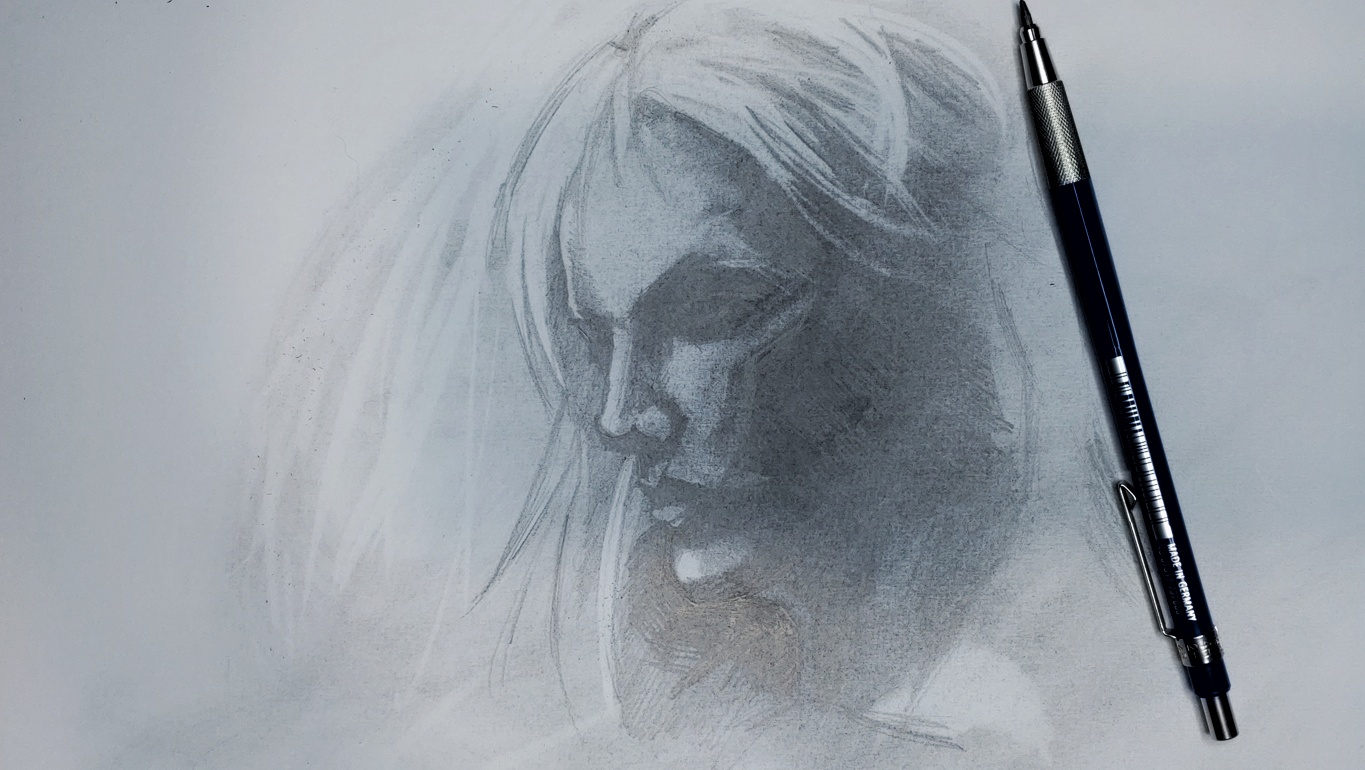

RE: Sketchbook: Version 1.5 - Damien Levs - 04-22-2024
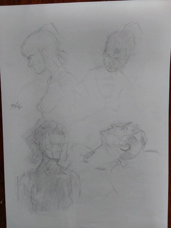
Some pages from life drawing today. It was such a challenge, but I really enjoyed it. Definitely need lots more of this.


RE: Sketchbook: Version 1.5 - darktiste - 04-22-2024
(04-22-2024, 01:20 AM)Damien Levs Wrote: Some pages from life drawing today. It was such a challenge, but I really enjoyed it. Definitely need lots more of this.
I personally think it ok to draw the full figure on paper when are planning out the composition slowly first but when it come to maintaining proportion when you put many drawing on a page i find that personally if you don't adjust the scale of thing you will miss space on the page so if you try to draw to many thing at the same scale you will bump into other drawing on the page or the frame of the page itself.What useful with drawing at different scale is you can draw at different scale and still retain the information.
So here what i suggest if you plan to do a full figure start with a full figure place it around the center and fill the rest with smaller drawing if you want to save on paper. Otherwise you might run in the problem that you will squish the proportion of your figure to fit them in the page and that no buano it bad practice in my book.The problem with that is if you plan on putting value you will want to avoid rubbing the value off so it best to draw from left to right when putting new element on the page the problem is that you now have to deal with the frame of the page so my advise for that is to do stick figure to map out the space you plan to use to see if it realistic to fit the element first before committing.
Critic on the women looking on the side on the image of the last post.
One thing i observe is that you present the lips with a force perspective which suggest to me tha you don't yet understand how it wrap around the mouth cylinder.
The dips of the ''bump'' of the top lips should align with the nose.To see if the lips is done right in perspective the nearest side measuring from the mirror axis should be longer then the furthest side when look at an angle.But it will look wrong when you get the mirror axis off centered like what has happen in your drawing.
Also the spacing between the nose the eye is a tricky one because of how the eye sit inside the socket of the eye.We often draw character from a front view so it feel abnormal to have eye so close together so we tend to space thing out when in reality they almost overlap the more the head turn away from us.
Lately the more the face is facing us the less the distance is between the corner of the eye to that line you drawn going to the ears because the side of the face is relatively flat compare to the front of the cranium which is more aerodynamic.
It kinda hard to critic live drawing because i don't know how much she was really facing away from us it much easier to critic a study from a reference.So i advise you work both way to supplement and get further feedback.
RE: Sketchbook: Version 1.5 - Damien Levs - 04-22-2024
darktiste - I'm not really planning any composition. I'm not going there to create full finished pieces. I just want the study time. But, you're right, I should be drawing more full figure. I am tending towards trying just the head and face as portraits is my main area of practice right now.
Yeah, I also do need to practice the wrap around of the mouth.
----
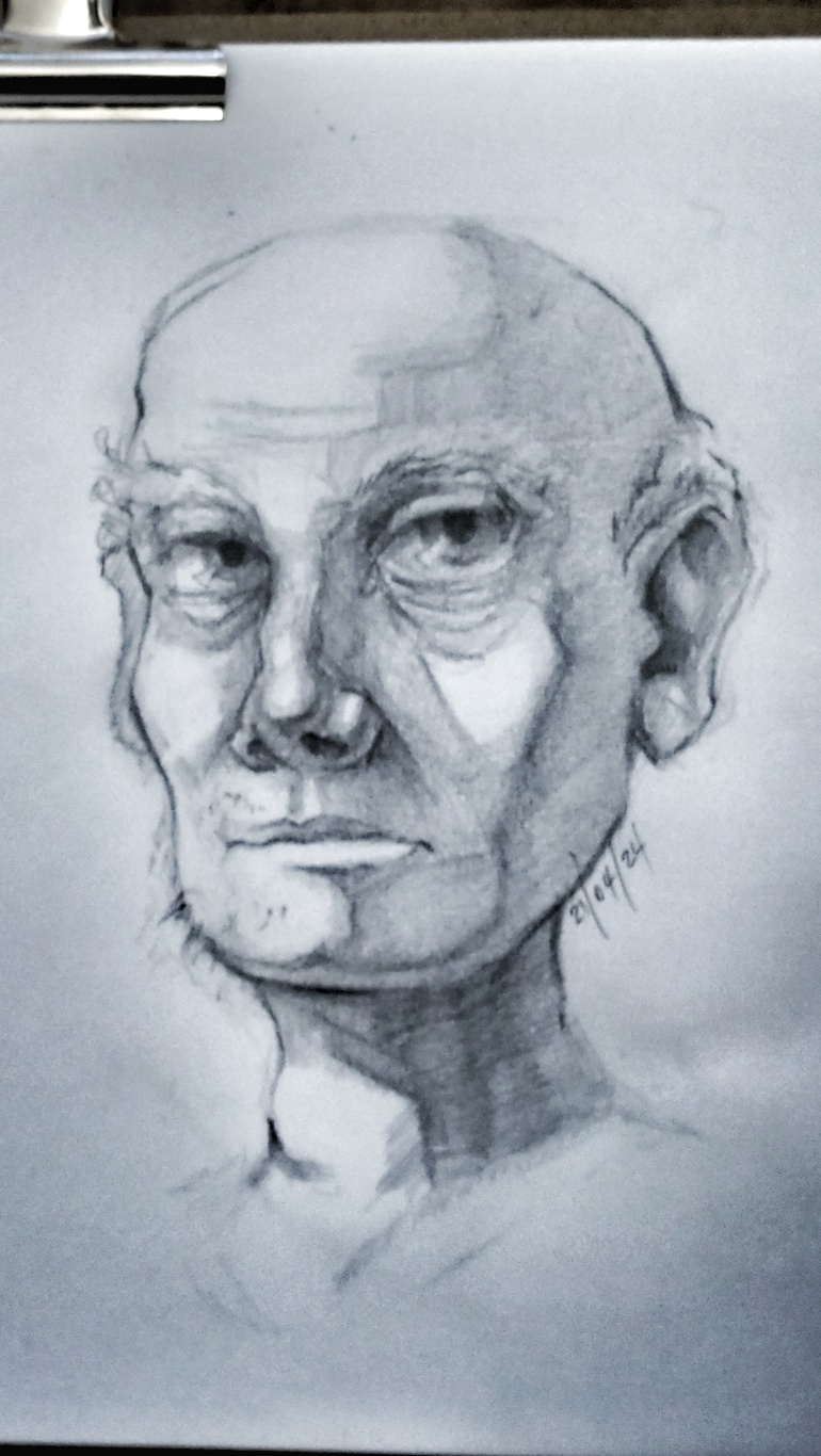
Here's a little stylised sketch attempt from imagination last night before bed.
RE: Sketchbook: Version 1.5 - Damien Levs - 04-23-2024
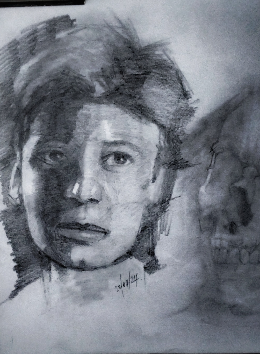
Tonight's study...
RE: Sketchbook: Version 1.5 - Jephyr - 04-23-2024
Really nice lines and values with the last one. The styized one kinda reminds me of characters I like to do as well.
Nice work in post #105 too.
Keep 'em coming!
RE: Sketchbook: Version 1.5 - Damien Levs - 04-24-2024
Jephyr - Thanks so much. I really do appreciate the time you took to reply. I felt quite happy with the values there, but as always, many areas need improvement.
----
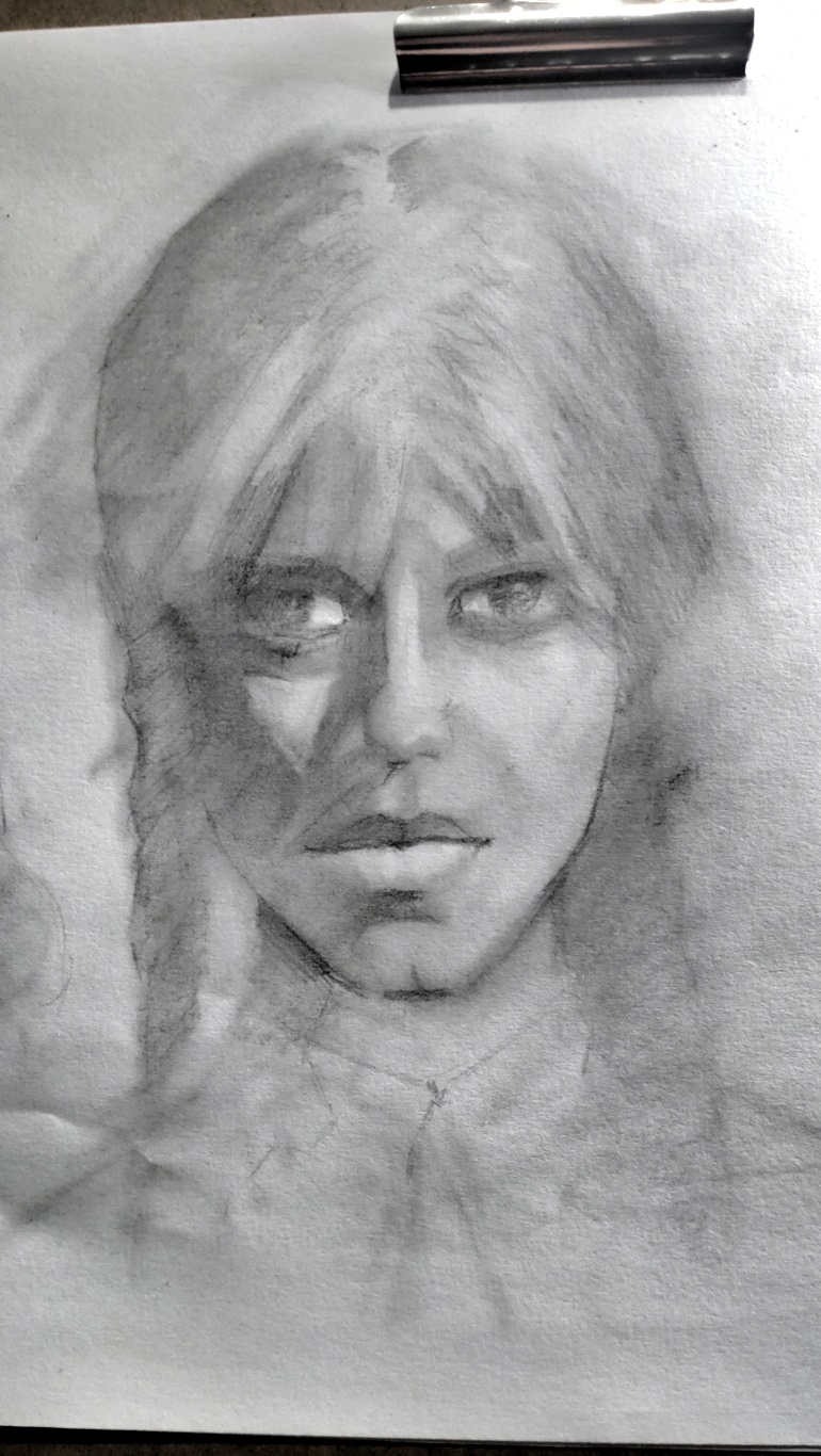
Here's one from last night. I saw someone on a video using an eye shadow applicator to soften the pencils and it looked amazing. So I thought I'd give it a try. I actually really enjoyed this process, but I am so frustrated with how I messed up the left eye (her right eye). Not to mention proportions being off. Oh well, onwards and upwards.
RE: Sketchbook: Version 1.5 - Damien Levs - 04-25-2024
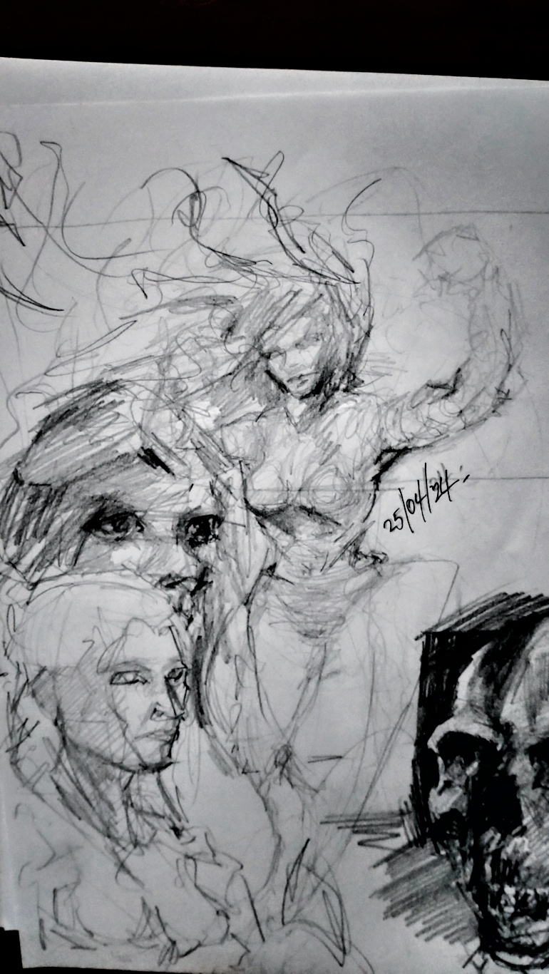
Admittedly...I didn't study. I just had some fun...
RE: Sketchbook: Version 1.5 - Damien Levs - 04-27-2024
Tried a bit from memory. No reference. I've started with trying to draw the torso, but I'm not sharing those just yet. They're quite messy at the moment.

RE: Sketchbook: Version 1.5 - darktiste - 04-27-2024
I don't recommend shading the form everytime if you focus on getting an understanding of the form you can do separate study but i think it best if you try to start with individual fundamental that you combine later on into more complex study like let say you do a 1-3 hour study depending on how much you work and can squeeze into your art time i suggest to combine what you learn every week just like a kind of weekly recap and revaluation of where you see your fundamental are leaking and where your study need to swift.Surely also making habit of mixing live drawing and drawing from memory is important if you don't want to end up referencing every pose you do which isn't a sin but it take away from the drawing time and slow down the process so ultimately it a return in investement to commit what you learn to memory.
I would say self accountability can be annoying at time but it the honest way for a mindful growth of your artistic skill.
RE: Sketchbook: Version 1.5 - Damien Levs - 04-28-2024
darktiste - Yeah I know what you're saying. It all needs working on really and I've been feeling a bit burnt out with just doing line. So I decided to try some shading. I'm sure everything will come together eventually.
----
Just a very quick sketch before bed last night, because I got home late.

RE: Sketchbook: Version 1.5 - Damien Levs - 04-30-2024
A little practice from tonight...

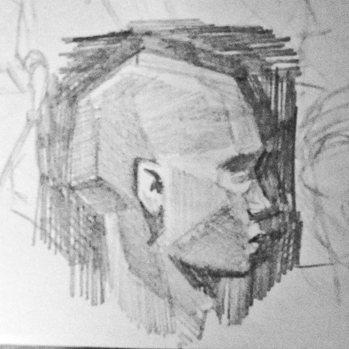
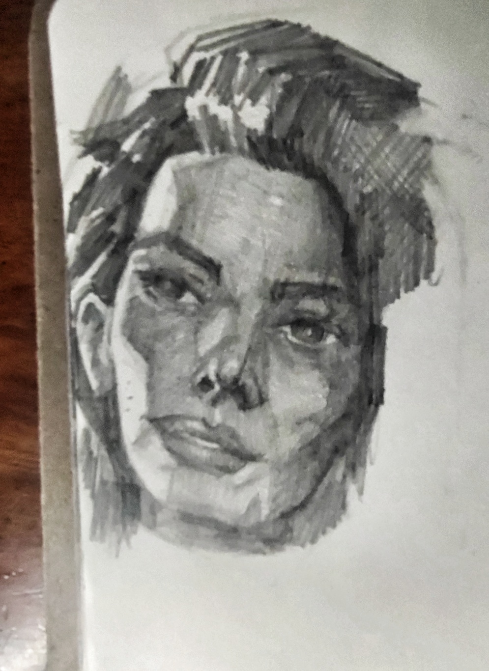
RE: Sketchbook: Version 1.5 - darktiste - 04-30-2024
This stuff is looking great a good mix.I would say spend lil more time setting up the feature of the face before commiting.The nose and moth are off on that longer drawing.To get you center line of the face look between the eye brow and then consider the angle of the head and adjust.
You got the essence in the sketch maybe you just need to try at different scale. When a drawing is bigger it harder to measure a trick is to stand up and get some distance between your eye and the drawing this way your eye see thing in the scale you normally work when it done at a smaller scale.If you work with tunnel vision that an other issue try to work around the face to keep thing proportionate and symmetrical.
RE: Sketchbook: Version 1.5 - Damien Levs - 05-01-2024
darktiste - Thanks so much...also thanks for the educational reference. That'll come helpful. I feel like this was a better study session. Quick studies, and then a longer drawing. In that thinking, I think life drawing is helping in the process too. I really need to book my spot for the next session incase someone else gets it.
----
Here's some more....
Structure studies...
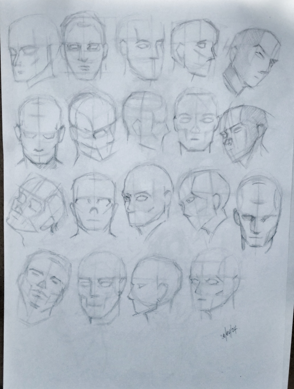
Longer one from photo ref...
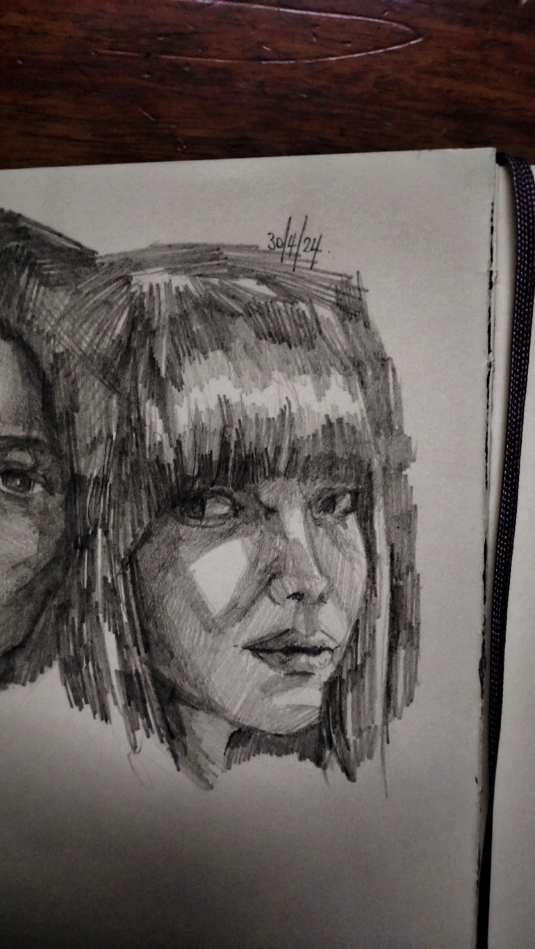
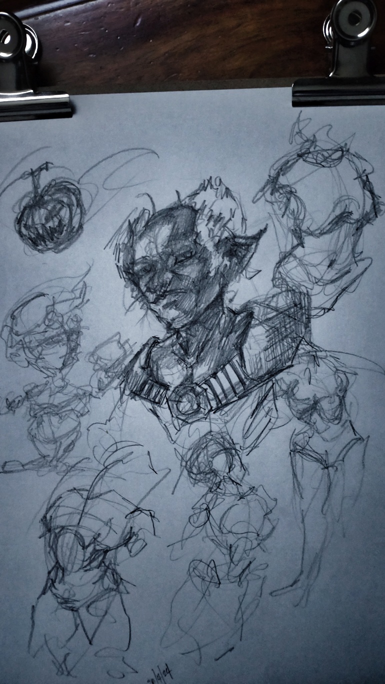
...and playtime... imagination/memory...
RE: Sketchbook: Version 1.5 - darktiste - 05-01-2024
The problem with shading is that your suppose re draw the problematic pose when you erase you mess up the shading it why making sure you get the feature right with line art first is the logical way obviously since it a longer drawing i understand you would not split it in session but you could.
By redrawing you address the issue rather then simply aknowledge the issue which isn't the same.Obviously it tedious work and correction is a stressful part of the work you comfronting you issue but it also the honest way not to put thing under the rugg and keep the issue reoccuring later on.
Just take example of https://crimsondaggers.com/forum/user-6373.html i critic is work constently and he apply the feedback.That require a thick skin sometime.But it pay off.
One thing i would say is to study the eye on the form that something that seem slightly off consistently by that i mean the left eye seem to height.
But once again good mix.The mouth and nose look more stable in about no time.Your imaginary work as a lot of energy to it i think that good for gesture but i think it would be interesting to see you use a ink pen so you commit a bit more to thinking a process that seem like it use less intuition and more deliberate understanding of construction the ink pen force you to be clean.Give it a try if you feel like it the good thing is it cost nothing if you already got the ink pen.Sure at first it won't feel like home and more stressful but it more mindful practice.
Anyways have a good day and slay
RE: Sketchbook: Version 1.5 - Damien Levs - 05-01-2024
(05-01-2024, 08:14 PM)darktiste Wrote:
One thing i would say is to study the eye on the form that something that seem slightly off consistently by that i mean the left eye seem to height.
But once again good mix.The mouth and nose look more stable in about no time.Your imaginary work as a lot of energy to it i think that good for gesture but i think it would be interesting to see you use a ink pen so you commit a bit more to thinking a process that seem like it use less intuition and more deliberate understanding of construction the ink pen force you to be clean.Give it a try if you feel like it the good thing is it cost nothing if you already got the ink pen.Sure at first it won't feel like home and more stressful but it more mindful practice.
Anyways have a good day and slay
Thanks! You're right. I should take more time to properly map out the eyes. I really should practice those more on their own as well I think. I always have a hard time getting them to look right.
I do have a Pentel ink brush pen. I'll give it a go tonight. Could be fun. I'll update later tonight!