
+- Crimson Daggers — Art forum (//crimsondaggers.com/forum)
+-- Forum: PERSONAL ARTWORK (//crimsondaggers.com/forum/forum-9.html)
+--- Forum: SKETCHBOOKS (//crimsondaggers.com/forum/forum-10.html)
+--- Thread: Fedodika the Koala (/thread-3465.html)
Pages:
1
2
3
4
5
6
7
8
9
10
11
12
13
14
15
16
17
18
19
20
21
22
23
24
25
26
27
28
29
30
31
32
33
34
35
36
37
38
39
40
41
42
43
44
45
46
47
48
49
50
51
52
53
54
55
56
57
58
59
60
61
62
63
64
65
66
67
68
69
70
71
72
73
74
75
76
77
78
79
80
81
82
83
84
85
86
87
88
89
90
91
92
93
94
95
96
97
98
99
100
101
102
103
104
105
106
107
108
109
110
111
112
113
114
RE: Fedodika the Koala - slash razor - 02-25-2019
awesome that your getting life drawing in.... you probably dont need me to tell you that your proportions are out.... anyway not sure if you do but maybe you could put gesture lines down capture the movement first then build or suggest head/ ribcage/ pelvis and then build on it from there... to me its seems like your just following the outline... anyway Im sure once it clicks youll be unstoppable
RE: Fedodika the Koala - Fedodika - 02-25-2019
Slash: thanks, yea i was struggling alot friday :/
Hobbit, Amit: really appreciate the writeup yall, i spent a lot of time tweaking this thing today, fixed lets see.. i fixed the wrapping of the light bands, i see what you mean amit by the diffuse, i just really like the aesthetic of the shadow, it feels edgy ( I did a little diffusing of the light, its a slight bit softer.) I fixed the hand that looked shit, tried my best to wrap the perspective of the buildings according to one vanishing point. Fixed the nightmarish contrast idk how I settled on last night... Again, big thanks for the critique and if anything else looks wrong, let me know, im still gonna fudge with that shadow line tomorrow i want it to travel smoothly through the canvas, feels okay right now, but i know ill gripe it tomorrow!
overall this piece is the closest to my niche ive gotten, the sexy goth woman, in a somewhat narrative piece, not too pinupey or story driven, so on the money niche wise.
RE: Fedodika the Koala - Hobitt - 02-26-2019
You still didin't fix the perspective,probably the easiest way to fix it would be to cut out that area rotate is and warp it so it matches the perspective.And maybe lower the values a bit more still some exposure issues. Keep working on this don't let a good piece go to waste!
RE: Fedodika the Koala - Leonard - 02-26-2019
Some of the values are pretty weird man, the shadow is like a straigt line across her
chest and arms, maybe try to wrap the shadows more around the form.
You also have this weird thing in some of your paintings where the shadows are green -ish.
(bottom right and top left corner) you could make them more blue/purple.
(maybe it's due to your monitor settings)
I like it overall though, keep at it!
RE: Fedodika the Koala - Fedodika - 02-26-2019
Leonard, hobbit: thx i tried to fix the perspective, before i had moved something a tad, but today I really overhauled it, and started over on a few buildings. I drew several things to help, this isnt really something ive tried before, drawing a city scape so some struggling is to be expected. I also cleaned out the greens, which I on occasion stumble into intentionally, but green isnt a great color to have too much in paintings, so point taken.
I also removed the light bands, and expanded the light pool so it looks like its wider than where its landing on her. Im more than open to any paintovers, comments on stuff that looks weird so i can really nail this down. As for tomorrow ill be tweaking the contrast in the buildings so the sit well but dont take up alot of attention. I found some cool tricks with layers to make some interesting effects but that means about nothing if the grounding its on is flawed, so any itty bitty things you see, ;)
in other news i did a gouache painting which ill post tomorrow, really itching to get back to figure studies, another day of processing nutrients into greasy dirt on paper that kinda looks like something
RE: Fedodika the Koala - Amit Dutta - 02-26-2019
I can't do a full crit here, I haven't been able to find my tablet stylus for 3 months XD . A paintover would be better but man you gotta use reference for that hand. It's even worse now; the fingers look like tampons and they are almost the brightest thing on the canvas. Work on them in your study a bit more too praps? They have the derp look to them that you used to do with your faces. :P
The more diffused light on her is way way better...exactly the kind of thing I meant. You're losing a bit of the harder vs soft edge balance in the face and hair (all kinda mid edged) compared to that in her legs (done quite well). If you can match the edge work in the legs and apply to her face and torso which is the focal point, it would feel less sketchy! The hair looks a little flat in terms of form and the shape design could be better. perhaps play with giving it a bit more volume and the shapes.
This is the first time I am seeing on a decent screen, so yeah thank the other folks for mentioning the value and exposure issues and adjusting. It was nuclear! My phone lied to me. However I think a bit of the bounce light/atmosphere that was in the bottom of the image in #1874 is actually quite pleasing (also suggests the lights of the city below and that it is an environment that exists outside the frame) , so praps you could bring it back a teeny bit and see how it looks. I think in terms of render to make it sing, the last 3% is the hardest but so worth it.Keep at it dude. It is definitely the most solid thing you have put together so far, don't falter!! you can do eeeeet!
RE: Fedodika the Koala - Leonard - 02-27-2019
I did a little overpaint, hope you don't mind,
went a bit overboard with some of the effects lmao, but yeah.
I changed some of the anatomy, her right knee is still weird, definitly work on the hands
as amit already pointed out, also adjusted the color scheme a little and changed the lighting somewhat.
Also don't paint the edges of the buildings in the background lighter than the sky.
Changed the composition a little bit aswell :) maybe her cloak is too extreme now but i think it looks
better, composition wise.
![[Image: Lhus428.jpg]](https://i.imgur.com/Lhus428.jpg)
RE: Fedodika the Koala - Fedodika - 02-27-2019
Amit: Again many thanks for the writeup, i tried to fix the hand, tried experimenting with my own hand poses, ended up spending about 5 hours just drawing and redrawing to get a nice hand pose that felt natural and not the really lazy straight up derp i had initially went for. Also found a sexier more stylized hair style that im iffy about the lighting, but i at least like the shape a lot more. The contrast might be too hard, im not sure, I can see how the previous nuclear one was too hard, but this one is more colorful with more midtones than yesterdays upload, so ill take another look at it tomorrow!
Leonard: Hey uuuh thanks! i think you mighta got a little too carried away there lol, uuh just... yea, kinda reminds me of one of darkiste's lovely paintovers <3 I do appreciate the thought though, i dont think you improved my image at all tbh :O
Tomorrow we'll keep nudgin the last 3% of this thing the best we can!
RE: Fedodika the Koala - Hobitt - 02-27-2019
Looking a lot better Fedo! The more you rework it the better it will look.And i have another paintover.
To start things off when you desaturate the image it looks better now, i think you have a bad habit of overdoing the saturation levels think about it this way if everything is saturated nothing is saturated, so i knocked the general saturation level way down with a hue/saturation adjustment,that way its easier to add things in.Also everything is relative to each other, what i mean by this is that in this example the pants are the same value as the cape where in relation the cape should be darker since white pants tend to be the lightest thing in the picture, doing still lives with different object can help observe that.
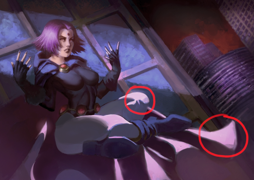
Same thing goes with hues right now its a bit monotonous using a color layer i made her face warmer in relation to her clothes which are cooler you can instantly see how it makes it easier on the eyes, a lot of these principles are addressed in Loomis creative illustration if i recall you have red it before you might want to do it again escpecially the chapter on the form principle (first pages i think) and the value chapter.Also one thing is that her legs are flat shapes right now add some subtle modeling in there both in light and shadow again still lives are great for this, another small point and its very general but form shadow = soft, cast shadow = hard so the legs for example would have a softer edges, another thing would be the cape on the bottom since there is dust kicking around it would make the cape a bit softer in that area.
Some small nitpicks would be the cape shape on her left right now it feels a bit abrupt so you may want to play around and see what works better.And a few anatomy things her breasts feel a bit too parallel right now and the shape of her back is a bit too straight might want to look at ref and see how it goes.
And now onto the last bit the background.
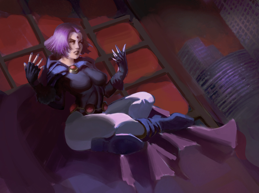
If you grab ref of skyscrapers you will see that the windows are like mirrors aka the values and hues will be the same as the environment around it thats why i made them red, and of course there are a lot more factors like dirt and the fresnel effect a good idea to read up on that during your free time and again here is a ref of it
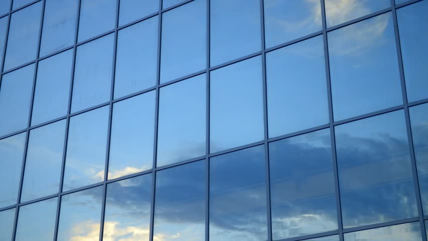
If you look at it the frame is darker in relation to the windows that relation will carry both in light and shadow, as for the background (the very distant buildings) you can add more atmosphere in there ( lower the contrast and add more red hue variations and more soft edges) that way it will stay back a bit more and you wont have render it as accurately.If you don't have her on a separate layer you can lasso her out and add a mask for easier repainting.
So yeah you are heading in the right direction keep picking at this piece!, if you don't feel like doing it now thats ok put away the file for later and return to it once you feel you have the right energy, don't finish it for the sake of finishing it you can have a really good piece with this that would make a great entry into a portfolio for work. But don't give up on it!.
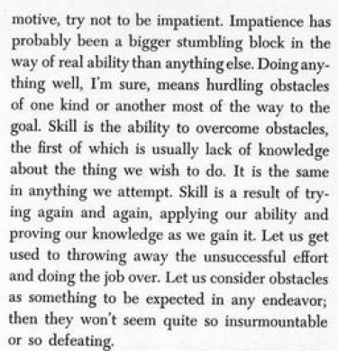
And since i brought up Loomis i think here is a relevant quote.
RE: Fedodika the Koala - Fedodika - 02-28-2019
Hobbit: many thanks for the paintovers and recommendations. I worked basically all of it into the image, except for the windows i made them damaged to add some interest, that and raven occasionally breaks objects and glass with her powers in the show. It really came together with the red, i had no idea knocking the saturation back would help it that much with the realism. now i just gotta figure out how to make the distant buildings work, i have this kind of red funneling sky idea that well isnt realistic, but it looks cool. Just a red sky with dark clouds moving in a direction that serves the composition.
And of course render the cape more on the flaps, but as always if theres any little nitpick you can come up with im more than open to hearing it, i wanna do it good and i have plenty of energy to work and fix things until it is a piece i can keep in my porfoilio for a while
RE: Fedodika the Koala - Hobitt - 02-28-2019
I have to say im impressed! And yeah basically if it looks good in black and white it will look great in color, for a while keep in mind your tendency to oversaturate and overexpose your paintings thats something you will have to get rid of with focused practice maybe do some basic still lives to improve that.
A few small nitpicks: maybe rework her left hand some more right now its looking a bit weird,the cape edges can be softer, continue adding very small shifts in value to indicate forms ( legs, face etc.) right now some areas are a bit flat here is a example on a photo:
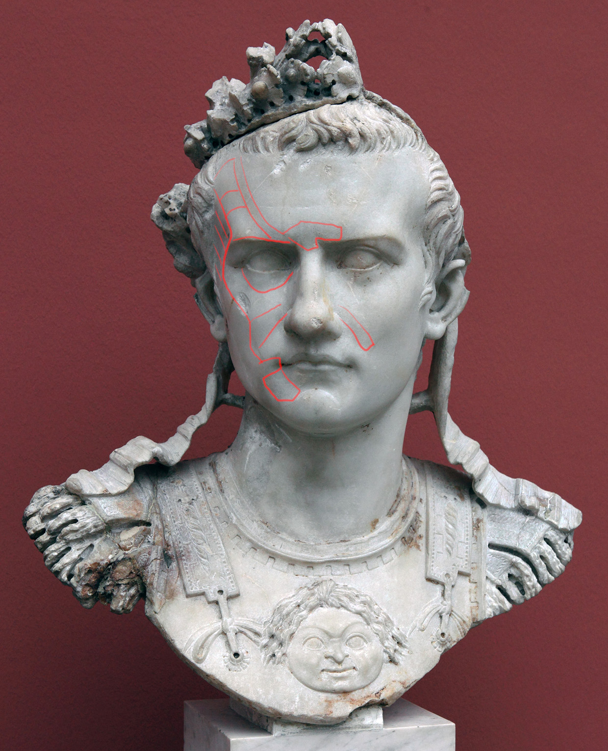
See how very tiny value shifts ( less than 5% probably) indicate the planes of the cheeks and forehead, you always want to describe form that way.
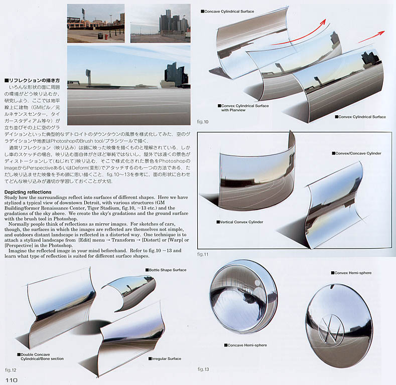
Now for the buildings: maybe try to add some reflectivity on the glass from the beams again a good test would be take a mirror and put a plank on it or something you will see how it reflects,here is some explanation on how it works if you ever want to dive deeper into this topic Loomis and Scott Roberston has info on it.
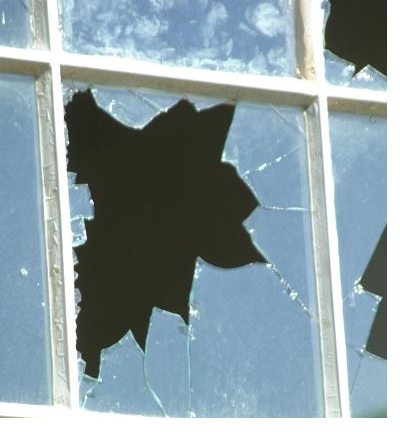
Also if you look at ref of broken glass you will see that the edges are a bit lighter it gives them that sharp looking quality.
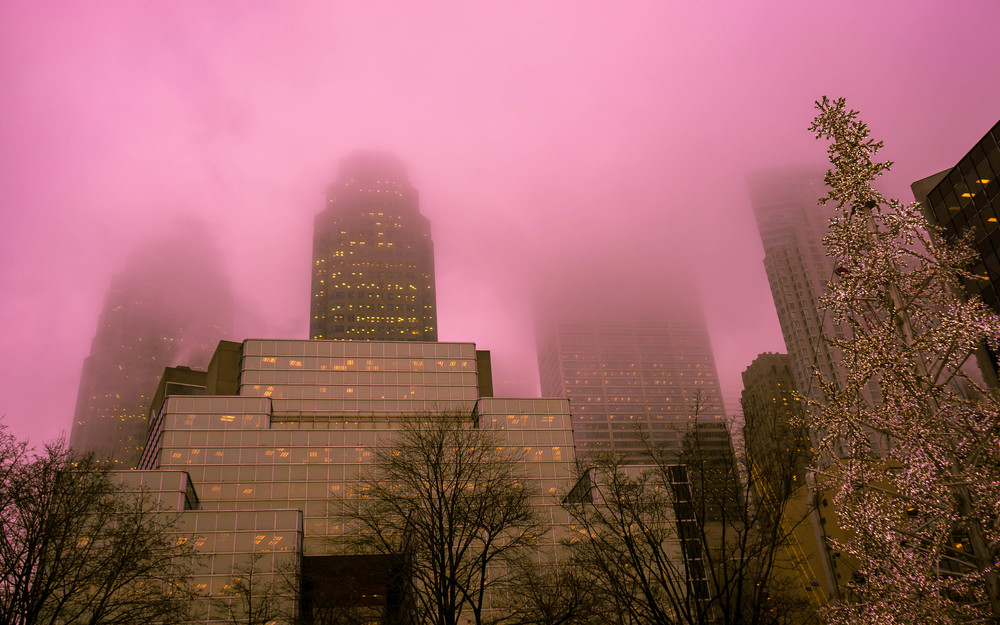
Also the stuff on the bottom, is a bit too dusty thats something you would want to do for the distant buildings.
And again reference can help:
Also a technical thing, im not sure at what resolution you are working on but for a scene like this the bigger the better.
So yeah keep pushing its just gets better and better , and if you make a mistake or it looks worse dont hesitate to paint things out and do again.
And today a quote from Greg Manchess:
"All painting is re-painting.
Do it again. Drawing it once is never enough. Painting it once isn’t either. Do it over and over, focusing on improvement each time. Got a favorite part of a painting? Learn to paint it out. Learn to paint over it. Do not try to save those good mistakes. Paint them again and this time shoot to get it right…under your control. Nobody is an expert by doing something good once."
RE: Fedodika the Koala - Fedodika - 03-01-2019
Hobbit: Many thanks again for the writeup. I didnt know i could push a piece this far tbh.. like the clouds and buildings, the way i ended up rendering them was a complete happy accident. I fixed the hand, tried to reduce the harshness of the contrast, more easy on the eyes. I lowered the color of the buildings, and the overall red in the sky. I was thinkin a piotr jablonski vibe on the clouds.
The windows and such, im not sure how to work a reflection in, because i want them to be the brighter color they are, but I also like the very ominous black sky, so i may have to compromise and make the windows very dusty and not as reflective, which does exist, especially in abandoned buildings. However, there is a hint of a reflection, it ended up looking to clean, so i dirtied it up with some dark masses.
Im gonna try after life drawing to push it any further, but i am running out of ideas and a lot of things feel complete, specially at the higher res im working on, which is about 4k pixels wide. I rendered the absolute dogshit out of the wood, the glass, the cloth material, buildings, clouds, working in some tasty lost edges, i didnt know it would just keep adding on, guess all that charcoal pencil stuff pays off.
Anyways, im itchin to get back to regular sketching and figure studies, as well as doing some gouche paintings of yea still life kinda stuff. gouache is fun, its a lot of wrestling and fighting with edges, makes me appreciate them more when you literally gotta smash the brush just the right way, im always excited :D
But yea ill definitely at least clean it up a good deal and make the contrast ideal, because right now it feels a tad bright, but its getting very close. I think a lot of things are too sharp, kinda iffy on contrast here and there, too blurry etc. Putting it as my wallpaper is a good way to check the image fully stretched out so thats a good habit to have since things also jump out that way
RE: Fedodika the Koala - Hobitt - 03-01-2019
No problem i glad i can help! A few more suggestions , you overdid the saturation on the BG again like i mentioned before its a bad habit you will have to catch yourself, you want to reduce the contrast there so adjusted it,think about it this way you can either make the thing more (saturated,lighter,darker,etc) or you can reduce the things around it to make that thing appear stronger by comparison,also i figured what was bothering me about the hand too, the fingers are too parallel so it looks stiff and boring, and i added reflections of the beams on the glass its not much but it adds to the feeling of reflectivity, and fixed some form drawing on the cape buckle thing.
I would say 4k wide is not enough in this case, i would make it 4k high and around 7k wide, if your pc cant handle that you can cut out and paste parts of the painting onto separate canvases and then paste them back in, higher resolutions will give you much more control in the plane definition areas, also i noticed you used the term rendering i would say that its less about detail and more about correct definition of forms, like on that statue example i provided earlier,right now you mostly added more noise to the forms instead of defining them. More detail does not make a good painting.
Anyways i see you want to do some studies and take a break which i would agree on, put away the painting for now don't look at it for a while and return to it with a fresh eye, and i can guarantee that if you keep all these things in mind you will see how can you improve this piece yourself! Never do the thing you don't want to do at the moment.
And yeah good job so far you really pushed yourself on this piece, and listened to all the feedback people gave you.And don't stop making personal pieces and don't finish too early with this one you can still get more out of it, and of course study the things that you had problems with in this piece and apply it to your next pieces.
Good luck!
RE: Fedodika the Koala - beau - 03-02-2019
Hey fedolika, looking good. This piece will go well in your portfolio for showing versatility. The broken glass looks like leavess on the first read- maybe add some cracks radiating andfrom it, to give it more of a shattered feel. Glass should feel like a math equation, in that it cracks lead more or less back to the center of impact, so you might do some compositional stuff with the cracks leading the eye around. I would definitely soften the building in thebackground, fade them back or something, the parallel lines fight for attention, and all of it should be on her. some fog might also do a good job of that while showing distance (like between the second and third buildings), and a monster climbing over buildings at her reflected behind her would be good too, depending on how detailed you waant to go. Nice colors, I like the way you light stuff and vary your color.
One more thing, the composition was bugging me, I figured out what that was after staring for a bit- the light going across her forms an arrow with the background! You can fix that by tapering the light falling over her, or extendin the ray to go above her head and fade away as it goes to her right and adding denser fog to the top buildings or making that arrow snap back to her somehow, but play with it
RE: Fedodika the Koala - Fedodika - 03-03-2019
Hobbit/beau: thanks for the writeup yall, these things are being taken into consideration... ill have an update soon, maybe 2 days from now since ill be busy tomorrow
Today was very frustrating, getting back into figure work, i did probably 3x this much just didnt photograph it. Life drawing stuff was very very rusty, very embarassing, so im gonna train back up so i can at least execute something decent. Im trying to draw on this very small sketchbook, its about 5X8 inches, since i heard this little theory...
Einstein said if you cant simplify something you probably dont get it very well... I notice i simplify a lot more when drawing small, and a lot of my lazy poor planning habits come out when i draw small, so im forcing myself to think smaller, and in turn, will help me think about bigger shapes ironically.
RE: Fedodika the Koala - smrr - 03-04-2019
You're really kicking ass with this current illustration Fedo, keep up the good work - everyone's really helped out with providing some insight into what could be improved. I believe this'll really turn out awesome man
Your figure studies are leveling up too
Yeah, just keep up the good work Mr. Koalalala
RE: Fedodika the Koala - Artloader - 03-05-2019
Hey Fedodika, nice going in here dude. I'm loving the Raven illustration, it has a cool mysterious vibe about it.
Just one thing I noticed about the lighting - her knees look to be too far down to be caught in the shaft of light imho. Or maybe there is another light source? Anyway please ignore if not helpful.
Nice work on the figures, I like how you've mapped the shadow shapes.
Keep it going dude!
RE: Fedodika the Koala - Fedodika - 03-05-2019
Smrrr: hooo hoo hoo hooo <3
artloader: yes, it is a second light source, shining directly above, which also catches on the cape. thx!
spent about 8 hrs today on studying the gospel of raul moreno, so im getting a wee more accurate each time with these, and occasionally fitting the whole drawing on the page! Also, im not making the same mistake of drawing the head too small or the hands too big as often! I spend about 8-15 minutes on these, which i timed, but when i look at them i struggle to believe it took that long. My lines are scratchy here and there, and flowing in others. Just gotta do more and more till theyre all flowing!
The shaded one was about a 40 minute drawing on the smaller sheets i mentioned last time.
Soon ill probably nail down some more stuff on raven, i have a much more real palette feel on it now, and the files huge like 7K as recommended, and i can manage it barely. The only problem is working on a large brush, then zooming in and forgetting the brush is huge, totally crashes the computer, so gotta watch out for that ;)
RE: Fedodika the Koala - Fedodika - 03-06-2019
alright had to order a new camera charger, so there was a lot of sketches i couldnt photograph today :/ so in 2 days ill get that so here is some imagination sketches to apply some of the concepts im refining from the book im studyin
RE: Fedodika the Koala - Fedodika - 03-07-2019
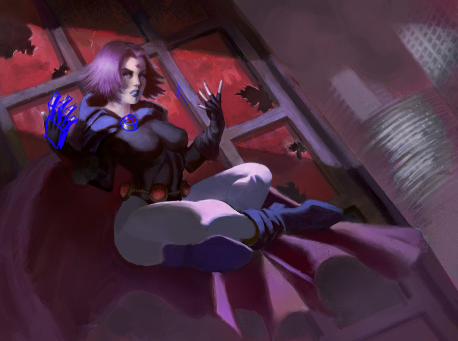
Update on the raven, i was slaving over this hand for the past two days, finally just used some 3d and found a good pose for it that felt natural. Im not joking like, i spent about 6-9 hrs or so just fiddling about trying to find a hand pose i liked, erasing and redrawing and such, all the while noodling the other areas of the image
Bringing the saturation down, its really been put in its own world. I think the new hand looks better than the other so ill probably spend some time making the other one look as good, and also bring the cape up thats going under the arm because it just cuts off behind the leg.