
+- Crimson Daggers — Art forum (//crimsondaggers.com/forum)
+-- Forum: PERSONAL ARTWORK (//crimsondaggers.com/forum/forum-9.html)
+--- Forum: SKETCHBOOKS (//crimsondaggers.com/forum/forum-10.html)
+--- Thread: Gabriela's skecthbook (/thread-1390.html)
Gabriela's skecthbook - Gabriela Birchal - 09-26-2012
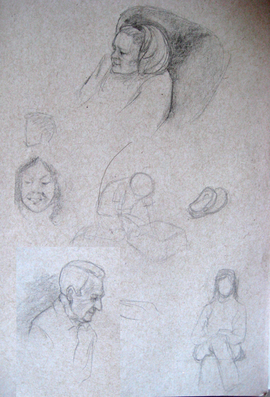
Hey, I'm finally starting a sketchbook here. I'll to keep up posting new stuff on here.
I'll start with some heads I drew while studying Andrew Loomis last night.


RE: Gabriela's skecthbook - Gabriela Birchal - 10-02-2012
Some new sketches today. Sorry it's not much but I'm trying to pick up the pace =)
Also my first attempt at making a super reflexive sphere:

RE: Gabriela's skecthbook - Gabriela Birchal - 10-04-2012
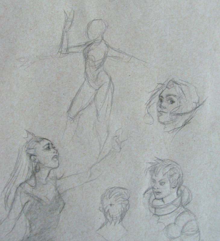
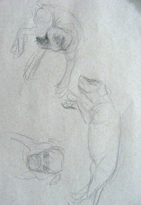
A few more sketches today:


RE: Gabriela's skecthbook - Gabriela Birchal - 10-14-2012
A study I did based on an illustration by Akihiko Yoshida for Tactics Ogre

RE: Gabriela's skecthbook - Gabriela Birchal - 11-02-2012

More study, now based on Saejima Illustration
Also here's some steps from a comission I took, I'm still strugling with drawing the poses correctly. Criticism and hints are greatly appreciated =)


Making some more progress:


RE: Gabriela's skecthbook - Gabriela Birchal - 11-08-2012
More progress:

RE: Gabriela's skecthbook - Gabriela Birchal - 11-10-2012
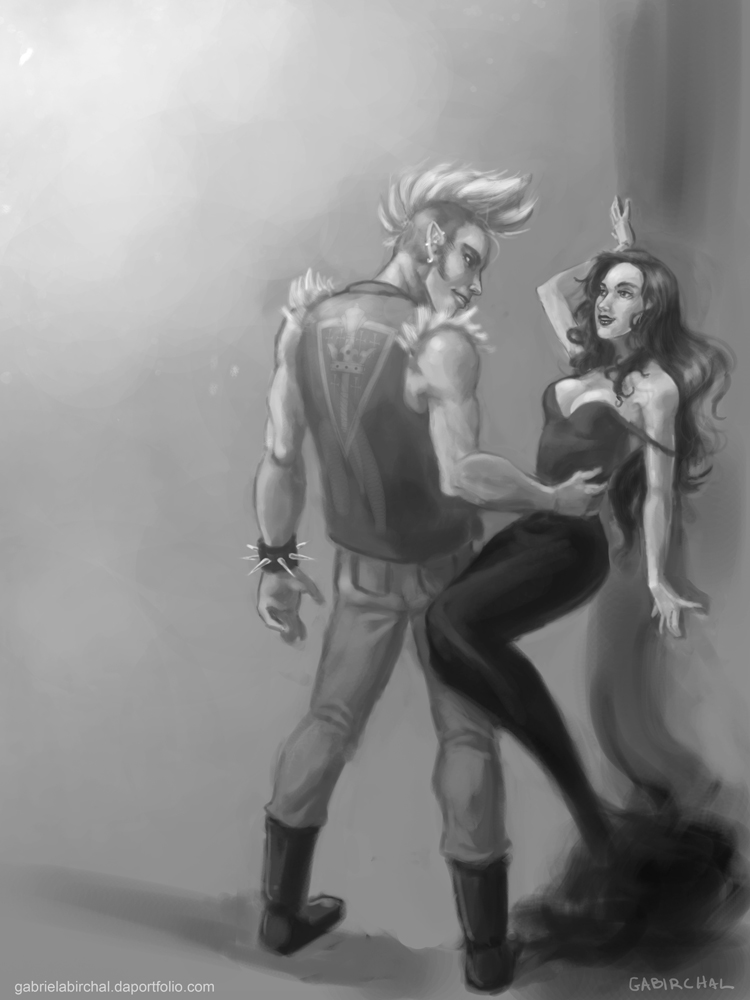
Done =)
RE: Gabriela's skecthbook - Gabriela Birchal - 11-12-2012
Portrait study from photo reference:

RE: Gabriela's skecthbook - Gabriela Birchal - 11-13-2012
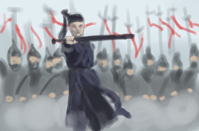
Thumb study from movie Hero
RE: Gabriela's skecthbook - Raman Djafari - 11-13-2012
I feel like your characters look kinda flat in some places. maybe try to work more from dark to light, that is something that really helped me develope a sense of volume in my figures.
rendering that way feels like sculpting to me, because you litarally shape your figure adding the lighter values.
RE: Gabriela's skecthbook - Gabriela Birchal - 11-14-2012
(11-13-2012, 05:33 AM)Raman Djafari Wrote: I feel like your characters look kinda flat in some places. maybe try to work more from dark to light, that is something that really helped me develope a sense of volume in my figures.
rendering that way feels like sculpting to me, because you litarally shape your figure adding the lighter values.
Thanks a lot for the feedback.
Yeah I guess I have to worry more about the volumes before jumping into colors. Thanks again!
RE: Gabriela's skecthbook - Gabriela Birchal - 12-02-2012
More comission development. This time it's a portrait of a Vampire. I'm using John Singer Sargent work as a ref to give a painterly look.


RE: Gabriela's skecthbook - Gabriela Birchal - 12-03-2012

RE: Gabriela's skecthbook - Gabriela Birchal - 12-05-2012
Started coloring the piece:

Edit: Final version has some minor changes
