+- Crimson Daggers — Art forum (//crimsondaggers.com/forum)
+-- Forum: PERSONAL ARTWORK (//crimsondaggers.com/forum/forum-9.html)
+--- Forum: SEEKING CRITIQUE/PAINTOVERS (//crimsondaggers.com/forum/forum-36.html)
+--- Thread: The Aerialist - Critique Needed! (/thread-2236.html)
The Aerialist - Critique Needed! - Camilleon - 02-14-2013
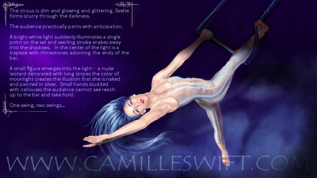
Hello again, so here we are with another work in the same series as Mr. Turtle ("The Room"). I would very much appreciate any feedback you can give! What works, what doesn't work, etc. Personally, I would have liked to use a vertical format instead of this wide horizontal one, but the reason I am using a horizontal one is because I hope to put this whole series online, each painting a full page--hence the widescreen format. I don't want a "lightbox" like the one I currently use in my portfolio gallery.
![[Image: Dreamtime---Aerialist.jpg]](https://3.bp.blogspot.com/-c-UiaG9tY3c/URvirQVA5bI/AAAAAAAACKU/mFbCofiCg80/s1600/Dreamtime---Aerialist.jpg)
RE: The Aerialist - Critique Needed! - Amit Dutta - 02-14-2013
Hey Camille, I like the general comp of the piece. It works quite well. Anatomy wise, the figure is pretty good, the only thing I can see is that her right leg at the angle it's at looks quite chunky because there isn't much curve and taper between thigh knee and calf on the inside. It's a small thing. In general I thought she was quite bright so perhaps having some of her in shadow / out of the spot light would make it a bit more dynamic and interesting.
The only other thing was that I thought the font choice while I understand why you chose it, is actually quite hard to read especially when it's all in one block like that. I also added some small border elements to the text really quickly. Not sure if these made anything better though? I addressed all these in a quick paintover. Hope it helps

RE: The Aerialist - Critique Needed! - Camilleon - 02-15-2013
Ah, yes--I'm digging the partial shadow over her! Definitely makes it more dynamic like you said. I'll have to study my source photo some more--I think you're right in that top leg needs a wee bit more curvature, but now that I'm looking at it, I think the bottom leg might be a little too small/thin. I find the frame a little distracting--I'll have to mull that over. You do have a point about the font, though, I'm wondering if I can get it crisper if I add the text afterward in Indesign...
In any case--thank you so much for the feedback! Extremely helpful!
RE: The Aerialist - Critique Needed! - Amit Dutta - 02-15-2013
(02-15-2013, 06:51 AM)Camilleon Wrote: I find the frame a little distracting--I'll have to mull that over.
In any case--thank you so much for the feedback! Extremely helpful!
No worries! Actually now I find that frame distracting as well...perhaps something more subtle. I guess I was trying to deal with the feeling that it just looked a tad bit "unfinished" in a way, but I'm not sure what you would want to do. Perhaps you could add a bit of custom interest to the typography itself, like larger first capital letters for the paragraphs or something like that; something that also reiterates the theme of the circus?
RE: The Aerialist - Critique Needed! - Camilleon - 02-20-2013
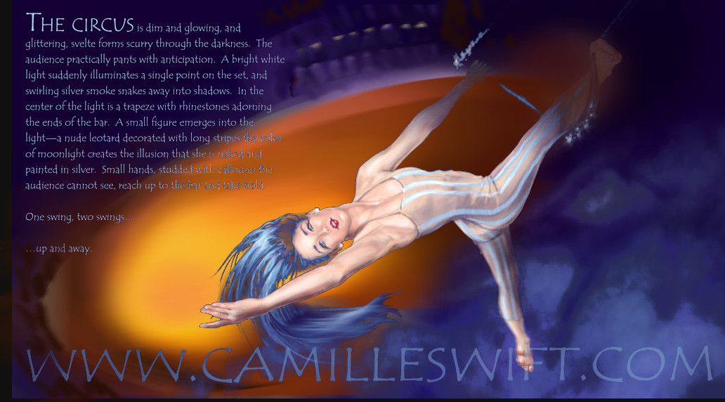
All right, check it out--I made some adjustments thanks to Monkeybread! I'm still not quite happy with it, though, so give me your thoughts!!!
![[Image: The+Aerialist_Final.jpg]](https://4.bp.blogspot.com/-bEBQ155YJl0/USQshRXD9FI/AAAAAAAACLA/bJkhN1GYclE/s1600/The+Aerialist_Final.jpg)
RE: The Aerialist - Critique Needed! - Amit Dutta - 02-20-2013
Now this is quite a lot more so late in the game but...

I thought the addition of the ring below using a complementary colour added a bit of zing. Also motion blurred hair and dangling leg a bit...It may be a bit busy now especially with the large site text, but perhaps something along those lines?
RE: The Aerialist - Critique Needed! - Elmst - 02-21-2013
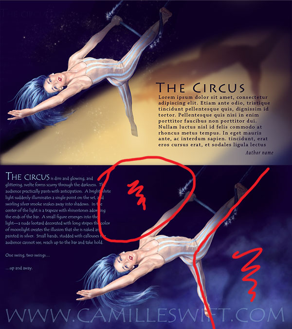
I love your painting! The one thing I do see in both the Turtle painting as well as Aerialist, compositionally you are leaving the text until last, it looks like you are creating negative space for the text and fitting the text in that space, rather than the text becoming part of the complete composition.
I have done a quick paint over to illustrate my thoughts, the text needs to be worked in better but we have eliminated several problem areas.
The light strength and color could use work but it is a nice jumping off point.
Hope this helps.

RE: The Aerialist - Critique Needed! - Camilleon - 02-21-2013
A big thanks to you both! I actually had the ring in the painting from the very beginning, but I had it in the bottom right-corner, covering about a third of the area beneath her. I tried a few different things with it, but hated the way everything looked, so I took it out! I like how both of you have it actually more centered in the composition and the complimentary color is a great idea. I definitely like the re-positioning of the text--it makes the composition considerably less awkward. I'll update again as soon as I've tweaked it some more. Thanks again!
P.S. The reason I don't have the author's name for the text is because I wrote it. :)