+- Crimson Daggers — Art forum (//crimsondaggers.com/forum)
+-- Forum: PERSONAL ARTWORK (//crimsondaggers.com/forum/forum-9.html)
+--- Forum: SEEKING CRITIQUE/PAINTOVERS (//crimsondaggers.com/forum/forum-36.html)
+--- Thread: False God (/thread-2619.html)
False God - dwilliams - 03-21-2013
Hello everyone- first time posting here.
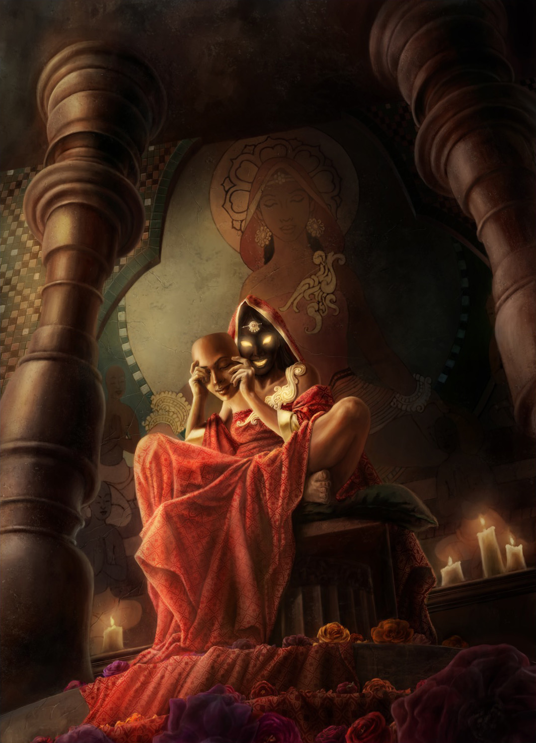
I'm close to finishing an illustration for my portfolio, and I'd love to hear everyone's feedback on what I have so far. The basic narrative behind this piece is a goddess is sitting on her pedestal with offerings of flowers on the floor in the foreground, and a mural of her with her followers on the wall behind her. The happy and serene face depicted on the mural is actually just a mask, and she's revealing her evil/demonic face to the viewer, contrasting with them mural behind her.
I'm kind of at a point where I'm not sure what else needs to be worked on with this piece, so I'm interested in everyone's suggestions or critiques. Thanks!

RE: False God - ChantalFournier - 03-21-2013
I love the concept and the storytelling, but I'm really not convinced by the perspective of the columns and of the border of tiles. The columns don't look like they are perpendicular to the dais the goddess is on and the difference between the bottom and the top might be too sharp. I suggest you use sketch up or another 3d software to make sure. Be careful of the 3d software's camera settings, you don't want a fisheye or something. Some of your fabric highlights also appear washed out to me. I would think her outfit would have glorious saturated colors but the pattern pales in the light and some parts are too desaturated vs the dark parts.
I also think her eyes should cause rim lights on the hand and mask for a more dramatic effect.
Good luck, you are very close!
RE: False God - dwilliams - 03-22-2013
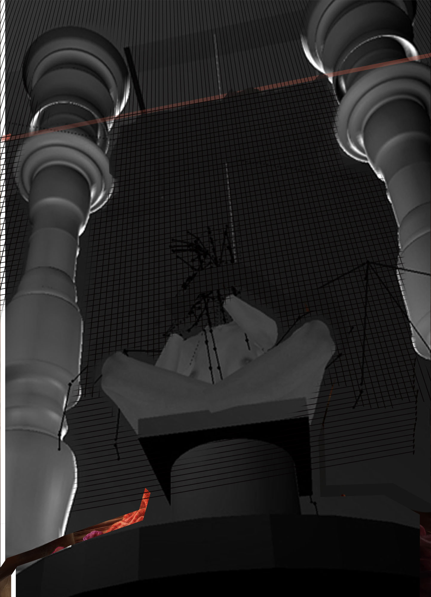
I did create a 3d model for the columns, though I'm wondering if the camera settings I had are indeed making the perspective look wonky.
RE: False God - ChantalFournier - 03-22-2013
That might be a case of zoom vs dolly or the lens you picked. The columns look like they are tilted toward the goddess.
RE: False God - dwilliams - 03-22-2013
Here is the 3d ref that I used for the piece. I can see little fixes that I should make with the pillars and the pedestal, but overall I think I followed it pretty close. Does the reference itself look like it's wrong? Is that why the pillars in the painting look strange? I originally had the ceiling farther back, but I moved it closer to the columns (where I drew the red line) in order to give more space for the mural. I also drew a grid for the tiles on the wall and just painted on top of it. Do the tiles look like they're out of perspective here?

RE: False God - ChantalFournier - 03-22-2013
In some 3d software, it's possible to zoom the camera without moving it OR to move it closer without zooming.
Here is the explanation according to the Maya Help file:
Quote:DollyOk, I'm not a 3d rendering specialist, but here's my hypothesis:
Moves the camera into the view, or backs the camera out of the view. When you use the Dolly tool, you change the perspective; that is, objects far from the camera change in relative size at a slower rate than objects which are close to the camera. Compare to Zoom (see Zoom ).
You can use the Dolly tool in a perspective view or an orthographic view.
Zoom
Changes the focal length (viewing angle) on the camera. The Zoom tool does not change perspective like the Dolly tool does; all objects in the frame change size at the same rate. The camera doesn’t move, but the effect is similar. To move in or out of the view without changing the viewing angle, see Dolly.
The results are different, the closer you are from the foreground, the more distorted the perspective in the background becomes. If you don't know how to do it with the software you are using, I suggest reseting the camera back or creating a new one, then placing the camera at the same angle but further away. Then render your image bigger and crop in. You should have a more natural looking set of columns.
RE: False God - dwilliams - 03-25-2013
Here is the final so far, after various revisions. I tilted the columns apart slightly to lessen the exaggeration I had before, so hopefully they don't look like they're tilting towards each other anymore. I also made a fix to the mural in the background, as well as a bunch of other small stuff.

RE: False God - Jaik - 03-25-2013
This new one looks much better. The only thing I can think of (and you may have a reason for doing it the way you did) is it might look better with the forehead decoration on the mask instead of the face behind it, it would make the real face a bit darker and less detailed which in my opinion would be a bit more evil and you can really push the forehead object on the mask to make that a second read so that your eyes move from the real face to the mask, instead of to say.. the candles, which is where my eyes were naturally drawn.