+- Crimson Daggers — Art forum (//crimsondaggers.com/forum)
+-- Forum: PERSONAL ARTWORK (//crimsondaggers.com/forum/forum-9.html)
+--- Forum: SEEKING CRITIQUE/PAINTOVERS (//crimsondaggers.com/forum/forum-36.html)
+--- Thread: Horse Battle UPDATE 7/5- final (/thread-2756.html)
Horse Battle UPDATE 7/5- final - dwilliams - 04-04-2013
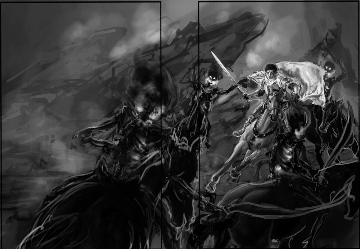
I've finished a value rough of my current piece. This illustration is pretty straightforward- a knight on horseback fighting against a bunch of shadowy-skeletal guys chasing after him, in the format of a wraparound book cover. Two are following behind him, and another two have run in front of him. I wanted to have a piece in my portfolio with a lot of action (and horses) since that's something very common in fantasy art. The edges on the shadow guys are going to be more blurred and shadowy when I get closer towards the final, but I left them sharp here so you can see them better. They also have flames/fire coming out of their skulls and inside the ribcage area, in case it wasn't clear what the bright spots on them were.
What I'd really like everyone's input on so far is the composition. There's a lot of stuff going on and I want to make sure its fundamentally strong. Do you see any awkward tangents or anything like that? I tried to get the eye to follow the curvature of the skeleton swords leading towards the knight, who is the focal point of the piece obviously.In particular I wanted to know what people thought of the horse in the foreground on the front cover (not the larger horse from behind on the back cover side) Do you think the placement of the horse is awkward at all? Like the way the head or legs are cut off? I've been having a tough time finding a good position for that figure without covering up too much of the knight.
Thanks for taking a look!

RE: Horse Battle WIP - Amit Dutta - 04-04-2013
Hey man, I think the main issue at the moment is that it is pretty hard to see what is going on because you haven't actually "finished" your value sketch. Most things are very dark and it is also pretty flat and lacking depth so you can't really get a sense for the comp without closer inspection. If it doesn't read at thumbnail size you need to keep working on it.
From what I can tell the picture is pretty dynamic, and the main dude and the ones behind him work quite well with the bg, but, I can't really tell what the perspective is supposed to be as there are contradicting cues between the main rider and the background rocks. I think the idea of a foreground rider might work if you played with it, perhaps even going in much closer so we can see just an elbow and a sword or something like that. You do seem to be more concerned about showing off all of that nice horse drawing you did especially because you have spent the most time rendering that already so that does restrict what you can do with the comp in terms of overlap. Also the main horse is looking good but it's not the best idea to go that far in a value sketch if you haven't nailed the comp already. You would just have to redo all that work if the comp changes and actually, you're less likely to not want to make the hard decision to make changes to give the piece what it needs because you don't want to erase what you've spent time on already.
I'd say if you want to showcase the main character then really just go for it and make the foreground guy much less prominent and simplify your comp.
In general for comps something I'd suggest would be to simplify your values into fairly discrete flat areas of shape and value until you nail it. There's no point adding scribbly details and vague airbrushing as you have because these tend to muddy the comp. and you're after the big shapes anyway.
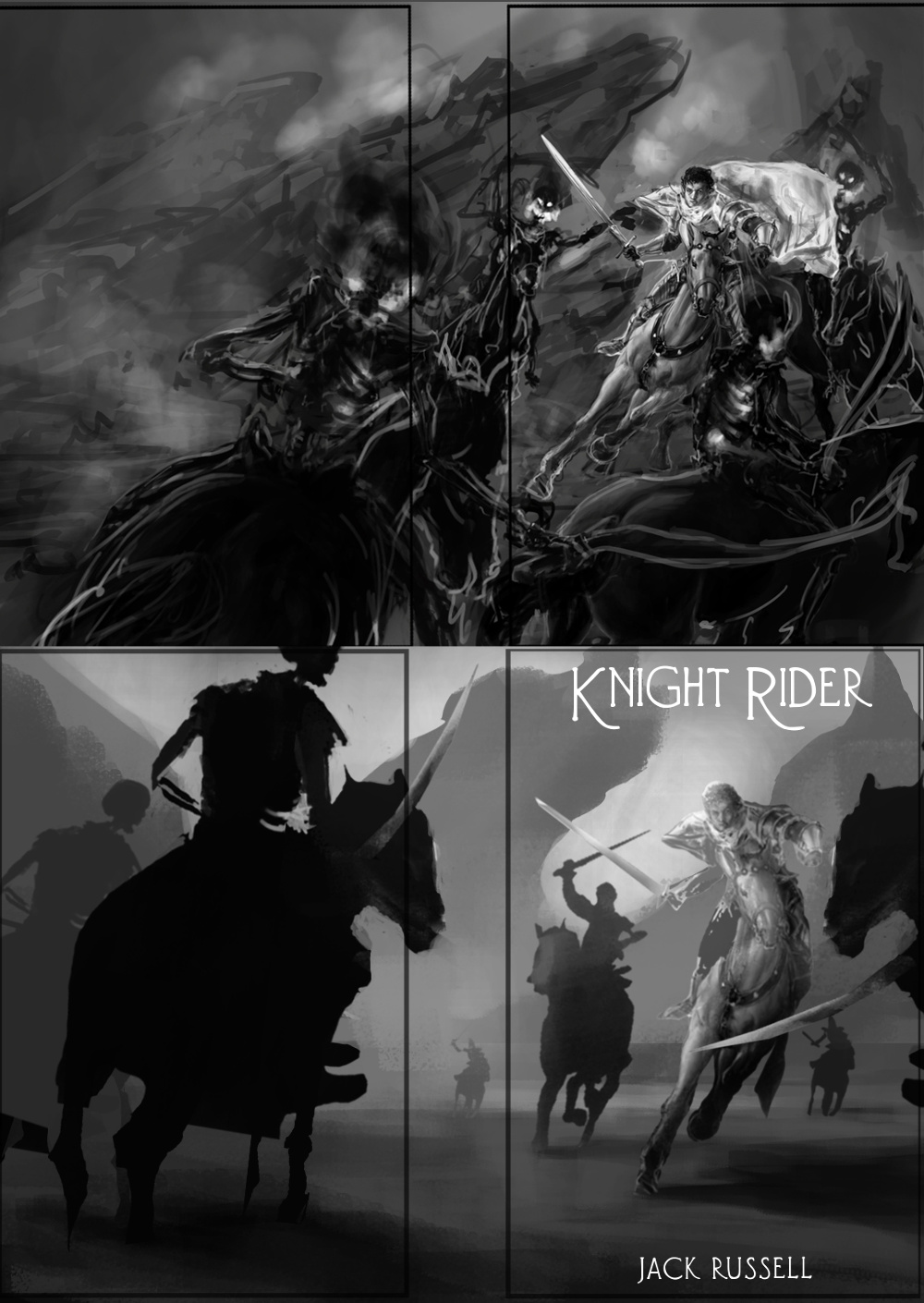
I didn't exactly paintover what you had to address your specific comp issues but I did a comp. sketch the way I would if I was going to do this. I basically started with your main guy unchanged (got rid of his cloak for simplicity, would add it in later) and then I fit everything else to his perspective. I created the silhouettes of every shape (background, each rider) in a different locked layer and filled them with a flat value. I scaled and moved things around until they kinda worked, then I used a large soft brush with lighter or darker shades of value just to give them a bit of form and integrate them into the background and change their depth in the comp.
At this stage I'd go away and do 5 more of these comps before the illo. :D
I know I changed your whole piece so it may not help for your illo. but I'd recommend you work out your compositions this way or similar and then nail it before you go into detailing.
Hope that helps

RE: Horse Battle WIP - dwilliams - 04-05-2013
Here is another composition I tried, based off of the critiques I've gotten here and elsewhere.I simplified the shapes of the shadow guys so it's less busy and easier to see what's going on.
I moved the position of the two rear horses a bit and changed the front two horses a lot as well. The front two horses are closer to the viewer, and allow a clearer view of the knight. I've also adjusted the values some to give the piece more depth. Overall I think this piece reads a little easier and has more dimension to it, with a stronger foreground and more visible background in the distance. Let me know what you think!
[ATTACH=CONFIG]1759555[/ATTACH]
RE: Horse Battle WIP - dwilliams - 07-06-2013
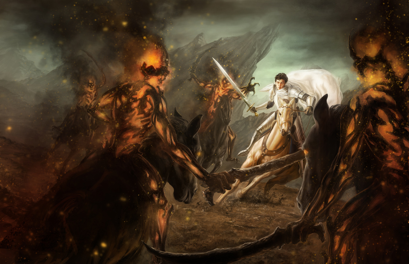
Finally found some time in between work to finish this piece. I still have some more detailing/sharpening to do in some areas, like on the ground and on the main horse, but all the essential details are there, and I'd like to know what people think. I also still need to do a little work on the guy's face- something just isn't working for me. Does the composition make sense? I wanted the skeletal riders to be smokey/flamey, but can people still make sense of where the riders are and what they're doing?

RE: Horse Battle UPDATE 7/5- final - babix - 07-09-2013
nice work dude! i think a little bokeh effect or speed blur would do well in this picture IMO