+- Crimson Daggers — Art forum (//crimsondaggers.com/forum)
+-- Forum: PERSONAL ARTWORK (//crimsondaggers.com/forum/forum-9.html)
+--- Forum: SEEKING CRITIQUE/PAINTOVERS (//crimsondaggers.com/forum/forum-36.html)
+--- Thread: Background color suggestions? (/thread-2784.html)
Background color suggestions? - nathan - 04-06-2013
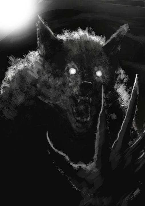
Hey everybody. I'm finishing up this sketch tomorrow and thought I'd ask opinions on background colors or treatments that would enhance it. Any ideas?
EDIT:
Did some further tweaking on this, added highlights and went for a night sky background. Thinking about a subtle starfield and possibly a raised paw for the foreground.
What do you think?
RE: Background color suggestions? - nathan - 04-29-2013
(04-06-2013, 02:44 PM)nathan Wrote: Hey everybody. I'm finishing up this sketch tomorrow and thought I'd ask opinions on background colors or treatments that would enhance it. Any ideas?
EDIT:
Did some further tweaking on this, added highlights and went for a night sky background. Thinking about a subtle starfield and possibly a raised paw for the foreground.
What do you think?
MORE EDITING:
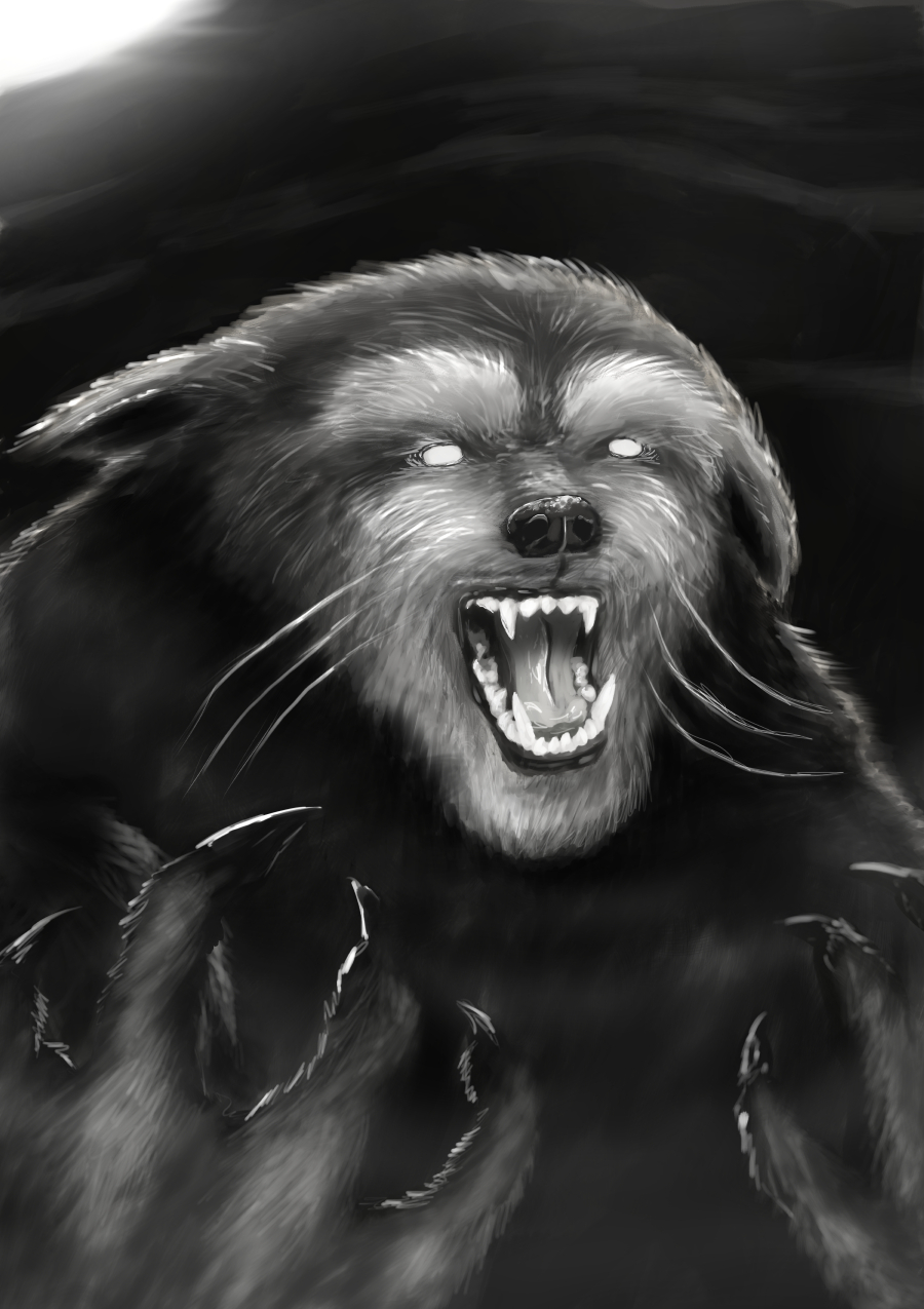
I've pushed the depth by adding a foreground paw and some foggy atmosphere. Any thoughts, suggestions? Is the paw at too weird an angle, or do I need more arm perhaps?
RE: Background color suggestions? - Wardy - 04-30-2013
ok im not a great painter by any means but I'll help out if i can.
the first thing that grabs me is that the neck/head transition is a bit weird. he doesnt really seem to have a neck, it just seems to be his head on a pair of really beefy shoulders.
The paw looks a bit awkward because we dont know where its coming from, if you did a more dynamic pose, and zoomed out a bit then we could tell, but seeing as its a portrait with an added paw its a bit hard to tell. I would recommend increasing the canvas size, and actually working out where the paw is coming from, where the arm is, and try to create a more dynamic pose- perhaps on a rock, the paw on the rock closest to us and a turned head towards us? I would try a sketch but I suck... Let me know if you want me to give it a shot.
Hopefully that helped... a bit... hehe, good luck with it.
All the best :)
RE: Background color suggestions? - nathan - 04-30-2013
Thanks for the post!
I agree, the arm needs better integration, looking really floaty at the moment. I'm also planning to better define the chest area, to suggest a slight forward lean. I want to keep the portrait layout, though. Might do another one with a full body pose.
As for the neck, I was going for a sheepdog/cat sort of look, with a bloated hulk type body (size, not definition)-so I'll probably tweak the fur around the neck to help suggest that.
Thanks again for the notes, it's cool getting feedback!
RE: Background color suggestions? - nathan - 08-27-2013

Decided to go back to this and try to finish it up this time. I've modified the hand, made it "hands" and tried to push the depth a little more.
Tweaks to follow:
-Better definition around neck of fluffy fur collar/shoulder
-More detail in focus areas to draw attention
-color pass
-"roughened" pass, where I'll make it look mangy and dirty (as a test)
-tightened up lighting (from front and rim from moon)
Geez, more than I thought to do! I'll keep chipping away until it's done.
Thanks for viewing!
RE: Background color suggestions? - Mike086 - 09-09-2013
http://livestre.am/4BFMe
Did a livestream for you.

RE: Background color suggestions? - nathan - 09-10-2013
(09-09-2013, 07:01 AM)Mike086 Wrote: http://livestre.am/4BFMe
Did a livestream for you.
Thanks, Mike! I've had too full a plate to do much on this recently, but I'll enjoy checking out your take on it. I hope to finish it up soon!