+- Crimson Daggers — Art forum (//crimsondaggers.com/forum)
+-- Forum: PERSONAL ARTWORK (//crimsondaggers.com/forum/forum-9.html)
+--- Forum: SEEKING CRITIQUE/PAINTOVERS (//crimsondaggers.com/forum/forum-36.html)
+--- Thread: Confusing composition (/thread-3019.html)
Confusing composition - giovannyarce - 05-07-2013
Hi guys, I need some help here, I think I got a little bit crazy adding elements to this illustration. I'm starting to learn more about composition, who knows, maybe is just a problem of contrast or framing. Thanks a lot guys, hope to learn a lot in this forum.
RE: Confusing composition - ChantalFournier - 05-07-2013
Can you tell us what is going on and what you think should be important?
RE: Confusing composition - giovannyarce - 05-08-2013
I'm planning to add some people walking through the roots with some torches in their hands, the girl statue have the last flowers and living plants in their hands, is like an altar. The whole place is like an ancient place, where the roots are moving to the sky and maybe connects with a celestial source or whatever the spectator wants to give to the piece. Hmmm, something like that, I'm still not sure about the main theme.
RE: Confusing composition - ChantalFournier - 05-12-2013
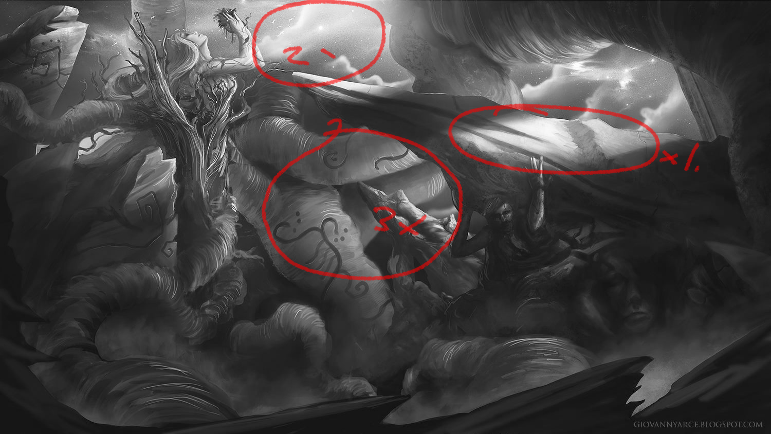
The thing is, right now, your areas of highest contrast are the diagonal rock on the right and the cloud next to the female statue. These things are not the centre of interest so it's a bit confusing. And the 3 big jagged dark things at the bottom of the image are probably rocks or something, but they look more like places where you stopped rendering. I think you need to remove these and redesign them, to look like actual rocks or ground.
Your whole image looks like you didn't stop and make thumbnails and plan. It looks like you started doodling and never stopped and rendering and coloured and now you have all kinds of cool parts, but no coherent composition.
RE: Confusing composition - Amit Dutta - 05-12-2013
To reiterate what Chantal is saying is that you haven't planned your comp in the sense of value arrangement beforehand. I've uploaded a grayscale image of your main focal points according to your value scheme so you can get a sense of the highest points of contrast. It's often useful to keep referring to grayscale because values are where you get your main read in any piece.

You can see that most of the main focal points don't actually lie on any of the characters, which for a character-centric piece is where you would expect them to be, so I think you should focus the light on the main lady, the guy below the rock and whatever else is happening to link them together. I agree with what she said in that, you probably need to figure out all the elements that will end up in your piece before you get to as high a render level as you are currently at; especially so for a narrative piece.
I also agree with her in that you should probably have a good indication of where you want to go with the piece before you offer it up for crit, or we'll just have to ask it of you in the end. In general, think about layering your values,,dark - mid - light overall and highest contrast at focal areas.
Hope this is useful.
RE: Confusing composition - giovannyarce - 05-13-2013
Thank you guys for this critiques, I will pay more attention to this details, I agree about all you guys said, my main problem right now is how I use my values so I can get my focal point in the right spot. I will post a new wip later, cheers.