+- Crimson Daggers — Art forum (//crimsondaggers.com/forum)
+-- Forum: PERSONAL ARTWORK (//crimsondaggers.com/forum/forum-9.html)
+--- Forum: SEEKING CRITIQUE/PAINTOVERS (//crimsondaggers.com/forum/forum-36.html)
+--- Thread: Composition and Value (/thread-3073.html)
Composition and Value - Wardy - 05-14-2013
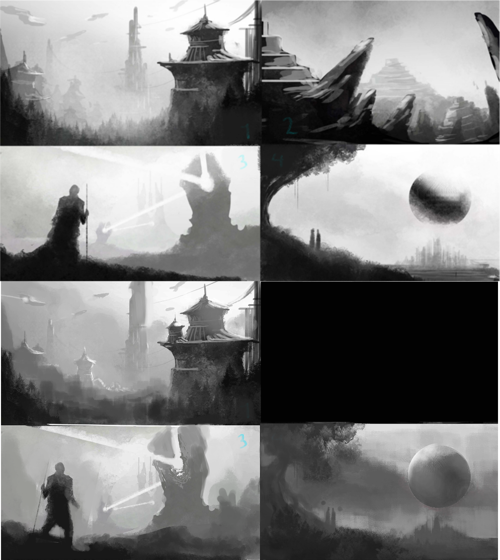
Hey guys, just did a few random fantasy/sci fi thumbs (its my exam wind down atm so nothing too out of my comfort zone...) and starting to feel a bit more relaxed and comfortable with working with value in environments.
Please let me know what I've done wrong with the composition/value and what I could improve, thanks :D
RE: Composition and Value - Amit Dutta - 05-14-2013
I believe this is what you call in the industry, a level up. Well done mate, whatever you're doing it's paying off. These are much better value wise and the comps are much better as well.
Think you are still going towards the extremes a little bit too much especially on the whites, your skies are very close to 100 in fairly large areas, so tone it down a bit. Once you've painted for a while, check your highest and darkest values with the colour picker or histogram and readjust using curves. (I prefer curves to level, because it gives you more control.
I'd say you now need to start thinking about exerting more control and having more layers inbetween your basic fore-mid-background values to add interest and depth.
Also don't always separate out the three layers so distinctly. In your comp create objects that go from fore to midground or midground to background continuously. It will feel a bit more real and really create the feeling of a real space, than distinct layers do.
When you have foreground layers coming down and touching the canvas (as in 1) it drops the viewer out of the scene so be careful about that. Also try extending things out of frame as well (eg far building in #1) as it adds scale and indicates to the viewer that the world extends out of the canvas and so is a snapshot of something real.
You're getting better in comp, but you're still not really nailing the rule of thirds in most cases. You're close but not quite there. It really is just a matter of plonking your focal points on the thirds. You can get creative later, but just try doing that consistently and things will automatically look better. Think about not just one focal point, but also secondary and tertiary points as well. You want to create flow between the focal points.
Did a quick tweak of the comps and values (except for number 2, I think that was too plain to really do anything to without painting more than I wanted to)

RE: Composition and Value - Wardy - 05-14-2013

Thanks very much! I'm feeling a lot more comfortable with these, and I've got a good method sorted out (using the 3/4 value technique and nice foggy brush to soften up some shapes) so I'm feeling a bit more satisfied with what I'm doing now, so thanks a lot for the help with that :)
Finished Gurneys book a little while back, so hopefully my colour paintings will show some improvement as well.
Really loving the thumbs you did, I see completely what you mean about the rule of thirds (i kinda guestimated it here, will draw a grid and assign a hierarchy in future). I really like how you brought focus with the light on the little house in 3 on the bottom left, will keep that technique in mind in future. I think I may develop some of these, I really dont like 2 as it is very confused so I think I'll learn from and ditch that one.
I'll try to get some more interesting stuff in between layers and frame the picture better, as I know it needs some grounding which I'm not providing.
Thanks a lot for taking a look, will see what I can do about the sky (its because I'm using a gradient as the background as I dont like block colours, will do it from dark grey to light grey in future, thanks) and keep improving one or two and render them properly in colour I think :)
Cheers! :)
RE: Composition and Value - Amit Dutta - 05-15-2013
No worries, keep pushing! Oh also a lot of these comps are pretty much identical, in terms of perspective and focal point placement, so try and vary it up. Really think about pushing perspective to your advantage.