+- Crimson Daggers — Art forum (//crimsondaggers.com/forum)
+-- Forum: PERSONAL ARTWORK (//crimsondaggers.com/forum/forum-9.html)
+--- Forum: SEEKING CRITIQUE/PAINTOVERS (//crimsondaggers.com/forum/forum-36.html)
+--- Thread: wip need some advice (/thread-3192.html)
wip need some advice - kailos - 05-31-2013
Hey guys working on some fan art for the video game Dead Space. Wanted to do this to practice my colors, as well as lighting and rendering techniques. Its basically done but not sure something feels off and I cant really put my finger on what it might be. Who knows, maybe I've just been looking at it to long. Im just not sure if it is done or if there is something more I can do to it or if I should go back a few steps and fix somethings. Wanted to go for a very grunge, realistic, dark look as this is the look of the game. Any advice or critiques would be greatly appreciated. Thanks
RE: wip need some advice - Amit Dutta - 05-31-2013
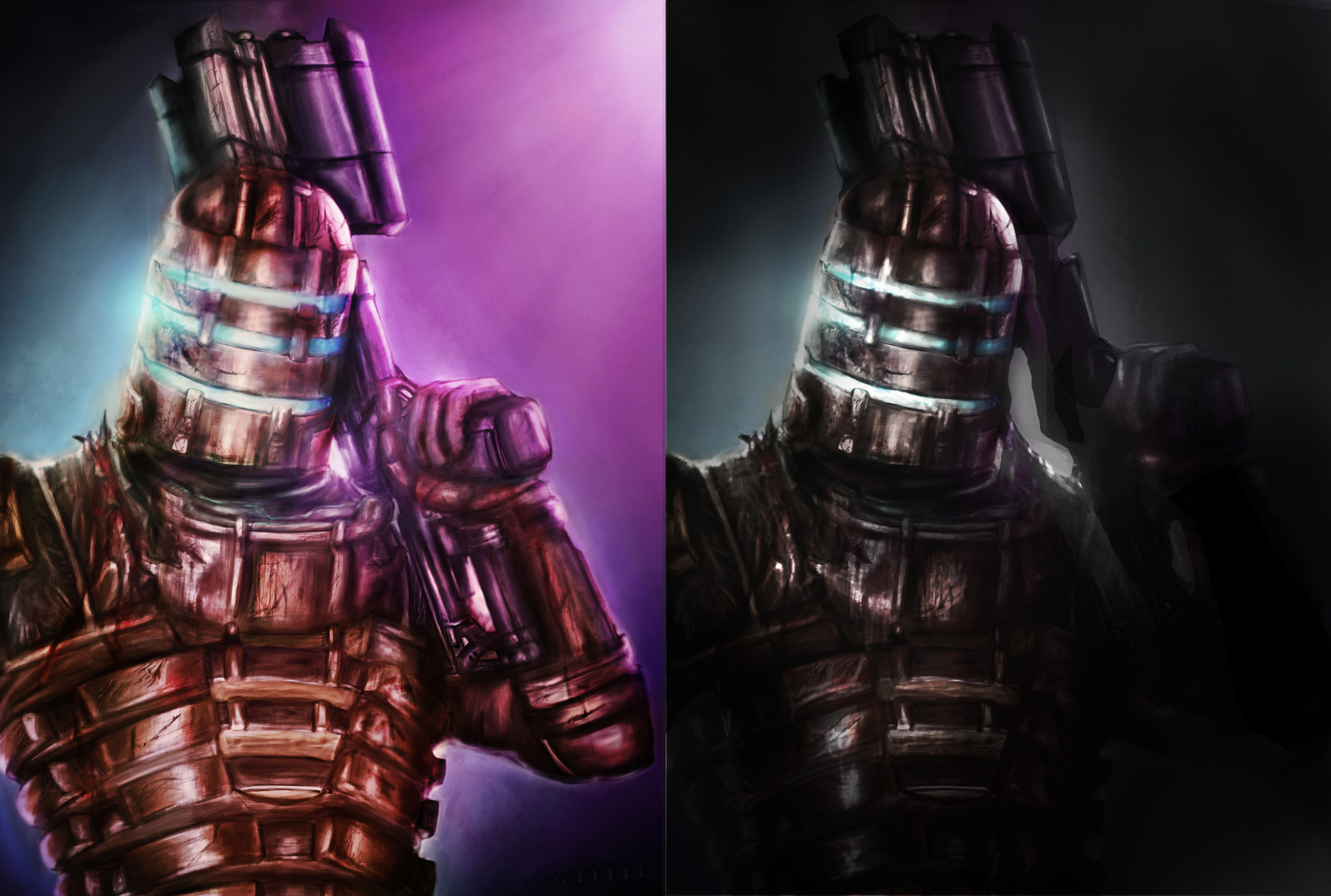
Did a paintover for you. (well actually it was more of an image adjustment than painting) Basic things were too much contrast in value and too much saturation in colour if you were going for realistic grunge. I think you could pay more attention to your rendering of the basic forms and volumes to get them to work within perspective of the piece. Things are looking quite flat in several areas. Think about painting around forms to get them to look more 3D. A way to do this is to control your edges and think about using a combination of hard edges to showcase silhouette and softer edges in places wrapping around forms to show that they are going back into the distance.
You chose a comp that cuts down the figure quite abruptly using one edge of the canvas and it's probably not ideal. I tried to use vignetting and lighting focus to improve this somewhat without having to repaint the figure in a better comp, but if I was working on this I would redo the entire composition to show more of that side of the figure as well or use a crop that isn't so brutal maybe.
Hope that is useful.
RE: wip need some advice - NRAG - 06-03-2013
As a serious Dead Space fan I have to say the potential for this image drives me crazy! I love the pose you laid out and the atmosphere you're trying to capture. Here's a quick paintover process I did for you in about 20 min. I might have taken the painting too far so I'm sorry if i did.
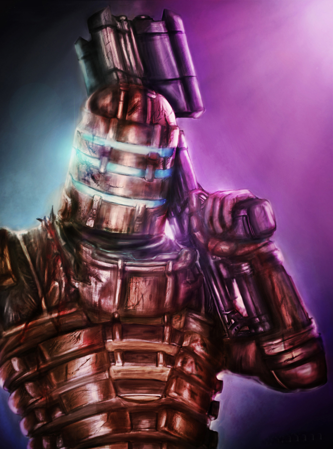
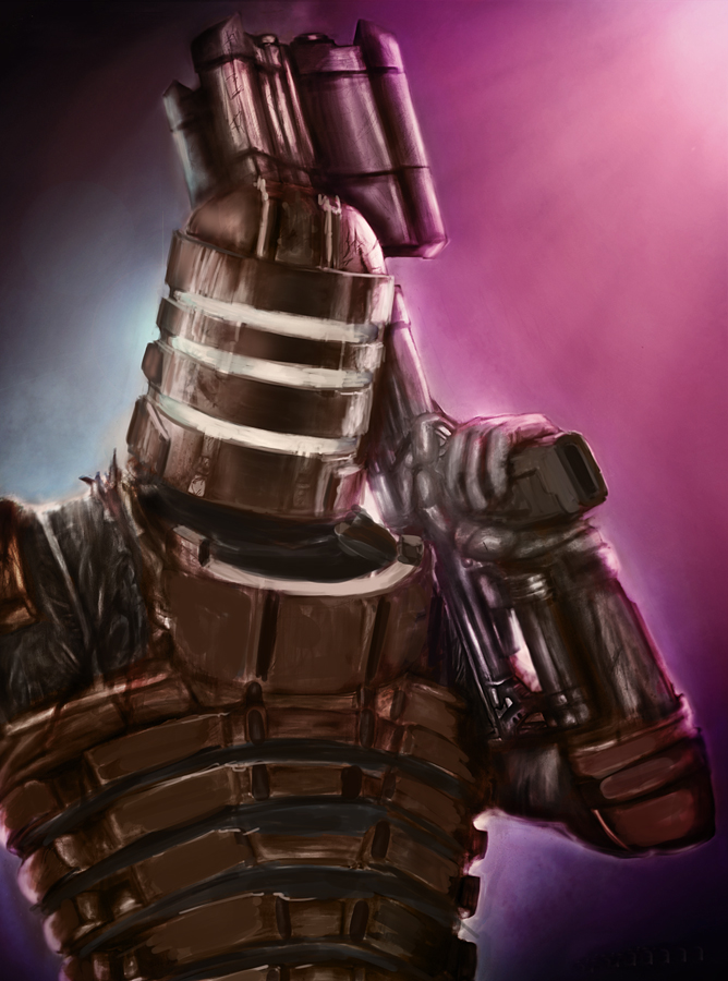
First thing to do, watch your light sources, keep them simple. I narrowed down the scene into 3 of them, two high side light sources and the visor light source. This also helps with the composition now that the subject is darker against the lighter background. I also turned the lights into a blue and red color, instead of the teal and purple it was. Your monitor colors might need to be adjusted if they looked blue and red on your monitor.
As I started painting I wanted to bring back that classic copper brown that was getting lost in the many light sources the image had. I also brought in the grey leather that is under the armor. Now watch your shapes, making sure they're formed in perspective. I'm not talking about making grid work, I just eyed the thing. He's looking down slightly so you're going to see the top of some of that masks, notice you cant see any of the bottom of the mask. For the chest its the opposite, He's leaning back so now you can see a bit of underneath the armor and you don't see the top.
The other thing here is watch your edges, a lot of them were far to soft. I used two brushes only for this, the opacity hard round and the opacity soft round brushes that come with photoshop. I change their size frequently, it's very simple how I use these. For hard edges use the hard brush. For establishing the softer side light sources I mostly use the soft round but will occasional bring in the hard round to add some banged up detail.
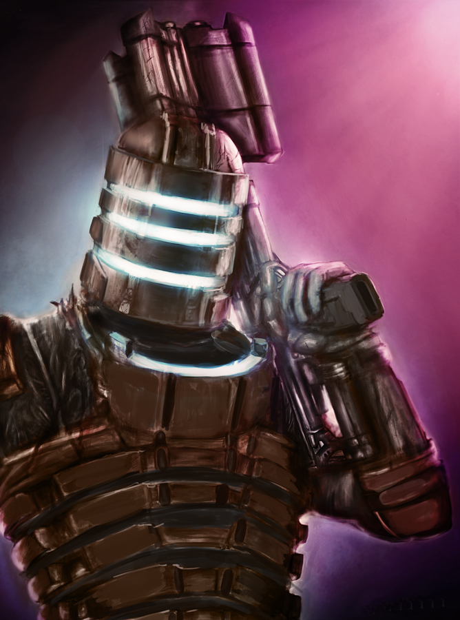
Here's a cool trick for you for adding lights. I use a color dodge layer with a soft round brush and a dead space blue color. Now just start painting in the lights and the areas the light hits. Be careful, this effect can be easily taken too far, so make sure to do a couple tries with it then chose the one you like best.
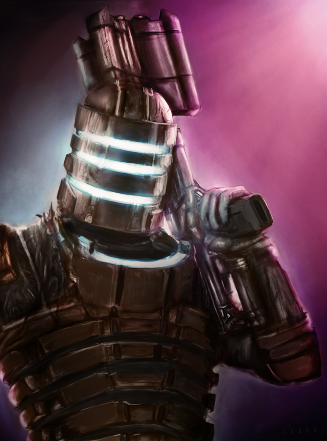
Here's something important, open a layer adjustment and mess with the levels randomly. much like flipping the canvas, this will reset your eye to find areas that will look better darker. I quickly decided the lower torso of Isaac needed to be darker. I would have never noticed had I not messed around with the levels.
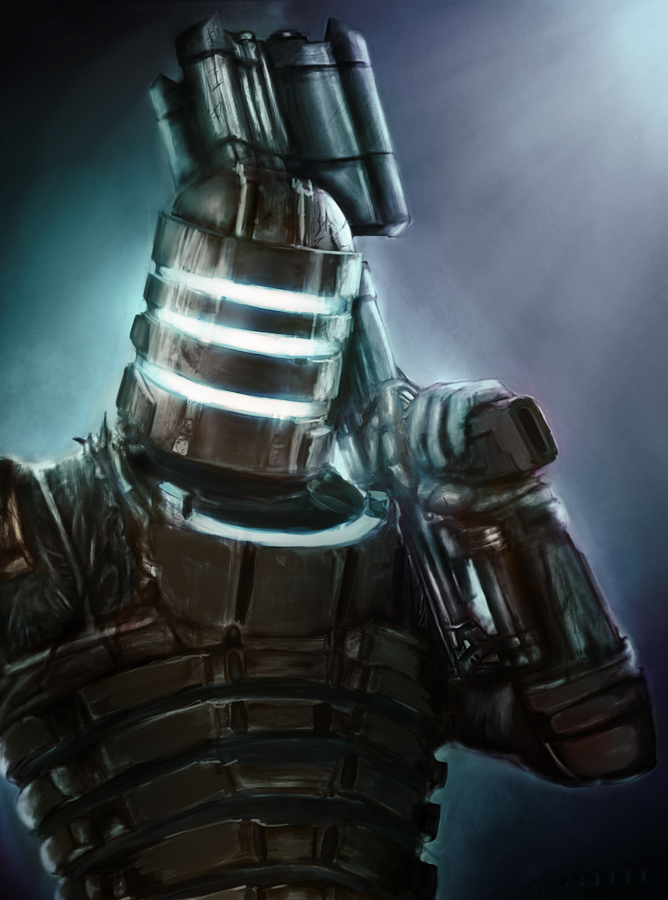
This last part is just a personal preference and not really a suggestion. Ok so in the game there is a color theme a lot of people don't notice. When things are chill the lighting is blue or teal, then when the shit hits the fan it goes red. In the image the shits not really hitting the fan Isaac is just being a bad ass, so I like the blue.
The image has the potential to be so awesome, so keep working it. the last thing I'd do but wont for this is add varying levels of detail into the different focal points. The stuff I want to pop out more to the viewer will get the most detail.
Great idea man! Hope this helps! Keep at it!
RE: wip need some advice - kailos - 06-03-2013
Thanks for your help and the paint over guys! I can see what your both saying and Im gonna work on it, see if I can get it right! After taking some time off from looking at the image and now coming back to it seems like a breath of fresh air. Now I can start seeing what you guys are pointing out. NRAG Im a huge DS fan to thats why i really wanted to get it right, gonna play around with it to see what I can do with it. Hopefully by the end of this week I can post something on here to see if its any better lol. Thanks again for the help, this is why I love crimson daggers!
RE: wip need some advice - kailos - 06-15-2013
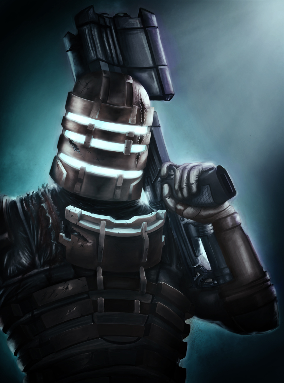
Hey guys been busy with work so haven't had a lot of free time to dedicate to working on this. Here is what I have so far, hopefully I can dedicate some free time to it and finish it over the weekend. Went with just the blue and fixed the colors a bit like NRAG suggested. Also worked a bit on vignetting like monkeybread had suggested and have just been reworking it in general making the changes you guys have suggested.
I forgot to explain something the last time I was on here. Originally I had sketched out this comp to be a pretty close up. But when I added the big gun it pushed it back a bit and then I had 3 options fix it to include the other arm, rest of torso and thighs, crop it closer or leave it as is. Since I was unsure at the time I just started working on it as is and eventually just decided to leave it there. I know the comp isnt the best I am still considering doing one of the other two options, crop it closer or zoom it out. Im open to suggestions.
Still want to add some more detail, blood, scratches, fix up the gun a bit more, etc but what do you guys think? Do you think its looking better? Anything that you see that i still need to work on or adjust? Thanks again for the help guys.
