+- Crimson Daggers — Art forum (//crimsondaggers.com/forum)
+-- Forum: PERSONAL ARTWORK (//crimsondaggers.com/forum/forum-9.html)
+--- Forum: SEEKING CRITIQUE/PAINTOVERS (//crimsondaggers.com/forum/forum-36.html)
+--- Thread: Lady Dragon needs help (/thread-3361.html)
Lady Dragon needs help - Aikanaro - 06-25-2013
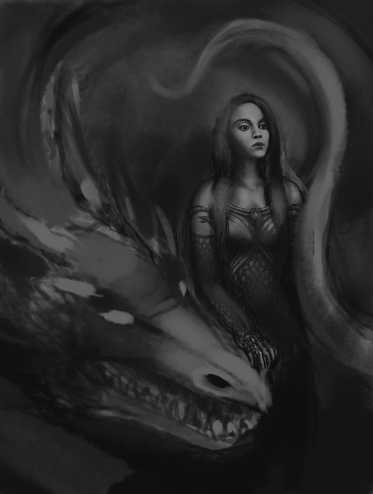
Work in progress. I was working on other pictures while listening to music and the song "Lady Dragon" by Dreamtale came on and it inspired me to paint this. Let me know what you think will make it look better or draw/paint on it to show me. Thank you :D
RE: Lady Dragon needs help - Madzia - 06-25-2013
I love to be inspired by music :D really nice interpretation ! Her expression is awesome, really grabs my attention to it! The only problem I see you're going already to pretty sophisticated details when in my opinion composition and values still need a lot of attention and light source isn't specified. Her hairs and scales on dress just look flat without any form. I would also suggest to avoid using pure white it doesn't leave you much space for specular highlight and it's hard to colorize it. I would also change gesture of hand cuz it look like she is grabbing/holding some ball in it. You're still early in the process so fix few things and keep going :) Find best way on your own my paintover is only a suggestion :)

RE: Lady Dragon needs help - warmics - 06-26-2013
i agree with everything mazdia said, pay special attention to how you place the dragon's head. in your current sketch it feels forced, pushed in a way just so it would fit in the frame, it's ok if the dragon goes a little beyond the frame, or if you do what mazdia did and push it back a little further inside. hope that makes sense
RE: Lady Dragon needs help - Aikanaro - 06-27-2013
Sorry, I when ahead and painted some of it before looking at what people posted
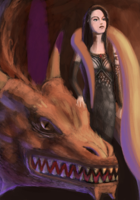
 . Well.. here it is.. The song is about a lonely lady dragon waiting for love
  btw. It's really cheesy but it has a great harmony. I wanted her hand to look like she was scratching the dragon's head, kinda.. I was wondering if the dragon's teeth's are too big, and if i should get rid of the spikes on his head. Also, if she could used more jewelry. Um.. what else.. I know I need to work more on the shadowing and lighting. Should I ad another source of light?
RE: Lady Dragon needs help - DoubleThink - 06-28-2013
Hey Aikanaro,
You really do need to add a clearer light source, it helps your illustration immensely.
I painted over your latest version
I added some red on the girl and the dragon and the background.
I made the foreground a little colder by adding blue, to set off the dragon.
fixed a small perspective issue on the farthest horn.
Added an reptile eye to the dragon
Put his botton jaw back a little, so the teeth can cross over.
Gave the girl a little more hair on top and shortened her forehead
Added some orange/ red on the girl (avoid greys and blues, it draws the life out of people)
Gave the girl a bit of rim light to set her off against the background.
Hope that helps :-)
Try to avoid using too much black in a colored illustration. Especially on people
RE: Lady Dragon needs help - Aikanaro - 06-28-2013
(06-28-2013, 03:42 AM)DoubleThink Wrote: Hey Aikanaro,Yes, one of the first things i learned about painting was never use pure black and white to shadow and light.
You really do need to add a clearer light source, it helps your illustration immensely.
I painted over your latest version
I added some red on the girl and the dragon and the background.
I made the foreground a little colder by adding blue, to set off the dragon.
fixed a small perspective issue on the farthest horn.
Added an reptile eye to the dragon
Put his botton jaw back a little, so the teeth can cross over.
Gave the girl a little more hair on top and shortened her forehead
Added some orange/ red on the girl (avoid greys and blues, it draws the life out of people)
Gave the girl a bit of rim light to set her off against the background.
Hope that helps :-)
Try to avoid using too much black in a colored illustration. Especially on people
I was thinking of adding purple instead of blue (I been using blue a lot lately).
RE: Lady Dragon needs help - Aikanaro - 06-30-2013
is it looking any better?
RE: Lady Dragon needs help - Mike086 - 07-01-2013
View the livestream critique here.
I livestreamed a paintover of your work, you'll need to skip ahead to the middle of the video to see the paintover.

RE: Lady Dragon needs help - Aikanaro - 07-01-2013
(07-01-2013, 08:31 AM)Mike086 Wrote: View the livestream critique here.
I livestreamed a paintover of your work, you'll need to skip ahead to the middle of the video to see the paintover.
Thanks a lot for the help. Yeah, the picture was only about 55%-60% done. I'm starting over though, going to add another dragon or two, and change the pose of the women (thanks for the tip :D).