+- Crimson Daggers — Art forum (//crimsondaggers.com/forum)
+-- Forum: PERSONAL ARTWORK (//crimsondaggers.com/forum/forum-9.html)
+--- Forum: SEEKING CRITIQUE/PAINTOVERS (//crimsondaggers.com/forum/forum-36.html)
+--- Thread: Autumn Equinox - Day 1 (work in progress) (/thread-3561.html)
Autumn Equinox - Day 1 (work in progress) - giovannyarce - 07-11-2013
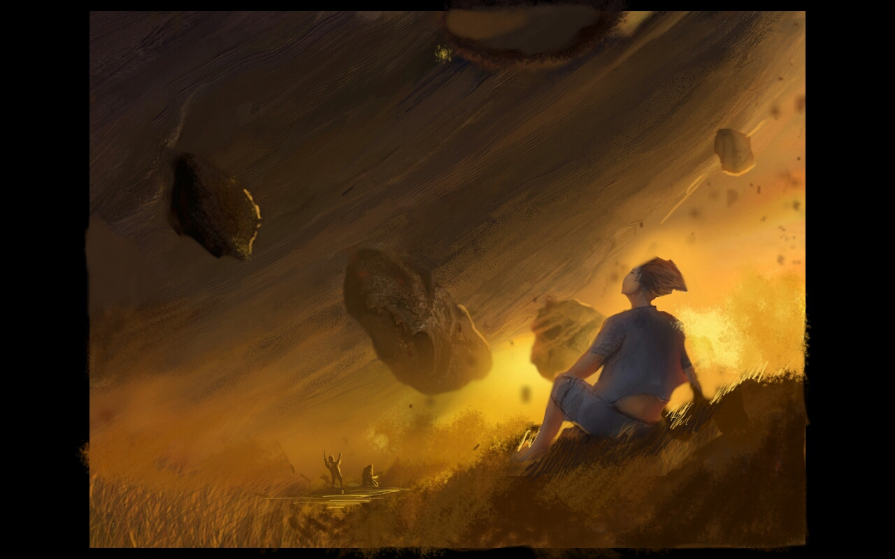
Hello guys, here I will post my work in progress of this piece called Autumn Equinox - Day 1.
Hope you enjoy it and don't forget to critique, I would like to learn and improve more in composition, perspective and anatomy.


In this third wip I'm using less saturated colors to see how the eye stay in the picture.

RE: Autumn Equinox - Day 1 (work in progress) - Fly - 07-16-2013
Perspective and anatomy as far as i can tell look good : )
Composition The guy looks a little cramped in the corner but he is in high contrast which is good. The three people in the distance i would move them out of the center towards the hill and up a bit. The third has a nice atmosphere but a touch more detail bring back the craters.
RE: Autumn Equinox - Day 1 (work in progress) - Amit Dutta - 07-17-2013
Love the atmosphere and mood. I think compositionally you could improve things by having the figure on a third focal point and really using the curve of the planet thing to drive the comp. You have a bit of a horizontal band going on with the floating rocks so I moved them around a bit. Also moved the smaller figures to coincide with the curve of the planet and tried to add a bit of depth with some detail in the ground and using overlap of layers. with floating things sometimes it helps to fix them in space by throwing their cast shadow on things as it can be hard to fix nail them by value alone. hope I got the gist across. I think you can do even cooler things by playing with values of the floating rocks to really play with the depth of them.
With a piece like this its success hinges on how you handle depth and scale. Oh and I like the craters better too. I did this paintover on a tablet so not sure how it looks for real.
