+- Crimson Daggers — Art forum (//crimsondaggers.com/forum)
+-- Forum: PERSONAL ARTWORK (//crimsondaggers.com/forum/forum-9.html)
+--- Forum: SEEKING CRITIQUE/PAINTOVERS (//crimsondaggers.com/forum/forum-36.html)
+--- Thread: Portrait critique (/thread-3616.html)
Portrait critique - Tygerson - 07-17-2013
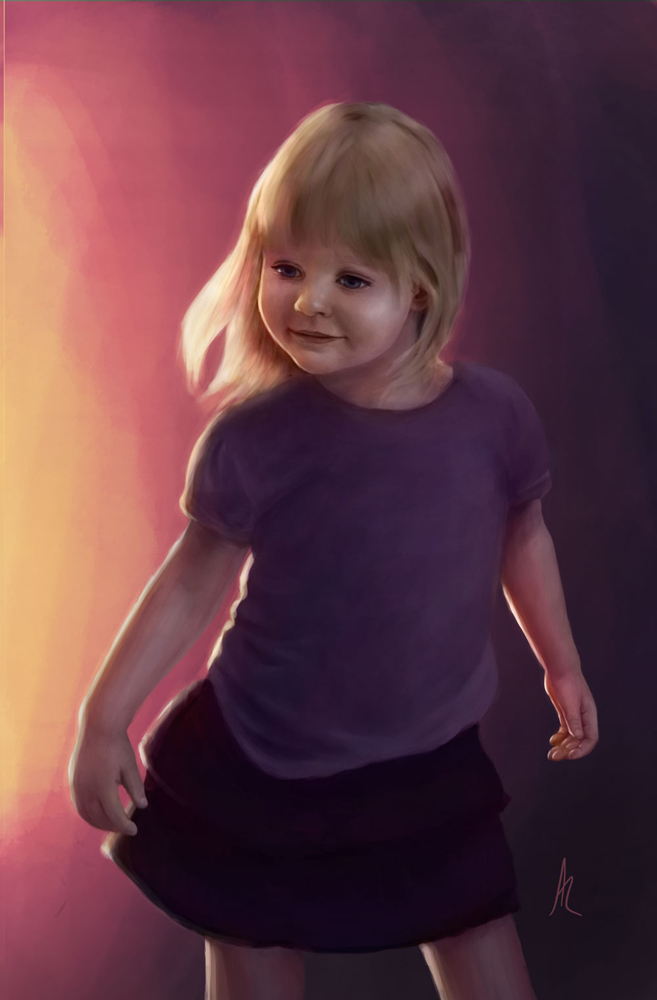
This is a portrait I've been working on for about a week, and I'm a little stuck.
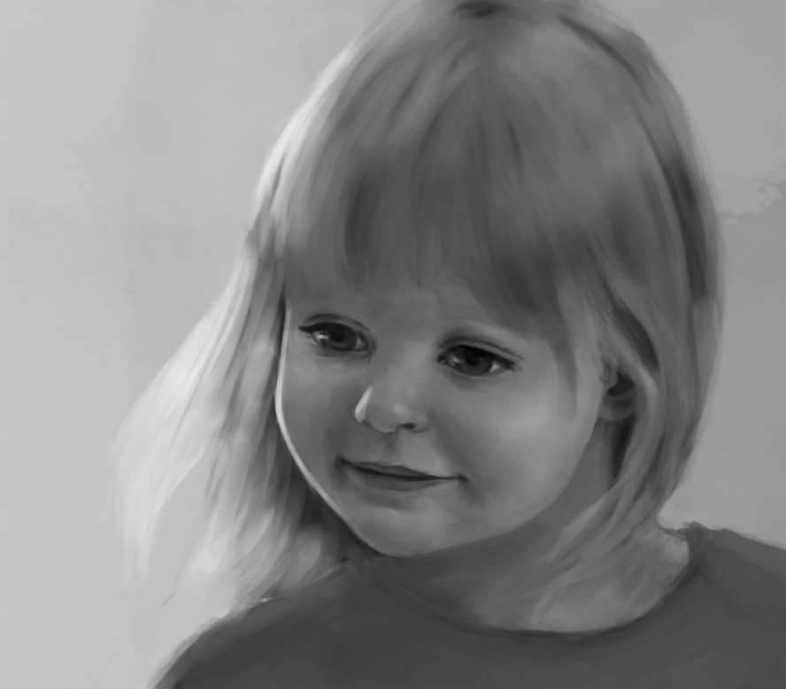
The smile lines look weird, and I can't figure out why. The ref didn't pop, so I tried darkening and adding some sort of rim light like so:
But that seemed a bit dark for a little girl's portrait, so I tried lightening it:
I'm kind of leaning toward the lighter version.
Is the guess at lighting anywhere near what it should be? How do I get the smile lines right? Is there something else glaringly off that I'm not even seeing?
(I haven't rendered out the hands yet, but will be doing that after posting. Also, I tried and failed at color, and so am at least trying to get values right first.)
Go ahead and tear it apart, paint over, anything. Please.
Oh, and a face close up so mistakes can't hide in low res:

RE: Portrait critique - Rognoll - 07-17-2013
I think the girl's nose is wider in the photo
RE: Portrait critique - Patrick Gaumond - 07-17-2013
I think you could toss in a 3rd, darker value for the smile lines.
Right now theres only two, which makes it read as a mild plane change.
Tossing in a slightly darker value will make the plane change slightly more dramatic, and will accentuate the rest of the smile. Just don't make it too much of a leap. Maybe only by a level of value or so
Hope that helps. The rest of the image looks great by the way. I would lean towards to the one with the darker background but thats just my preference.
RE: Portrait critique - Tygerson - 07-19-2013
Some more work. I tried color, and it just isn't working out at all. Not even worth posting. I'll try again tomorrow, but if anyone knows a good place to go for learning to color dramatically lit portraits, please let me know! I have never ever been able to make skin and hair look good in color.
I'm still keeping both dark and light versions going. I think I like the dark for the whole image, but the light for a crop of the face.
RE: Portrait critique - ChantalFournier - 07-19-2013
As Rognoll said, the nose is narrower in the drawing than in the picture, the eyes are a bit closer together and the head is generally a bit narrower. You can use the ruler tool to verify these things when you aren't sure, it's like using a measuring stick in real life. I like the rendering though, I find it looks very picture book-esque.
RE: Portrait critique - Tygerson - 07-20-2013
Wow, you guys have really well calibrated eyes!
RE: Portrait critique - Tygerson - 07-20-2013
Okay, I sat there with a ruler for about an hour, trying to fix facial stuff. Hopefully it's a little better, or at least balanced.
So after a few false starts at color, I looked at some Steve Argyle portraits and tried to figure out how he works. (This http://www.steveargyle.com/gallery/artwork/?artwork_id=187 and this http://www.steveargyle.com/gallery/artwork/?artwork_id=441 )
Then I made an 8 step value scale and tried to figure out a color for each value for the skin at least. It's better than it was, but still not there. It feels like there is both too much color and not enough.
And without the extra notes:
Any critique would be greatly appreciated!
RE: Portrait critique - Tygerson - 07-23-2013
More messing with the color. Hopefully it's getting better. The face color is still odd.
