+- Crimson Daggers — Art forum (//crimsondaggers.com/forum)
+-- Forum: PERSONAL ARTWORK (//crimsondaggers.com/forum/forum-9.html)
+--- Forum: SEEKING CRITIQUE/PAINTOVERS (//crimsondaggers.com/forum/forum-36.html)
+--- Thread: Serenity screencap study (/thread-3631.html)
Serenity screencap study - ZombieChinchilla - 07-19-2013
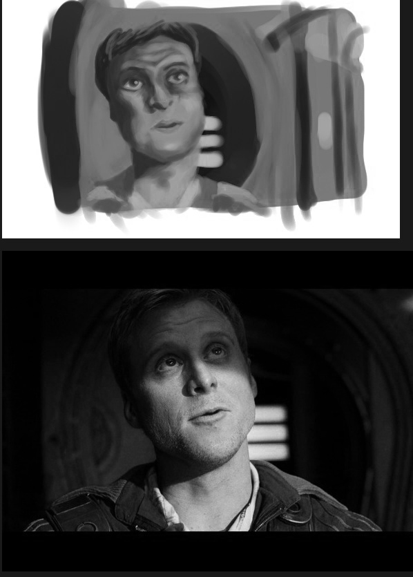
Hey, guys! I'd really appreciate some crits on a study I attempted. I really need to practice with color, considering I can only really draw people during the day time and such. So I wanted to use screencaps as a study for different lighting and color and stuff. I started with this screencap of Wash from Serenity, but it didn't work out that much, to say the least. Instead of looking like there's a blue light shining on his face, it just looks like he has some weird disease. Help?
![[Image: serenity_zps45667844.png]](http://i233.photobucket.com/albums/ee268/Charlie342/serenity_zps45667844.png)
![[Image: screenshot-med-11_zps03a1fbbf.jpg]](http://i233.photobucket.com/albums/ee268/Charlie342/screenshot-med-11_zps03a1fbbf.jpg)
I know there's a few things wrong with his face, and I could change the proportions on some things, but I was focusing more on the colors. I also kind of just slapped the background together in two minutes, should I maybe have spent more time on it?
Please and thank you!
RE: Serenity screencap study - EduardoGaray - 07-19-2013
Looks to me like you really rushed this study.
First, the values.
You cant think about colors without thinking about values too. Dont rush things, if you compare your painting with the reference, you should be able to see the huge difference in values and colors. You used a muddy yellow color for the skin, but cant you see how the yellow turns into a soft light rose skintone? and how the same rose skintone turns into a purpleish line when the light fades and enters the zone in shadows?
The background needs to be much darker, almost black in some areas (but dont use pure black). Also, looks like you just started painting the guy without doing any kind of previous preparation, hence all the problems with him. Maybe doing a portrait wasnt your objective with this study, but it wouldnt hurt to work on that too.
Now, i passed the pictures to grayscale so you can clearly see what i mean about values and color temperature.

Remember that often, values do all the work and colors get all the credit.
Cheers, hope you will find something useful here!
RE: Serenity screencap study - Mike086 - 07-20-2013
Hey Zombie, I livestreamed a critique for you, it involved a paintover, but in the end I just did a demo on how I select colors for a study and the ins and outs of how to go about thinking when creating the study.
http://livestre.am/4xNwv
RE: Serenity screencap study - ZombieChinchilla - 07-21-2013
Eduardo- Ah, thank you so much. I tend to struggle with the whole idea of values and colors without just doing a greyscale painting and then painting over it with an overlay layer. But yes, I see what you mean and I could definitely fix that. Thanks again!
Mike- Okay, woooow. Thanks so much for dedicating an hour on my crappy painting. I'll admit I did rush this painting, I tend to paint/draw fast a lot, so I didn't think of having to spend more than an hour on a study like this, but that's probably something I should work on doing. I appreciate you showing me your step-by-step of how you pick colors, I'll play around with colors more now. I started another study, but it's not finished yet so I'll be sure to finish it and post it here once my busy weekend stops being so busy. But it's a different screencap this time, since I thought I would do a different after watching you do the one from Serenity. And then this week I'll do a still life! And finally, though this may be somewhat embarrassing, I already own Color and Light, along with James Gurney's other art instruction book. :X But I haven't utilized it as much as I could have, and will be sure to study it more. I somewhat forgot I even had it.
But yeah, thanks again. I'll make a follow-up post in the next day or so.
RE: Serenity screencap study - ZombieChinchilla - 07-23-2013
Okay, here's my other screencap study, this time from Hannibal. Colors are better, I think, but Will Graham's face could use some work, with color and proportions.
![[Image: willgraham_zps468f7d68.png]](http://i233.photobucket.com/albums/ee268/Charlie342/willgraham_zps468f7d68.png)
I'm planning on doing a still life color study later today.