+- Crimson Daggers — Art forum (//crimsondaggers.com/forum)
+-- Forum: PERSONAL ARTWORK (//crimsondaggers.com/forum/forum-9.html)
+--- Forum: SKETCHBOOKS (//crimsondaggers.com/forum/forum-10.html)
+--- Thread: The Daily Goosebump (/thread-3654.html)
The Daily Goosebump - pseudo-me - 07-23-2013
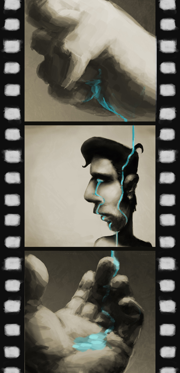
Hey everyone! My name's Flavia, and... well, I draw. Looking to improve, so I can do it full-time. I'm switching from Psychology to art, and I'd like to catch up on the technical part, so I can convey my ideas and feelings better. I like how focused and diligent you guys are, so I'm starting a sketchbook in the hope that some of it is going to rub off :)
Cheers!


RE: The Daily Goosebump - pseudo-me - 08-02-2013
stuff, stuff!
RE: The Daily Goosebump - Belanaite - 08-02-2013
Hey! I reaaally love this one: http://crimsondaggers.com/forum/attachment.php?aid=28593
It has good values, nice framing, color palette is good aswell, though it maybe would have been prettier for the red (organs, birds etc) to be more cyan and stronger in saturation to give the dull green a contrast. Also I think the grass there doesn't need to be so bright, it takes away a bit of attention. From the last picture I see you need to make sure you get your proportions right, you can do that by counting heads for example (like here ).
Other than that I can just say I'm really looking forward to seeing more from you, your art is quite..different. Your picutres communicate in many different ways and I think they're quite atmospheric (light/shading & colours).
RE: The Daily Goosebump - pseudo-me - 08-03-2013
(08-02-2013, 06:58 AM)Belanaite Wrote: Hey! I reaaally love this one: http://crimsondaggers.com/forum/attachment.php?aid=28593
It has good values, nice framing, color palette is good aswell, though it maybe would have been prettier for the red (organs, birds etc) to be more cyan and stronger in saturation to give the dull green a contrast. Also I think the grass there doesn't need to be so bright, it takes away a bit of attention. From the last picture I see you need to make sure you get your proportions right, you can do that by counting heads for example (like here ).
Other than that I can just say I'm really looking forward to seeing more from you, your art is quite..different. Your picutres communicate in many different ways and I think they're quite atmospheric (light/shading & colours).
Thanks a bunch for your kind words, Belanaite! :)
Right, right, and right you are - I tend to skip most of the planning, measuring and all that grown-up stuff when drawing, and yeah, it shows. Trying to counter that somewhat, but on the other hand I'm afraid I'll lose the mind-wandering factor. Hopefully I'll be able to blend these two approaches, eventually.
On another note, more goosebumps, because, yeah. That.