
+- Crimson Daggers — Art forum (//crimsondaggers.com/forum)
+-- Forum: STUDY GROUP (//crimsondaggers.com/forum/forum-5.html)
+--- Forum: PARTNER/GROUP DAILIES (//crimsondaggers.com/forum/forum-30.html)
+--- Thread: LLB - Weekly theme: FREE (/thread-3761.html)
LLB - Weekly theme: FREE - Aragah - 08-06-2013
Heya!
Here Shall the four brave knights by the name of
-Aragah
-Bjulvar (The turtle-loving-man)
-Markus
-Rosolino
Venture in to the unknown(to us) field of scenery,landscape, setting and interior painting!
The study plan so far is about 1 quick study/sketch a day. and a semi-finished piece by sundays!
![[Image: Shh,_The_Rat_Is_Our_Patronzk5Detail.jpg]](http://www.toplessrobot.com/Shh,_The_Rat_Is_Our_Patronzk5Detail.jpg)
RE: Brick by Brick - Markus - 08-06-2013
To oblivion and back good sir, and here I am to take the first blow.
Shameful display! This was about 90 minutes.
Original image can be found here.
Let's do this!
RE: Brick by Brick - Bjulvar - 08-06-2013
With nothing but determination and a pencil.
This is also around 90 minutes or so, focused on composition and color the most.
Original here!
I'm gonna be equally as cool with a youtube clip
RE: Brick by Brick - Aragah - 08-06-2013
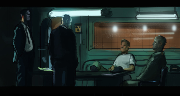
Markus! awesome dude! i know that they are happy little clouds. soft clouds. but a few harder edges could help the over all thing!
Patrik! awesomesauce. specially that head agains the light bulb, so much blue and so little value! those effects are always sweet and handy to use.
And with great enthusiasm, He fails at his very first try!
but worry is not needed! this warrior shall swing his sword even harder tomorrow!(no dick jokes, plz) For he does not fear death or failure! he's only scared of mediocrity.
since we are on the intro to anime vibe. ill post my childhood favorite.(im not as cool as you guys)
some stuff that looks like nothing! but ill look like something soon! spent about 2 hours intaking theory. then some quick applications to test out. and tomrrow ill be on to making something that makes sense.
RE: Brick by Brick - Bjulvar - 08-07-2013
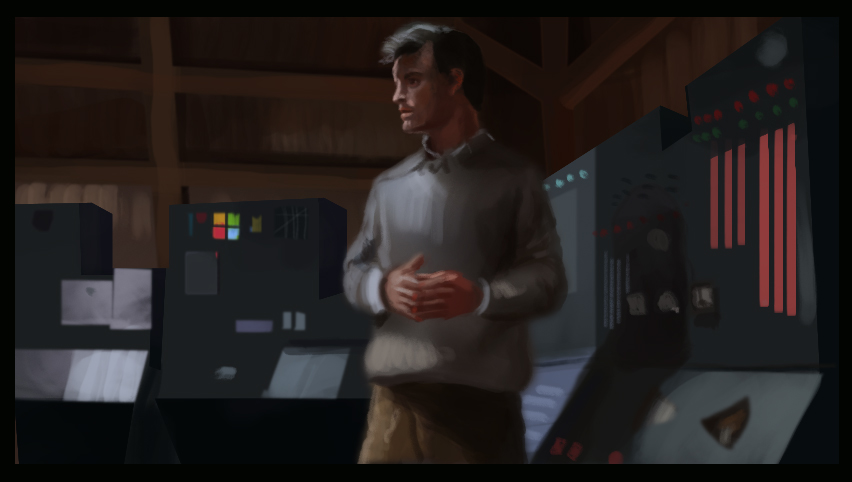
Aragah I almost couldn't handle all that blue! My brain is still confused! Nice that you did a more technical practice, that's something I dread to do.
Markus I expected it to be much worse based on your lamentations haha! Seems like you got enough information out of it! Thinking the same as Aragah, they're a bit muddy with softness!
No music this time!
But you have my axe!
I'll lower the bar so you guys don't have to. This is around 2 hours. There was a lot of techo shit everywhere! Trying to find a workflow to make these more organized and efficient.
RE: Brick by Brick - Markus - 08-07-2013
Almost forgot!
1h5min study from one of my favourites.
I was trying to get the value and colour right. I get caught up in small detail easily though.
Original.
Don't know what much to say at this point. Let's just keep the ball rolling.
Bjulvar: On your last piece, edge control. Although it's a movie study you can direct the eye with soft and hard edges, like the focus of a camera basically.
RE: Brick by Brick - Aragah - 08-07-2013
Patrik! i was thinking. maybe check if there was a more blue over all feeling to the shot? because those blues and red seem to have a really really strong contrast right now.
Markus. hm. not much to say. the focus was the bg. and you got it pretty good.
wuah.
today was though.
perspective is hard.
the drafting table looks worng because i though putting a box in front of the normal desk was a good idea. but its not.
and i think i somehow screwed up a bit the measurements on the depth....
lets go yaaaaaalll!
tomorrow shall be awesome!
RE: Brick by Brick - Markus - 08-08-2013
90 minute study. I messed the colours on this one I think.
original
Aragah: Are you studying an existing space, or constructing your own? Looking good man.
RE: Brick by Brick - Aragah - 08-08-2013
Markus. that one is a made up one! i was tring to think of a studio kind of space.
your studi is looking pretty sweet. with nice shapes and dark values. i jsut feel that you missed a good deal in value and saturation on that water reflection. and since that and the clouds right above it seem to be a major point of interest, some harder edges would be cool :)
Patrik!!!! WHERE IS YOOOOUURRRS??????
so i was rolling around in bed this morning and i had one of those "a ha!" moments: figured out what i had done wrong with the depth measurements on that last one. but was too lazy to go back and fix it. hahahaha. ill get that right on the next one!
today was way faster. around 1 hour only.
that window perspective is so ridiculously off. only noticed way at the end.
trying out some colors.
noting how how ridiculously important light temperature is. specially when all the local colors are basicly gray. bounce light plays major roles too. and transitions are super ultra soft. so hard to get them if you are not ultra confident with your brushstroke. more than 2-3 in the same spot just simply destroys the transition....
leaving the ref in there. so yall can see every mistake and call me out on it :) (yes, please do that )
RE: Brick by Brick - Markus - 08-09-2013
Aragah, thanks dude. I kinda ran out of time with that one so I rushed the foreground elements and water.
Love those moments of clarity, by the way, when everything seems to fall into place. If I can nitpick regarding your recent one Aragah, notice the colour saturation of the wood bits. Stronger saturation and more yellow for the lower, a more reddish hue for the top one. The lower portion of the image could do with a teensy tiny bit of darkening I think.
Right now I feel I'm taking too much time to establish the picture. I get caught up in detail and building a complex palette or texture, like on the gate here is hard for me. This one was about 1 hour 10 or so minutes.
original
RE: Brick by Brick - Bjulvar - 08-09-2013
Sorry tried making a deadline and a study yesterday! Finished way too late at night to do the study :P But I'll make up for it today!
Damnit feels like I have nothing to come with in terms of critiq, thinking the same as you guys! But that screen from Conan that you did Markus has a bit too dark value in the distance. It's missing that halo-like light effect and some highlights. Overall I think you interpreted the colors well even if they're slightly off!
Considering the latter study it's almost spot on colorwise. Missing some of the orange bounce light on the structure though.
Aragah I think it's awesome that you're doing the technical stuff. The thing that I dread! Agree that it gets confusing when the local color is more greyish. The transitions look good but yours has brighter shadows. I think there's more color in the shadow and bounce light where the brickwall and window meet and that the wood is more orange/red!
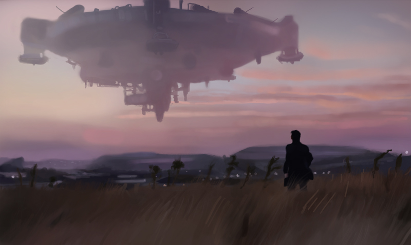
I also got an a ha moment today. Not super-significant but the large ship in my study is getting darker the closer in atmosphere it gets to the viewer. These values are killing me though! Tried focusing more on edgecontrol and took my time with it. Didn't want it to feel rushed this time.
RE: Brick by Brick - Aragah - 08-09-2013
ugh. i gotta run. sorry guys. ill reply later!
RE: Brick by Brick - Bjulvar - 08-09-2013
Sexy Aragah! Off to a good start with that one.
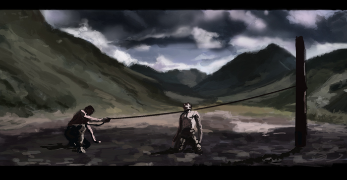
Here's the second one for today. Hard brush, 1 layer for the background and one for the characters. Clouds came out shit. But it felt good.
RE: Brick by Brick - chazillah - 08-09-2013
go boys, go : DDDDDDD !! woop. exciting!
RE: Brick by Brick - Bjulvar - 08-10-2013
chazillah - we're so brave, stay tuned for our escapades!
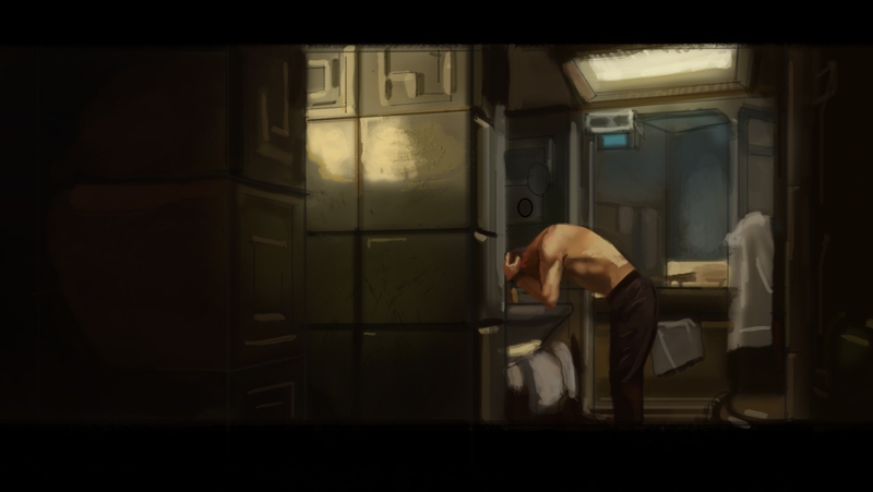
Darkest movie ever made! Valuewise atleast hurhur! I focused more on perspective this time around, while still doing a colorstudy of it. I might have some edge problems, but I'm in a therapy group right now and we're talking about it.
Probably won't be online more today, gotta prepare for work tomorrow!
Though one thing that I'm having trouble with is the transition between having the lineart and not. I lose a lot of my edges through that I think. How do you guys usually do?
I've tried lowering the opacity of the layer, but it seems to double the time in a way.
RE: Brick by Brick - Markus - 08-10-2013
chazillah, cheers dude!
Good stuff Bjulvar! Maybe you can try and push the perspective more. Like on the bound dude piece, I'd avoid using the same brush strokes on the foreground and background.
1 hour one.
Original
Let's keep pushing!
RE: Brick by Brick - Aragah - 08-10-2013
Patrik. i have the same problem.
usually i do a color sketch on a layer underneath it. then turn the lineart layer to overlay, lower opacity. and start working on a layer on top of everyhting.
but thats for the type of study that you are doing. for longer stuff i usually lasso and separate elements in layers....
Bjulvar. good job man. that value and saturation look super.
yealll.
wasnt able to focus today...
uuuughhh.
worked some on this.
i wanna do a finished lineart for sunday
RE: Brick by Brick - Aragah - 08-11-2013
feeling extra shitty about myself. dont know how to avoid it.
RE: Brick by Brick - Bjulvar - 08-11-2013
Markus Yeah totally true man! Colors are great in this one too. The shadow on his shirt might feel a little off though! But it's a solid study.
Aragah Hmm yeah starting with a layer on top of it might be something to try out, thanks dude.
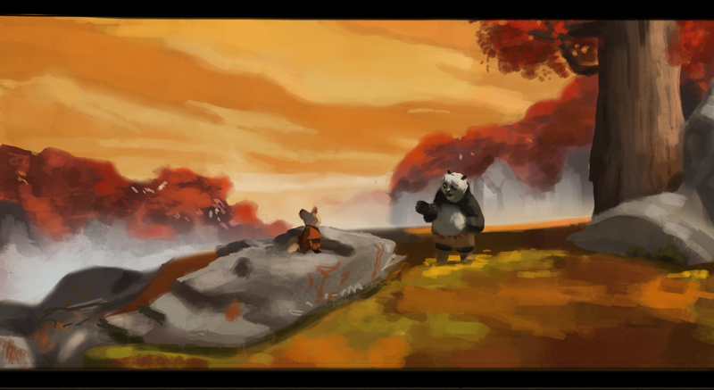
Don't feel bad abou yourself, you've got the touch! Seems like you got the point of what you were doing anyway. With the atmospheric light and stuff. Still reads well as a composition.
Pretty macho study if i get so say so myself. Mostly colors this time.
RE: Brick by Brick - Markus - 08-12-2013
Sorry guys, this weekend was hectic! I was doing some assisting with a music video.
Here's two one hour-studies. Wasn't able to produce anything from imagination for this week.
original 1
original 2
Okay what I learned with these two:
Atmosphere on the first one, 'borrowing' colours to suggest reflections and bouncing light, basic stuff. I think I kinda lost what I was getting at but anyway.
The second one, direction of line to suggest form. Like on the field for example, how it turns and rolls (I messed that up though). Another interesting thing was what I think of as 'buffer colours', like the progression of colour from warm brown of the fields to the cool blue of the mountains. There's some warm blues and reddish hues inbetween to make the transition easier for the eye. Or this is how I perceive it anyway.
I should give myself more time with this stuff I think.