+- Crimson Daggers — Art forum (//crimsondaggers.com/forum)
+-- Forum: PERSONAL ARTWORK (//crimsondaggers.com/forum/forum-9.html)
+--- Forum: SEEKING CRITIQUE/PAINTOVERS (//crimsondaggers.com/forum/forum-36.html)
+--- Thread: Suggestions/critiques welcome! (/thread-3864.html)
Suggestions/critiques welcome! - JBZ - 08-23-2013
Hi!
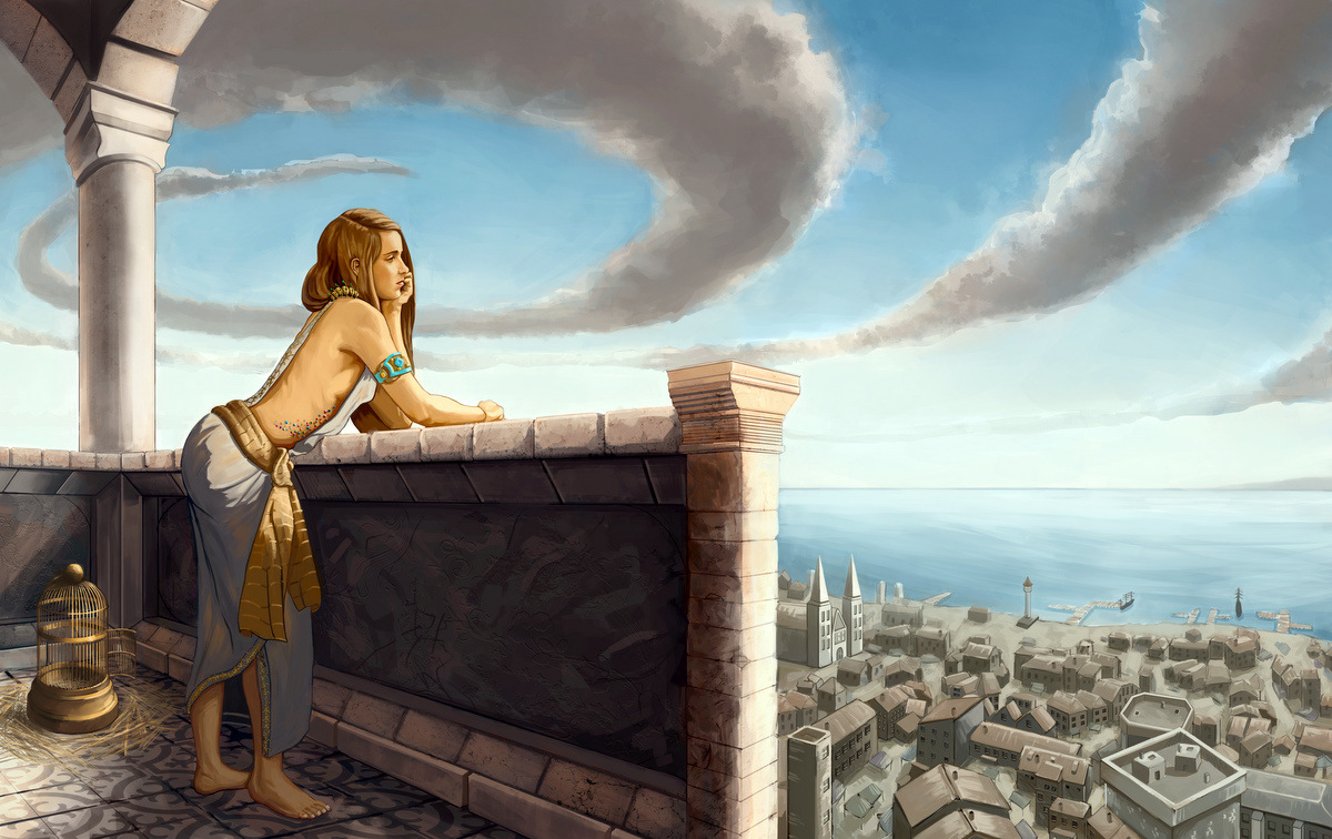
I'd like to know what you guys think of this piece, in which I've been working at for several days now. I am kinda partial about it myself: it's basically what I first envisioned, but as of now, it seems to me that it is lacking something. The story is this: a princess girl is looking out from her beach castle/fortress, longing for something, perhaps going on adventures, or waiting for an answer. I tried to reinforce the latter idea by placing an empty bird cage by her. All that is already conveyed, I think.. and yet.. the image seems a bit boring to me. :/
It could also be that I've grown too used of seeing it; I just don't know. That's why I'd be very thankful if someone could tell me what they think about it.
Having a fresh look at your work is immensely helpful, I believe. Thanks in advance!

RE: Suggestions/critiques welcome! - DoubleThink - 08-23-2013
Hey JBZ
The left side is looking pretty good already.
THe right side wasn't working for me.
I kept looking at the pillar in the middle also.
I think I found a good way to reinforce the perspective pointing toward the girl and still let you keep you background.
Also, mind the perspective on your ellipses. They're looking a bit wonky here and there.
nevertheless, it's a well rendered image.
A few more hours of extra love and you've got yourself a great portfolio piece :)
RE: Suggestions/critiques welcome! - JBZ - 08-23-2013
Woah! I'm going to be fixing the clouds to something more realistic... I guess the vortex thingy in the sky isn't really making any favours to the image.
About continuing the balcony, I also think that it is more pleasing visually, and yet, we lose sight of the horizon. I've been thinking about this myself and... well, the only way to fix this would be to raise the horizon line, and the viewer's POV. that also would mean that I'd have to redo the whole image...
I'll try doing what you suggested, creating spaces in the wall that let you see what's on the other side.
Really appreciated the paint over! :)
RE: Suggestions/critiques welcome! - Kaffer - 08-24-2013
I think the vortex could be redone in a more natural-looking way (with actual cloud shapes), and you'd still have that "adventurous" feeling, but it would be more believable. On the balcony- I'd try to put somekind of exciting architectural thing there insread of the vertical pillar, something that moves the eye back to the character, that way you still could show the horizon, and possibly achieve a more working composition.. :)
RE: Suggestions/critiques welcome! - JBZ - 08-24-2013
Hey Kaffer!
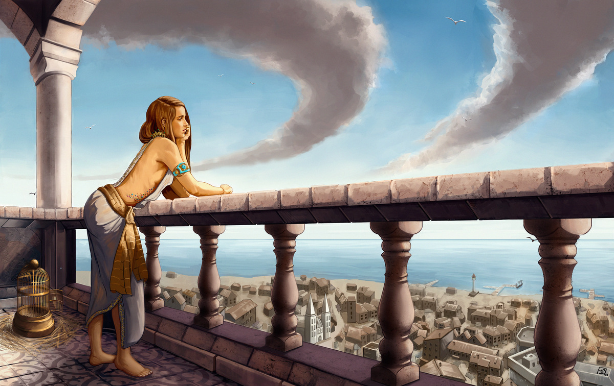
I've edited the clouds to let them have a more natural look. I figured the whole vortex idea was a bit too odd, specially taking into account perspective. I ended up easing up the curve and letting it get lost in the distance.
In the end I decided to extend the balcony, adding a balustrade. It allows to see the sea, which In the end I decided to lower. I know the perspective is skewed the moment I lowered the horizon... but I believe it's not too blatant :)
Thanks for your input!

RE: Suggestions/critiques welcome! - DoubleThink - 08-24-2013
much better!