+- Crimson Daggers — Art forum (//crimsondaggers.com/forum)
+-- Forum: PERSONAL ARTWORK (//crimsondaggers.com/forum/forum-9.html)
+--- Forum: SEEKING CRITIQUE/PAINTOVERS (//crimsondaggers.com/forum/forum-36.html)
+--- Thread: need help with the volume and color (/thread-4238.html)
need help with the volume and color - oxiso - 11-02-2013
Hello daggers, I need help with the volume and color of this dragon, I'm still not convinced about his appearance
![[Image: dragon_by_oxiso-d6ti5fl.jpg]](http://fc01.deviantart.net/fs71/i/2013/312/f/7/dragon_by_oxiso-d6ti5fl.jpg)
RE: need help with the volume and color - darktiste - 11-02-2013
you need to use depth and contrast and overlapping if you dont know those principle. i can't really explain them myself but you should aim to study them.Also i think that the background sky and mountain should have more difference in color to feel that kind of depth and separation that i think would help bring depth into that image for the moment it almost the same color every where in the background.
i suggest to look at some of those principle at http://ctrlpaint.com/library/ have a nice day
RE: need help with the volume and color - Adam Lina - 11-02-2013
The dragon's cast shadow should be darker than the shadow on his underside. Also I think you should push the cliff on the right into the background by making it lighter so you have something in the mid ground.
RE: need help with the volume and color - Amit Dutta - 11-02-2013
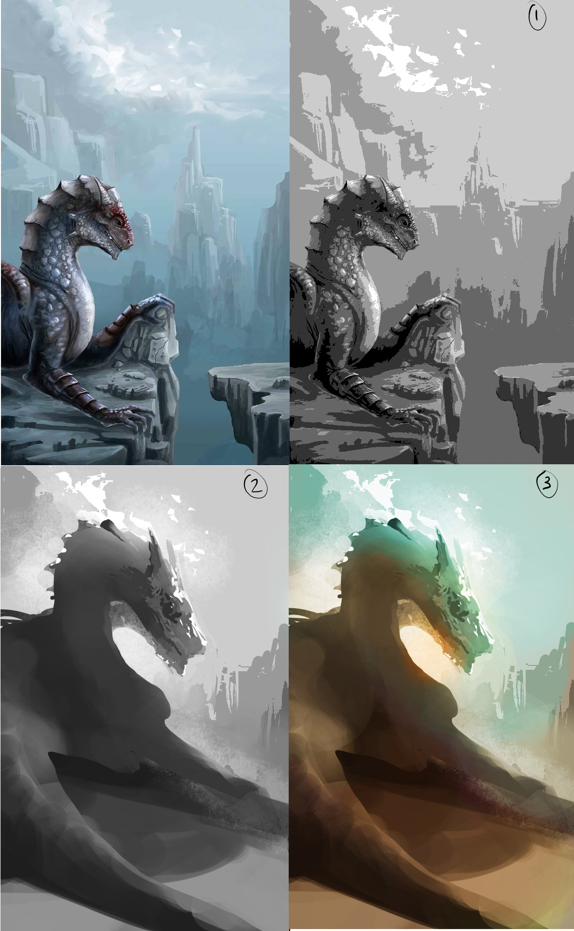
Hey Oxiso. I thought rather than tell you how to improve specific parts of this image there were a few fundamental process workflow type things that might help you.
First off the composition isn't ideal mainly because the dragon should be the focus. In 1 I desaturated and posterised your image to show the broad value structure. The main focal point is actually driven by the comp and pushed into the background even though the dragon has way more detail and contrast.
I think in terms of a good workflow, you should block out the comp in simple value silhouettes to get a comp that works. In 2. I just used the lasso and filled in the major shapes, and tried to think about major volumes. I pushed and pulled selected shapes with a soft airbrush to very simply indicate atmosphere. Once the general read of the volume was there I went back in and added some value detail in the head just to show off a bit more form. (this was very quick to do: < 10 mins)
The next step to help you with colour is to just take that basic value blockin and add some broad colour shifts mainly to play with temperate and contrast. I duplicated the value sketch, colorised for the shadows, then duplicated again colorized for the light, and using maskes painted them in and out to where I wanted. Added an overlay layer for some bloom effects. Again very quick < 5 mins.
You can do multiples of these to build your image solidly in the fundamentals so then rendering is just a matter of time and patience, rather than solving problems on the fly.
Hope that was useful.

RE: need help with the volume and color - oxiso - 11-09-2013
![[Image: dragon_by_oxiso-d6ti447.jpg]](http://fc03.deviantart.net/fs70/i/2013/312/c/a/dragon_by_oxiso-d6ti447.jpg)