+- Crimson Daggers — Art forum (//crimsondaggers.com/forum)
+-- Forum: PERSONAL ARTWORK (//crimsondaggers.com/forum/forum-9.html)
+--- Forum: SEEKING CRITIQUE/PAINTOVERS (//crimsondaggers.com/forum/forum-36.html)
+--- Thread: TMNT bebop redesign (/thread-4255.html)
TMNT bebop redesign - wolver - 11-05-2013
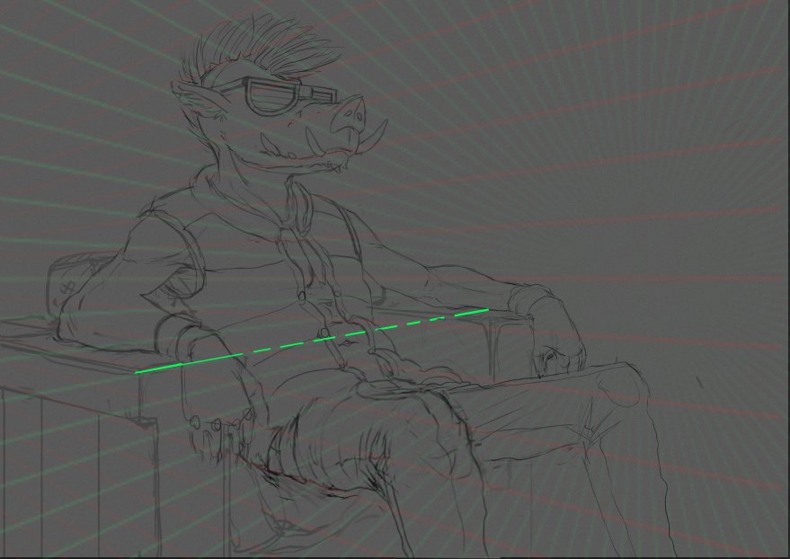
Hey daggers, looking for critics on my bebop redesign : )
I really want to get accurate anatomy, pose, perspective so any thoughts would be appreciated.
In particular i am having trouble with the foreshortening of the near leg and the pose of the arms.
![[Image: IVCfLHS.png]](http://i.imgur.com/IVCfLHS.png)
RE: TMNT bebop redesign - Amit Dutta - 11-06-2013
I like the sketch a lot. Great structure to the forms. I did a quick rejig. Basically just made the near leg larger and perspective warped it a bit to show more overlap and that it was coming forward more. Same thing to the near forearm. Check your perspective it's off in a few important places, figures need to be drawn in perspective too and this might help with your posing. Hope that helps
