
+- Crimson Daggers — Art forum (//crimsondaggers.com/forum)
+-- Forum: PERSONAL ARTWORK (//crimsondaggers.com/forum/forum-9.html)
+--- Forum: SEEKING CRITIQUE/PAINTOVERS (//crimsondaggers.com/forum/forum-36.html)
+--- Thread: Sword Lady WIP (/thread-4594.html)
Sword Lady WIP - dwilliams - 01-04-2014
Hello everyone. I was recently working on an illustration when I decided that it just didn't have the ooompf I was looking for, and felt a little flat. I went back to doing more thumbnails and I think I came up with a much more interesting idea/composition.
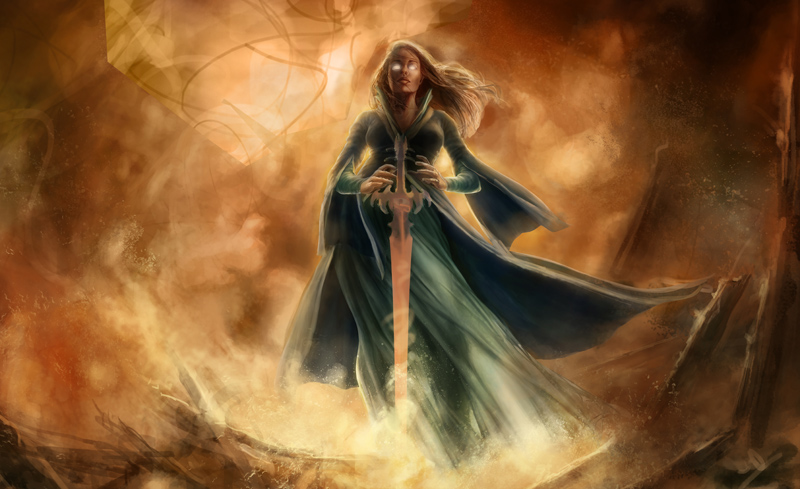
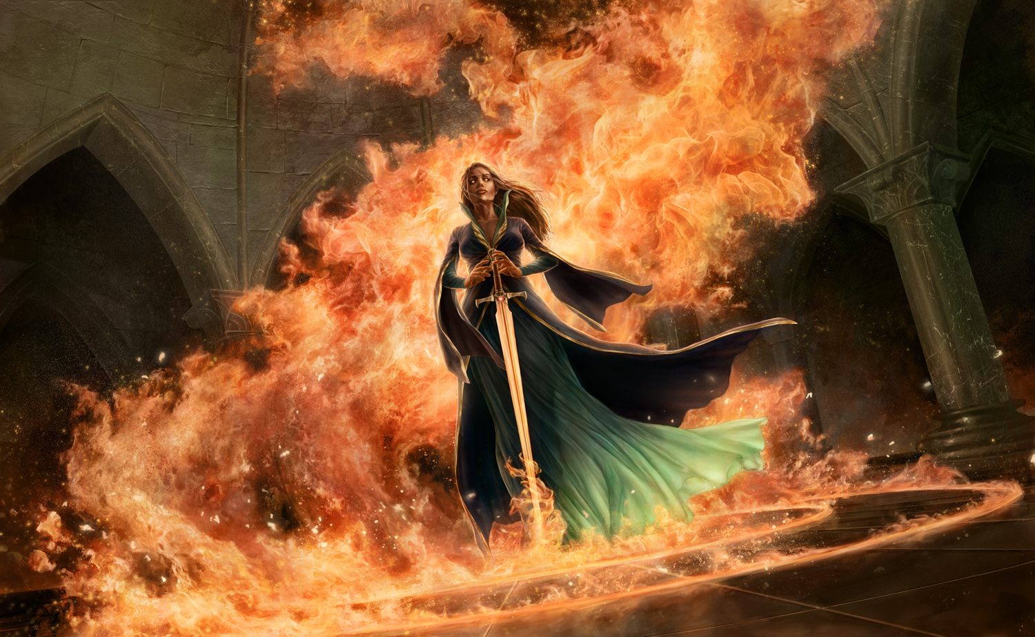
The story in this piece is pretty simple- there's an evil looking glowing sword possessing a noble lady, and the swirling flames and flaming circles on the floor of the temple hint at its destructive power. Originally the illustration was more of a blasted looking landscape or burnt out ruin, but I didn't like how it turned out.
I like the idea of the lady being in a dark, evil temple/chamber much more than some flaming ruins or landscape, but what I'm not sure about is how much of the temple to show in relation to the figure. I have a group of thumbnails here- they're fairly similar- showing some different interpretations of the same scene. Some of the thumbnails have more of the chamber in it, others are tilted a bit more, some have columns in the foreground of the piece.
A-
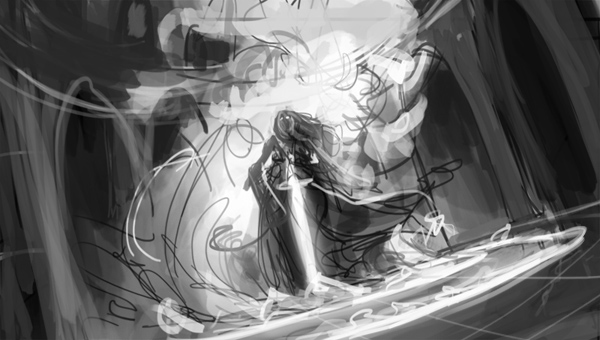
B-
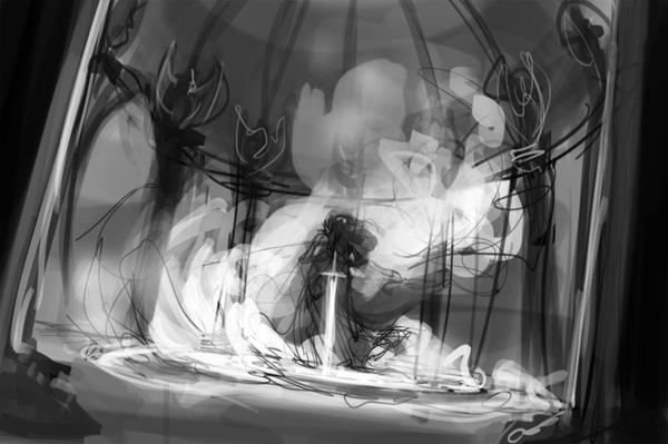
c-
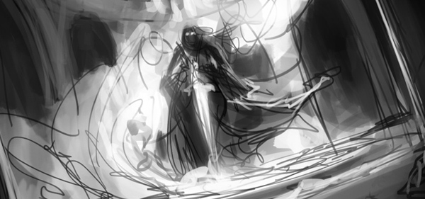
D-
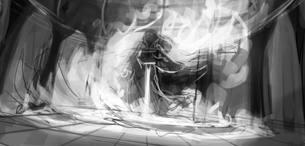
E-
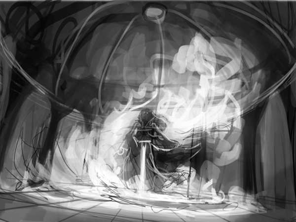
I feel like I have a pretty good idea of what general direction I want this piece to go in, there's just some smaller details I'm not sure about, so I thought I'd get some other people's opinions on it. Do any of these compositions strike you as being stronger or more dramatic than the others? Or do you think any of them could work?
Thanks for taking a look!
RE: Sword Lady WIP - Amit Dutta - 01-04-2014
Nice thumbs! They all could work with tweaks. I'd take out B and E, not because they are bad, but I think a more intimate view of the character might be good.
I think A and C are similar, but prefer A as the more dynamic of the two. D isn't quite as dynamic in perspective but it has a cool diagonal top right to bottom left swoop going on in it which adds a nicer flow to the comp. I also like cinematic aspects for scenes like this personally :)
So I guess a slight combination of A and D. The values and perspective work better in A, the diagonals and comp flow a bit better in D. Perhaps play with cinematic aspect with A's perspective. Also If you focused on accentuating diagonals in A and really make use of dark against light and vice versa (light swirls against dark bg, figure against light swirls, light sword against dark figure etc etc. )
I get the sense that if you really nailed the broad values with this one it could be a stunning piece. So don't jump to detailing right away, get the volume values down perfect first :)
Carry on!
RE: Sword Lady WIP update 3/13 - dwilliams - 03-14-2014
Nearly finished with this piece, I'd like to know what everyone thinks of it so far.
RE: Sword Lady WIP - Psychotime - 03-14-2014
It looks nice, but I think the fire effect is a little too obvious. But that's just me.
Why isn't the light of the fire affecting the environment?
RE: Sword Lady WIP - dwilliams - 03-14-2014
She's supposed to be in a really big room, and I wanted the background to be more subdued with less contrast to bring more attention to the figure, but I'm not sure how that all reads right now.
RE: Sword Lady WIP - Amit Dutta - 03-14-2014
I think it looks great. Really nice job. I guess I understand what psychotime is saying a bit, in terms of texture density of the fire, there probably is some scope to simplify a little in areas if you wanted. I do agree that the fire does need to affect things. You might be ok with subduing the background by leaving as is, but definitely the lower part of her dress should be shifted more towards the warm than it is, and not sure the lighting on it rings true given the environment.
Also not 100% convinced by the perspective of the arches, mostly that right column arch seems a little off somehow. And this is a personal thing, but i don't like uber render everywhere, so it was me I would imply more of the background than detail it. In general though it's a pretty strong piece and a good render job. Well done.