+- Crimson Daggers — Art forum (//crimsondaggers.com/forum)
+-- Forum: PERSONAL ARTWORK (//crimsondaggers.com/forum/forum-9.html)
+--- Forum: SEEKING CRITIQUE/PAINTOVERS (//crimsondaggers.com/forum/forum-36.html)
+--- Thread: Seeking critique/paintover (/thread-4689.html)
Seeking critique/paintover - Anchimayen - 01-25-2014
Hey guys, i've got this new piece, it's called Monster in the mirror.
I tried to paint an first-person view from someone that is looking in the mirror.
However i'm not entirely sure if i aced this one (got this feeling there is a lot place for improvement.) So i hope you guys can help me point out my flaws.
Thanks in advance!
RE: Seeking critique/paintover - darktiste - 01-26-2014
The arm is so low that it fail to make it seem like a first person.Also the shadow for me suggest that he is a midget.Maybe he is just falling on the floor it just not clear enought.The lighting of the piece could be more dramatic in my opinion.The eye of the creature could be the center of the piece to add drama.It a mirror without reflection?And for the last point the monster is to static(boring pose).Try to do thumbnail next time also the scene suggest me that you might want to work on perceptive because it all flat in the background.
RE: Seeking critique/paintover - Anchimayen - 01-26-2014
(01-26-2014, 05:29 AM)darktiste Wrote: The arm is so low that it fail to make it seem like a first person.Also the shadow for me suggest that he is a midget.Maybe he is just falling on the floor it just not clear enought.The lighting of the piece could be more dramatic in my opinion.The eye of the creature could be the center of the piece to add drama.It a mirror without reflection?And for the last point the monster is to static(boring pose).Try to do thumbnail next time also the scene suggest me that you might want to work on perceptive because it all flat in the background.
Thanks for your comment! It's was kind of the first time for me in lot's of things in this image: 1st person view, interior mirror view, creature without a real human kinda face. So i kinda expected a lot of flaws. But these things you pointed out are really helpful. Thanks again!
RE: Seeking critique/paintover - Anchimayen - 01-27-2014
I believe i solved most of the problem mentioned by the changes i've made (most of them weren't that difficult to tackle). Now i'm going to brainstorm over how i'm going to make the monster look less boring. :)
RE: Seeking critique/paintover - Amit Dutta - 01-27-2014
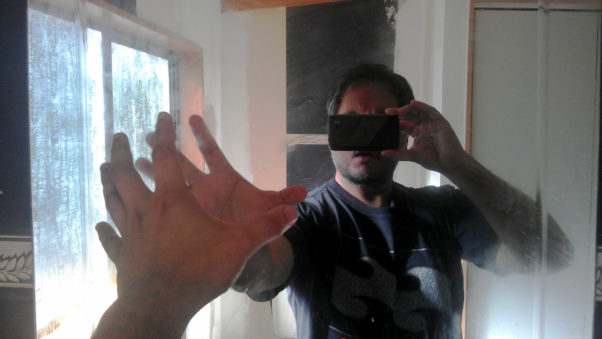
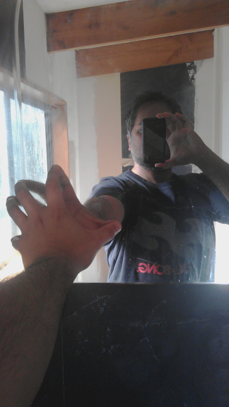
If it's a mirror, shouldn't the corresponding arm of the monster be raised as well? If not it's not exactly clear it's a mirror?. I don't think you have solved the issues with the arm and first person thing yet. The foreshortening of the arm is still not enough to suggest depth. I'd suggest you use reference to get it right...should be easy enough to take a photograph with your arm raised, facing a mirror to give you a lot of what you need to get this right.
*Edit: I shot a couple of ref photos of myself doing just this. Luckily the camera obscures my monstrous face. haha.
The lighting conditions were horrible, I'd recommend you setup lighting as close as you would want to be in your illustration, but even so you can see a whole bunch of stuff you can do with composition and pose alone if you play around while taking photos.


I think the composition was better before, though not perfect then. Now you have split the canvas almost exactly in half horizontally which again makes it less dynamic. And as always, if you haven't before any illustration you should do some quick value thumbnails or take lots of well posed ref shots to play with ideas easily so you can nail these issues before you spend time rendering
RE: Seeking critique/paintover - Anchimayen - 01-31-2014
Thanks Monkeybread, your input is really appreciated, i don't have a mirror in my crappy apartment xD ,so these pictures you made help me a lot in the process. Also i will bring back foreground only a bit lower to recreate the composition i had before. :)
RE: Seeking critique/paintover - Amit Dutta - 01-31-2014
Ha, no problem. You have some form of camera right? Next time you go to a public restroom, whip it out and get all vogue with it.:) should make for some entertaining reactions as well.
RE: Seeking critique/paintover - ZombieChinchilla - 02-04-2014
I'm a little confused as to what the story to this piece is. Is it about a man looking in the mirror to see that he's turned into this monster? Or is he seeing this monster behind him, and falling over due to shock? Either way, monkeybread is right about needing the corresponding arm in the reflection of the mirror.
RE: Seeking critique/paintover - Anchimayen - 02-04-2014
(02-04-2014, 02:52 AM)ZombieChinchilla Wrote: I'm a little confused as to what the story to this piece is. Is it about a man looking in the mirror to see that he's turned into this monster? Or is he seeing this monster behind him, and falling over due to shock? Either way, monkeybread is right about needing the corresponding arm in the reflection of the mirror.
I'm sorry about the confusion, it's this person seeing his reflection only it's this monster living inside of him. I'm working on the corresponding part, no need to beat a dead horse. xD
RE: Seeking critique/paintover - Anchimayen - 02-09-2014
Hi here is the new version with a more believable hand/arm (thanks to the pictures monkeybread posted) and corresponding mirror view. It's not perfect yet but it is a big step in the right direction in my opinion.
RE: Seeking critique/paintover - Amit Dutta - 02-09-2014
The hand is a lot better and really adds to the image. Some of the structure to the hand doesn't quite seem right...check the angles of the finger bones on the back of the hand, they don't line up with the wrist in perspective very well. You also need to think about drawing overlapping forms when showing things like the fingers going into the distance with foreshortening. Look especially at the little finger. For example a knuckle joint will overlap the next segment of the finger a little. Show one form in front of the other. Values of little finger are a bit off which also breaks the depth illusion. Just look at your own hand if the ref is hard to make out...the lighting was really bad after all.
Other than that, move the head of the monster to be higher and to the right, so that it isn't so centered and obscured, and instead becomes the primary focal point. The ref I shot wasn't just for anatomy, but I kept composition in mind, so the main focal point in each was my head. Just use a basic silhouette to figure out placement of things for composition without worrying about rendering. Your monster still could do with a lot of work on it to show off, volume, form, texture and design but don't do that until everything is in place compositionally.
And when it comes to rendering, you might want to start having a think about your lighting scheme. At the moment it is very ambient and even which doesn't make for a very dynamic or exciting image. Consider different schemes to up the drama and impact. How about if this was to take place in a dark bathroom, lit by a set of flickering lights winking off and on, and our hero during one of the flashes, catches sight of the monster? This kind of story exploration is really good because it helps build up ideas for lighting, mood, narrative, etc.
The motto should be, research and do most of the problem solving of the illustration up front, so that rendering is just a technical exercise.