+- Crimson Daggers — Art forum (//crimsondaggers.com/forum)
+-- Forum: PERSONAL ARTWORK (//crimsondaggers.com/forum/forum-9.html)
+--- Forum: SEEKING CRITIQUE/PAINTOVERS (//crimsondaggers.com/forum/forum-36.html)
+--- Thread: Skin value practice *Nudity* (/thread-4818.html)
Skin value practice *Nudity* - Alchimi - 02-28-2014
Hey daggers,
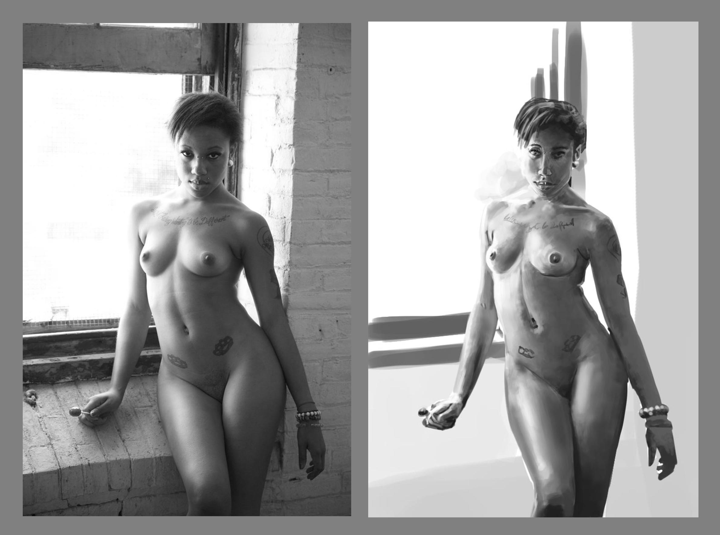
So I did this study, (and should do countless more). I spent something like 3 hours. I'm not happy about the face, but choose to stop here, call it done, and start a new one.
Main objective here was value study of the skin tones. I'm a very big beginner at digital painting, so all the photoshop brushes work has yet to be understood by me.
Still, I'll be happy to have any remarks or crits.

RE: Skin value practice *Nudity* - Adam Lina - 02-28-2014
Did you use the eyedrop tool on the reference at all? Id advice against that if you did. Otherwise your values look good. Just some of the value shifts on the form as it turns need work. Like that spot on her right forearm in the shadow area is too dark and has a hard edge where there shouldnt be. The center line of shadow on her abs shouldnt have a hard edge either. Maybe you should practice painting spheres and simpler forms to work on your lighting of forms some more. Thats my 2 cents at least.
RE: Skin value practice *Nudity* - Alchimi - 02-28-2014
Thanks Haze,
Nope I didn't use the eyedrop tool.
And yeah you're right about the edges, and paiting spheres and simple forms to practice. That's something I totally didn't do enough and should do more.
And thanks about the 2 cents, they are appreciated :)
RE: Skin value practice *Nudity* - eru - 03-01-2014
im trying my hardest to get values to look good mine seems to be too bright and too dark like it has really sharp contrast and then i just spend like another 3-4 hours just to blend them i get very tired. But yours looks really good Ill find the answer somehow :D
RE: Skin value practice *Nudity* - Alchimi - 03-02-2014
Haha thanks for the compliment eru. Even thought I still have a veeery long way to go on these values changes...
if you keep having too much contrast, try to nail the base value of the object, alongside the lightest light and darkest shadow, it should help you nailing the values.
About values work and contrast and all that stuff, I can't recommend enough this site: http://ctrlpaint.com/ it has a awesome free video library on the topic of painting in general and digital painting in particular. Also, the store has this one: http://ctrlpaint.myshopify.com/collections/frontpage/products/basic-photoshop-rendering which is very good on the subject of values.
Scott Robertson also did some killer tuts on gnomon workshop about basic rendering of forms.