+- Crimson Daggers — Art forum (//crimsondaggers.com/forum)
+-- Forum: PERSONAL ARTWORK (//crimsondaggers.com/forum/forum-9.html)
+--- Forum: SEEKING CRITIQUE/PAINTOVERS (//crimsondaggers.com/forum/forum-36.html)
+--- Thread: Seeking critique (/thread-4886.html)
Seeking critique - cicakkia - 03-17-2014
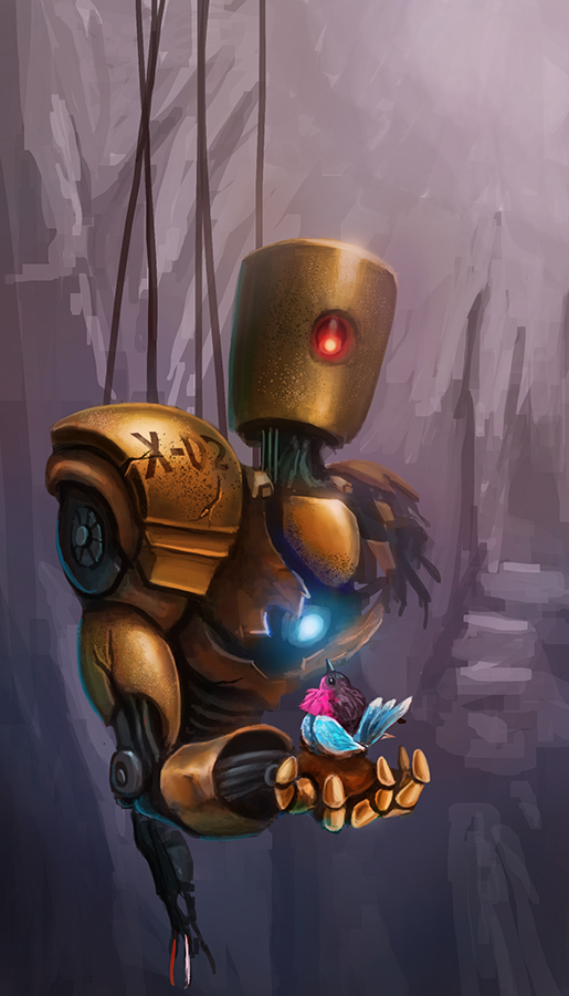
Hi, I wanted to make an image about wrecked robot with holding some life creature on its hand. And here I come up with. I would love to see others critiques and feedback for correction and improving it. Thanks

RE: Seeking critique - DimikA - 03-17-2014
It looks nice so far. I like the design of the robot. Although the painting can be improved to look even better.
The background is kinda distracting, the strokes attract too much attention.
The colors of both, the robot and the bird, are equally bright and warm. I think, if you make the bird the main focus and make the robot more desaturated, rusty and grey will give your painting more depth.
And if you leave some space below the robot will help your composition. The hand is situated at the front si it has to look more precise. I did a quick paintover, hope you find something useful.
![[Image: 02bVQDB.jpg]](http://i.imgur.com/02bVQDB.jpg)
RE: Seeking critique - cicakkia - 03-18-2014
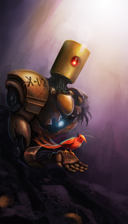
(03-17-2014, 09:25 PM)DimikA Wrote: It looks nice so far. I like the design of the robot. Although the painting can be improved to look even better.Thank you for the input, Dimika. I never thought doing more darker would put much a good atmosphere. I try to fix as you suggest and I do like how it comes. As I wanted to learn the good composition, your paintover is very very useful
The background is kinda distracting, the strokes attract too much attention.
The colors of both, the robot and the bird, are equally bright and warm. I think, if you make the bird the main focus and make the robot more desaturated, rusty and grey will give your painting more depth.
And if you leave some space below the robot will help your composition. The hand is situated at the front si it has to look more precise. I did a quick paintover, hope you find something useful.
Here's for now.

RE: Seeking critique - Kaffer - 03-18-2014
It's coming along nicely, I suggest tuning the chest-light down, it kinda draws attention from the bird (if that is our focus). I'd probably try to bring the values and colors of the bird a bit closer to the robot, I get it needs to stand out but maybe it's a bit too much. There are some pretty interesting textures going on there.. :)
RE: Seeking critique - cicakkia - 03-20-2014
(03-18-2014, 07:17 PM)Kaffer Wrote: It's coming along nicely, I suggest tuning the chest-light down, it kinda draws attention from the bird (if that is our focus). I'd probably try to bring the values and colors of the bird a bit closer to the robot, I get it needs to stand out but maybe it's a bit too much. There are some pretty interesting textures going on there.. :)Thanks, Kaffer. That's pretty good suggestion. I will try to reduce the light on its chest
So here it is. Add some debris and wreckage. I also change the bird position, size and color into red. But after the morning, I did see the previous image with blue fat fluffy more interesting than new one. Lol. But I leave you guys opinion.
