+- Crimson Daggers — Art forum (//crimsondaggers.com/forum)
+-- Forum: PERSONAL ARTWORK (//crimsondaggers.com/forum/forum-9.html)
+--- Forum: SEEKING CRITIQUE/PAINTOVERS (//crimsondaggers.com/forum/forum-36.html)
+--- Thread: Advice on this piece? (/thread-5043.html)
Advice on this piece? - Baoto - 05-05-2014
Hey guys,
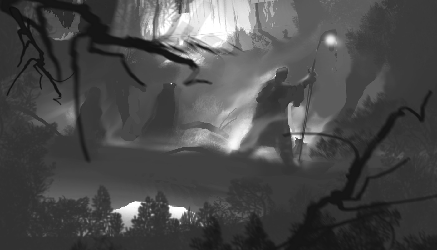
I know something is wrong, but can't really put my finger on it. I have tried a more structured approach and put some focus on the compositon. What I wanted is a clear separation of values and giving the viewer's some area of rest in the foggy parts, while directing them to the guy on the right as the focal point.
At least that was the plan, but now I am completely unsure about everything. Could someone tell me if it's going in the right direction and what I could do/correct to improve it?
Thanks!
RE: Advice on this piece? - Adam Lina - 05-05-2014
This was my first real attempt at a paint over. It was actually a lot of fun too. Its a cool painting you've got. I added a bit more to the top and right side so to give it more breathing room and cropped off some of the bottom. This puts the focal point of the guys head right on the top right third of the comp. The rule of thirds is a powerful tool for compositions.
You have it so the bridge creates a split right along the horizontal axis of the composition and there really isnt much added by the bottom half below the bridge line. So adding to the top and right side balances out the less important parts of the bottom while giving you more of that very interesting horizon line to play with(I tried make tree shapes all curl in toward the focal point but you could do a much better job with it then me). I also messed around with the values a bit so you dont have so much dark of the right and hardly any on the left side. I increased the size a bit of the focal character to give him more impact as well. Also I gave the bridge a slight dutch tilt. Always use the dutch tilt :)
I might also recommend maybe adding a bit of an accent color to the focal point as well. But I really dont know enough about colors and wouldnt want to mess up the lovely neutrals you have.
RE: Advice on this piece? - Valerien - 05-06-2014
Hi Baodo,
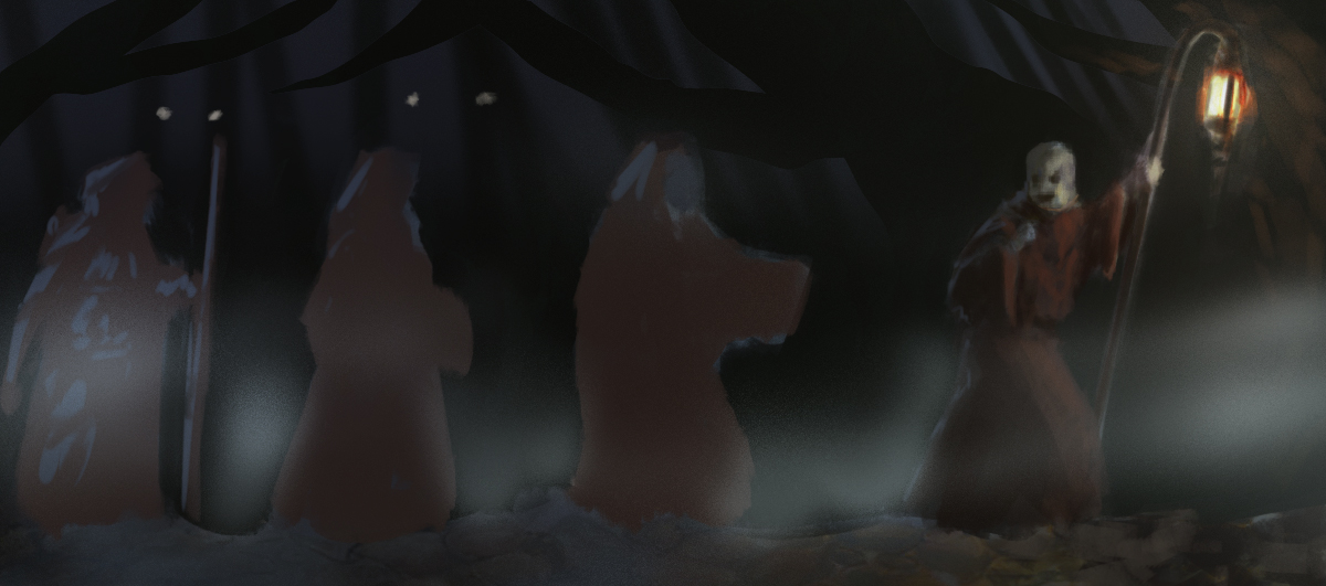
I did a quick overpaint of your piece. I tried to highlight a handful of key points that your original image lacked a bit to me :
1- Contrast -> The original file was quite faint, thus hard to read properly
2- Direction -> there is now a cultist/phantom that is moving toward the [old] man. This directs the eye toward the focal point of the piece : the man's fear
3- Color opposition -> it's not quite there yet, but I tried to give the man warm tones (he's alive) and a yellow light source, while the phantom is purple-ish and comes from the darkness
Good luck going forward !
![[Image: fQkIQjm.jpg?1]](http://i.imgur.com/fQkIQjm.jpg?1)
RE: Advice on this piece? - Defre - 05-06-2014
Hi. It's my first attempt to paintover .
So at first I cut your picture a bit from above and added some space to the right just to give the firgure more space .
The most important thing I want to show you is importance of tone. Remember one of main rules of drawing - the more object is closer to viewer the more it's darker, so the level of tone recedes from the point you stay.Object at the distance gets colder in colour and looses saturation.
But at the picture the trees at background are much more darker than bridge and figures. But they are closer. So i did the stones darker and trees lighter.
As I see you wanted to have a foggy weather with clouds. When you have that conditions sky gets really really light. Also there is no sun during this weather - it means no strong ligh source - no dark shadows. Clouds scatter sun's light across the whole sky so light is ( i don;t know how to say) almost everywhere.

It means you won't have that much contrast betweem light and shadow on objects on cloudy days.
Going further)
Your character has a lantern(or what is it) so it's light scatters throught the fog. It makes this "colour corona"; you can see it on paintover.
I think thats it.
You can turn your image to black/white to see tone clearly.
Hope it has helped. Good luck ;)
RE: Advice on this piece? - meat - 05-06-2014
The bridge is cleanly cutting your image in half. Would it help direct attention to Lantern-man if you have some foreground or middle ground elements going over both the top and bottom half of the image, and leading our eyes to Lantern-man? (other than the fog)
RE: Advice on this piece? - Amit Dutta - 05-07-2014
I agree with Defre on his emphasis on values. I agree with Meat for hitting the second major issue in the piece which is focus and composition. Both need a lot of work. I did a paintover only focusing on value and comp. I apologize for the shitiness of it, I am using a mouse on a 10 year old laptop. I would have hit a bit more detail highlighting on the main figure to make him more the main focus but it's hard to get detail in nicely and quickly with a mouse lol, so I didn't bother, just cast the lamp light on him and you'll be good.
Hope it helps

RE: Advice on this piece? - Baoto - 06-14-2014
You guys are unbelievably awesome! I never expected so many paintovers and I honestly appreciate it. I apologize for not properly thanking all of you earlier.
All of you were right about the bridge splitting the image with nothing really going on in the lower half. I also like Valeriens idea of adding more storytelling elements. Also thanks to Defre for pointing out how light works and to Haze, mneat and monkeybread for overworking the focus and composition.
I have been trying to work on what was suggested, basically taking monkeybreads paintover as a foundation. I added details and started working in warm and cool colors.
I know that I'm slow, but I'd like to take this piece as close to a finished, portfolio level as I can and I would greatly appreciate further comments!
RE: Advice on this piece? - Mike086 - 06-15-2014
Did a long paint over and critique for you, check out the video here: http://livestre.am/4SyTO
Here is a small bit of what I did, but my buddy gave a lesson in composition that even I learned from.
Carlton's Blog

RE: Advice on this piece? - meat - 06-19-2014
I moved your light-in-yonder-wood-clearing over from center to the left, so there's a light source on the left balancing a light source on the right. You might want to move that around more, maybe closer to the cross-point of Rule of Third... . I also rotated the staff forward to give him more of a leading motion instead of looking like he might be being followed by unwanted ghosts (the nervous hand-to-chest pose gave that feeling). Then I added more ghosts to make it look even more like it's a line of figures being lead at the front with that lantern-man. See if these changes help your story or not:
