
+- Crimson Daggers — Art forum (//crimsondaggers.com/forum)
+-- Forum: STUDY GROUP (//crimsondaggers.com/forum/forum-5.html)
+--- Forum: COMMUNITY CHALLENGES (//crimsondaggers.com/forum/forum-46.html)
+--- Thread: Bloodsports 5 Reborn - Miyazaki Remarketed! (/thread-5044.html)
Bloodsports 5 Reborn - Miyazaki Remarketed! - Jaik - 05-05-2014
Bloodsports 5: Miyazaki Re-Marketed!
Been waiting a while for this. This is the first one I saw Dan doing on Livestream more than 2 years ago now. Will be fun to take a shot at it. I think I am going to be doing Nausicaa.
As a little bit of a change to the brief, I think we can say that you can do any Miyazaki film and not limit yourself. But it will probably be most successful if you choose one of the main ones though.
Originally Created by: Dan Warren
Requirements:
- Must create a composition that works as a DVD cover AS WELL as a POSTER. format should be a VERTICAL RECTANGLE similar to the gauntlet piece. include space for the title and credits, tho including them IS NOT required.
- Must use one of Miyazaki's 9 canon films. they are listed below!
- Images must include a MINIMUM of ONE CHARACTER. feel free to add more! image MUST also include an ENVIRONMENT or ELEMENTS of an environment! no single shot portraits!
-character designs MUST be relative to the look and feel of the movie chosen! feel free to make alterations to small details or expand on vague elements, but no total costume overhauls! no genre mixing! stick to the films visual feel!
- Studies must be provided and must be relevant to the character design and elements used in the illustration. COMPOSITIONAL SKETCHES are also REQUIRED with studies in order to be eligible!
LASTLY! Images must be in a visual style that IS NOT ANIME! Images sent that are will be disqualified!
This challenge is all about an increasing trend in today's MOVIE MARKET! the challenge is to take an already developed and proven IP from a foreign market and re-imagine it for another audience. which audience that may be is up to you! whether you are taking a more serious miyazaki plot and pushing it to full realism or making one of his more whimsical stories even m ore childish is entirely your choice, just keep in mind that because the point here is to REIMAGINE and get your visual translation skills going, so NO ANIME! this would result in images for a market the film is already a major part of. were looking for new and exciting takes on some of the most influential animated films of all time, not fanart rehashes of movie stills! feel free to use ANY of the 9 films in Miyazaki's core Canon. films outside this list will not be eligible to win. they are-
Nausicaä of the Valley of the Wind
Castle in the Sky
My Neighbor Totoro
Kiki's Delivery Service
Porco Rosso
Princess Mononoke
Spirited Away
Howl's Moving Castle
Ponyo
'Deadline': 19th May 2014
RE: Bloodsports 5 Reborn - Miyazaki Remarketed! - ZombieChinchilla - 05-05-2014
Ooooh, this sounds fun. I'm a fan of Miyazaki, but my favorite's Princess Mononoke, so I'm thinking of doing that one.
RE: Bloodsports 5 Reborn - Miyazaki Remarketed! - Jaik - 05-06-2014
Yesss, Princess Mononoke is great.
Decided to do Nausicaa, going to be doing this mostly traditionally since my computer is dead and this laptop has horrible colour calibration. Might do some digital grayscale editing when it is done.
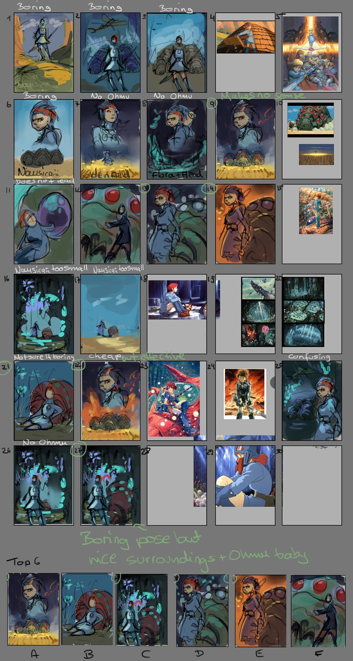
These are my thumbs: Not sure which to go with yet
RE: Bloodsports 5 Reborn - Miyazaki Remarketed! - PointFiveBlue - 05-06-2014
Never done one of these before, but I'm really tempted to take part in this one. Are there any special requirements I need to fulfil to take part?
RE: Bloodsports 5 Reborn - Miyazaki Remarketed! - Jaik - 05-07-2014
PointFiveBlue: Just to be awesome, you already meet the requirements xP
Trying to turn the squirrelfox into a disney/pixar version. Struggling. Will get there eventually.
*I suck at cute* -_-
RE: Bloodsports 5 Reborn - Miyazaki Remarketed! - Lyraina - 05-08-2014
Ooops, I forgot to post >_>
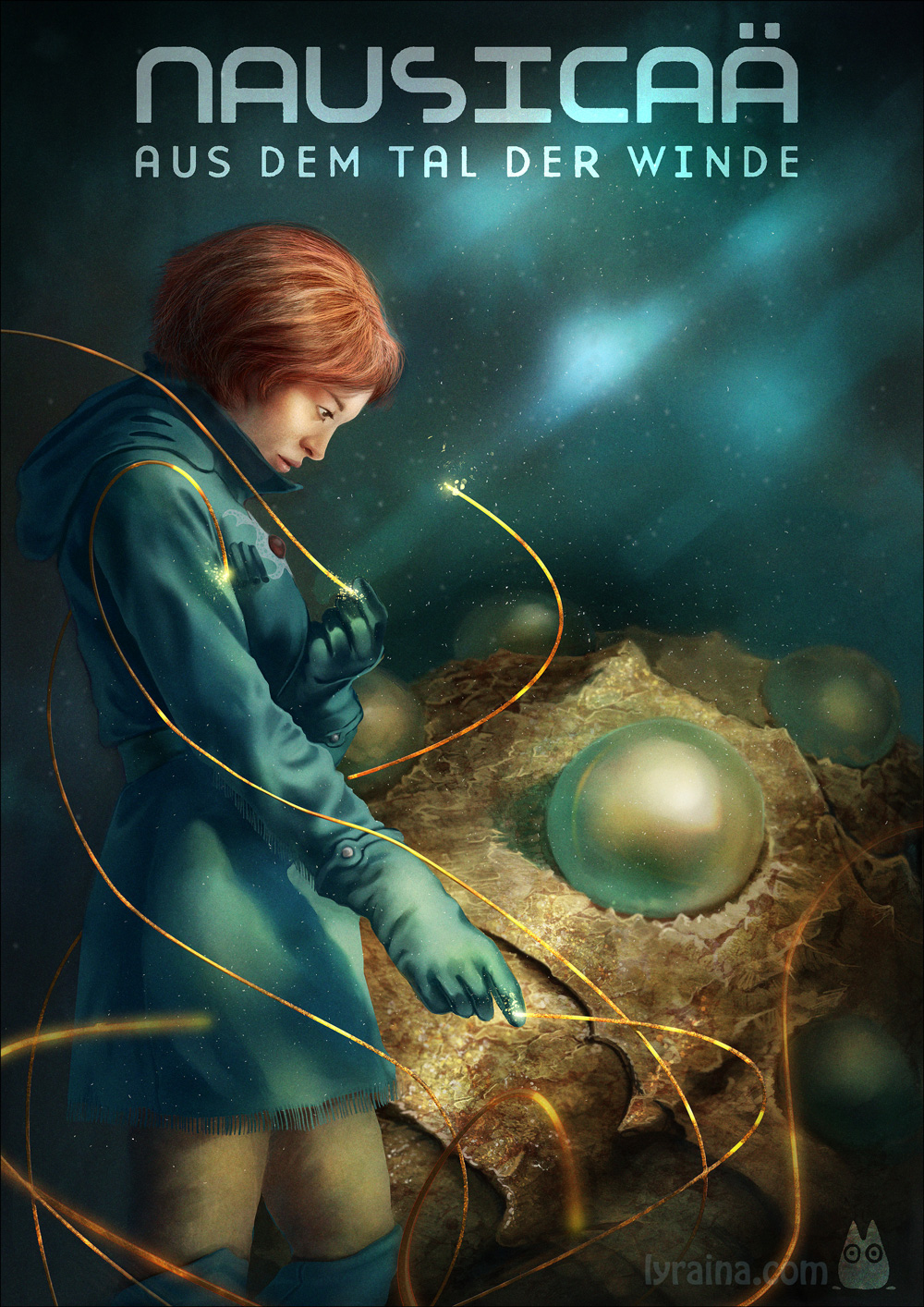
Wanted to do something different than Jaik, but endet up with Nausicaä anyway :P
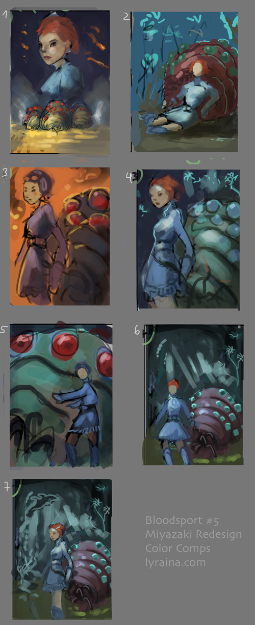
color comps
refining those, trying to decide on one.
RE: Bloodsports 5 Reborn - Miyazaki Remarketed! - meat - 05-08-2014
Everybody loves Nausicaa, lol! You guys are composition machines!
Jaik: if you're doing cute, the black of the eye need to be bigger, but not completely black unless you're prepared to do lots of watery orbs to break the Satan-black.
Lyraina: the ones you're refining, may I suggest not having her back to the Omu she loves and respect so much? The film was about the relationship between human and the forest (and the insects of the forest), so maybe some more interaction between them could help get that across.
Just some 2 cents...
RE: Bloodsports 5 Reborn - Miyazaki Remarketed! - Lyraina - 05-09-2014
Omg I want a Ohmu to cuddle with right NOW! ;_;
Thank you for the feedback, meat. I was thinking more of "trusting and comfortable leaning close to Ohmu", or maybe even "protect Ohmu", but not "turning back towards Ohmu". But I agree with you that this can be read the wrong way.
So I tried it again today and tried to get more emotion in there, the problem is that I am losing the 'movie poster' feeling (if she's looking away from the viewer) and also there's just no storytelling or anything :/ It feels stupid to do all those thumbnails just to end up with something weak/boring. Makes me wonder why I do thumbnails in the first place. So far, compositionally I still prefer the most boring ones, like c2, except that it's... boring :P Oh my. Maybe I'll scrap this and just do a floating head :P
RE: Bloodsports 5 Reborn - Miyazaki Remarketed! - meat - 05-09-2014
Movie poster don't have to be looking us, do they? I mean sometimes they look at each other, or to the sunset, or something. Not that those are great ideas. Sure the poster needs to be relevant to the movie, but it's also an entity of its own. There's no right or wrong, or even an angry client waiting on the other end of the phone. So just have fun, make something that looks nice to you, just keep in mind to fit in a few pre-established standards from this brief.
I don't know if I can get in on this, but if I do, I'll do Porco. 'cos y'all doing Nausicaa!!!! That film was great, has a special place in my heart. Make sure you read the manga too, it's even more awesome, and dark, and complicated. And the manga was 100% hand-drawn over the span of 13 years.
RE: Bloodsports 5 Reborn - Miyazaki Remarketed! - PointFiveBlue - 05-10-2014
Seeing a lot of love for Nausicaa here, decided to do something different.
Idea 1 (the classy option):
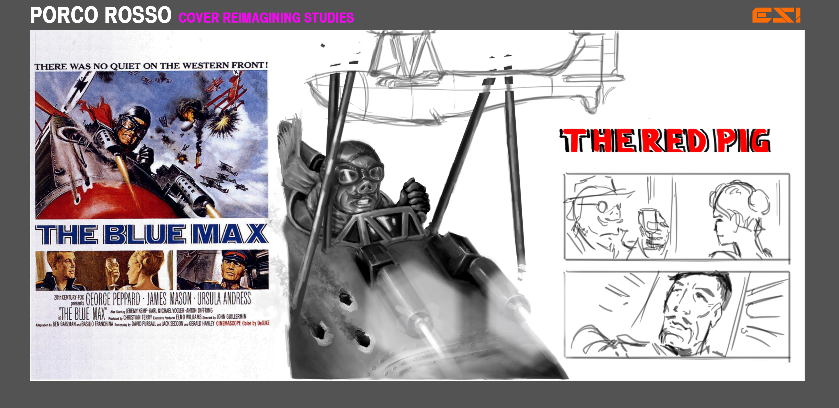
Cover for Porco Rosso done as an homage to classic war film The Blue Max.
Idea 2 (the stupid option):
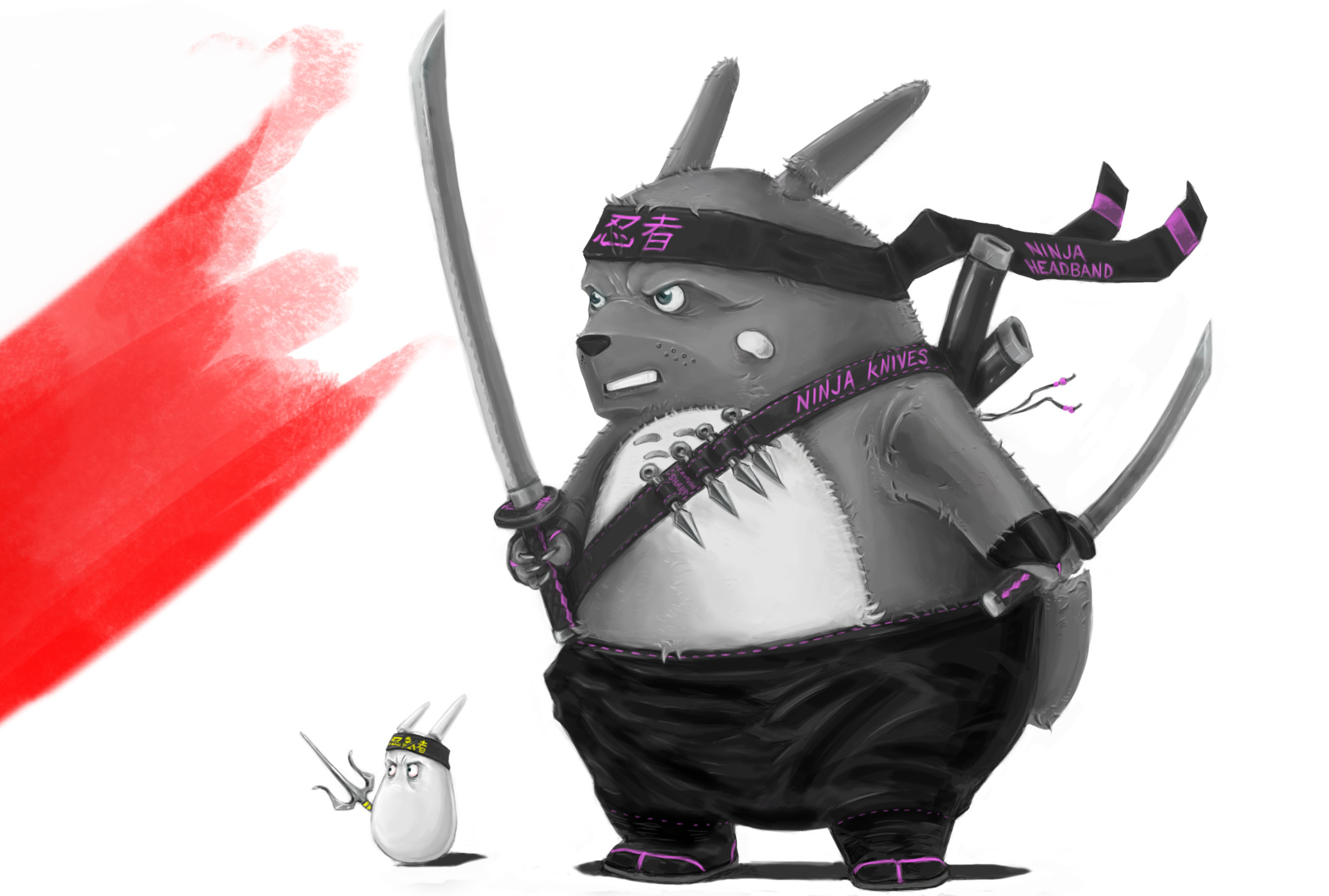
Cover for My Neighbour Totoro done as if an opportunist VHS rental company had bought the distribution rights in the 80's and, because the film was Japanese, assumed it must be about ninjas.
Disclaimer: everything I know about ninjas I learned from Godfrey Ho films.
https://www.youtube.com/watch?v=FlMl709tnhE
RE: Bloodsports 5 Reborn - Miyazaki Remarketed! - Lyraina - 05-12-2014
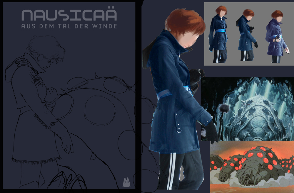
meat, thanks again. You're right, so I decided to push the connection between Nausicaä and the little Ohmu, instead of just staring at the viewer, while maintaining a kind of static/boring pose. I'll have to see if I can get my hands on the manga (might even be successful raiding my brother's room oO).
PointFiveBlue: Good to see you join!
Shot some ref today and failed at color comps, but I think I'll go for a mix of 1 and 6.

RE: Bloodsports 5 Reborn - Miyazaki Remarketed! - meat - 05-14-2014
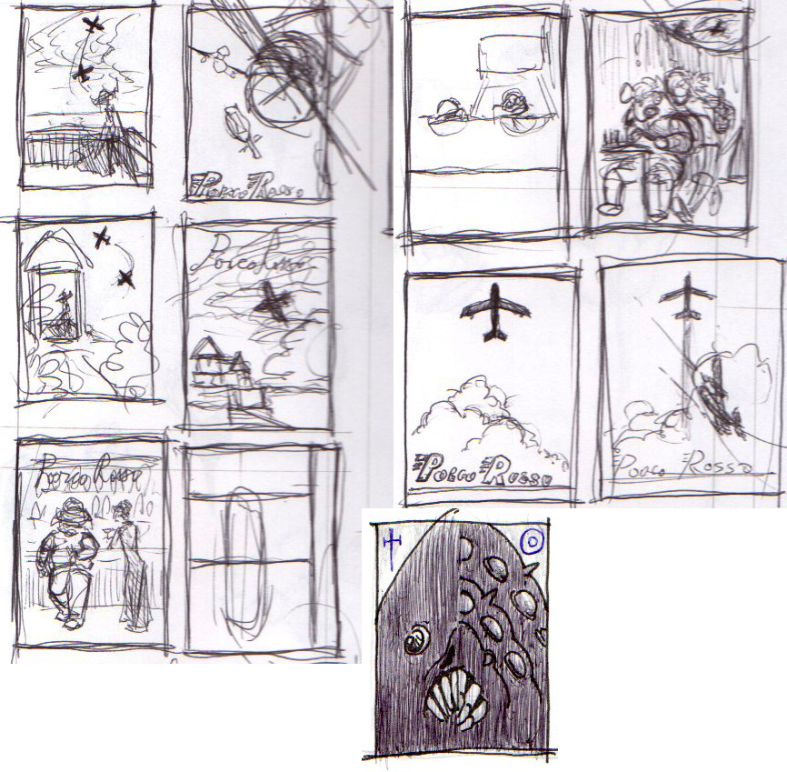
Tentative post... most of these are good in thumbnail only, can't really do them for real yet.
RE: Bloodsports 5 Reborn - Miyazaki Remarketed! - Lyraina - 05-16-2014
Good to see you join, meat :) Even if you're busy atm.
Some nice compositions in there, I like how dynamic the second one is... fits a movie about flying very well I think. Although something more simplistic like the plane centered above the clouds would also make a good poster - reading very well, stating clearly what it's about even from a distance. Which one to choose would mostly depend on what you would most enjoy painting I think.. I can also see how the bottom left for example, leaning in a bar, would work out.
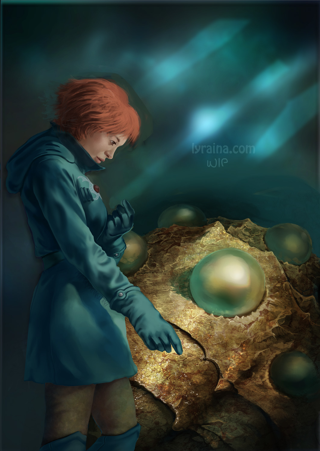
Struggling along with mine (I'm aware of the contrast/texture/edge quality differences):
RE: Bloodsports 5 Reborn - Miyazaki Remarketed! - Lyraina - 05-19-2014
update
RE: Bloodsports 5 Reborn - Miyazaki Remarketed! - Lyraina - 05-20-2014
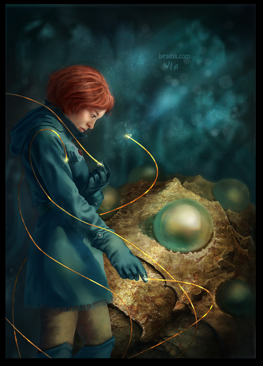
I thiiiink that's it. Run into some fine-tuning troubles in the end I didn't expect, like how to make everything fit together, how to do the background, texturing the clothes... D: But definitely learnt a lot with this one.
RE: Bloodsports 5 Reborn - Miyazaki Remarketed! - meat - 05-26-2014
Sort of related... have you guys heard this Studio Ghibli 25 years concert? http://youtu.be/X9mGQU7rGGM