+- Crimson Daggers — Art forum (//crimsondaggers.com/forum)
+-- Forum: PERSONAL ARTWORK (//crimsondaggers.com/forum/forum-9.html)
+--- Forum: SKETCHBOOKS (//crimsondaggers.com/forum/forum-10.html)
+--- Thread: Tungsart's sketchbook (/thread-5328.html)
Tungsart's sketchbook - Tungsart - 08-14-2014

Hi, new to this forum, so many great artists here, my first post...
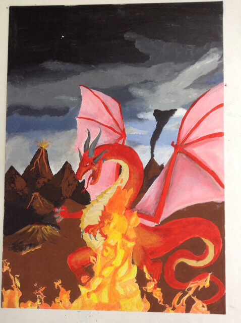
Here is a picture, please tell me what I can do to make it look more real, and what I should practice on to get better.
Looking forward to reading your comments
RE: Tungsart's sketchbook - Wardy - 08-14-2014
hey mate welcome! uh for this kinda thing i'd post it under 'critique and paintover' for the biggest helping hand. i'll throw in some pointers though, for me what isnt working is the composition. you've but the focal point bang in the middle and thats very boring for the eye.
http://www.cgsociety.org/index.php/CGSFeatures/CGSFeatureSpecial/phil_straub_composition_tutorial
^read all of it :)
secondly, values- your dragon is actually lighter than its environment at the moment- this is a no-no, unless in very special circumstances. values get lighter in shade as they go into the distance, and also more blueish and less contrasted. think of it like a big blanket of blue mist in the distance. check out my before and after grayscale photos, sorry i did this with a trackpad rather than a tablet so its reaally crappy.
im not 100% on what lighting situation this is, if it is at night then look up some references of mountains /volcanoes at night :
http://www.surmont.com/gallery/d/1147-2/aranal_1.jpg
http://static.panoramio.com/photos/large/2094105.jpg
see how its bluish and darker in value in the foreground? same rules apply.
if its at day, you need to make this more clear, it seems half and half atm and the values done help establish either. Flame light falls off in intensity very fast, so the top half of the dragon will be darker than the bottom half, while at the moment it is a block value. gradients are your friend!
http://vagabondvirginia.files.wordpress.com/2013/01/dscn3409.jpg
references are an even better friend :D
anyways, cool idea for this, would love to see how it turns out. you've got a good design going, see if you can get things going from foreground to background, because atm its not interesting for the eye. it seems to go very close foreground straight to background in the distance, put some shrubbery or something in the foreground, and in the midground add something too to add depth.
Anyway i hope that helps even a little bit, and please dont take it the wrong way- we are all here to improve, and i am no where near professional myself so i gotta take my own advice and start working!
all the best dude :)
RE: Tungsart's sketchbook - Tungsart - 09-27-2014
Thanks for the comments wardy.
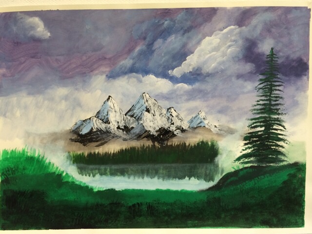
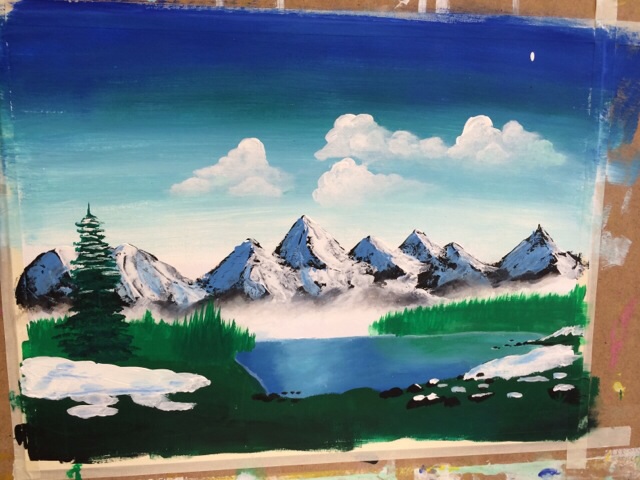
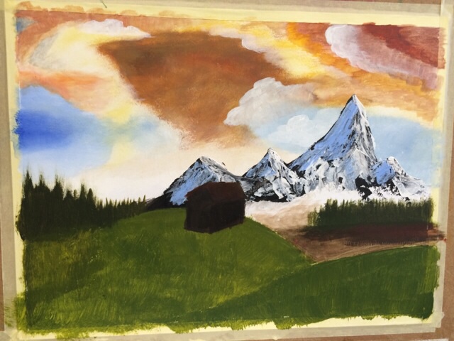
Breen a While since i posted now but here's a new picture
Anybody know how to post several pictures in one post with iPad?


