+- Crimson Daggers — Art forum (//crimsondaggers.com/forum)
+-- Forum: STUDY GROUP (//crimsondaggers.com/forum/forum-5.html)
+--- Forum: COMMUNITY CHALLENGES (//crimsondaggers.com/forum/forum-46.html)
+--- Thread: CRIMSON CHOW #4 - M'Lord FINALS (/thread-5732.html)
CRIMSON CHOW #4 - M'Lord FINALS - pnate - 10-16-2014
Post your finals here!
(Refer to WIP thread for complete rules: http://crimsondaggers.com/forum/thread-5511.html )
-Only ONE submission per person
-You may vote for as many entries as you like
-Voting will remain open until Friday, October 24th
Remember:
Deadline for submission is Sunday, October 19 @10pm GMT
RE: CRIMSON CHOW #4 - M'Lord FINALS - pnate - 10-18-2014
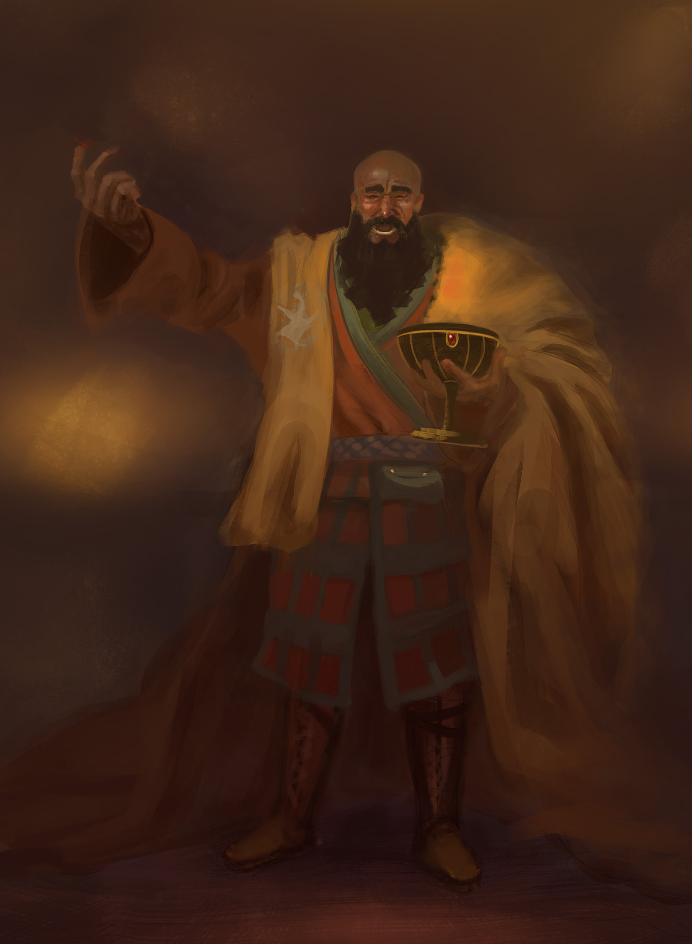
My entry. Excited to see what ya'll done
![[Image: wb0IyR4.jpg]](http://i.imgur.com/wb0IyR4.jpg)
RE: CRIMSON CHOW #4 - M'Lord FINALS - crackedskull - 10-19-2014
You nailed it, right down to the pinky finger :D

RE: CRIMSON CHOW #4 - M'Lord FINALS - Fedodika - 10-19-2014
ROCK OUTTTT!
RE: CRIMSON CHOW #4 - M'Lord FINALS - Jonesoda - 10-19-2014
I guess I'm gonna leave it at this, disapointed :(
Gotta get on top of some master studies for my brushwork, feel that's seemingly a big issue atm, love painterly stuff - really wanna get good at it, I think I try to bullshit it without the knowledge.
Anyway awesome entries dudes! Unique take Fedodika! I really like it!
RE: CRIMSON CHOW #4 - M'Lord FINALS - Jonas Jerde - 10-20-2014
Time to call this one. I've noticed a bunch of things I need to work on while I was painting this, so that's good I suppose. Cool entries guys, I look forward to the next one.
![[Image: CChow1_small_zpsb4e82dbf.jpg~original]](http://i886.photobucket.com/albums/ac62/jonas1221/CChow1_small_zpsb4e82dbf.jpg~original)
RE: CRIMSON CHOW #4 - M'Lord FINALS - atrenr - 10-20-2014
man was this rushed, haha. Couldn't really start until yesterday. oops! I realized I can't remember the last time I actually tried to execute a human face, time to practice!
Nice job everyone!
RE: CRIMSON CHOW #4 - M'Lord FINALS - Amit Dutta - 10-23-2014
Great work guys. I haven't participated, but thought maybe I could lend some crit to the mix as a show of good will.
First off, I'm going to put a design bomb under your asses. The brief was design the lord of a house. With the exception of pNate and perhaps Fedodika and atrenr, I don't think any of you hit the mark. Many scream warrior, or random minstrel but not Lord/Lady the head of a house. Attitude and gesture are almost as important as the techical design elements and rendering when it comes to implying character traits.
Some quick bullets:
pnate: Great work as always. Clean silhouette, lovely rendering, I think you probably nailed the lord feel best. I do think that you did take an easy route out with the very simplistic robe, and more emphasis on sigils/markings and ornate design accents might help add to the feel of Lordliness. Great work though!!
CrackedSkull: I think you actually did get a feeling of boisterous aristocrat down quite well, but something about him seems un lord like. He could just be a relatively well off drunken tavern dweller just as easily. There are fundamental things needing work such as proportion, gesture, volume of form and materials that would be improved with focused study on those things.
Fedodika: Most unique take on the brief, and this ganesha lord is clearly well off and aristocratic. Not sure it gets across lord of a house well with just robes, but the idea is there. Think about focus, with characters the face arguably should be the thing to get the most attention and detail just because we automatically go there. Technical things to work on are volume, proportion and lighting. Your colours are also tending towards the gray which make things less vibrant. Perhaps some colour studies from life with 100% opacity brush and eyeballing would help?
Jonesda: I like where yours is headed in terms of a design, but I think this is more warrior lady than lady of the house. The rendering seems a bit tentative and wavery, even though the structure is there. I would say work on that brushwork, especially lost and found edges more, if you want the painterly look. At the moment things are mostly in sharpish focus. Also maybe a focus on material differentiation studies would help you get that across a bit better! Great framework to work on though
JJAaron: Nice technique, nice presentation, nice design overall. Only issue. I think you missed the brief completely. This screams warrior, period. Sorry mate, gonna stick it to you on that one because you clearly have technical and design skills, but in this case ignored the brief. I suspect the ref you were using took over your design, rather than you imposing your will on the ref. Perhaps a bit more focus on Volume of your forms could also help as some things look a bit flat.
Atrenr: Nice work for such short notice. I think you probably got the balance of Lord/Warrior down quite well in terms of design. Some proportion issues (very stubby legs). The fabric is a bit stiff and unrealistic and in general I think your colours lack vibrancy, variation and complementaries, and are tending towards the grays. Wonder if this is a colour over grayscale at all? Other fundamental things like the sword blade angle and his hand angle are so much at odds that it looks like a bent sword. Can't fault you given how short a time you worked on it.
Hopefully I didn't offend anyone, the crits are there to kick your ass after all. Great work everyone :)