+- Crimson Daggers — Art forum (//crimsondaggers.com/forum)
+-- Forum: PERSONAL ARTWORK (//crimsondaggers.com/forum/forum-9.html)
+--- Forum: SEEKING CRITIQUE/PAINTOVERS (//crimsondaggers.com/forum/forum-36.html)
+--- Thread: What do I need to improve most? (/thread-5937.html)
What do I need to improve most? - Matthew McEntire - 12-13-2014
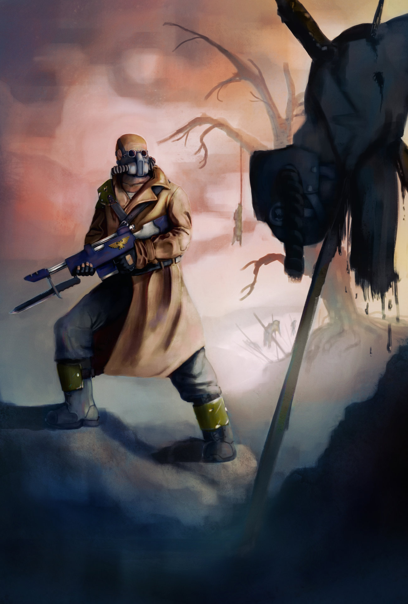
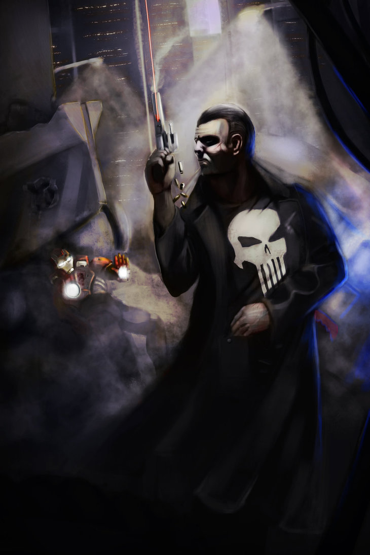
I began preparing my portfolio for digital illustration ~4 months ago. It's been very eventful and I have learned more in these 4 months than I did in my 4 years of college. That does mean, however, that there has been a ton of new things to try with each picture meaning that I've probably neglected plenty. Anyway, I'm happy with how the portfolio is shaping up, but since I am about to start up on my next work I would really like to know what I need to really focus in on before I start thumbnailing. Here is my portfolio so far, oldest - newest.


I really appreciate any advice you all can provide. Thanks a lot for taking a look.
RE: What do I need to improve most? - Amit Dutta - 12-15-2014
Hey Matthew,
What you do better but could be improved further:
Composition: You are generally getting a sense for it...though there are still issues like in that Punisher vs Iron Man piece. IM is obscured quite a bit. Probably more thumbnailing in your process will help.
Narrative: Your pieces do have narrative, so keep working on accentuating this aspect.
The following are things I noticed from most of your pieces that you might consider working on.
Anatomy.
General proportions could do with more work and study.
A special focus on Hands (especially) and faces is needed.
Always use reference whether you can find it / shoot it yourself.
Also do more study on figures in perspective.
Defining Form:
You can paint form quite well, but I think you also do lose the mojo and end up painting quite flat in areas. The chem guy's cape, the space marine's gun. These you haven't painted around the form well so they look flat. There are other examples in each of your paintings.
Atmosphere:
You tend to blitz a 'dirty smoke' type brush for all your atmospheric perspective. It makes all your environments look overly smokey and indistinct. I used to cover up everything with atm. persp. as well when I first learned about it. it is useful as heck, but I think you run the risk of using it as a cop out for not painting more detail in areas.
Use it for effect when it is needed, not to simply hide large chunks of canvas.
Lighting.
You are thinking about lighting, and seem to have an overall approach to each piece but I think doing more study using reference would help you develop more variety. All your pieces are low key, high contrast, set in dusk or nighttime. Perhaps a subconscious attempt to take the easy way out?
I think you are ok with rendering localised lighting to define some individual forms relatively well but then when it comes to atmospheric light the things tend to get very 'digitally airbrushed' and dodged, and have an over the top bloom effect going on. I think more study of real life atmospheres will help you come up with other varied solutions and reduce this effect. Experiment with different brushes, even gradients can work better in a lot of situations.
Materials and Reference:
Always Use reference when you don't know / haven't studied how to draw something many times before.
It shows you haven't, most obviously in things like folds of the characters clothes, reflection and material speculars for metal, all of which just don't look 'correct' Reference would sort this out.
Much of what you paint looks to have similar properties whether it be skin, fabric, metal, glass. Try drawing some study "texture balls"; just round balls of dirt, metal, skin, fur, lit well, to start to get that knowledge under your belt. I also recommend life studies as the best for understanding material properties.
General: Focus on edges.
Everything is either very sharply outlined in your pieces or dropping to loose quickly and haphazardly most noticeable in the space marine ambush piece. I can't tell whether the soft edges of his helmet are supposed to be weather, light bloom, or something else. I think you are trying to use different edge types, but sharp edges draw focus, so they should be used to aid composition more specifically. You have done a better job of edge control in your giant piece, but I feel the right balance still hasn't been struck.
Check out this blog, one of four posts on edges by Stapleton Kearns:
http://stapletonkearns.blogspot.co.nz/2009/04/about-edges.html[/url]
Richard Schmid also has a great edges exposition in his book Alla Prima.
Colour Theory:
You have a sense of colour, but more nuanced understanding would be good. Besides studying from life, check out Gurney's 'Color and Light' for a good general understanding of colour theory if you haven't already and try and apply to your work.
That's a long list to work on. Basically it is a push to keep developing your fundamentals, because these will help you the most with your technical skills in the long run. Don't feel discouraged, we all have to work on our weaknesses, and as long as you can study / apply efficiently on your shorfalls you will keep improving a lot.
So that's the technical. The other stuff to think about is what you want to show in your folio. I got some good advice recently to work on a project of your own or somebody else's, that ties multiple of your pieces together in a coherent way. So if you are illustrating a postapocalyptic warrior, maybe do the mutants of the world in another illustration. Or an environment piece for a location in your world. Tying things together like this is fun for you as you build the world, but also shows you can design and follow an existing art style or theme. Another option is to choose a piece of literature you like and illustrate a few scenes out of that. People love seeing project work that builds a story as well, and if it is from a story that people would recognize you have scored points in demonstrating your illustrative capacity to tell a story as well and not just wing it with random pieces.
Good luck!
RE: What do I need to improve most? - Matthew McEntire - 12-15-2014
(12-15-2014, 05:24 AM)Amit Dutta Wrote: Hey Matthew,
What you do better but could be improved further:
Composition: You are generally getting a sense for it...though there are still issues like in that Punisher vs Iron Man piece. IM is obscured quite a bit. Probably more thumbnailing in your process will help.
Narrative: Your pieces do have narrative, so keep working on accentuating this aspect.
The following are things I noticed from most of your pieces that you might consider working on.
Anatomy.
General proportions could do with more work and study.
A special focus on Hands (especially) and faces is needed.
Always use reference whether you can find it / shoot it yourself.
Also do more study on figures in perspective.
Defining Form:
You can paint form quite well, but I think you also do lose the mojo and end up painting quite flat in areas. The chem guy's cape, the space marine's gun. These you haven't painted around the form well so they look flat. There are other examples in each of your paintings.
Atmosphere:
You tend to blitz a 'dirty smoke' type brush for all your atmospheric perspective. It makes all your environments look overly smokey and indistinct. I used to cover up everything with atm. persp. as well when I first learned about it. it is useful as heck, but I think you run the risk of using it as a cop out for not painting more detail in areas.
Use it for effect when it is needed, not to simply hide large chunks of canvas.
Lighting.
You are thinking about lighting, and seem to have an overall approach to each piece but I think doing more study using reference would help you develop more variety. All your pieces are low key, high contrast, set in dusk or nighttime. Perhaps a subconscious attempt to take the easy way out?
I think you are ok with rendering localised lighting to define some individual forms relatively well but then when it comes to atmospheric light the things tend to get very 'digitally airbrushed' and dodged, and have an over the top bloom effect going on. I think more study of real life atmospheres will help you come up with other varied solutions and reduce this effect. Experiment with different brushes, even gradients can work better in a lot of situations.
Materials and Reference:
Always Use reference when you don't know / haven't studied how to draw something many times before.
It shows you haven't, most obviously in things like folds of the characters clothes, reflection and material speculars for metal, all of which just don't look 'correct' Reference would sort this out.
Much of what you paint looks to have similar properties whether it be skin, fabric, metal, glass. Try drawing some study "texture balls"; just round balls of dirt, metal, skin, fur, lit well, to start to get that knowledge under your belt. I also recommend life studies as the best for understanding material properties.
General: Focus on edges.
Everything is mostly sharply outlined in your pieces, but sharp edges draw focus, so they should be used to aid composition, not necessarily just be ubiquitous. You have done a better job of edge control in your giant piece, but I feel the right balance still hasn't been struck
Check out this blog, one of four posts on edges by Stapleton Kearns:
http://stapletonkearns.blogspot.co.nz/2009/04/about-edges.html[/url]
Richard Schmid also has a great edges exposition in his book Alla Prima.
Colour Theory:
You have a sense of colour, but more nuanced understanding would be good. Besides studying from life, check out Gurney's 'Color and Light' for a good general understanding of colour theory if you haven't already and try and apply to your work.
That's a long list to work on. Basically it is a push to keep developing your fundamentals, because these will help you the most in the long run. Don't feel discouraged, we all have to work on our weaknesses, and as long as you can study / apply efficiently on your shorfalls you will keep improving a lot.!
Good luck!
That's a pretty long list, I really appreciate you taking the time to look at each picture and bring up all these points. I'll be sure to make an effort to improve on those areas listed. Up until about 4 months ago I was almost entirely pencil and pen, so it's been a very interesting transition. Looking forward to getting started on my next painting with all of this in mind. Thanks a lot for the great advice, Amit!
RE: What do I need to improve most? - Amit Dutta - 12-15-2014
No worries! It's always interesting learning a new software, getting to know it and what it can do, also getting used to having shitty drawing skills on a tablet when you are used to direct on the surface drawing. it all takes time.
I think definitely work on folio stuff, but spend your time doing focused study as well. If you have something in mind and you can't quite figure it out or get it to look right, go to reference, do some studies and then see if you can solve the problem again. This is probably a good way to build study into your folio building. :)