+- Crimson Daggers — Art forum (//crimsondaggers.com/forum)
+-- Forum: PERSONAL ARTWORK (//crimsondaggers.com/forum/forum-9.html)
+--- Forum: SEEKING CRITIQUE/PAINTOVERS (//crimsondaggers.com/forum/forum-36.html)
+--- Thread: Firestarter Critique (/thread-6734.html)
Firestarter Critique - ATP - 08-11-2015
Hello hello,
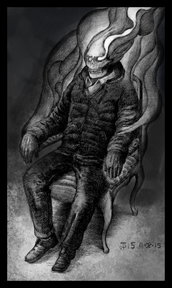
I've been working on this one for a few days now, and I've finally brought it to the point where I'm not going to nudge it any more. The goal here was to draw an anatomically and proportionally correct figure sitting in a chair, whose head was on fire. I'm not the most imaginative person, I know.
I've sprayed fixative on it so I'm not going to be able to make any changes to it, but I will write down any critique you can offer. Thanks in advance, I'm looking forward to what you think. I know I have some work to do on drapery and foreshortening, but any specific advice is highly appreciated.
Cheers!
RE: Firestarter Critique - meat - 08-12-2015
The only thing I'd say is if you want the flaming head to be more of a main focus, put stuff in the background so there's a light-dark contrast for the flaming head. Think about what is your top, top focus in your image, and it's better to be smaller than a whole person's body. Within that body there needs to be a main focus too, like main character for a whole stage, then a main character for each Act, then main character for each Scene... .
