+- Crimson Daggers — Art forum (//crimsondaggers.com/forum)
+-- Forum: PERSONAL ARTWORK (//crimsondaggers.com/forum/forum-9.html)
+--- Forum: SEEKING CRITIQUE/PAINTOVERS (//crimsondaggers.com/forum/forum-36.html)
+--- Thread: Soldier Design Critique (/thread-6806.html)
Soldier Design Critique - Uzaydogan - 09-02-2015
Hello, everyone
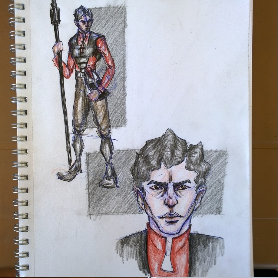
I wonder if anyone would be kind enough to critique my works. These are pages from my sketchbook, I used blue pen to sketch, ink it with a black pen then colour it with colour pencils. I am open to any kind of critiques whether it is about style or technique.
Thank you


RE: Soldier Design Critique - meat - 09-02-2015
They have a lot of exposed body parts for a soldier whose main function is full-on armed conflict with the goal of kill or be killed. They look more like security guards in a civilian setting at the moment. Your focus is design, so method are less of an issue than number of different designs you can come up with, and how well your design convey your purpose (war, soldier). Also, find the heaviest object/tool in your apartment/house and pick it up in your hands and do some poses with it. Even a long sword is very heavy, and anyone trying to lift and swing a halberd like that will hurt their back muscles and be put on unpaid vacation for months. Not a good news for that soldier's hungry family....
RE: Soldier Design Critique - DavidSzilagyi - 09-10-2015
Personally, I think the look of the calf/foot areas look kinda cool, they definitely have a cool style to them.
But in terms of the armor aspect of the pieces, do you have reference for what you're sketching out? If you do, I'd say go in and take a look at how those outfits and armors are constructed and put together. Similarly like a cosplayer, think about how these outfits would ACTUALLY get put together for walking around. Not that you need to get caught up in the mechanics of a belt for fastening chest piece backs and fronts together, but think about what goes on first, pants and shirt, then chainmail, then gloves and boots, then armor on top, then helmets, then swords/axes/equipment. Take a look at the Lord of the Rings concept art on Massive Black's site for the Rohan(?) soldiers. That's level of detail is what cosplayers and 3d modellers and art directors look at and are like "this person knows exactly how these characters are dressed and he knows how to dress them up and down. Aw yiss."
As well, for anatomy, take Loomis and other anatomy books and keep studying faces and spatial awareness of how a body sits and rests in space.
You're on the right track, keep on going and studying and you're gonna get great in no time!
RE: Soldier Design Critique - Uzaydogan - 09-13-2015
Thank you both, I will surely look at how armors works and study my anatomy. And do more detailed artwork.