+- Crimson Daggers — Art forum (//crimsondaggers.com/forum)
+-- Forum: PERSONAL ARTWORK (//crimsondaggers.com/forum/forum-9.html)
+--- Forum: SEEKING CRITIQUE/PAINTOVERS (//crimsondaggers.com/forum/forum-36.html)
+--- Thread: Digital Render and style critique (/thread-6837.html)
Digital Render and style critique - Uzaydogan - 09-16-2015
Hello everyone!
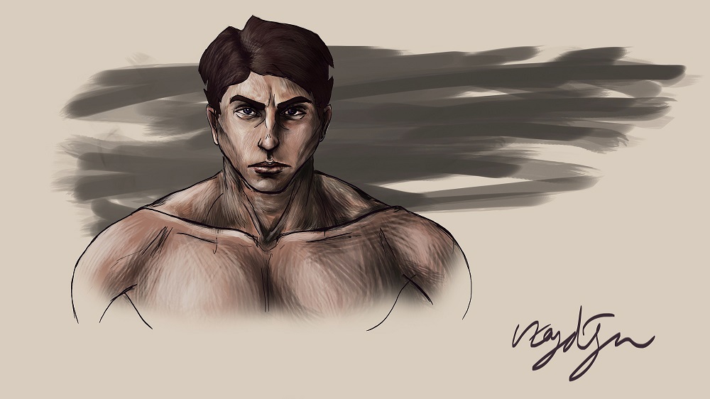
Does anyone can critique my digital painting attempt. I would be happy if you critique about digital painting techniques and theories, style. Also can you tell me what kind of feeling do you get with this unbaked style of mine.

Check out my DeviantART page for full resolution image.
Thank you.
RE: Digital Render and style critique - meat - 09-18-2015
Your sense of 3D form is showing through in your painting, and that's good! There is a work-in-progress feel to your painting, and it's more like a drawing than a painting. The background lines feels sloopy because there're too many of them in too many different length and curves... they look liek speghetti, basically. The fuzzy, blurry eraser at the bottom is too digidal feel, it just doesn't look good. If you want to take a brush and just erase out a fading edge, use something with more scatter and varying shapes, and don't leave the black outline untouched. THe black outline stands too far apart from the rest of the lines They can use some variation in thickness and darkness and transparency - what we call line weight. Hope that helps :)
RE: Digital Render and style critique - Uzaydogan - 09-23-2015
Thank you, that was very helpful:)
RE: Digital Render and style critique - Di-Dorval - 11-10-2015
Hey I agree with above line weight would be a great starting point! You don't really need to worry on style atm imo just inspire yourself from your favorite and better artists if you think you're lacking style wise!
To help with line weight I added the attached image which shows pretty much all the theory needed to get started. It's a boring drawing but the text is good. Don't know who its from though..
Also don't be afraid to go with larger strokes when painting so that it dosnt look scratchy unless its your style. Also using photo reference for lighting is great to improve.