+- Crimson Daggers — Art forum (//crimsondaggers.com/forum)
+-- Forum: TOURNAMENTS (//crimsondaggers.com/forum/forum-71.html)
+--- Forum: THE CRIMSON CRUCIBLE (//crimsondaggers.com/forum/forum-72.html)
+---- Forum: CRIMSON CRUCIBLE WIPS (//crimsondaggers.com/forum/forum-73.html)
+---- Thread: Dino's CC WIP(S) (/thread-7342.html)
Pages:
1
2
Dino's CC WIP(S) - kazenodino - 03-13-2016
Hello people :)
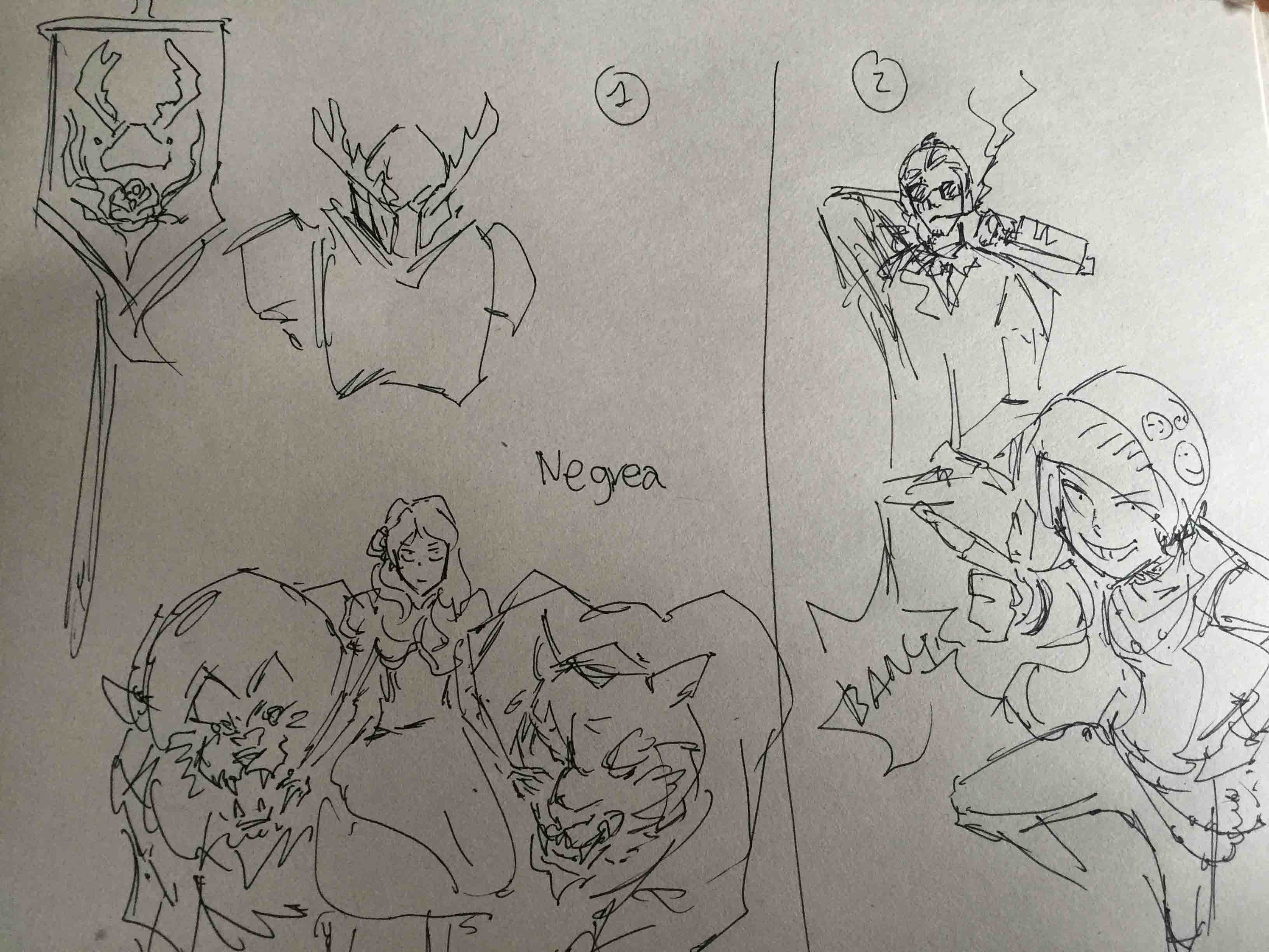
trying to decide which option to go for.
explored a bit for each:
1. House Negrea a lot of nature themes and fights with animals.
2. Modern Sandor and Arya.
3. cyber punk Sandor and Arya(I liked most).


will be ending up with 3 I guess.
Cheers,
Dino
RE: Dino's CC WIP(S) - Amit Dutta - 03-13-2016
Great. Lots and lots of trying out of ideas and playing with designs to get past the first obvious ones is a good thing to do. Looking forward to seeing more as this develops :)
RE: Dino's CC WIP(S) - Broadway - 03-13-2016
Beetle sigil is on point :). I like all your options really, but I gotta say I'm most curious what a present-day Arya/Sandor would look like. Cool stuff!
RE: Dino's CC WIP(S) - Piotr Jasielski - 03-14-2016
I like all of your options. The last comp looks especially nice. And I'm Arya fan so would love to see how that develops.
RE: Dino's CC WIP(S) - tinDeer - 03-14-2016
That sigil of your first option looks really cool! Either way, all the options sound promising, but I personally would find the second one most interesting as well.
RE: Dino's CC WIP(S) - Triggerpigking - 03-14-2016
I like the last two options a lot, especially the modern one (thinking about going with a modern redesign myself.)
RE: Dino's CC WIP(S) - Lodratio - 03-14-2016
Those sketches are very expressive! I'd say cyberpunk arya with the attitude of modern arya would be the best combination.
RE: Dino's CC WIP(S) - kazenodino - 03-14-2016
wow thanks for all the feedback peeps :)
I went with cyberpunk finally, tho I think modern day is very interesting too I just like cyberpunk a little bit more :X
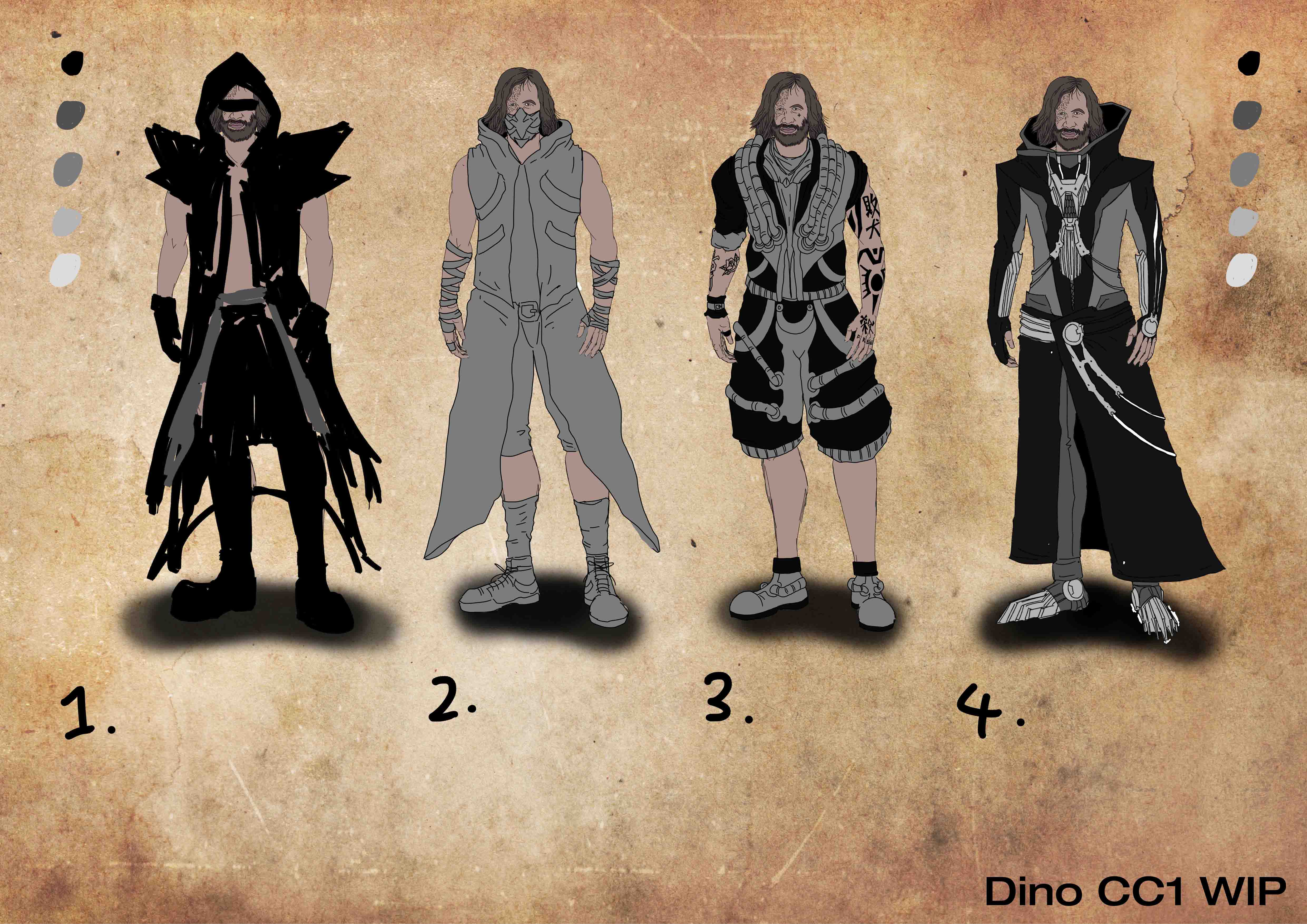
here's what I did today, meet punk Sandor!

1. I like very much, tho it's a bit too much and overdone everywhere?
2. A bit too young for mr.Sandor? :P
3. Very kingdom hearts after I've finished.
4. I liked most, A bit more mature design.
thanks for reading :)
Dino
RE: Dino's CC WIP(S) - Liberty - 03-14-2016
Very good compositions on top, good luck.
RE: Dino's CC WIP(S) - kazenodino - 03-14-2016
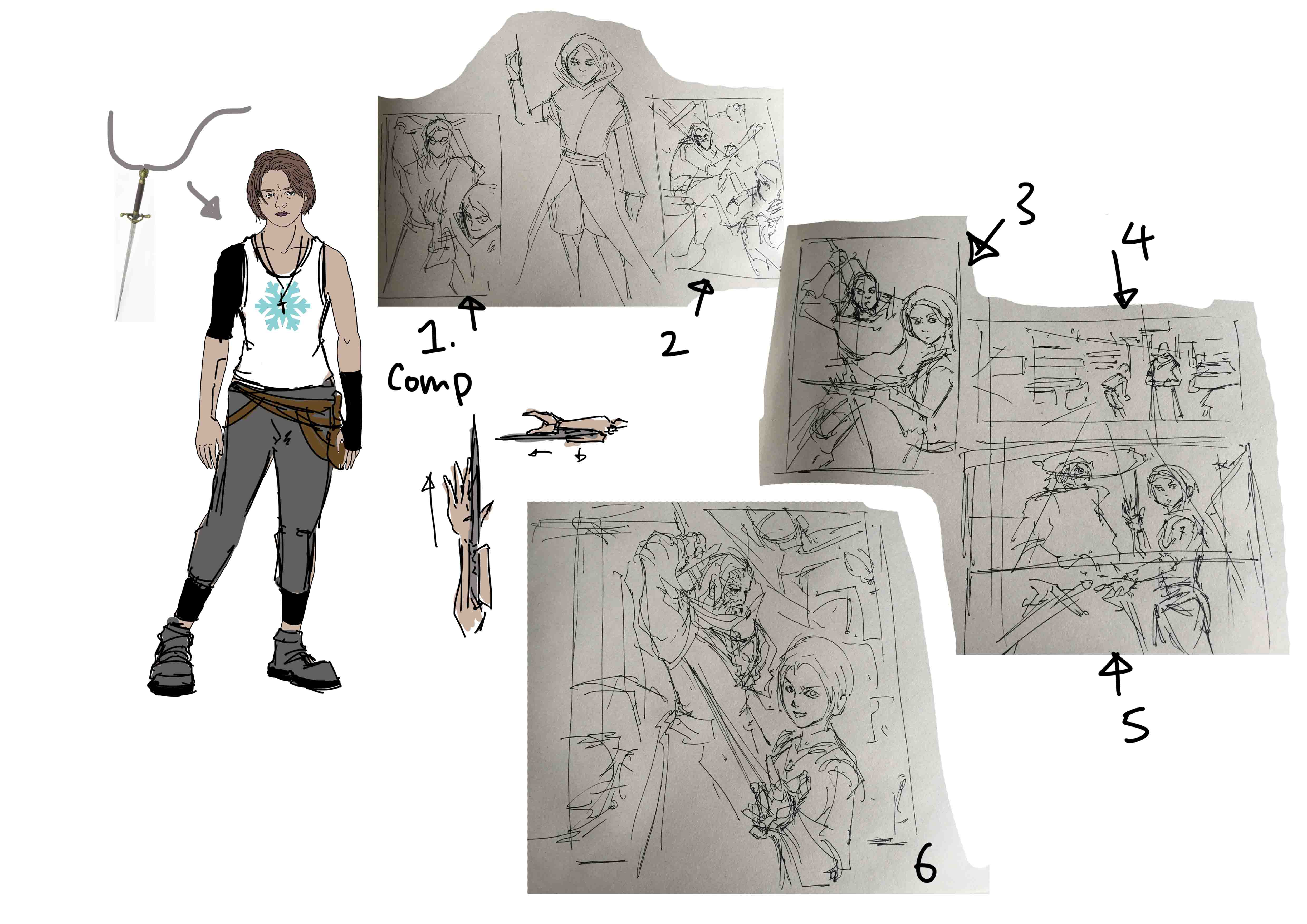
update with more comps,
going for 6.

RE: Dino's CC WIP(S) - Piotr Jasielski - 03-14-2016
You've got some really good comps. As for design, try to find a right balance and maybe include something that would indicate similarities between both original and redesigned characters (the Hound had his special hound helmet for example).
RE: Dino's CC WIP(S) - kazenodino - 03-14-2016
@Piotr Yes I feel the design is a bit off too, trying to change the hounds chest piece into a dog head shape.
RE: Dino's CC WIP(S) - slash razor - 03-15-2016
awesome stuff you got going on there Kazenodino, very nice comps, I like whats hapnin in three, will be interesting where you take this, keep pushing
RE: Dino's CC WIP(S) - Lodratio - 03-15-2016
Huh. I think you might be going too realistic. You're losing the energy and the expressiveness of your faces that your sketches have.
RE: Dino's CC WIP(S) - kazenodino - 03-15-2016
@slash razor, Thankyou for your nice words :)
@Lodratio, Yes thankyou, I think I needa play the realistic down a bit!
RE: Dino's CC WIP(S) - kazenodino - 03-15-2016
update.
does she look like arya? I have no idea lol
original colors:

full cyberpunk color:

RE: Dino's CC WIP(S) - EduardoGaray - 03-18-2016
awesome art style and design! i like both the original and cyberpunk colors, though maybe a mix between the two would be more interesting.
RE: Dino's CC WIP(S) - Piotr Jasielski - 03-18-2016
She does have the Arya feel. I like it. I think the frst one looks closer to the series design, but as Eddy said, you might mix it - for example keep the original colors but add one strand of cyan hair.
RE: Dino's CC WIP(S) - smrr - 03-18-2016
Firstly man, your drawings and sketches are ACE!
Secondly, I'm so happy you went the cyberpunk route --- ++respect, your designs are looking so interesting! Aaaahh! :D
Get it!
RE: Dino's CC WIP(S) - kazenodino - 03-27-2016
Went Taiwan for a week just got back to Hongkong today, honestly feeling lazy and want to give up, then I saw people actually liked my idea so atleast I'd like to get the idea out.
(background not mine is from my ref bladerunner.)