
+- Crimson Daggers — Art forum (//crimsondaggers.com/forum)
+-- Forum: TOURNAMENTS (//crimsondaggers.com/forum/forum-71.html)
+--- Forum: THE CRIMSON CRUCIBLE (//crimsondaggers.com/forum/forum-72.html)
+---- Forum: CRIMSON CRUCIBLE WIPS (//crimsondaggers.com/forum/forum-73.html)
+---- Thread: A Razors Edge CC1 Game of Thrones (/thread-7357.html)
Pages:
1
2
A Razors Edge CC1 Game of Thrones - slash razor - 03-14-2016
hey guys glad to be a part of this, I never ever finish anything so this my opportunity to start doing some finished pieces.
anyway here goes, had a few ideas last night, scribbling away and was going to go with a character study of a decrepit old man, very conniving and devious sitting upon his throne surrounded by his many daughters and loyal subjects, Walder Frey... but of course I didnt read the Brief properly and realized there were 3 parts to it lol wasted a couple of hours so I scrapped that Idea.
I decided to go with a Enviro of the House Negrea, after weighting options, I decided I wanted to stay in the GoT era and creating a character might of been a bit much for me this time round.
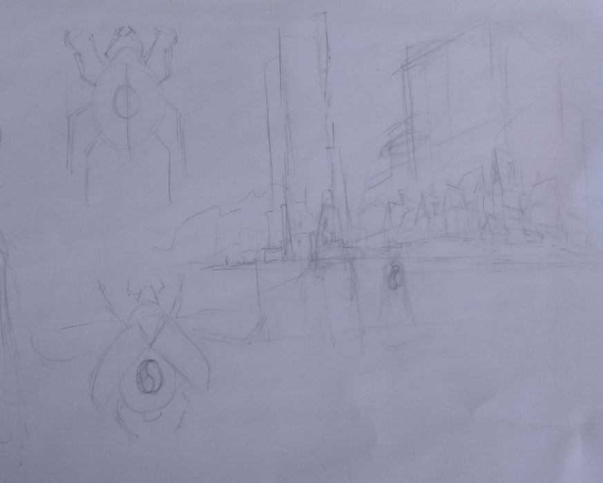
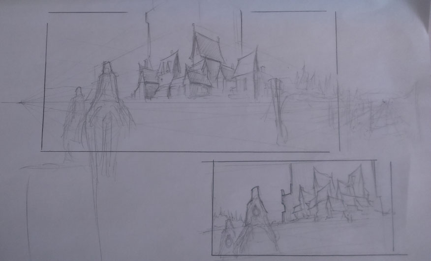
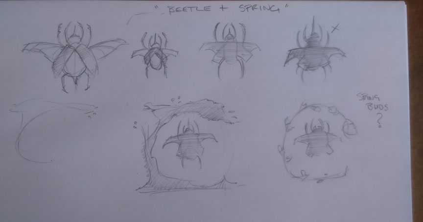
Anywho my idea is pretty basic, probably generic lol = Village, Castle, and rolling fields and not particularly in that order, and maybe a Knight on horse with the bug banner haha... so anyway Im thinking keep with springtime motto as per brief, still very dark and moody but with a bit of spring time color, maybe blossoms to break the mood of the foreboding castle and dirt ridden town, Im bringing in some soldiers just so they can have the House of Negrea banner is some form, also trying some beetle ideas out...
still just playing with ideas at the mo, I'll keep working on the compo, C&C very welcome, anyway back to it, this is what I've got so far.
.jpg)
RE: A Razors Edge CC1 Game of Thrones - kazenodino - 03-14-2016
like the last comp the top of buildings actually look like beetle horns :)
RE: A Razors Edge CC1 Game of Thrones - Amit Dutta - 03-14-2016
Nice sketches man, keep playing with the comps and design ideas. Check out Dragonstone in the series. Karakter studio did concept art for it. The buildings are reminiscent of dragon scales, or sharp teeth etc. Definitely apply this to House Negrea's home hangout :)
RE: A Razors Edge CC1 Game of Thrones - crackedskull - 03-14-2016
Those shapes look pretty good, cant wait to see where you take this.
RE: A Razors Edge CC1 Game of Thrones - neopatogen - 03-15-2016
Placing beetle sigil on the character's backs is a great idea! You environment sketches look promising, too! Can't wait so see more!
RE: A Razors Edge CC1 Game of Thrones - slash razor - 03-15-2016
thanks kazenodino could ba a idea? not sure at this time....
had a look at your suggestion Amit and damn I'll be a happy man if I come any where close to those lol....
thanks crackedskull yea I do like the sharp shape look, and to be honest not sure where I'm going to take this lol I'm to fussy, no wonder I dont finish anything...
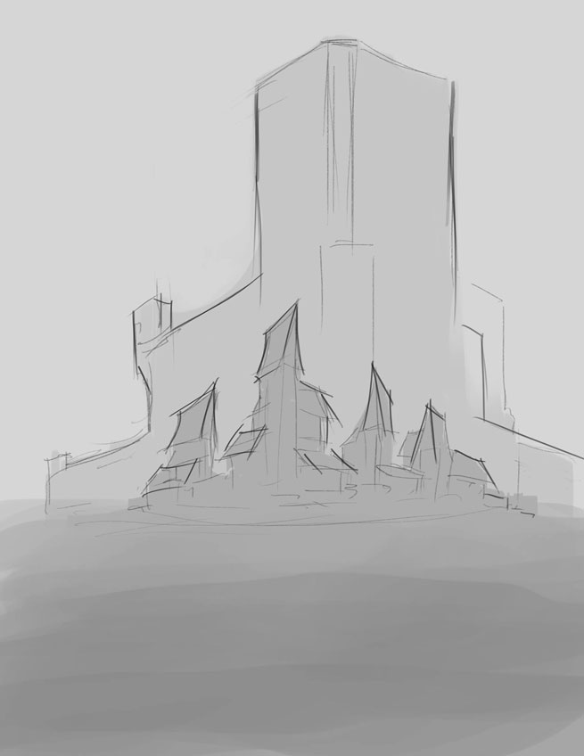
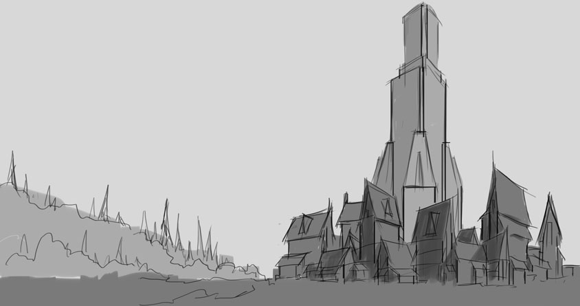
I did a bit more on the idea I had, I'm starting to think it looks a bit stagnant? what do you guys think? dont want to leave my run home too late, might come back to it but...
going to explore more thumb comps in different views, so will do that tomorrow...
Edit: just seen your post neopatogen thanks yea was either on the back or a flag, maybe both... dont like my beetle design at the mo...
RE: A Razors Edge CC1 Game of Thrones - Eyliana - 03-15-2016
I like the beetle designs, they are nice simplifications. And I'm intrested to see where your environments are going :)
RE: A Razors Edge CC1 Game of Thrones - Piotr Jasielski - 03-15-2016
Looks good so far, but deffinitely try exploring some more thumbnails. Good luck :)
RE: A Razors Edge CC1 Game of Thrones - EduardoGaray - 03-15-2016
hey i like your composition a lot, though like Piotr says, it wont hurt if you keep exploring the idea and doing more thumbnails. Its also really good to see that you are putting everything into perspective from the start. Looking forward to see your idea develop!
RE: A Razors Edge CC1 Game of Thrones - JyonnyNovice - 03-15-2016
Hey slash, I liked your Walder Frey idea - to me it doesn't sound like it's outside of the brief? I agree you should do more thumbs for the buildings! It doesn't look so exciting at the moment ! Best of luck ^_^
RE: A Razors Edge CC1 Game of Thrones - slash razor - 03-15-2016
hey thanks Piotr, EduardoGaray yea thats my biggest problem, getting a idea in my head and sticking with it without exploring different options got to break that habit...
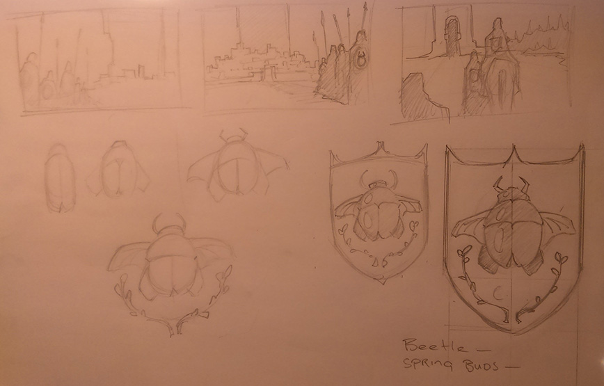
thanks Eyliana, Ive played around with the beetle idea and sorta happy with a design Ive come up with, nothing ground breaking but happy...
hey JyonnyNovice yea I could have stuck with Walder Frey but I didnt want to change the era and demographic so thats why I went with House Negrea... love the GoT world to much...
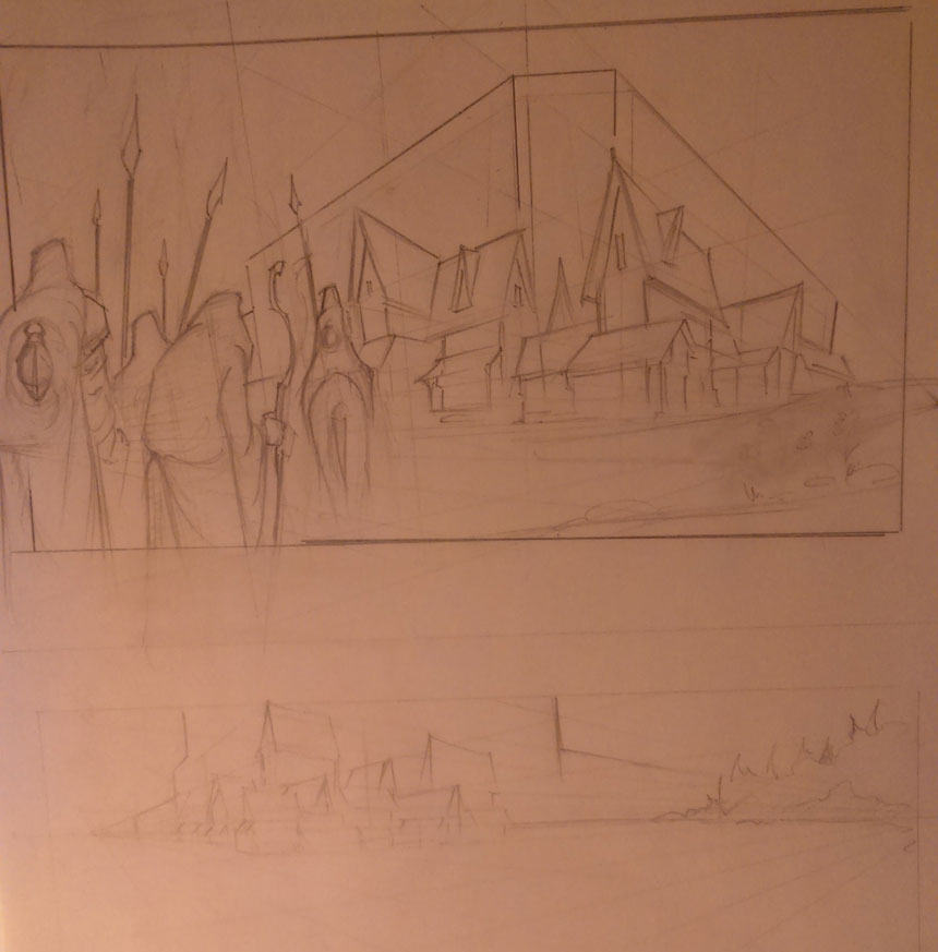
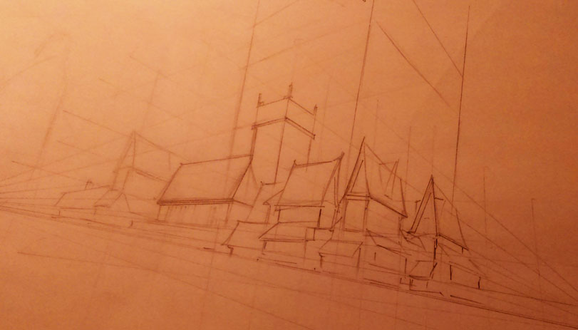
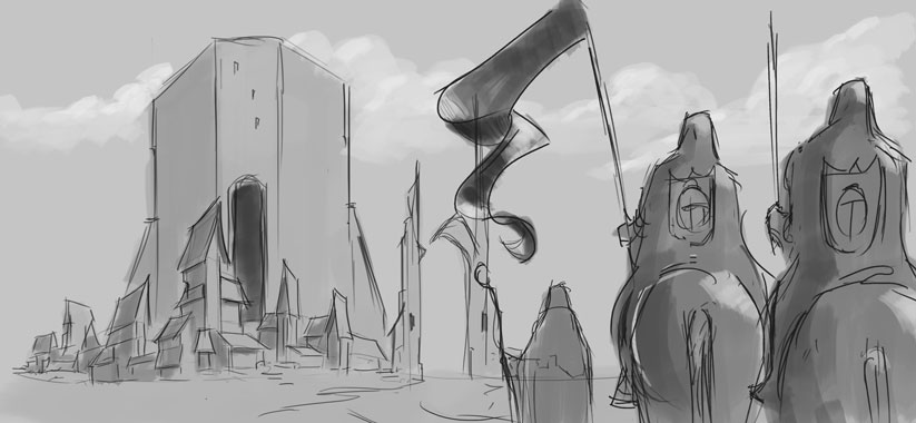
done more thumbs and stuff, didnt really venture out of my scope, probably more getting to the limits of my ability lol, anyway Im happy with a couple of versions I have, will try to refine a couple and see where that leads...
sorry bout the quality of some of the images
RE: A Razors Edge CC1 Game of Thrones - BrushNoir - 03-16-2016
It's getting better and better, keep it coming!
RE: A Razors Edge CC1 Game of Thrones - Amit Dutta - 03-16-2016
nice update! You'll start homing in on something :)
RE: A Razors Edge CC1 Game of Thrones - slash razor - 03-17-2016
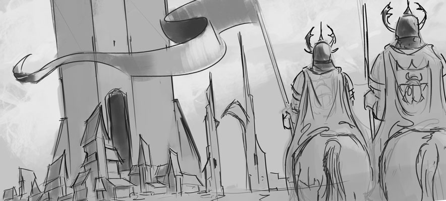
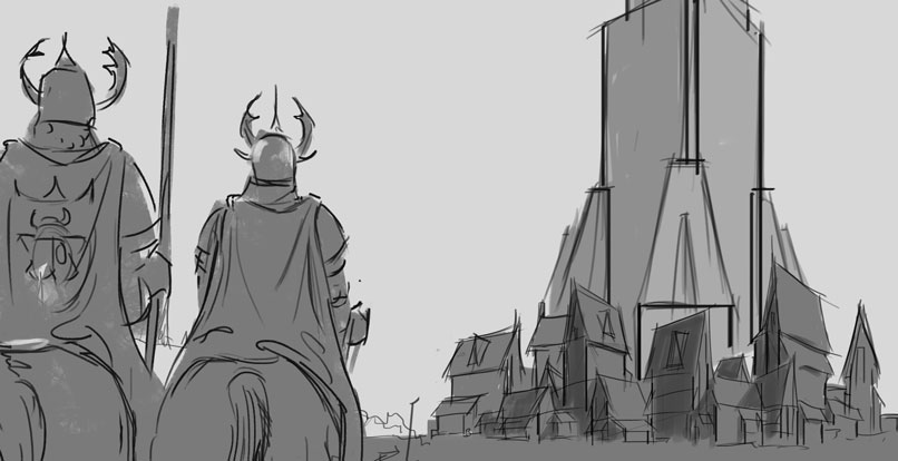
hey guys just a update, didnt really do much last night, did a couple variations of the comps I have, tried different perspective views, Helmets, flag, just to give it more dynamic feel, did it work??? I feel a bit lost at the mo, and time is short so let me know what guys think? what it might need, what doesnt work, did I do to much lol... anyway C&C very appreciated
also does it have the GoT feel to it? what might help there???
RE: A Razors Edge CC1 Game of Thrones - Amit Dutta - 03-17-2016
I like the first one but it can be tweaked to suggest depth and scale more. The banner is nice, but it's huge. I would take the riders from the first with the banner, and make them about half smaller, so we can see most of the horses.. Make the rider in front a bit smaller than the one behind and overlap them. Then take the scale of the village and reduce it in scale a bit so it is more like the second and compress the value range so it seems to be more in the distance. You can bring intermediate layers of forest and road that sweep down towards the town from top right as shapes to accentuate depth and make it a bit more dynamic a comp.
I did a paintover because I like composition problems, so I know it works, but I'm going to have to let you at it yourself...can't give you an advantage others haven't had! Good luck!
RE: A Razors Edge CC1 Game of Thrones - slash razor - 03-17-2016
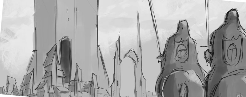
or should I just go with a cropped version of the original?
Edit: oh just seen your message haha wouldve loved the paintover... yea I will try your suggestions, Ill play around with it tonight and see how it goes thanks...
RE: A Razors Edge CC1 Game of Thrones - Amit Dutta - 03-17-2016
That could work, though I like the dynamicism of the first one in post #14. I'd still suggest more depth in between the castle and riders. I did like the banner, just not so large. Haha, ok I'm gonna let you tough this one out man. Making decisions are all part of this game. Most of these are pretty solid and have potential, so time to pick something and work it up. :)
RE: A Razors Edge CC1 Game of Thrones - kopper - 03-17-2016
The subtle camera tilt in the first one of your previous post is nice, gives the image a bit more movement (along with the banner). Maybe it's my personal preference, but when you have static elements like buildings and the horsemen, adding a bit of motion gives the scene more energy. Unless you could convey the movement of the the horses more, but I don't think you have to if you use other means through things like a slight camera tilt and waving banner and even using clouds in a dynamic way.
RE: A Razors Edge CC1 Game of Thrones - slash razor - 03-17-2016
thanks guys just the feedback I need to carry on, yep totally spot on, the two other comps way too static, will try and push depth too... thanks again
RE: A Razors Edge CC1 Game of Thrones - smrr - 03-18-2016
Haha, I can relate hardcore on never finishing anything -- but you got this--!
Sounds like an great idea and I can see it coming to fruition nicely; again, I'm with Amit. The banner was a nice touch, just not as large. Also, give that canvas a tilt for some added dynamism like you had before ;)
Good job with the balanced composition and making the enviro a significant focal point ~ really sticking to your idea!