+- Crimson Daggers — Art forum (//crimsondaggers.com/forum)
+-- Forum: PERSONAL ARTWORK (//crimsondaggers.com/forum/forum-9.html)
+--- Forum: SEEKING CRITIQUE/PAINTOVERS (//crimsondaggers.com/forum/forum-36.html)
+--- Thread: Any sort of advice is welcome :) (/thread-7486.html)
Any sort of advice is welcome :) - yangdaniel027 - 04-13-2016
Hey guys, I would really appreciate any sort of advice that would help push this piece further, as well as things that I should work on for future pieces.
The bookshelf on the left is bothering quite a bit but I can't exactly put my finger on it...
Thank you :)
RE: Any sort of advice is welcome :) - Piotr Jasielski - 04-13-2016
It would seem the perspective is a little off. Lines should be converging towards the vanishing point in the far back.
I'd also increase the midtone levels (darken), so there is a bit more contrast to the light and environment.
I hope that helps.
RE: Any sort of advice is welcome :) - Amit Dutta - 04-14-2016
I don't see huge issues with the perspective except for what P-dawg said but.... hand hands hands hands......do a bit more work on them because they are so important for this piece.
Also do more work on material differentiation. I know it can be a style thing, but i feel it isn't seeing your previous work. I feel you need to add more design and narrative...the scroll is blank, the books are blank, her design is mostly blank. Sometimes the additional elements help make this a world we want to believe in...so make that happen. You aren't weaving a picture, you're weaving a world.
Sorry for the abruptness, in a belligerent mood tonight.
RE: Any sort of advice is welcome :) - yangdaniel027 - 04-14-2016
Thanks guys...exactly the kind of critique I was looking for..now that I really concentrate on her hands I can see what you're saying. I agree that the overall designs of everything are plain. This is something I'll work on specifically to improve on. I'll be joining the material studies on here to also improve on differentiating materials.
RE: Any sort of advice is welcome :) - John - 04-14-2016
Hello! Not quite sure about this. So disregard if false!
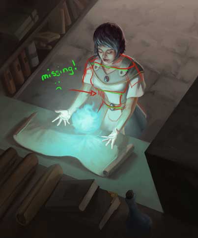
But, the anatomy looks like it's chopped up into two sections, particularly the chest up and the rib cage area, as opposed to being just one cohesive unit. Everything chest upward looks parallel to the table while everything chest downward looks turned a little bit, probably 15 degrees clockwise.
So... redlining the original piece:

And a super fast paint over:

Man this is one gutsy 3-point perspective piece.