+- Crimson Daggers — Art forum (//crimsondaggers.com/forum)
+-- Forum: PERSONAL ARTWORK (//crimsondaggers.com/forum/forum-9.html)
+--- Forum: SEEKING CRITIQUE/PAINTOVERS (//crimsondaggers.com/forum/forum-36.html)
+--- Thread: Composition feedback please! (/thread-7831.html)
Composition feedback please! - ehoax - 08-18-2016
Hi all,
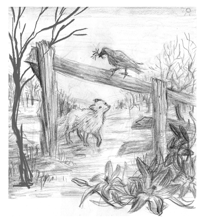
Would love some feedback on the composition for this piece. This is just a rough compositional sketch but I'd really appreciate any suggestions on placement/etc.! It's eventually going to be a part of a book cover design. Not actually for a real book, just for my portfolio ;P
I'm having a particularly hard time framing the left side, I have the tree I added in after I scanned it but I'm not super sold on it...

(also the sun in the upper right isnt for the final it's just a lighting reminder for myself... haha.)
Anyway I'd love some feedback! I'll gladly return the favor if you wanna link me to your thread/ or anything you'd like a crit on!
RE: Composition feedback please! - Milena Mantovani Buzzinaro - 09-03-2016
(08-18-2016, 10:20 AM)ehoax Wrote: Hi all,
Would love some feedback on the composition for this piece. This is just a rough compositional sketch but I'd really appreciate any suggestions on placement/etc.! It's eventually going to be a part of a book cover design. Not actually for a real book, just for my portfolio ;P
I'm having a particularly hard time framing the left side, I have the tree I added in after I scanned it but I'm not super sold on it...
(also the sun in the upper right isnt for the final it's just a lighting reminder for myself... haha.)
Anyway I'd love some feedback! I'll gladly return the favor if you wanna link me to your thread/ or anything you'd like a crit on!
ok, firt thing. firt the praise hahah
cute draw, your trace is beatiful, i loved the animals.
But, the composition was one mess. I thought it was very confusing, details like as stone and tree was leaving the polluted painting.
So, what i did was:
![[Image: DsSlBmv.jpg]](http://i.imgur.com/DsSlBmv.jpg)
- Each animal stayed in point of interess. (Rule of thirds, more about > http://www.photographymad.com/pages/view/rule-of-thirds )
![[Image: ZMD5hbf.jpg]](http://i.imgur.com/ZMD5hbf.jpg)
- Reverse the perspective of hedge, because that way the viewer's eye goes to where the kitten is looking
![[Image: cEGQ7ES.jpg]](http://i.imgur.com/cEGQ7ES.jpg)
- Aaand, I added some leaves in the foreground to give a sense of depth.
I hope help you and good job, is getting pretty <3