
+- Crimson Daggers — Art forum (//crimsondaggers.com/forum)
+-- Forum: TOURNAMENTS (//crimsondaggers.com/forum/forum-71.html)
+--- Forum: THE CRIMSON CRUCIBLE (//crimsondaggers.com/forum/forum-72.html)
+---- Forum: CRIMSON CRUCIBLE WIPS (//crimsondaggers.com/forum/forum-73.html)
+---- Thread: Came here for the free sandwich (/thread-7865.html)
Came here for the free sandwich - John - 09-01-2016
Splash art for Riot Games.
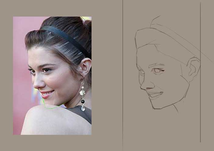
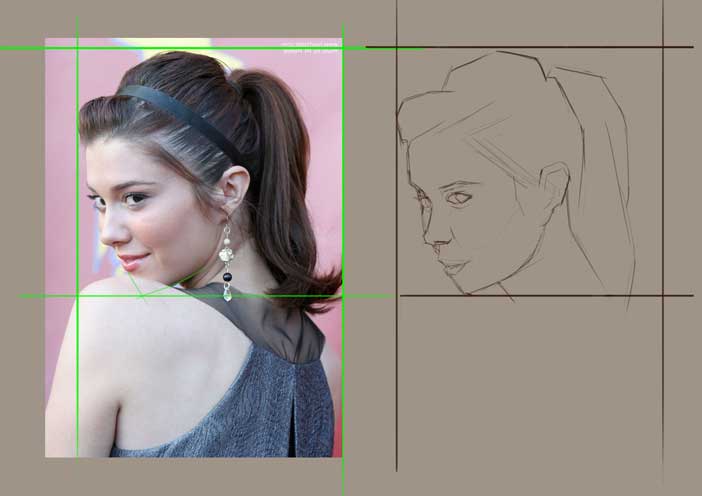
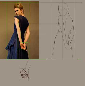
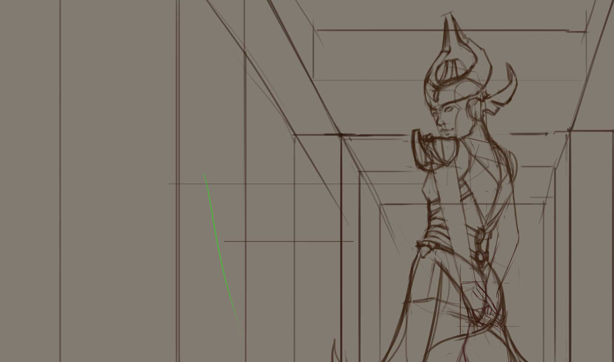
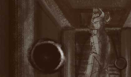
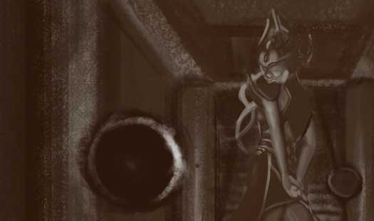
![[Image: I-immediately-regret-this-decision-anchorman.gif]](http://gifrific.com/wp-content/uploads/2012/07/I-immediately-regret-this-decision-anchorman.gif)
RE: Came here for the free sandwich - Amit Dutta - 09-03-2016
Glad to see you here John! Never give up...never surrender.
![[Image: giphy.gif]](https://media.giphy.com/media/DLZIE0DXVTApG/giphy.gif)
RE: Came here for the free sandwich - John - 09-11-2016
@Amit: Give up? Surrender? I don't know the meaning!
---
Scrapping everything, and trying to give the piece more thought. By 'more thought', I meant better references. By 'better', it means be inspired by that Black Narcissus death scene. By 'inspired', it means homage. By 'homage', means blatant rip off.
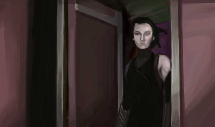
Process!
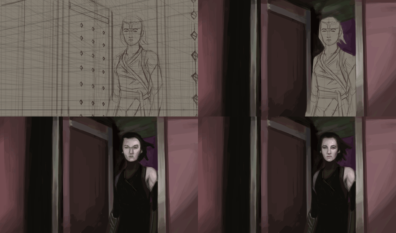
RE: Came here for the free sandwich - Artloader - 09-12-2016
Good stuff John. I like your use of references. Both designs looked good, the first one felt more fantastical, the second more contemporary. Looking forward to seeing where you take this.
Keep it going dude!
RE: Came here for the free sandwich - John - 09-16-2016
Artloader - Hey Loader. What you said was spot on. The first one I immediately dropped the first sign I realized I wasn't going to get the lighting right. On that piece, I had 3 light sources, 2 of which are orbs shooting dark violet light. I don't know how to pull that off, and it took a lot of time for me to find references. On top of that, the perspective was killing me.
Second one I had better references. I had to make a sharp turn towards this composition because of the tons of things to do this month. Which I hope is the right decision moving forward.
---
Done and ready for my sandwich:
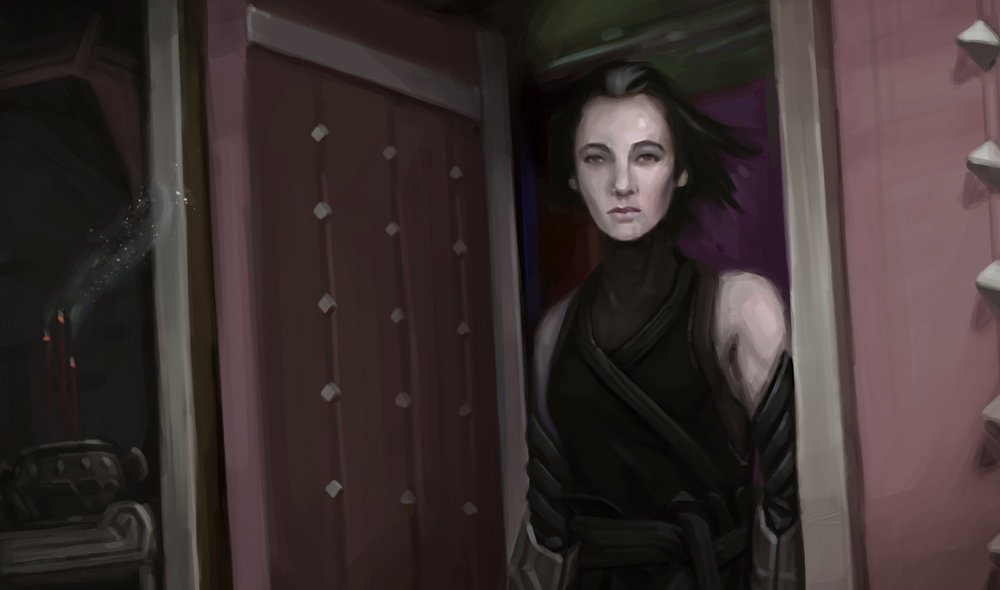
RE: Came here for the free sandwich - Artloader - 09-16-2016
Hey this came out looking great John!
I love the camera angle, the slightly tilted verticals give this a real sense of drama and that faraway look in her eyes is pure gold!
RE: Came here for the free sandwich - neopatogen - 09-16-2016
Wow, already done! You're heaps ahead of me :)
I actually like the 1st sketch much much more, that fantastical feeling and implied deails and the mystery, and interesting perspective.
I actually understood right now after reading your comments that my approach is usualaly different, whatever I study, I use to choose difficult stuff and fail rather than to be rather confident that I'll do it well. The best approach must be somewhere in between I guess :)
I googled that Black Narcissus death scene and I find the woman's face there much more full of powerful emotion and feeling.
Also, black neck looks a bit weird for me, I think it's cloth, in this case you might show some quite a bit more simplified folds.
Good work on simplifying colors, your studies worked well for you! And I really like those candles, they create mood :)
Practicing shit sandwich cooking as you can see :)
RE: Came here for the free sandwich - John - 09-16-2016
@Artloader: You know what, you just gave me an idea where to polish it more. Thanks!
@neo: That is true about what you've said about having the right balance of it being challenged but confident whenever anyone tackles a piece. I admit, it's sort of a cop out just to go for something easy that you know will work well.
That's true what you've said about the actress. I started the piece having her in mind, but switched her out with a modified Elizabeth Taylor! I adore Kathleen Byron's face so much that one day I hope I'll get to paint her as ref for a piece in the near future. She has a face fit for a villain and I love villainy faces.
The black neck thing is supposed to be a ninja cloth thing. Or is it? I don't remember! Hmm... But regardless of what it is, thanks for catching that! Now it bothers me much that I will change it.
You're Shit Sandwich Lite haha!
To both of you, thanks for the crits!