
+- Crimson Daggers — Art forum (//crimsondaggers.com/forum)
+-- Forum: TOURNAMENTS (//crimsondaggers.com/forum/forum-71.html)
+--- Forum: THE CRIMSON CRUCIBLE (//crimsondaggers.com/forum/forum-72.html)
+---- Forum: CRIMSON CRUCIBLE WIPS (//crimsondaggers.com/forum/forum-73.html)
+---- Thread: CC6: KABOOH! (/thread-7959.html)
CC6: KABOOH! - Lodratio - 10-12-2016
Summerbreak's over kids! [Read this like a cheesy 80s movie oneliner]
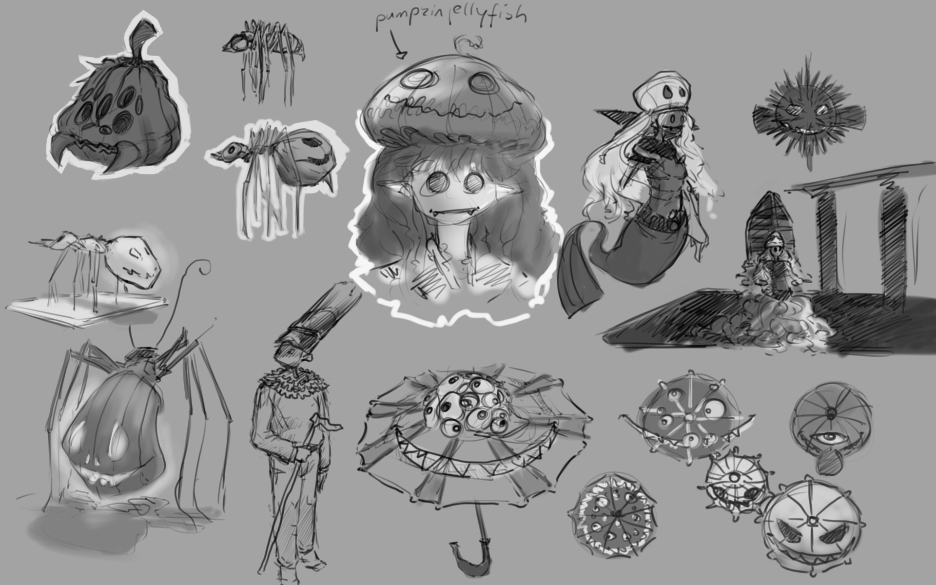
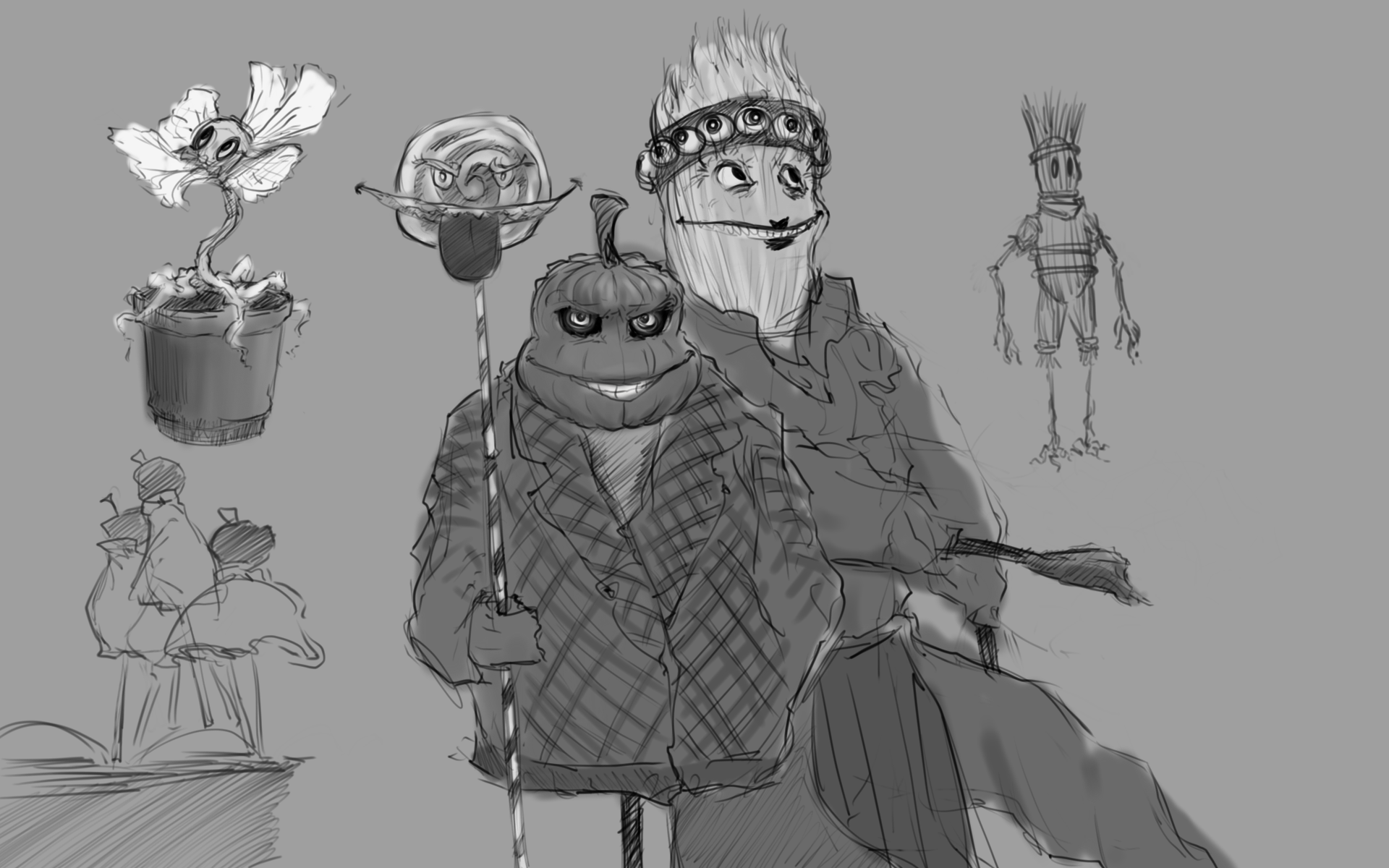
I had no idea where to take this in the beginning, so I started doodling around and brainstorming ways of personifying various basic halloween things. The characters and their relationship are pretty important for the brief this time around, so I want to take some more time to think about that some more before I commit to any particular kind of creature, but in terms of, for lack of a better word, style the second page has some elements that I want to explore more.
Well, let's see where it goes.
![[Image: cc6_sketch1_by_lodratio-daksjie.jpg]](http://img07.deviantart.net/1b53/i/2016/285/1/3/cc6_sketch1_by_lodratio-daksjie.jpg)
![[Image: halloween_design_sketches_by_lodratio-daksjta.jpg]](http://img12.deviantart.net/c2c6/i/2016/285/e/0/halloween_design_sketches_by_lodratio-daksjta.jpg)
RE: CC6: KABOOH! - Piotr Jasielski - 10-12-2016
Oh, I really like your ideas so far :]
RE: CC6: KABOOH! - Amit Dutta - 10-12-2016
You ROCK. :) Keep it up.
RE: CC6: KABOOH! - neopatogen - 10-12-2016
Awesome, really. That many sketches and I can't even say which one I like more. Perhaps the spider lady. And the bird. And lanterns... :)
RE: CC6: KABOOH! - devinn - 10-13-2016
We had a similar idea with the spooky sucker/lollipop thingamajig!!! (in the silohouttes at my wip thread) GREAT MINDS, MAN. GREAT MINDS. (scrapped the idea, doe. haa)
RE: CC6: KABOOH! - Eyliana - 10-13-2016
So many cool sketches and I love your style ^^ I really like the torch lady!
RE: CC6: KABOOH! - Slapper - 10-13-2016
Really cool sketches, I also like the way you think about finding the concepts. Might try to be more open ended like you.
RE: CC6: KABOOH! - Lodratio - 10-19-2016
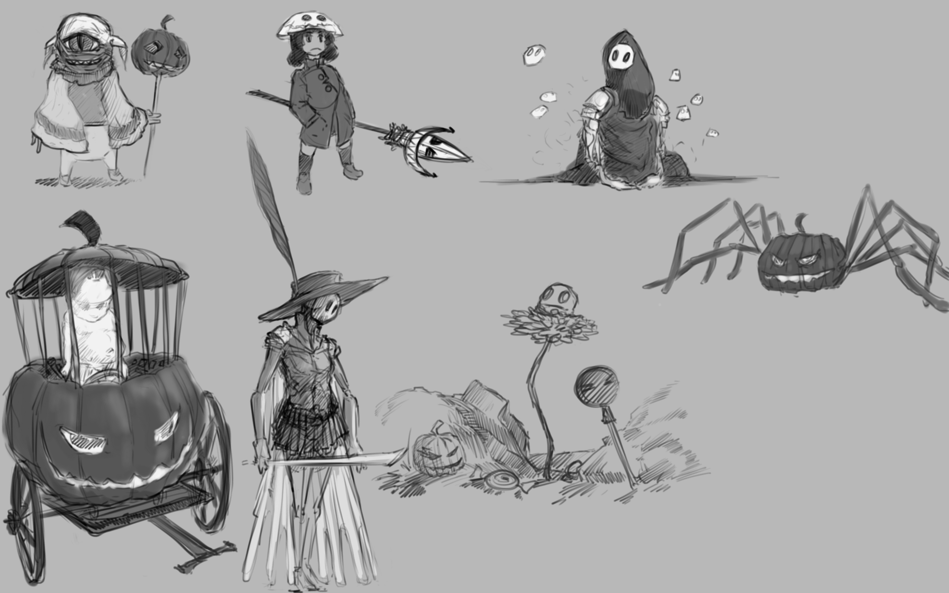
Thanks for all the positive response. There doesn't seem to be anything particularily outstanding among my first sketches, so I've been doing more exploration to get some more ideas to work with. From this point forward my main concern is going to be coming up with an interesting dynamic for the character relationship.
@Jaktrayter it's not too late to give your zombie doll a cute lollipop ceptre!
RE: CC6: KABOOH! - Amit Dutta - 10-19-2016
There's such charm in your sketches and ideas, and that's one of the reasons why I personally am starting to greatly prefer stylised stuff over the more realistic things...it gives you so much more free reign to come up with interesting designs. :)
RE: CC6: KABOOH! - Lodratio - 10-28-2016
Oh no I'm late! I guess I should have taken the fact that holiday time is over a little more seriously... well, here's some more progress.
The first page is the horrifying result of my trying to get a feel for how to paint with a tablet during seminars, and the following ones are composition and story ideas. It's different variations of the confrontation between the Halloween creatures I've been working on and an Easter bunny civilization of some kind. I'm pretty busy, so I'm not sure I'll be able to spend enough time on the final, but at least I don't have any commitments on Friday, so I'm going to try and work on a semi-finished composition tomorrow and flesh it out on the day of the deadline. Well, that's the plan at least. Also, it seems I misspelled Halloween a bunch of times in there. Just pretend you didn't see anything.
![Filename: 2016102815471[1].png
Size: 1.98 MB10-27-2016, 11:52 PM](attachments/92882/2016102815471[1].png)
![Filename: 201610281547[1].png
Size: 1,023.19 KB10-27-2016, 11:52 PM](attachments/92883/201610281547[1].png)
![Filename: artflow_201610281547[1].png
Size: 1.16 MB10-27-2016, 11:53 PM](attachments/92884/artflow_201610281547[1].png)
RE: CC6: KABOOH! - BadWoolf - 10-28-2016
I love the concept of them being in conflict with cute bunnies! Great sketches, I look forward to seeing your finished product :)
RE: CC6: KABOOH! - Knopfkater - 10-28-2016
Moonrabbits

Your approach is amazing, definitely different than the more serious illustrations
i really hope you get done in time,
it would hurt to not see them come to life ^-^
RE: CC6: KABOOH! - Lodratio - 10-30-2016
@Knopfkater I'll have you know I'm very serious!
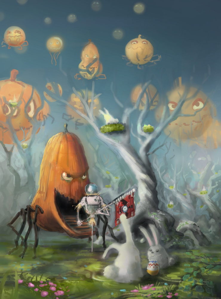
Super rushed process where I didn't take nearly enough time to get a decent composition going and was struggling all the way to try and compensate for it. I know that's one thing I'll be focusing more on next time.

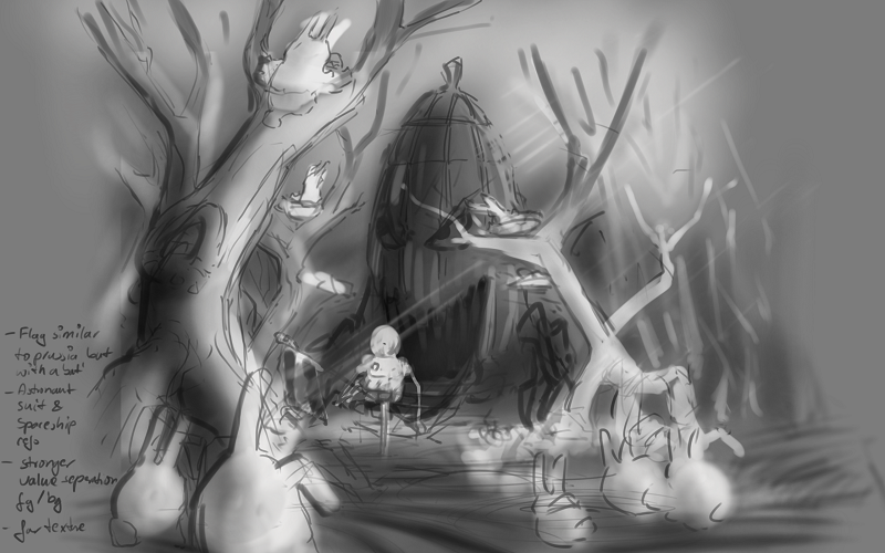
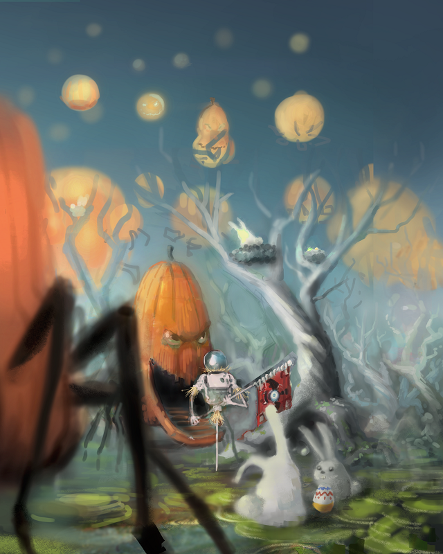
Final. Not sure how I feel about it. I still like the idea, but I don't think the execution has the atmosphere I was going for. It just feels too neutral.
RE: CC6: KABOOH! - neopatogen - 10-30-2016
I love your work! Those pumpkin eyes expression :) And colors.
You definitely nailed the "powerful combo" part of the brief. Not sure how important was the gloomy mood part, but I can't imagine you paint too gloomy stuff :). The idea reminds me of Bobby Chiu's rabbit eater illustration, although yours is very different for sure. I remember he said that people like when an illustration lets the brain figure out something it makes the images more appealing and viral. Awesome work, although the rendering is not polished the basic stuff is there and it reads real well!
RE: CC6: KABOOH! - Amit Dutta - 11-04-2016
Duh for some reason I thought you had done all your sketches in pencil. My bad! So I guess my crit about figuring out how to take the charm in those sketches into final comps still applies but you can ignore the scanning bit haha. I definitely think you need to do some work on basic form / lighting and rendering studies (like really down to fundamentals) so you can meet the strength of the sketches with the render! Good job man, the ideas are always fun to see :)
RE: CC6: KABOOH! - neopatogen - 11-04-2016
Btw did I get it right that the humanoid is luring the rabbits into the creature`s mouth?
RE: CC6: KABOOH! - Lodratio - 11-04-2016
@neo: Nah, it's an invasion, but I can see why you'd read it differently. Like you guessed, I imitated the bobby chui painting in which rabbits are being lured in by some kind of camouflaged predator to some degree with my final this time, and maybe I went further in that direction than I intended subconsciously.
@Amit: I've been trying to get the same amount of control over my digital sketches as I do over traditional, so in a way it's pretty encouraging that you've been fooled into misremembering that those were traditional sketches. As for rendering... well, I don't enjoy doing it because it's way too time consuming, but I also think that in order to be able to do a good looking simplified lighting scheme for an illustration you need to have a pretty good understanding of rendering, the same way you need to have a good understanding of facial anatomy to be able to draw stylized faces. In a way the trick seems to be taking the methods concepts you use to draw a (somewhat) realistic looking face and putting them in different relationships to each other. I could try doing something more along those lines in terms of rendering the next time around, but like you said I'll need a better understanding of lighting to make it work.
RE: CC6: KABOOH! - Piotr Jasielski - 11-04-2016
I think you'll like the next challenge. Your designs were fantastic, it just seams you have trouble to put the in an illustration and render. You should definitely simplify your values first and think more about the composition.
RE: CC6: KABOOH! - Amit Dutta - 11-05-2016
@Lodratio: Hmm, actually I disagree. I think going simpler will help you more. To me it feels like you are trying to run before you can crawl when it comes to rendering.
Really, if the nuts and bolts of the form, the lighting, the perspective, the values are put down accurately in the simplest form, the detail rendering is just icing on the cake. Look at your sketches. That's basically what you have, and they feel solid. You then lose the plot when thinking of rendering on...so I would say don't! keep it as simple as possible for a while.
I think doing digital studies of basic primitives in perspective, giving them local colour, lighting them differently and so on, will help a lot!
The same can be applied to more complex shapes/forms. If you boil things down to the forms in perspective and can get the 3 basic tones of shadow, local, light done right, this will go a long way.
I find when you are struggling with anything, going back to the fundamentals usually helps.
Also there is a large factor of workflow that comes into play when getting into digital and it can take time to find something that works for you. The time consuming part of rendering I would suggest it isn't the time it takes but the fact that you are probably doing and redoing the same things a lot, because the basics haven't been put in place. At least that's what I found with my own stuff. Rendering is incredibly frustrating if you are constantly redoing or trying to fix something that you didn't solve at the more basic level